Apple
Apple, iPhone, iPad, Mac News and Rumors
Deals: Get the Apple Pencil 2 for $109.99 ($19 Off) and 512GB M1 MacBook Air for $1,099.99 ($149 Off)
- Deals
Today we're tracking a pair of deals, one on the Apple Pencil 2 and one on the 2020 M1 MacBook Air. These sales include the current best price online for the Apple Pencil 2, and an all-time low price on the MacBook Air.
Note: MacRumors is an affiliate partner with some of these vendors. When you click a link and make a purchase, we may receive a small payment, which helps us keep the site running.
Apple Pencil 2
Firstly, Woot has the Apple Pencil 2 for $109.99, down from $129.00. This sale isn't the lowest price we've ever tracked on this accessory, as it's been down to $99.00 in previous sales earlier this year, but it's still a solid second-best deal if you're looking to purchase an Apple Pencil 2 this week.
$19 OFFApple Pencil 2 for $109.99
The Apple Pencil 2 is compatible with the new iPad mini 6, but not the new 10.2-inch iPad. For that tablet, only the original Apple Pencil is supported.
MacBook Air
Amazon today has the 512GB M1 MacBook Air for $1,099.99, down from $1,249.00. This is a match of the all-time low price on this model of the 2020 MacBook Air, and it's available in Space Gray and Silver.
You'll see this sale price reflected on the checkout screen, once an automatic coupon is applied to your order. While the Gold option won't be available until around October 1, you can still purchase a Gold MacBook Air today at this discounted price ahead of the delayed shipping date.
$149 OFFM1 MacBook Air (512GB) for $1,099.99
The 256GB model is on sale as well, available for $849.99, down from $999.00. All three colors are discounted for this model, but none are in stock today. This is still the lowest price we've ever tracked for the 256GB MacBook Air, so if you're willing to wait a few weeks, it's worth locking in this price while it's available.
You can find even more discounts on other MacBooks by visiting our Best Deals guide for MacBook Pro and MacBook Air. In this guide we track the steepest discounts for the newest MacBook models every week, so be sure to bookmark it and check back often if you're shopping for a new Apple notebook.Related Roundup: Apple Deals
This article, "Deals: Get the Apple Pencil 2 for $109.99 ($19 Off) and 512GB M1 MacBook Air for $1,099.99 ($149 Off)" first appeared on MacRumors.com
Discuss this article in our forums
Deals: Amazon Takes $149 Off 2020 MacBook Air Models, Starting at $849.99 for 256GB
- Deals
Amazon today is offering the 512GB M1 MacBook Air for $1,099.99, down from $1,249.00. This is a match of the all-time low price on this model of the 2020 MacBook Air, and it's available in Gold and Silver.
Note: MacRumors is an affiliate partner with some of these vendors. When you click a link and make a purchase, we may receive a small payment, which helps us keep the site running.
You'll see this sale price reflected on the checkout screen, once an automatic coupon is applied to your order. Only the Gold color is available to ship today, while the Silver option won't be available until around September 21. You can still purchase a Silver MacBook Air today at this discounted price ahead of the delayed shipping date.
$149 OFFM1 MacBook Air (512GB) for $1,099.99
The 256GB model is on sale as well, available for $849.99, down from $999.00. All three colors are discounted for this model, but none are in stock today. This is still the lowest price we've ever tracked for the 256GB MacBook Air, so if you're willing to wait a few weeks, it's worth locking in this price while it's available.
You can find even more discounts on other MacBooks by visiting our Best Deals guide for MacBook Pro and MacBook Air. In this guide we track the steepest discounts for the newest MacBook models every week, so be sure to bookmark it and check back often if you're shopping for a new Apple notebook.Related Roundup: Apple Deals
This article, "Deals: Amazon Takes $149 Off 2020 MacBook Air Models, Starting at $849.99 for 256GB" first appeared on MacRumors.com
Discuss this article in our forums
Deals: Amazon Drops Price of 256GB M1 MacBook Air to New Low of $849.99 ($149 Off)
- Deals
Amazon today introduced new low prices on the M1 MacBook Air for both 256GB and 512GB storage options. To start, you can get the 256GB model for $849.99, down from an original price of $999.00.
Note: MacRumors is an affiliate partner with Amazon. When you click a link and make a purchase, we may receive a small payment, which helps us keep the site running.
Only Silver and Gold are available at this price on Amazon. This sale marks a new all-time low price for Apple's 2020 M1 MacBook Air, providing the cheapest entry price into the lineup since it debuted last year.
$149 OFFM1 MacBook Air (256GB) for $849.99
Likewise, the 512GB version of the M1 MacBook Air is seeing a notable discount to $1,099.99, down from $1,249.00. This is a record low price for the notebook, and it's available in all colors.
$149 OFFM1 MacBook Air (512GB) for $1,099.99
You can find even more discounts on other MacBooks by visiting our Best Deals guide for MacBook Pro and MacBook Air. In this guide we track the steepest discounts for the newest MacBook models every week, so be sure to bookmark it and check back often if you're shopping for a new Apple notebook.Related Roundup: Apple Deals
This article, "Deals: Amazon Drops Price of 256GB M1 MacBook Air to New Low of $849.99 ($149 Off)" first appeared on MacRumors.com
Discuss this article in our forums
Deals: All-Time Low Prices Return to Apple's M1 MacBook Pro, Starting at $1,099.99 for 256GB
- Deals
- MacBook Pro 13"
Amazon this week has the M1 MacBook Pro on sale in both 256GB and 512GB configurations, including a return to record low prices for both models. Prices start at $1,099.99 for the 256GB MacBook Pro, down from $1,299.00. You'll see the discount after an automatic coupon worth $49.01 is applied at the checkout screen on Amazon.
Note: MacRumors is an affiliate partner with Amazon. When you click a link and make a purchase, we may receive a small payment, which helps us keep the site running.
This price is a match of the previous all-time low price on the 256GB M1 MacBook Pro. This model of Apple's notebook line includes the same aluminum body with large Force Touch trackpad as previous generations, speakers at the side of the keyboard, and a 13.3-inch display with slim black bezels. Both colors are on sale and available to ship out today.
$199 OFF256GB M1 MacBook Pro for $1,099.99
Secondly, Amazon has the 512GB MacBook Pro for $1,299.99, down from $1,499.00. This sale price is available in both Silver and Space Gray, and it's sold directly from Amazon.
$199 OFF512GB M1 MacBook Pro for $1,299.99
You can find even more discounts on other MacBooks by visiting our Best Deals guide for MacBook Pro and MacBook Air. In this guide we track the steepest discounts for the newest MacBook models every week, so be sure to bookmark it and check back often if you're shopping for a new Apple notebook.Related Roundup: Apple DealsRelated Forum: MacBook Pro
This article, "Deals: All-Time Low Prices Return to Apple's M1 MacBook Pro, Starting at $1,099.99 for 256GB" first appeared on MacRumors.com
Discuss this article in our forums
Deals: Take Up to $199 Off Apple's M1 MacBook Pro and MacBook Air at Best Buy and Amazon
- Deals
- Featured
Best Buy and Amazon are both offering great deals on numerous models of the MacBook Pro and MacBook Air today, including a handful of record low deals on the latest Apple notebooks.
Note: MacRumors is an affiliate partner with some of these vendors. When you click a link and make a purchase, we may receive a small payment, which helps us keep the site running.
13-Inch M1 MacBook Air
Starting with the 2020 M1 13-inch MacBook Air, you'll find the 256GB notebook for $899.00 at Amazon and $899.99 at Best Buy, down from $999.00. Amazon stock has dwindled and will "ship soon," but Best Buy has plenty of stock in all three colors.
Additionally, both retailers have the 512GB M1 MacBook Air at $1,099.99, down from $1,249.00. While this is a record low price on the 512GB notebook, the 256GB model's discount is a second-best price.
- M1 MacBook Air, 256GB - $899.99, down from $999.00 at Best Buy / Amazon
- M1 MacBook Air, 512GB - $1,099.99, down from $1,249.00 at Best Buy / Amazon
13-Inch M1 MacBook Pro
For the newest MacBook Pro models, Best Buy and Amazon have lowest ever prices on the new 2020 M1 13-inch MacBook Pro. You can get the 256GB notebook for $1,099.99, down from $1,299.00, in both Silver and Space Gray.
For more storage, the 512GB M1 MacBook Pro is on sale for $1,299.99, down from $1,499.00. This model is also available in both Silver and Space Gray at this price.
- M1 MacBook Pro, 256GB - $1,099.99, down from $1,299.00 at Best Buy / Amazon
- M1 MacBook Pro, 512GB - $1,299.99, down from $1,499.00 at Best Buy / Amazon
You can find even more discounts on other MacBooks by visiting our Best Deals guide for MacBook Pro and MacBook Air. In this guide we track the steepest discounts for the newest MacBook models every week, so be sure to bookmark it and check back often if you're shopping for a new Apple notebook.Related Roundup: Apple Deals
This article, "Deals: Take Up to $199 Off Apple's M1 MacBook Pro and MacBook Air at Best Buy and Amazon" first appeared on MacRumors.com
Discuss this article in our forums
Deals: Get Apple's 512GB M1 Mac Mini for Record Low of $799 on Amazon ($100 Off)
- Deals
- Mac mini
A record low discount has returned to Apple's 512GB M1 Mac mini today on Amazon. You can get this model for $799.00, down from its original price of $899.00.
Note: MacRumors is an affiliate partner with Amazon. When you click a link and make a purchase, we may receive a small payment, which helps us keep the site running.
This sale matches the previous all-time low price on the 512GB M1 Mac mini seen on Amazon, and it's available to ship out today. You'll find a matching sale over at B&H Photo, which offers free expedited shipping for orders placed in the United States.
$100 OFFM1 Mac mini (512GB) for $799.99
At this time, the 256GB M1 Mac mini is not seeing a steep discount at any retailer, with Amazon offering the lowest price at $659.00, down from $699.00. The best price on this model has been $599.00, so we recommend waiting for a better deal.
Keep up with all of this week's best discounts on Apple products and related accessories in our dedicated Apple Deals roundup.Related Roundups: Apple Deals, Mac miniBuyer's Guide: Mac Mini (Neutral)Related Forum: Mac mini
This article, "Deals: Get Apple's 512GB M1 Mac Mini for Record Low of $799 on Amazon ($100 Off)" first appeared on MacRumors.com
Discuss this article in our forums
Deals: Shop Record Low Prices Across Apple's Full MacBook Pro and MacBook Air Lineup (Up to $499 Off)
- Deals
- MacBook Pro 14" & 16"
- MacBook Pro 13"
- MacBook Air 13"
Apple's MacBook Pro and MacBook Air lineup is seeing all-time low discounts across the board today, including the 2019 16-inch MacBook Pro, 2020 13-inch MacBook Air, and 2020 13-inch MacBook Pro.
Note: MacRumors is an affiliate partner with some of these vendors. When you click a link and make a purchase, we may receive a small payment, which helps us keep the site running.
13-Inch M1 MacBook Air
Starting with the 2020 M1 13-inch MacBook Air, Amazon has the 256GB notebook for $899.00, down from $999.00. This price is available in all three colors of Gold, Silver, and Space Gray, but stock is dwindling on the latter two options.
$100 OFF13-inch MacBook Air (256GB) for $899.00
Additionally, Amazon is also selling the 512GB M1 MacBook Air at $1,099.00, down from $1,249.00. Both of these discounts represent all-time low prices, and they're shipped and sold directly from Amazon.
$150 OFF13-inch MacBook Air (512GB) for $1,099.00
13-Inch M1 MacBook Pro
For the newest MacBook Pro models, Amazon has lowest ever prices on the new 2020 M1 13-inch MacBook Pro. You can get the 256GB notebook for $1,099.99, down from $1,299.00, in both Silver and Space Gray.
$199 OFF13-inch MacBook Pro (256GB) for $1,099.99
For more storage, the 512GB M1 MacBook Pro is on sale for $1,299.99, down from $1,499.00. This model is also available in both Silver and Space Gray at this price.
$199 OFF13-inch MacBook Pro (512GB) for $1,299.99
16-Inch MacBook Pro
Moving to the 16-inch MacBook Pro, we're tracking record low prices on both storage options for this 2019 notebook. You can get the 512GB model for $1,999.99, down from $2,399.00. This sale is available in both Silver and Space Gray color options.
$399 OFF16-inch MacBook Pro (512GB) for $1,999.99
The 1TB 16-inch MacBook Pro is on sale for $2,299.99, down from $2,799.00. Like the other model, this is an all-time low price, but it's only available in Silver. Both notebooks are sold by Amazon and are ready to ship today.
$499 OFF16-inch MacBook Pro (1TB) for $2,299.99
You can find even more discounts on other MacBooks by visiting our Best Deals guide for MacBook Pro and MacBook Air. In this guide we track the steepest discounts for the newest MacBook models every week, so be sure to bookmark it and check back often if you're shopping for a new Apple notebook.Related Roundups: Apple Deals, MacBook Pro, MacBook AirBuyer's Guide: MacBook Pro (Buy Now), 13" MacBook Air (Neutral)Related Forums: MacBook Pro, MacBook Air
This article, "Deals: Shop Record Low Prices Across Apple's Full MacBook Pro and MacBook Air Lineup (Up to $499 Off)" first appeared on MacRumors.com
Discuss this article in our forums
Deals: Find All-Time Low Prices on M1 MacBook Pro Models in Amazon's Newest Sales ($199 Off)
- Deals
- MacBook Pro 13"
Today we're tracking a pair of deals on the M1 13-inch MacBook Pro from late 2020, with Amazon matching previous record low prices on both storage options for this model.
Note: MacRumors is an affiliate partner with some of these vendors. When you click a link and make a purchase, we may receive a small payment, which helps us keep the site running.
Starting with the 256GB 13-inch MacBook Pro, you can get this model for $1,099.99 in Space Gray on Amazon, down from $1,299.00. At the time of writing, the Silver model is out of stock for this sale.
$199 OFFM1 MacBook Pro (256GB) for $1,099.99
You can also get the 512GB 13-inch MacBook Pro on sale today, priced at $1,299.99, down from $1,499.00. Both Silver and Space Gray colors are available for this model, and they're shipped and sold by Amazon.
$199 OFFM1 MacBook Pro (512GB) for $1,299.99
Both of these discounts found today on Amazon match the previous all-time low prices on these M1 MacBook Pro models, making them the best sales online this week. You won't need any coupon code or have to wait for a discount at checkout, as both sales have been directly applied already by Amazon.
You can find the best monthly deals on all new MacBook Pro and MacBook Air notebooks in our "Best Deals" guide. Be sure to visit the guide and bookmark it if you're on the hunt for a new Apple notebook; we'll be updating it weekly as we discover new MacBook offers across the web.Related Roundup: Apple DealsRelated Forum: MacBook Pro
This article, "Deals: Find All-Time Low Prices on M1 MacBook Pro Models in Amazon's Newest Sales ($199 Off)" first appeared on MacRumors.com
Discuss this article in our forums
Deals: Get the M1 MacBook Air for Up to $150 Off, Starting at $899 for 256GB
- Deals
- MacBook Air 13"
Amazon, B&H Photo, and Adorama today are discounting the M1 MacBook Air to match previous record low prices for both 256GB and 512GB storage options. To start, you can get the 256GB model for $899.00 today on Adorama, down from an original price of $999.00.
Note: MacRumors is an affiliate partner with Amazon. When you click a link and make a purchase, we may receive a small payment, which helps us keep the site running.
Only Silver and Space Gray are available at this price on Adorama. You can also find this sale on Amazon, with a $50 automatic coupon applied at checkout on the Gold and Silver colors. Gold is available to ship in one to two business days, and Silver will be in stock soon, according to Amazon.
$100 OFFM1 MacBook Air (256GB) for $899.00
Likewise, the 512GB version of the M1 MacBook Air is seeing a notable discount to $1,099.00, down from $1,249.00. This is a record low price for the notebook, and it's available in all colors. For Silver and Space Gray, you'll find an automatic coupon that will be applied to your order at the checkout screen. The same sale can be found at B&H Photo on the Gold model.
$150 OFFM1 MacBook Air (512GB) for $1,099.00
You can find even more discounts on other MacBooks by visiting our Best Deals guide for MacBook Pro and MacBook Air. In this guide we track the steepest discounts for the newest MacBook models every week, so be sure to bookmark it and check back often if you're shopping for a new Apple notebook.Related Roundups: Apple Deals, MacBook AirBuyer's Guide: 13" MacBook Air (Neutral)Related Forum: MacBook Air
This article, "Deals: Get the M1 MacBook Air for Up to $150 Off, Starting at $899 for 256GB" first appeared on MacRumors.com
Discuss this article in our forums
Deals: Apple's 512GB M1 MacBook Air Hits New Low Price at $1,099 ($150 Off)
- Deals
- MacBook Air 13"
Amazon today is offering the 512GB M1 MacBook Air for $1,099.00, down from $1,249.00. This is beating the previous sale price by about $50, and represents a new low price for this model of the 2020 MacBook Air.
Note: MacRumors is an affiliate partner with some of these vendors. When you click a link and make a purchase, we may receive a small payment, which helps us keep the site running.
You can get the M1 MacBook Air at this price in both Gold and Silver. For the latter color option, you'll see the price reflected at the checkout screen once a $50 coupon is automatically applied.
$150 OFFM1 MacBook Air (512GB) for $1,099.00
The 256GB model is on sale as well, available for $899.00, down from $999.00. This is a sale price that we've been tracking for most of the summer, so it remains a solid deal if you are shopping for the entry level model of the MacBook Air.
You can find even more discounts on other MacBooks by visiting our Best Deals guide for MacBook Pro and MacBook Air. In this guide we track the steepest discounts for the newest MacBook models every week, so be sure to bookmark it and check back often if you're shopping for a new Apple notebook.Related Roundups: Apple Deals, MacBook AirBuyer's Guide: 13" MacBook Air (Neutral)Related Forum: MacBook Air
This article, "Deals: Apple's 512GB M1 MacBook Air Hits New Low Price at $1,099 ($150 Off)" first appeared on MacRumors.com
Discuss this article in our forums
Deals: Get $49 Off Apple's New M1 iMacs, Starting at $1,249.99 for 7-Core 256GB
- Deals
- iMac
Amazon this week has a sale on Apple's new 24-inch M1 iMac in two configurations. Sales start with the 7-core GPU with 256GB, priced at $1,249.99, down from $1,299.00. This sale is available in Blue and Silver.
Note: MacRumors is an affiliate partner with Amazon. When you click a link and make a purchase, we may receive a small payment, which helps us keep the site running.
This sale is a match of the previous record low price on this version of the M1 iMac. No other retailers are matching the sale as of writing, so you'll only find this deal on Amazon.
$49 OFFM1 iMac (7-Core GPU, 256GB) for $1,249.99
In another new sale, Amazon is also offering $49 off the M1 iMac with the 8-core GPU and 256GB of storage, priced at $1,449.99, down from $1,499.00. These iMacs are sold directly from Amazon and both are available to ship today.
$49 OFFM1 iMac (8-Core GPU, 256GB) for $1,449.99
You can keep track of ongoing sales on Apple's iMac line by visiting our Best iMac Deals guide. There, we keep track of the best iMac offers from Amazon, Adorama, B&H Photo, and other retailers, so be sure to check back often if you're shopping for an iMac for the first time, or thinking of upgrading.Related Roundups: Apple Deals, iMacBuyer's Guide: iMac (Caution)Related Forum: iMac
This article, "Deals: Get $49 Off Apple's New M1 iMacs, Starting at $1,249.99 for 7-Core 256GB" first appeared on MacRumors.com
Discuss this article in our forums
Deals: Amazon Continuing to Discount M1 MacBook Air Models to All-Time Low Prices (Save Up to $149)
- Deals
In the wake of Prime Day, Amazon is still discounting the M1 MacBook Air to record low prices in both 256GB and 512GB storage options. To start, you can get the 256GB model for $899.99 today on Amazon, down from an original price of $999.00.
Note: MacRumors is an affiliate partner with Amazon. When you click a link and make a purchase, we may receive a small payment, which helps us keep the site running.
As of writing, all colors are in stock and ready to ship from Amazon. The sale has also been applied automatically so you won't need to wait until the checkout screen to see the discount price.
$99 OFFM1 MacBook Air (256GB) for $899.99
Likewise, the 512GB version of the M1 MacBook Air is seeing a notable discount to $1,099.99, down from $1,249.00. This is a record low price for the notebook, and you'll see this price at the checkout screen once a coupon worth $50 is applied.
$149 OFFM1 MacBook Air (512GB) for $1,099.99
You can find even more discounts on other MacBooks by visiting our Best Deals guide for MacBook Pro and MacBook Air. In this guide we track the steepest discounts for the newest MacBook models every week, so be sure to bookmark it and check back often if you're shopping for a new Apple notebook.Related Roundup: Apple Deals
This article, "Deals: Amazon Continuing to Discount M1 MacBook Air Models to All-Time Low Prices (Save Up to $149)" first appeared on MacRumors.com
Discuss this article in our forums
Deals: Amazon Discounts 512GB M1 MacBook Air to Match Record Low Price of $1,149 ($100 Off)
- Deals
- MacBook Air 13"
Apple's 512GB M1 MacBook Air has returned to its all-time low price of $1,149.00, down from $1,249.00. This sale is available on Amazon, and only for the Gold color option. Stock appears to be low, although Amazon sometimes has more in stock than is reflected on the website.
Note: MacRumors is an affiliate partner with some of these vendors. When you click a link and make a purchase, we may receive a small payment, which helps us keep the site running.
Apple updated the MacBook Air in November 2020 with the new Apple M1 chip, which has an 8-core CPU, a 7- or 8-core GPU, and a 16-core Neural Engine for machine learning. These updates brought about improved performance, better battery life, and more. There's also a 256GB model, but we aren't seeing any notable discounts this week.
$100 OFFM1 MacBook Air (512GB) for $1,149.00
You can find the best monthly deals on all new MacBook Pro and MacBook Air notebooks in our new "Best Deals" guide. Be sure to visit the guide and bookmark it if you're on the hunt for a new Apple notebook; we'll be updating it weekly as we discover new MacBook offers across the web.Related Roundups: Apple Deals, MacBook AirBuyer's Guide: 13" MacBook Air (Neutral)Related Forum: MacBook Air
This article, "Deals: Amazon Discounts 512GB M1 MacBook Air to Match Record Low Price of $1,149 ($100 Off)" first appeared on MacRumors.com
Discuss this article in our forums
Deals: Apple's 512GB M1 MacBook Pro Hits $1,299.99 on Amazon ($199 Off, Lowest Price)
- Deals
- MacBook Pro 13"
At Amazon today you can get Apple's 13-inch M1 MacBook Pro (512GB) for $1,299.99, down from $1,499.00 on Amazon. You'll see this price at the checkout screen after an automatic coupon worth $50 is applied.
Note: MacRumors is an affiliate partner with Amazon. When you click a link and make a purchase, we may receive a small payment, which helps us keep the site running.
This sale is available in both Silver and Space Gray color options, and it's in stock and ready to ship. At a total of $199 off the original price, this is a match of the previous low price on this model of the MacBook Pro.
$199 OFFM1 MacBook Pro (512GB) for $1,299.99
If anyone's on the hunt for the entry level version of the M1 MacBook Pro, Amazon does have the 256GB model at its typical sale price of $1,149.99, down from $1,299.00. There's no checkout coupon for this one, and it's also being discounted in both colors.
You can find even more discounts on other MacBooks by visiting our Best Deals guide for MacBook Pro and MacBook Air. In this guide we track the steepest discounts for the newest MacBook models every week, so be sure to bookmark it and check back often if you're shopping for a new Apple notebook.Related Roundup: Apple DealsRelated Forum: MacBook Pro
This article, "Deals: Apple's 512GB M1 MacBook Pro Hits $1,299.99 on Amazon ($199 Off, Lowest Price)" first appeared on MacRumors.com
Discuss this article in our forums
Deals: Take $49 Off Apple's M1 iMac With New All-Time Low Prices
- Deals
Amazon today is taking $49 off Apple's new 24-inch M1 iMac in two configurations. Sales start with the 7-core GPU with 256GB, priced at $1,249.99, down from $1,299.00. This sale is available in Blue and Silver.
Note: MacRumors is an affiliate partner with Amazon. When you click a link and make a purchase, we may receive a small payment, which helps us keep the site running.
Amazon previously was discounting this model down to around $1,258.99, making today's sale a new all-time low on this model of the M1 iMac. No other retailers are matching the sale as of writing, so you'll only find this deal on Amazon.
$49 OFFM1 iMac (7-Core GPU, 256GB) for $1,249.99
In another new sale, Amazon is also offering $49 off the M1 iMac with the 8-core GPU and 256GB of storage, priced at $1,449.99, down from $1,499.00. These iMacs are sold directly from Amazon and both are available to ship today.
$49 OFFM1 iMac (8-Core GPU, 256GB) for $1,449.99
You can keep track of ongoing sales on Apple's iMac line by visiting our Best iMac Deals guide. There, we keep track of the best iMac offers from Amazon, Adorama, B&H Photo, and other retailers, so be sure to check back often if you're shopping for an iMac for the first time, or thinking of upgrading.Related Roundup: Apple Deals
This article, "Deals: Take $49 Off Apple's M1 iMac With New All-Time Low Prices" first appeared on MacRumors.com
Discuss this article in our forums
Deals: Save $100 on Apple's 2020 M1 Mac Mini, Starting at $599.99 for 256GB
- Deals
- Mac mini
Record low discounts have returned to Apple's 2020 M1 Mac mini on Amazon today, in both 256GB and 512GB storage options. For the 256GB model, you won't see the sale price until you reach the checkout screen and receive an automatic coupon on your order.
Note: MacRumors is an affiliate partner with Amazon. When you click a link and make a purchase, we may receive a small payment, which helps us keep the site running.
Starting with the 256GB M1 Mac mini, you can get this version for $599.99, down from $699.00. This is beating the previous Amazon low price of $639.00, and it's in stock and ready to ship today.
$99 OFFM1 Mac mini (256GB) for $599.99
You can also save $100 on the 512GB M1 Mac mini, available for $799.00, down from $899.00. This is another all-time low price on the M1 Mac mini, beating the previous record low of $829.00 on Amazon and other retailers.
$100 OFFM1 Mac mini (512GB) for $799.99
Keep up with all of this week's best discounts on Apple products and related accessories in our dedicated Apple Deals roundup.Related Roundups: Apple Deals, Mac miniBuyer's Guide: Mac Mini (Neutral)Related Forum: Mac mini
This article, "Deals: Save $100 on Apple's 2020 M1 Mac Mini, Starting at $599.99 for 256GB" first appeared on MacRumors.com
Discuss this article in our forums
Deals: Amazon Introduces Pair of Record Low Prices on Apple's 27-Inch iMacs (Save Up to $399)
- Deals
- iMac
Amazon today has introduced another discount on Apple's 512GB 27-inch 5K iMac with 6-core CPU. We've been tracking a discount down to $1,699.99 over the past few weeks, and now you can get this 2020 model for $1,599.99, down from $1,999.00, after an automatic coupon worth $299.01 is applied at checkout.
Note: MacRumors is an affiliate partner with Amazon. When you click a link and make a purchase, we may receive a small payment, which helps us keep the site running.
This is now the best price we've ever tracked for this model of the 27-inch iMac across all retailers. The iMac is ready to ship today with Amazon's typical free shipping for all Prime members.
$399 OFF27-inch iMac (512GB SSD) for $1,599.99
Additionally, the 256GB 27-inch 5K iMac is on sale for $1,499.99, down from $1,699.00. This model hasn't seen a discount in a few weeks, and now Amazon has introduced a sale alongside the 512GB model. You'll see the markdown at checkout after a $199.01 discount is automatically applied.
$299 OFF27-inch iMac (256GB SSD) for $1,499.99
You can keep track of ongoing sales on Apple's iMac line by visiting our Best iMac Deals guide. There, we keep track of the best iMac offers from Amazon, Adorama, B&H Photo, and other retailers, so be sure to check back often if you're shopping for an iMac for the first time, or thinking of upgrading.Related Roundups: Apple Deals, iMacBuyer's Guide: iMac (Caution)Related Forum: iMac
This article, "Deals: Amazon Introduces Pair of Record Low Prices on Apple's 27-Inch iMacs (Save Up to $399)" first appeared on MacRumors.com
Discuss this article in our forums
Deals: Amazon Discounts 512GB 27-Inch iMac to Lowest Price of $1,699.99 ($299 Off)
- Deals
- iMac
Today we're tracking an ongoing record low price on Apple's 512GB 27-inch 5K iMac with 6-core CPU from 2020. You can get this model for $1,699.99 on Amazon, down from $1,999.00, after an automatic coupon worth $199.01 is applied at checkout.
Note: MacRumors is an affiliate partner with Amazon. When you click a link and make a purchase, we may receive a small payment, which helps us keep the site running.
This sale was introduced last month on Amazon and it remains the best discount we've ever tracked for this model of the 27-inch Intel iMac. Amazon's discount is so steep it's pricing the 512GB model down to the same level as the 256GB 27-inch iMac.
$299 OFF27-inch iMac (512GB SSD) for $1,699.99
The iMac is in stock and sold by Amazon, ready to ship today with Amazon's typical free shipping for all Prime members. You can keep track of ongoing sales on Apple's iMac line by visiting our Best iMac Deals guide.
There, we keep track of the best iMac offers from Amazon, Adorama, B&H Photo, and other retailers, so be sure to check back often if you're shopping for an iMac for the first time, or thinking of upgrading.Related Roundups: Apple Deals, iMacBuyer's Guide: iMac (Caution)Related Forum: iMac
This article, "Deals: Amazon Discounts 512GB 27-Inch iMac to Lowest Price of $1,699.99 ($299 Off)" first appeared on MacRumors.com
Discuss this article in our forums
Deals: Get Apple's 512GB 27-Inch iMac for Lowest Price of $1,699.99 ($299 Off)
- Deals
- Featured
- iMac
Amazon this week is still hosting a record low deal on Apple's 512GB 27-inch 5K iMac with 6-core CPU. You can get this 2020 model for $1,699.99, down from $1,999.00, after an automatic coupon worth $199.01 is applied at checkout.
Note: MacRumors is an affiliate partner with Amazon. When you click a link and make a purchase, we may receive a small payment, which helps us keep the site running.
This sale is particularly notable because it knocks down the 512GB 27-inch iMac to the same price level as the 256GB model. It's also the best price we've ever tracked across all of the major Apple resellers online. The iMac is ready to ship today with Amazon's typical free shipping for all Prime members.
$299 OFF27-inch iMac (512GB SSD) for $1,699.99
You can keep track of ongoing sales on Apple's iMac line by visiting our Best iMac Deals guide. There, we keep track of the best iMac offers from Amazon, Adorama, B&H Photo, and other retailers, so be sure to check back often if you're shopping for an iMac for the first time, or thinking of upgrading.Related Roundups: Apple Deals, iMacBuyer's Guide: iMac (Caution)Related Forum: iMac
This article, "Deals: Get Apple's 512GB 27-Inch iMac for Lowest Price of $1,699.99 ($299 Off)" first appeared on MacRumors.com
Discuss this article in our forums
Deals: Amazon Discounting M1 MacBook Air Models By Up to $149, Starting at $899.99 for 256GB
- Deals
- MacBook Air 13"
Apple's M1 MacBook Air with a 256GB SSD has returned to its all-time low price of $899.99 today on Amazon, down from an original price of $999.00. This sale will be seen after an automatic coupon worth $50 is applied at checkout.
Note: MacRumors is an affiliate partner with Amazon. When you click a link and make a purchase, we may receive a small payment, which helps us keep the site running.
As of writing, only the Gold color option is in stock and ready to ship from Amazon. Silver is delayed by over a month, but Space Gray will be "in stock soon" according to Amazon's stock estimation.
$99 OFFM1 MacBook Air (256GB) for $899.99
Likewise, the 512GB version of the M1 MacBook Air is seeing a notable discount to $1,099.99, down from $1,249.00. This is a record low price for the notebook, and it's only available at this price in Gold.
$149 OFFM1 MacBook Air (512GB) for $1,099.99
You can find even more discounts on other MacBooks by visiting our Best Deals guide for MacBook Pro and MacBook Air. In this guide we track the steepest discounts for the newest MacBook models every week, so be sure to bookmark it and check back often if you're shopping for a new Apple notebook.Related Roundups: Apple Deals, MacBook AirBuyer's Guide: 13" MacBook Air (Neutral)Related Forum: MacBook Air
This article, "Deals: Amazon Discounting M1 MacBook Air Models By Up to $149, Starting at $899.99 for 256GB" first appeared on MacRumors.com
Discuss this article in our forums

Apple News & Mac Rumors Breaking All Day
Tim Cook says Apple will donate to assist communities affected by Hurricane Melissa
- News
In a post on X today, Apple CEO Tim Cook announced that Apple will make a donation to help with relief efforts following the devastation caused by Hurricane Melissa. Here’s what he said.
more…iFixit tears down the M5 iPad Pro, shows where a second front-facing camera would go
- News
Following its series of teardowns of Apple’s recent announcements, iFixit has taken apart the new M5 iPad Pro. Here’s what they found.
more…9to5Mac Daily: October 31, 2025 – Apple’s Q4 2025 earnings
- News
Listen to a recap of the top stories of the day from 9to5Mac. 9to5Mac Daily is available on iTunes and Apple’s Podcasts app, Stitcher, TuneIn, Google Play, or through our dedicated RSS feed for Overcast and other podcast players.
Sponsored by CardPointers: The best way to maximize your credit card rewards. 9to5Mac Daily listeners can exclusively save 30% and get a $100 Savings Card.
more…watchOS 26 brings Apple Notes to your Apple Watch for the first time
- News
watchOS 26 is the latest major software version for Apple Watch, and among its host of new features, the popular Apple Notes app is now available on the wrist.
more…My top Apple Music upgrade in iOS 26 has a hidden feature I love
- News
Apple Music in iOS 26 is packed with new features, and my favorite of the bunch is pinned music. But much to my surprise, I just discovered that music pins have a hidden feature that makes them even better.
more…Here are all the cars that support Apple Wallet’s car key
- News
At WWDC in 2020, Apple announced a new car key feature that lets people use the Wallet app on the iPhone or Apple Watch to control their car. While adoption of this feature has been slow, head below to find the full list of cars that support Apple car key integration.
more…Apple TV has two big new thriller series, with even more coming soon
- News
Apple TV has increasingly become one of the best streamers for thriller series. Here are two big new crime thrillers airing now, and a preview of three more series right around the corner.
more…HomeKit Weekly: The Meross MS600 brings presence and light sensors to HomeKit
- News
Presence/motion sensors are one of the best ways to make automations feel more natural, but most of them run on batteries and eventually have to be swapped. That’s one of the main reasons I really like the Meross MS600 Smart Presence Sensor. It plugs into the wall, so you don’t have to worry about battery swaps. It combines millimeter wave radar, motion detection, and a built-in light sensor to detect it all.
more…Rumor: iPhone 18 Pro to come in three all-new colors
- News
Unlike any ‘Pro’ iPhone before it, the iPhone 17 Pro is available in a bright cosmic orange color. This trend of bold colors might continue with the iPhone 18 Pro lineup next year.
A new report from Weibo user Digital Chat Station, which has previously shared accurate iPhone rumors, the iPhone 18 Pro could be available in brown, purple, and burgundy.
more…Apple’s new HomePod Touch might make original model’s mistake
- News
Rumors indicate Apple has a touchscreen-equipped HomePod (likely named ‘HomePod Touch’ or ‘HomePad’) launching early next year. But a recent report on pricing indicates Apple might repeat a mistake it made with the first HomePod.
more…The Aura Ink digital photo frame is slow, lo-fi, expensive – and utterly lovely
- News
The Aura Ink is not your typical digital photo frame, and on the basis of the specs alone it doesn’t sound too impressive. That’s because it’s a color e-ink display, with all the drawbacks that entails.
It can display only four different colors – white, yellow, red, and blue – takes around 30 seconds to change from one photo to the next, and is expensive at $499 for a 13.3-inch model. And yet, despite all this, it’s actually the best digital photo frame I’ve ever used …
more…Baseus EnerGeek GX11 review: The portable charger that doubles as a hotspot
- News
Baseus’ recently announced EnerGeek GX11 power bank is not only a great power bank, but it also doubles as a cellular hotspot.
more…Deals: Apple Watch Ultra $99 off, Powerbeats Fit all-time low, iPhone 16 Pro $600 off, M4 Mac mini $110 off, more
- News
The Week 1 Best Buy Black Friday Doorbusters are now live and today’s 9to5Toys Lunch Break is loaded with some big-time price drops. Firstly, we are now tracking the best prices ever on several Apple Watch Ultra 3 configurations at $99 off the list price. From there we move over to the very first price drop on the brand new Powerbeats Fit alongside up to $110 off M4 Mac mini models, up to $600 off iPhone 16 Pro with new Amazon Renewed Premium all-time lows, and nearly $400 off the most affordable M4 Pro MacBook Pro. All of the details on these offers and more await below.
more…iOS 26.1 launches next week: Here are my three favorite features
- News
iOS 26.1 is just days away, with a launch expected early next week. Here are my three favorite new features after more than a month using the iOS 26.1 beta.
more…Next year’s AirPods lineup could be Apple’s biggest ever
- News
Apple just launched new AirPods Pro 3, but yet another AirPods model is rumored to arrive next year, expanding the lineup to be bigger than ever.
more…Channels lets you watch and record TV from anywhere, now with Multiview support and more
- News
Channels is a powerful and fan-favorite cord-cutting app that makes it easy to watch, record, and organize TV shows and movies.
Channels 7.0 is rolling out now for iPhone, iPad, and Apple TV, and it’s full of new features and changes to celebrate the app’s 10th anniversary.
more…Mosyle helps IT prepare for the agentic AI browser era with ChatGPT Atlas
- News
Agentic AI is a term that every IT team should become familiar with, as it will impact every aspect of their work. As SaaS apps continue to dominate, the browser has become more than just a window to the web. A new generation of browsers is emerging that brings the agentic AI era directly into how people work every day.
Agentic browsers can summarize information, reason over data, and even take action on a user’s behalf. OpenAI recently launched ChatGPT Atlas, and Mosyle, a popular vendor in the Apple IT space, is helping teams prepare for the future of agentic AI by adding its app to its app catalog.
more…Tim Cook provides update on next-gen Siri development
- News
During Apple’s earnings call with investors yesterday, Apple CEO Tim Cook provided a (vague) update on Apple’s work on the next-generation version of Siri.
The Apple CEO assured investors that the company is “making good progress” on the more personalized version of Siri ahead of a launch “next year.”
more…Security Bite: Beware sketchy ChatGPT-clones slipping back into App Store charts
- News
9to5Mac Security Bite is exclusively brought to you by Mosyle, the only Apple Unified Platform. Making Apple devices work-ready and enterprise-safe is all we do. Our unique integrated approach to management and security combines state-of-the-art Apple-specific security solutions for fully automated Hardening & Compliance, Next Generation EDR, AI-powered Zero Trust, and exclusive Privilege Management with the most powerful and modern Apple MDM on the market. The result is a totally automated Apple Unified Platform currently trusted by over 45,000 organizations to make millions of Apple devices work-ready with no effort and at an affordable cost. Request your EXTENDED TRIAL today and understand why Mosyle is everything you need to work with Apple.
Around this time two years ago, OpenAI’s incredibly popular GPT-4 API was spreading like wildfire all over the App Store. It wasn’t long before AI-powered productivity apps, chatbot companions, nutritional trackers, and basically anything else you could think of dominated the charts, garnering millions of downloads. Fast forward to today, many of those vibe-coded, opportunistic apps have disappeared, partly due to cooling hype but also Apple’s tougher stance against knockoffs and misleading apps.
However, this week, security researcher Alex Kleber noticed that one misleading AI chatbot, impersonating OpenAI’s branding, managed to achieve top marks in the Business category. Albeit on the less popular Mac App Store, this is still significant and warrants a brief PSA to be cautious when sharing personal information with these apps.
more…Upgraders vs. newcomers: who drove sales for each product category during Apple’s Q4 2025
- News
On today’s post-earnings conference call, Apple CEO Tim Cook and CFO Kevan Parekh shared a few interesting tidbits about who drove sales across the company’s major product categories. Here are the details.
more…WhatsApp now testing an Apple Watch companion app
- News
Today was a busy day for WhatsApp users. After confirming passkey support on Android and iOS, the company released a TestFlight build with a long-awaited feature for Apple Watch users. Here are the details.
more…New App Store prices for Poland, Switzerland, and Türkiye coming November 17
- News
Today, Apple informed developers that prices for apps and In-App Purchases will be adjusted in Poland, Switzerland, and Türkiye starting next month. Here are the details.
more…Tim Cook confirms Apple’s systems will ‘integrate with more’ AI providers beyond OpenAI
- News
Alongside today’s Q4 earnings conference call, Apple CEO Tim Cook also spoke with CNBC, where he addressed Apple’s predicament in the AI field. Here’s what he said.
more…Tim Cook says iPhone 17 demand stronger than Apple expected
- News
Discussing the early days of iPhone 17 availability during the quarterly report conference call, Apple CEO Tim Cook “intentionally dodged” a question on per-model performance, but hinted that demand for the base iPhone 17 and iPhone 17 Pro is strong. Here are the details.
more…9to5Mac Daily: October 30, 2025 – AirPods Pro lawsuit, more
- News
Listen to a recap of the top stories of the day from 9to5Mac. 9to5Mac Daily is available on iTunes and Apple’s Podcasts app, Stitcher, TuneIn, Google Play, or through our dedicated RSS feed for Overcast and other podcast players.
Sponsored by CardPointers: The best way to maximize your credit card rewards. 9to5Mac Daily listeners can exclusively save 30% and get a $100 Savings Card.
more…Apple says holiday quarter will be biggest ever in company history
- News
Apple just reported its latest quarterly earnings, which set a new revenue for the September quarter. But the company also teased that an even bigger accomplishment is coming next quarter.
more…Apple reports Q4 2025 earnings: $102.47 billion in revenue, up 8% (charts)
- News
Apple just announced its earnings report for fiscal Q4 2025, ended September. The company generated $102.47 billion in revenue, up 8% from the same quarter last year, and slightly above the expected revenue of $102.24 billion. Here’s the full breakdown.
more…Rumor Replay: iPhone 18 Pro design, new Apple apps, and more
- News
This is Rumor Replay, a weekly column at 9to5Mac offering a quick rundown of the most recent Apple product rumors, with analysis and commentary. Today: Apple’s new “pro” iPad apps, iPhone 18 Pro design and camera rumors, and more. Here are this week’s Apple rumors.
more…New court document reveals payment details between Jon Prosser and Michael Ramacciotti
- News
Following a couple of deadline extensions, Michael Ramacciotti’s lawyer sent in his answer to Apple’s complaint in the Jon Prosser case. Here are the details.
more…Apple to share Q4 2025 results today, here’s how you can listen in live
- News
As announced earlier this month, Apple will release its Q3 2025 earnings results after the bell, followed by a conference call at 2:00 p.m. PT / 5:00 p.m. ET. Here’s how you can listen live.
more…Here’s everything new Apple has coming in November
- News
October is wrapping up, and all signs indicate Apple has new hardware and software releases coming in November. Here’s everything to expect.
more…iPad mini 7 after one year: The ‘everything’ computer
- News
The iPad mini continues to hold a special place in my heart. The iPad mini 7 isn’t the most powerful tablet Apple makes by any means, but it’s the one that is the most inviting and the one my family and I gravitate to the most. It has been out for a year now and when I stopped to think about it, I began to realize just how many ways we use it, from simple web browsing and e-books, to child education purposes, to the brains of my work operation. And while my iPad Pro is my main computer and I love everything it does, I would have to say that the iPad mini is Apple’s most versatile and purest form of iPad.
more…Touchscreen Macs, OLED iPad mini, ads in Apple Maps
- News
Benjamin and Chance react to a bevy of Bloomberg reports about Apple’s future plans, from touchscreen Macs to ads in Apple Maps and a future OLED iPad mini.
And in Happy Hour Plus, the 1X NEO robot makes waves with a launch that demonstrated perhaps the biggest divide between the hype and the reality of the product. Subscribe at 9to5mac.com/join.
- Sponsored by Framer: The only free design tool that brings your ideas to the web. Visit framer.com/design and use code HAPPYHOUR for a free month.
- Sponsored by Material Security: Material Security is transforming how companies protect their most critical cloud assets. Learn more and see how it works at material.security.
- Sponsored by Shopify: Grow your business no matter what stage you’re in. Sign up for a $1 per month trial at shopify.com/happyhour.
Affinity is now an all-in-one free app with native Canva integration
- News
Affinity has announced a complete overhaul of its design suite. Starting today, the company is unifying all its tools into a single app for vector, photo, and layout work, and making it permanently free. Here are the details.
more…Slow Horses creator explains why he’s leaving Apple TV series
- News
Slow Horses just premiered its season 5 finale this week, and as was reported this summer, it was the last season for creator and showrunner Will Smith. In a new interview, Smith explains why he’s leaving the show despite it being renewed for two more seasons.
more…iPhone 17: Here’s what it costs to repair broken parts yourself
- News
Apple has now made self-service repair parts available for iPhone 17, iPhone 17 Pro and Pro Max, and iPhone Air. Here’s what it costs to repair broken parts yourself.
more…Deals: 24GB Mac mini $100 off, M4 MacBook Pro nearly $600 off, iPhone Air Bumper $30, more
- News
Thursday’s 9to5Toys Lunch Break deals are now ready to roll starting with a $100 price drop on the most affordable 24GB M4 Mac mini you can buy and a pair of big-time open-box discounts on M4 Pro MacBook Pro with a full Apple warranty at up $598 off (a new 16-inch deal popped up this morning). We also have the official Apple iPhone Air Bumper case down at $30, an ongoing all-time low on Apple’s brand new 25W Qi2 MagSafe charger, and all of the M4 MacBook Air configurations at $200 off. Scope it all out below.
more…Threads rolls out reply approvals and new activity feed filters
- News
Meta is introducing two more features designed to give Threads users more control over the conversations that happen around their posts. Here’s what’s new.
more…iOS 26’s Camera app hides key features, here’s how to find them
- News
iOS 26 introduced perhaps the biggest overhaul yet for Apple’s Camera app. But some users might find that many of their favorite features are missing. Here’s how to find them.
more…CarPlay in iOS 26 upgrades your display with a familiar iPhone feature
- News
iOS 26 is a huge update for CarPlay users, with more new features than we’ve seen in years. One addition that’s especially noteworthy is the introduction of widgets to CarPlay for the first time.
more…Apple TV announces new holiday film specials and free offerings
- News
Apple TV has announced its lineup of holiday-themed offerings for viewers, including classic holiday specials that can be viewed even without a subscription. Here are all the details.
more…This dock transforms the Mac mini into a retro classic Mac
- News
It’s becoming increasingly rare to find a tech accessory in 2025 that’s both functional and fun to use. As so many of these accessories become more commoditized, they begin to function and look the same, making them fade into the background. So when I saw the Wokyis Retro Docking Station for the M4 Mac mini, I was immediately intrigued. It transforms the Mac mini into something straight out of 1984. On paper, it had all the functions I needed out of a dock, but it was also such a cool-looking product. After using it for three weeks, it checked off every box. Here is what you need to know.
more…WhatsApp now supports passkeys for backups
- News
Your live WhatsApp messages and backups are both protected by end-to-end encryption, but so far you’ve only had the option of using a passkey to access your messages. Accessing backups required a password instead.
That’s all changing now as the company is in the process of rolling out passkey support for backups …
more…Expect more AI slop in Instagram, and more ads in Threads
- News
Today isn’t a great day for users of Meta apps. Mark Zuckerberg has told us to expect a “huge corpus” of AI content in Facebook and Instagram, while the company’s CFO Susan Li has said that ads in Threads are now running globally and that video ads are on the way …
more…Proton Data Breach Observatory reports as soon as your personal data hits the dark web
- News
Security-conscious readers probably already use the data breach alert site Have I Been Pwned, but a new Proton website is aiming to alert you at an earlier stage with what the company says will be near real-time reporting.
The company behind ProtonMail says it has launched the Data Breach Observatory because it can sometimes take too long to find out when your personal data has been made available for sale on the dark web …
more…US tariffs on Chinese imports affecting Apple are halved; threatened raises suspended
- News
Apple and/or its customers were facing billions of dollars a year in additional costs after increases to US tariffs on Chinese imports imposed by the Trump administration earlier this year. The company had initially absorbed these costs, but it was unclear how long that might last, with future price rises seeming likely.
There’s some good news today, however, with Trump halving the additional tariffs imposed after meeting with China’s President Xi. Additional tariff increases that were scheduled to come into effect shortly have also been suspended …
more…Apple adds new App Store submission and marketing features, will phase out promo codes in 2026
- News
Apple is rolling out a round of enhancements that will make it easier for developers to submit, manage, and market their apps on the App Store. Here’s what’s new.
more…Instagram to let select users tune the Reels algorithm in new test
- News
Instagram is rolling out a new test that lets select users fine-tune what they’d like to see in their Reels and Explore feeds. Here’s what it looks like.
more…Apple stock gets $320 target from Bank of America ahead of Q4 earnings
- News
In an new investor note, Bank of America maintained its “Buy” rating on Apple and raised its price target, citing strong iPhone 17 sales and long-term AI potential. Here are the details.
more…iPhone 17 Pro vs iPhone 16 Pro: Here’s everything new
- News
Apple’s flagship iPhone 17 Pro and Pro Max seem to be proving popular in early sales, but how do they stack up in terms of new features? Here’s everything new iPhone 17 Pro offers compared to last year’s 16 Pro.
more…Apple could solve my biggest problem with the iPad mini
- News
The iPad mini has always been an awkward member of the iPad family. Its form factor and price have made it hard to recommend. It’s also gone through periods of apparent neglect by Apple.
In 2021, however, the iPad mini entered a new era with a fresh design and a bigger 8.3-inch screen.
Now, it looks like the iPad mini is about to enter its next era … and Apple could fix its biggest problem.
more…9to5Mac Daily: October 29, 2025 – Apple Wallet IDs, OLED rumors
- News
Listen to a recap of the top stories of the day from 9to5Mac. 9to5Mac Daily is available on iTunes and Apple’s Podcasts app, Stitcher, TuneIn, Google Play, or through our dedicated RSS feed for Overcast and other podcast players.
Sponsored by CardPointers: The best way to maximize your credit card rewards. 9to5Mac Daily listeners can exclusively save 30% and get a $100 Savings Card.
more…M5 MacBook Pro’s most under-the-radar change performs better than Apple said
- News
The new M5 MacBook Pro is pretty light on changes beyond the chip, but one of its only other new features—faster SSD performance—seems to be a bigger upgrade than Apple let on.
more…What can I plug into my iPhone 17 USB-C port?
- News
iPhone 17, iPhone 17 Pro and iPhone Air feature a USB-C port at the bottom of the phone. If you are upgrading from an older phone, this means your old Lightning accessories won’t work anymore. But the USB-C port is much more capable overall.
With a USB-C cable and new charger, you can charge your iPhone from zero to 100% faster than ever before. You can also connect external displays, external storage, camera peripherals and more. Here’s what you can do with your new iPhone and its shiny new port …
more…watchOS 26 upgrades Apple Watch’s most popular face in two ways
- News
Apple Watch offers a wide collection of watch faces to choose from, but Apple says its most popular is the Photos face, which received two new features in watchOS 26.
more…Apple scores partial win in AirPods Pro crackling lawsuit
- News
Last year, Apple was hit with a class action lawsuit alleging that it failed to properly address and fix crackling and Active Noise Cancellation issues affecting first-generation AirPods Pro units.
As reported by Reuters, Apple this week convinced a US judge to dismiss part of this proposed class action lawsuit.
more…Deals: 1TB M4 Pro MacBook Pro up to $598 off, Apple TV 4K, Milanese Loop, Apple Watch Series 10 $170 off, more
- News
Today’s 9to5Toys Lunch Break deals are starting off with a giant $598 price drop on this 24GB/1TB M4 Pro MacBook Pro. This is the Space Black model in “excellent” open-box condition with a full Apple warranty alongside a relatively rare deal on the Apple TV 4K Wi-Fi + Ethernet (3rd Gen) and the best price ever on Apple’s latest black Milanese Loop. Those offers join a new all-time low on Apple’s brand new 25W Qi2 MagSafe Charger and some clearance pricing on Apple Watch Series 10 at $170 off. Head below for a closer look at everything.
more…iPhone Fold’s launch timing sounds like it couldn’t be better
- News
The latest rumors indicate we’re less than a year away from Apple’s first foldable iPhone debuting. And based on recent foldable market trends, it sounds like the iPhone Fold’s launch timing couldn’t be better.
more…Netflix is adding three new app features, here’s what’s coming
- News
Netflix’s app teams have had a big year, marked by recent redesign launches on iOS and tvOS. Now, during a talk at TechCrunch Disrupt, CTO Elizabeth Stone has announced three more changes coming soon to the Netflix app.
more…iOS 26’s Shortcuts app adds 25+ new actions, here’s everything new
- News
When iOS 26 launched, it brought a variety of upgrades and expansions to the Shortcuts app, including 25+ brand new actions. Here’s everything new.
more…Grammarly is becoming Superhuman as it gains new powers at no extra cost for now
- News
The AI writing aid Grammarly is changing its name to Superhuman (not to be confused with SimpleHuman) as it gains additional capabilities. The company says existing subscribers will get the extra features at no extra cost, but only until the beginning of February …
more…Apple spent $8M lobbying the EU last year and had 76 meetings
- News
A new report by a corporate watchdog says that Apple spent €7M ($8.1M) lobbying the EU in the past year, making it the joint second-largest spender in the tech sector. It says tech giants now spend more on EU lobbying than Big Pharma and the automotive industries combined.
It also reveals that Apple held a total of 76 meetings with Members of the European Parliament and high-level European Commission staff …
more…Mother describes the dark side of Apple’s Family Sharing when a relationship ends
- News
A mother with court-ordered custody of her children has described how Apple’s Family Sharing feature can be weaponized by a former partner.
Apple support staff were unable to assist her when she reported her former partner using the service in controlling and coercive ways …
more…Proposed law to ban teens from using AI chatbots may pose problems for Siri
- News
A bipartisan bill could lead to teams being banned from using AI chatbots, in response to parents expressing concerns about inappropriate content ranging from sexual conversations to assistance with suicide planning.
If the proposed GUARD Act becomes law, then it could impact Apple in three different ways – including the company’s plans for the new Siri …
more…iPhone says Slow Charger: what does it mean and how to fix it
- News
If you have an iPhone running iOS 26, you may have noticed that it now reports the estimated time to finish charging to 80% on the lock screen. If you are not using a fast charger, though, it will not do that and say ‘Slow Charger’ instead.
This probably means you are using an underpowered power brick or older cable. To fast charge with a wire, get a new charging brick that is rated for 30 watts or more, and a USB-C cable …
more…As Slow Horses season 5 ends, Apple TV launches another new Mick Herron drama series to keep subscribers hooked
- News
With Slow Horses season five coming to an end today, Apple TV is keen to keep the British crime drama series based off Mick Herron novels rolling. Based off the book of the same name, new TV show Down Cemetery Road debuts with a two episode premiere on Apple TV today.
The series stars Ruth Wilson and Emma Thompson, who are investigating the disappearance of a girl following an unexplained explosion inside a house. Ruth Wilson plays Sarah, a neighbor who enlists private investigator Zoe Boehm (played by Thompson) to help crack the case.
more…Apple just dropped a research dataset to help train AI image editing models
- News
Apple has released Pico-Banana-400K, a highly curated 400,000-image research dataset which, interestingly, was built using Google’s Gemini-2.5 models. Here are the details.
more…9to5Mac Daily: October 28, 2025 – iPhone 18 rumors, iPad apps
- News
Listen to a recap of the top stories of the day from 9to5Mac. 9to5Mac Daily is available on iTunes and Apple’s Podcasts app, Stitcher, TuneIn, Google Play, or through our dedicated RSS feed for Overcast and other podcast players.
Sponsored by CardPointers: The best way to maximize your credit card rewards. 9to5Mac Daily listeners can exclusively save 30% and get a $100 Savings Card.
more…Three new features announced today at the TikTok U.S. Creator Summit
- News
In addition to an update to its subscription-based revenue-sharing model, the company announced today two AI-powered features that will help creators streamline their pre- and post-production processes. Here are the details.
more…Apple Music product manager to discuss recently-released features in Reddit AMA [U]
- News
Update, October 29, 10:11 p.m. ET: The AMA has been postponed “to next month,” with a new date to be announced soon. The original post follows below.
The Apple Music subreddit has announced an AMA with Adam Silver, who has led the platform’s product development for nearly a decade. Here’s how to join in.
more…Report: Apple preparing major display upgrade for three upcoming products
- News
Apple is planning a major display upgrade for three future products, according to a new report. The same report also points to another upgrade coming specifically to the iPad mini.
more…iPhone 17 matches iPhone Air display performance in DXOMARK test
- News
DXOMARK has published its display test results for the iPhone 17 and iPhone Air. And despite a few minor differences, both achieved the same overall score, ranking #25 in their global ranking. Here are the details.
more…iOS 26 gave Apple’s Reminders app a convenient new tool for tasks
- News
Apple’s Reminders app got a fresh Liquid Glass look in iOS 26, plus a handful of other new features. One standout addition enables you to create new reminders faster than ever, here’s how it works.
more…Trump praises Apple’s U.S. investment as Tim Cook joins Tokyo event
- News
Apple CEO Tim Cook was one of the guests today at an event for business leaders in Japan, where President Trump highlighted Apple’s multi-hundred-billion-dollar investment in U.S. infrastructure. Here are the details.
more…macOS Tahoe 26.1: Here are Apple’s full release notes
- News
Apple has just shipped the RC (release candidate) of macOS Tahoe 26.1 to beta testers ahead of the public launch, here are Apple’s full release notes for what’s coming.
more…Apple debuts RCs for watchOS 26.1, tvOS 26.1, and more
- News
Apple’s next big round of software updates is almost here: today the RC (release candidate) versions of watchOS 26.1, tvOS 26.1, and more have arrived.
more…Apple releases macOS Tahoe 26.1 RC, here’s what’s new
- News
Apple is rolling out the release candidate version of macOS 26.1 for developers, as well as the public beta, ahead of the upcoming public launch. Here’s what to expect.
more…iPadOS 26.1 RC now available ahead of public launch
- News
Apple has just shipped the iPadOS 26.1 RC (release candidate), which means the software update is now on the cusp of its public launch.
more…iOS 26.1 release candidate now available with these changes
- News
Apple has released iOS 26.1 RC to beta testers ahead of the software update’s official release. Here’s what changes are coming to the iPhone in iOS 26.1.
more…Apple could launch five new Home products in the year ahead
- News
Reports indicate that Apple is planning to expand its lineup of Home products substantially in the year ahead, including a couple launches we’re expecting imminently. Here are five new Apple Home products rumored for the coming year.
more…Digital IDs in Apple Wallet: Where are they actually accepted?
- News
The rollout of digital IDs in Apple Wallet is gaining momentum. The feature just expanded to its twelfth state this month, with the addition of West Virginia. You can view the full list of states and territories with Apple Wallet support for digital IDs and driver’s licenses here
Once your state adds support for Apple Wallet IDs, however, the next big question is where you can actually use that new digital ID. Things are a bit patchwork right now, but here’s what you need to know.
more…Dark Matter season 2 is coming: Here’s everything we know
- News
Dark Matter debuted last year as yet another strong sci-fi hit for Apple TV, and a second season is officially on the way. Here’s everything we know right now about Dark Matter season 2.
more…Deals: M3 MacBook Air $659 off orig. price, Apple Qi2 25W MagSafe Charger, M3 iPad Air $370 off, more
- News
Today’s 9to5Toys Lunch Break deals are ready to roll. While we are now tracking $200 price drops across just about every M4 MacBook Air configuration, we also now have this Midnight 16GB M3 MacBook Air at $659 off the original price in Best Buy open-box condition with a 1-year Apple warranty (as well as a deal on this 24GB model). We spotted additional Amazon low price drops on the new M5 iPad Pro lineup, the best price to date on Apple’s new Qi2 25W 1-meter MagSafe Charger, and some new all-time lows on the Beats iPhone 17 Camera Control MagSafe case. Everything you need to know awaits below.
more…iOS 26.1 will add four new ways to customize your iPhone
- News
iOS 26.1 is expected to launch soon, and when it does, it will provide users with four new settings to customize the way their iPhone looks and works. Here’s what’s new.
more…LAST DAY – Giveaway: We are handing out FREE $175 Burton Goods gift cards
- Deals
We are huge fans of the wonderful American-made artisan leather accessories at Burton Goods, as you likely already know. We deliver loads of exclusive deal opportunities in partnership with the brand so our readers can save a ton on its leathercraft goods, but this week you have a chance to score a bunch of it for FREE – we are giving away three $175 Burton Goods gift cards to some lucky winners.
more…Apple Maps EV routing in CarPlay expands to Toyota vehicles
- News
Apple Maps EV routing arrived back in 2022 in the first supported vehicles, and has slowly expanded support over time. The latest addition is Toyota BEVs from 2023 and newer, here are the details.
more…Apple hits $4 trillion milestone ahead of earnings report after strong iPhone 17 launch
- News
Apple hit a company milestone on Tuesday as its valuation reached $4 trillion for the first time. However, unlike previous trillion dollar milestones, Apple isn’t the first company to reach this record valuation.
more…Apple responds to Apple Pay lawsuit that Fintiv still hasn’t served
- News
Apple has filed its response to Fintiv’s trade secret complaint over Apple Pay from August. The response comes not because Apple needed to meet a court deadline, but because Apple is trying to move the case along.
Despite Fintiv initiating the complaint two months ago, the company hasn’t actually served Apple, which would set the case in motion. Apple tells 9to5Mac that Fintiv is simply delaying and avoiding having its frivolous and meritless case tried in court.
more…Leaker says ‘iPhone 20’ will drop every physical button, go all-in on haptics
- News
Rumors indicate Apple is planning something special for its 20th anniversary iPhone model, the ‘iPhone 20.’ We’re expecting an all-glass display with no cutout, and the latest leak says the new model could drop every physical button in favor of solid-state buttons with haptic feedback.
more…MacPaw releases Moonlock, a standalone macOS security app with real-time protection, smart insights, built-in VPN, more
- News
After teasing its release earlier this month, MacPaw, the macOS software company behind many beloved apps such as CleanMyMac and Setapp, has officially launched Moonlock today. It’s an all-new standalone cybersecurity application built to give you real-time protection, visibility into your Mac’s security posture, and provide clear steps to improve it, without overcomplicating things. The look, feel, and even sound design are exactly what you’d expect from MacPaw.
more…Both real-life and lab tests suggest iPhone Air battery lasts a typical day
- News
One of the key compromises with the iPhone Air is a smaller battery, but a combination of real-life usage and lab tests suggests that it will get you through a typical day.
In one lab stress test, for example, where the phone is used with the screen on maximum brightness for three hours of video streaming, the iPhone Air dropped 15% of battery life – which is the same as the iPhone 15 …
more…This teardown-style case lets you peek inside your iPhone 17
- News
I’ve been using Spigen cases for years now. They make some of the most eye-catching cases in the game like their retro-style C1 line that aims to mimic the original G4 iMac look or their MagFit line. This year they decided to go all out and break out their Zero:One line, which gives you the teardown iPhone vibe without actually needing to mod your iPhone. This lets you see what the inside of your iPhone would look like if it was opened up, and as a tech head, I absolutely love this. Here is what you should know.
more…Apple’s Services division is now bigger than Walt Disney or Tesla – FT
- News
A new report says that Apple is expecting to announce annual Service revenues of well over $100 billion during its earnings report later this week.
If accurate, that would make the company’s Services division a bigger business than either Walt Disney or Tesla …
more…US passport support in Apple Wallet is a hugely important step for digital ID
- News
We learned back at WWDC25 that US passport support would be coming to Apple Wallet. It hasn’t yet arrived in iOS 26, but the company yesterday confirmed that it is on the way.
An update to the Apple website last month told us to expect it by the end of the year, and Apple’s VP of Apple Pay and Apple Wallet, Jennifer Bailey, confirmed in a conference keynote that it is still happening …
more…Apple @ Work Podcast: Inside Cognixion’s study using Vision Pro to give voice through brain signals and AI
- News
Apple @ Work is exclusively brought to you by Mosyle, the only Apple Unified Platform. Mosyle is the only solution that integrates in a single professional-grade platform all the solutions necessary to seamlessly and automatically deploy, manage & protect Apple devices at work. Over 45,000 organizations trust Mosyle to make millions of Apple devices work-ready with no effort and at an affordable cost. Request your EXTENDED TRIAL today and understand why Mosyle is everything you need to work with Apple.
In this episode of Apple @ Work, Chris Ullrich from Cognixion joins the show to talk about how the company is using Apple Vision Pro in a new clinical study to help people with conditions like ALS, spinal cord injuries, and stroke-related impairments communicate through a combination of brain signals, eye tracking, and AI.
more…iVANKY’S Thunderbolt 5-level dock brings triple external display support and more to your MacBook Pro
- News
Last October, Apple introduced the first Macs with Thunderbolt 5 – enabling faster data transfer than ever before. If you’re in the market for a new Thunderbolt dock to take advantage of all of the additional bandwidth on your M4 Pro/M4 Max MacBook Pro, Mac mini, or Mac Studio, this new dock from iVANKY. could be the right choice for you.
more…Judge Yvonne Gonzalez Rogers reverses App Store class action certification [U]
- News
Update: An Apple spokesperson provided 9to5Mac with the following statement regarding today’s decision:
“We’re pleased the Court recognized the plaintiffs failed to demonstrate the alleged harm to consumers and decertified the class. We continue to invest significantly to make the App Store a safe and trusted place for users to discover apps and a great business opportunity for developers.”
Last year, U.S. District Judge Yvonne Gonzalez Rogers gave the go-ahead to a class action accusing Apple of monopolizing the iPhone app market. Today, she reversed that decision. Here are the details.
more…WhatsApp to finally enable per-chat storage management
- News
Meta is working on a feature that will let users manage the storage of each chat from the chat info screen. Here are the details.
more…M5 iPad Pro after five days: Was upgrade from M4 worth it?
- News
Apple’s M5 iPad Pro arrived in users’ hands last week, and I’ve been using the 13-inch model ever since. Here are my early impressions of the new M5 iPad Pro after upgrading from the M4 model.
more…9to5Mac Daily: October 27, 2025 – Ads in Apple Maps, more
- News
Listen to a recap of the top stories of the day from 9to5Mac. 9to5Mac Daily is available on iTunes and Apple’s Podcasts app, Stitcher, TuneIn, Google Play, or through our dedicated RSS feed for Overcast and other podcast players.
Sponsored by CardPointers: The best way to maximize your credit card rewards. 9to5Mac Daily listeners can exclusively save 30% and get a $100 Savings Card.
more…AppleInsider News Feed
Apple commits to aid following Hurricane Melissa's deadly Caribbean impact
Apple says it will donate to relief efforts after Hurricane Melissa caused at least 50 deaths and billions in damage across the western Caribbean.
Hurricane Melissa | Imagery from NOAA's GOES-19 Satellite
Hurricane Melissa unleashed unprecedented destruction across Caribbean countries, including Jamaica, Haiti, Cuba, and the Dominican Republic. Currently, the death toll is believed to be at least 50 at the time of publication, according to USA Today
As it often does, Apple has promised to donate to relief efforts on the ground. The announcement was made by CEO Tim Cook in a post on X.
Continue Reading on AppleInsider | Discuss on our Forums
What Apple could buy, instead of spending $3.4 billion on tariffs in 2025
Apple says it's likely to spend a whopping $3.4 billion footing the bill for iPhone-related and similar tariffs through the end of 2025. That money could be better — or more frivolously — spent.
$3.4 billion is a lot of Apple Vision Pro devices - Image credit: Vanity Fair
It's no secret that designing, prototyping, and then building devices like the Apple Vision Pro is a costly business. It's also no secret that Apple has more money than most, too.
That's likely how Apple was able to deal with the tariffs itself, rather than passing the cost on to its customers. You only have to look at how Microsoft has dramatically raised prices almost across its entire product line or go to the grocery store to see how different it could have been.
Continue Reading on AppleInsider | Discuss on our Forums
M5 Apple Vision Pro vs. Samsung Galaxy XR: Processing power vs. AI
The M5 Apple Vision Pro now has a serious competitor from Samsung's with the Galaxy XR headset. Here's how the two devices compare.
M5 Apple Vision Pro vs. Samsung Galaxy XR: The two devices are remarkably similar in many aspects.
Following the debut of the new and improved M5 Apple Vision Pro, Samsung announced its take on XR headset hardware. Priced at only $1,800, the Samsung Galaxy XR delivers an experience that, in some respects, is quite similar to that of the $3,500 Apple Vision Pro.
Both the Apple and Samsung headsets offer a sophisticated stereoscopic 3D camera system, with roughly the same number of cameras and sensors. The Apple Vision Pro and Samsung Galaxy XR are also available with 256GB of storage and 16GB of RAM, among other things.
Continue Reading on AppleInsider | Discuss on our Forums
Wedbush hikes Apple target to $320 as iPhone 17 cycle outpaces expectation
A stronger-than-expected iPhone 17 launch and resilient services growth have Wedbush betting Apple's stock still has room to climb.
iPhone 17 Pro models are doing well in sales
Wedbush increased its 12-month price target for Apple to $320, up from $310. The change comes after Apple's record earnings in the September quarter and positive guidance for December.
Analyst Daniel Ives observed in a note to investors seen by AppleInsider that the iPhone 17 cycle is performing well in both the U.S. and China. Data suggests that the holiday season might be strong.
Continue Reading on AppleInsider | Discuss on our Forums
Apple's 14" MacBook Pro is on sale from $1,348 & even M5 models are discounted
Newly released M5 models and closeout M4 configurations are on sale, with prices falling to as low as $1,348. But don't delay, as many of the deals end tonight.
Save on Apple's entire MacBook Pro line with month-end deals.
The sale prices are courtesy of Amazon and B&H Photo, both of which are Apple Authorized Resellers. Whether you're looking to save $250 by picking up a closeout M4 model or if you want the best price on the new M5 spec, there are a variety of deals to choose from.
These are the top month-end MacBook Pro bargains:
Continue Reading on AppleInsider | Discuss on our Forums
Apple earnings, OLED iPad mini, and Affinity's new apps, on the AppleInsider Podcast
The fate of Affinity's apps has been revealed, as has Apple's latest earnings report, while looking ahead we can anticipate an iPad mini with an OLED screen — but also ads in Apple Maps, all on the AppleInsider Podcast.
Affinity has been remade — for the Mac, not yet for the iPad
It's not like this was as exciting as an iPhone launch, but if you were an existing Affinity user, the last month has been tense. Now the much-awaited and actually much-feared update to Affinity has been launched — and it's almost completely good news.
Which is what you can say about Apple's earnings, too. It does seem to always be good news, but this is where we can see just how big a hit the new iPhone 17 range has been.
Continue Reading on AppleInsider | Discuss on our Forums
Rackmount & add PCI-E to your M4 Mac mini with new Sonnet enclosures
Sonnet has launched new Thunderbolt 5 PCIe enclosures for Mac, doubling data speeds and expanding options for high-performance workflows.
M4 Mac mini
Sonnet Technologies just launched options for Thunderbolt-connected PCIe expansion aimed at professional Mac users. Thunderbolt 5 doubles the base bandwidth to 80 Gbps, with bursts up to 120 Gbps for video-heavy work.
The higher capacity lets one cable handle multiple high-resolution monitors and high-speed storage at the same time. It can also support other data-intensive devices without slowing down performance.
Continue Reading on AppleInsider | Discuss on our Forums
MacBook Pro M5 review: Iterative, yes, but worth every penny
The new MacBook Pro with Apple's M5 chip is here, and while it doesn't look any different, the AI and GPU upgrades are worth the upgrade cost.
If you're at all familiar with Apple's MacBook Pro lineup, the design of the new M5 model won't shock you. Apple typically has different tiers for the pro laptops.
There is a base 14-inch model with the standard processor, followed by 14-inch and 16-inch models that come equipped with either the "pro" or "max" processor versions. It's the two higher-end models that usually see the design innovation.
That base 14-inch version, the one I'm looking at here, is usually last to be updated and occasionally sees features trickle down from its pricier brethren. Still, a lack of physical changes doesn't negate the reliable performance found here.
Continue Reading on AppleInsider | Discuss on our Forums
Hope for iPhone Fold in 2026 rises, Apple is stockpiling components
If the iPhone Fold is going to ship in 2026, there needs to be orders for parts for it now. A new rumor claims that Apple is beyond just making orders, and is actively stockpiling parts for manufacture.
A render of what the iPhone Fold could look like - Image Credit: AppleInsider
Apple has been said to be about to launch an iPhone Fold just about every year since at least 2018. Most recently, it had appeared likely that it would come out in 2026, just based on the sheer volume of reports claiming so.
Now leaker Fixed Focus Digital on Weibo says that Apple is stockpiling iPhone Fold components. It's claimed that this information comes from supply chain sources, too.
Rumor Score: 🤔 Possible
Continue Reading on AppleInsider | Discuss on our Forums
TD Cowen joins chorus, raises AAPL target to $325
While investment firm TD Cowen believes Apple must invest more in AI, the success of the current iPhone 17 has made it raise its Apple stock price target by $50 to $325.
iPhone 17 Pro - Image Credit: AppleInsider
Just as Evercore has now raised its Apple target price, so TD Cowen has done the same — and for chiefly the same reasons. In a note to investors seen by AppleInsider, its analysts are more bullish in that they've raised the price by $50 compared to Evercore's $10.
Yet the analysts' report is actually slightly more cautious than Evercore's. It says that Apple must spend more on AI, although it also believes that the company is doing this.
Continue Reading on AppleInsider | Discuss on our Forums
Inside Camera in iOS 26 -- The essentials of iPhone photography
The Camera app is probably the most-used app on the iPhone. Here's everything you need to know to get started using the Camera in iOS 26.
iOS 26 Camera
Photography and videography have been a core part of the smartphone experience for quite some time. With the camera capabilities of the iPhone used frequently as a marketing tool, it is also evidently close to the heart of Apple itself.
As one of the most-used apps in Apple's ecosystem, the Camera is the primary way users capture photos or videos of events. It is used to make memories that they can view and share with others, and is arguably as important as basic features like using iMessage.
Continue Reading on AppleInsider | Discuss on our Forums
Evercore inches Apple stock price up to $300
In response to Apple's latest earnings — and projections for the next quarter's iPhone 17 sales — investment firm Evercore has increased its target price by $10.
Apple's new iPhone 17 Pro Max — image credit: Apple
This is the third time in just over a month that Evercore has raised its price, and each time it is primarily down to the high demand for the iPhone 17 range. On September 9, 2025, it raised the target from $250 to $260, then on September 26, it took it to $290.
Now in a note to investors seen by AppleInsider, Evercore has raised the price again to $300.
Continue Reading on AppleInsider | Discuss on our Forums
How to add an email account to Apple Mail on Mac or iOS
For many, the best email app is the one that came on your iPhone, Apple's own Mail app. To get the most use out of the Mail app, you can set it up to have all of your email accounts and addresses in one place in it.
To keep all of your emails in one place, you'll have to make some additions
Whether it be on your Mac or your iPhone, the process of adding an email account to Apple Mail is quick and painless. And, most importantly, it will make sifting through your emails that much simpler.
That's because once you have added two or more email accounts to the Mail app, you have a choice of how to read them. You can go separately into each one or click on the overall inbox to see all messages from all accounts, right there in one place.
Continue Reading on AppleInsider | Discuss on our Forums
JP Morgan hikes Apple stock target to $305, second increase in a week
Apple's momentum built on iPhone 17 demand and strong guidance for the December quarter has prompted JP Morgan to up its price target to $305, the second increase in a week.
iPhone 17 demand will drive growth
Several records were broken with Apple's Q4 2025 earnings, and even though iPhone growth wasn't as high as analysts hoped, at least one is more bullish than ever. Apple shared that it expects its December quarter to be its best yet, breaking records set during the 5G supercycle and the COVID outbreak.
According to a note from JP Morgan seen by AppleInsider, Apple is set to ride a wave of growth driven by AI investment, continued interest in iPhone upgrades, and the future foldable iPhone expected in late 2026. The only downside noted is Apple's operating expenses will continue to grow, approximately 19% year over year.
Continue Reading on AppleInsider | Discuss on our Forums
Chilkey ND104 review: Extremely solid construction for a mechanical keyboard
The Chilkey ND014 is a solidly built mechanical keyboard that also has a display and a high level of customization for Mac users, but expensive for what you get.
Chilkey ND104
Chilkey makes keyboards and mice with a focus on clean designs and assembly for both work and play. For its latest model, Chilkey made the decision to enter the world of crowdfunding, using Kickstarter as its testing ground for its next keyboard release.
Bringing the Chilkey ND014 to consumers this way lets the company see how much demand there is for its newest product, as well as raising funds to get it made in the first place.
Continue Reading on AppleInsider | Discuss on our Forums
All the records Apple said it broke in Q4 2025
If there was a central theme to Apple's Q4 2025 earnings call, it was how many records it broke either for the quarter or all time. Here's every metric they called out during the call.
Apple breaks plenty of records in Q4
Apple has a habit of breaking records. The iPhone is the most popular consumer electronic device on Earth, and its various other products are industry-leading in their own right.
It isn't unusual for Apple to let investors know when it's earned more money in a certain segment, or gained more users for a new product. However, what is unusual is just how many of those records were broken, or at least called out directly, during the Q4 2025 earnings call.
Continue Reading on AppleInsider | Discuss on our Forums
Historical trend broken, AAPL makes big gains after earnings
Breaking the historical mold, Apple's fourth-quarter earnings for 2025 lifted shares and has apparently signaled renewed confidence from investors. Or, at least, less profit-taking after earnings.
Apple stock rises after earnings call
Apple shares surged after reporting record fourth-quarter earnings, signaling renewed investor confidence. At the close of market, before the earnings result, AAPL closed at $271.40 before after-hours trading.
As of 5:57 PM eastern time, the stock rose to $284.40. By our count, this is the third time in 15 years that this has happened, and the first time that it has climbed this much as a percentage and a dollar-value after-hours during earnings in the same time period.
Continue Reading on AppleInsider | Discuss on our Forums
Tim Cook didn't have much to say about reports of low iPhone Air sales
Apple CEO Tim Cook was only asked about iPhone Air's early performance once, and he didn't say a single meaningful word about it. We're not surprised.
Apple CEO Tim Cook
We were surprised. After a month of drama from analysts complaining about iPhone Air sales not being what they wanted, one analyst in the last 10 minutes of the call asked Tim Cook about it. Cook dodged the question reminding the listeners that they don't break out individual model sales.
And, he didn't volunteer anything about it at all in any other comment or in the preamble, other than saying that the iPhone 17 is generally constrained, worldwide.
Continue Reading on AppleInsider | Discuss on our Forums
Apple is probably done releasing Macs in 2025
Apple's Q1 2026 forecast has warned that Macs will see a tough compare year-over-year to end the year since just about the entire consumer and prosumer Mac lines were updated in time for the 2024 holiday quarter, versus one model refresh before for 2025.
Only one MacBook Pro got an update in October 2025
Rewind to October 2024, and Apple has just revealed the M4, M4 Pro, and M4 Max to be used in all models of MacBook Pro. It was a surprise to see all the chipsets at once, and that bundle of hardware sold well through the holiday quarter.
According to SVP Kevan Parekh during Apple's quarterly earnings call, Apple expects the upcoming Q1 2026 to be a tough compare for Mac. That's simply due to Apple releasing only one updated Mac in the fall — the MacBook Pro with M5.
Continue Reading on AppleInsider | Discuss on our Forums
Hits from tariffs continue, Apple to pay $1.4 billion more in 2025 holiday quarter
Speaking during Apple's latest earnings call, Tim Cook revealed that in the last quarter, tariffs have hit Apple to the tune of $1.1 billion — and it will be another $1.4 billion in the holiday quarter.
Apple CEO Tim Cook
In the last earnings call, Cook predicted that the impact of tariffs would cost Apple much more in this next quarter. Between direct tariff payments and the cost of restructuring its global supply and delivery chains, Apple had spent $800 million.
That had actually been less than the $900 million Cook had previously expected.
Continue Reading on AppleInsider | Discuss on our Forums
Apple Intelligence-enhanced Siri is on track for a 2026 debut
Apple CEO Tim Cook says the long awaited Apple Intelligence boosted Siri will arrive on time in 2026, suggesting that Apple's delayed AI ambitions are back on track.
Apple Intelligence is back on track, according to Tim Cook
On Thursday, Cook told MSNBC that he believes Apple Intelligence features are on track for a 2026 rollout. This is notable as Apple had quit giving timelines for many of its missing AI features after repeated stalls in development.
And while "2026" is hardly a precise deadline, it may signal that Apple has finally worked out the kinks in its Apple Intelligence pipeline.
Continue Reading on AppleInsider | Discuss on our Forums
Cook: More partnerships coming soon to enhance Apple Intelligence
As a preamble to earnings, CEO Tim Cook said Apple is still looking to partner with companies other than OpenAI for Apple Intelligence integrations, but nothing is ready to be announced just yet.
Siri could get more integrations beyond ChatGPT soon
Apple's Q4 earnings are in, and it's a good one that beats Wall Street expectations, though iPhone sales aren't increasing at a rate investors would like to see. Another significant interest for investors is AI, which Apple CEO Tim Cook did comment on in regards to earnings.
According to a quote shared by CNBC live on their cable show, Cook shared that more AI integrations are coming, but there's nothing to announce. This aligns with previous rumors that Apple was in talks with Anthropic and OpenAI to bring versions of their models to Apple's Private Cloud Compute.
Continue Reading on AppleInsider | Discuss on our Forums
iPhone revenue falls short of Wall Street expectations, but it doesn't matter
Apple's iPhone revenue for the quarter is marginally below predictions because of supply constraints, but sales will instead manifest in what Tim Cook is calling the best holiday quarter ever.
iPhone 17 Pro Max
In Apple's latest quarterly earnings report, Wall Street analysts had expected the company to report iPhone sales of $50.19 billion. Instead, the company says it made $49.03 billion.
Ignoring that analysts who make these predictions having no clue what's going on inside Apple at any given moment, Tim Cook isn't concerned about it.
Continue Reading on AppleInsider | Discuss on our Forums
Apple iOS 26 leaker's court filing rolls Jon Prosser under the bus
Apple's iOS 26 leak lawsuit is starting to look less like high-tech corporate espionage and more like two defendants trying to blame the other for the leak.
Apple is involved in a lawsuit regarding iOS 26 leaks
In a formal court filing on October 29, 2025, Michael Ramacciotti denied conspiring with tech YouTuber Jon Prosser to steal Apple's trade secrets. He admitted to accessing an Apple development iPhone and showing Prosser some pre-release iOS 26 features over FaceTime.
However, Prosser claimed that the $650 payment he later received wasn't part of any deal. Ramacciotti insisted that the payment was unrelated to their interactions.
Continue Reading on AppleInsider | Discuss on our Forums
Apple's has record-setting Q4 $102.5B result despite very small iPhone revenue miss
In its last quarter of the 2025 financial year, Apple has posted $102.5 billion in earnings, marred by a narrow miss on iPhone earnings — but not sales volume.
Apple CEO Tim Cook [left], CFO Kevan Parekh [right]
Apple has released the financial results for Q4 2025, bringing to an end a very profitable year for the company. The quarter is the first to enjoy some of the effects of the period's product launches, including the iPhone 17 and iPhone Air, but the full effect will be felt during Apple's typically massive Q1 results in three months time.
The publishing of the results occurs shortly before the traditional conference call with analysts and investors, hosted by CEO Tim Cook and CFO Kevan Parekh.
Continue Reading on AppleInsider | Discuss on our Forums
Deals: Apple's M4 Mac mini 24GB RAM, 1TB SSD dips to $1,049
This upgraded M4 Mac mini is not only $150 off, but it features a bump up to 24GB of memory and 1TB of storage.
Save $150 on Apple's upgraded Mac mini.
The upgrades add to the versatility and appeal of the current Mac mini, and B&H is making it even more attractive thanks to a month-end price drop, bringing the cost down to $1,049.
Save $150 on Mac mini 24GB/1TB
Continue Reading on AppleInsider | Discuss on our Forums
Affinity's entire suite goes completely free on Mac with new all-in-one app
The popular three Affinity design apps on Mac and Windows both have been scrapped, as Canva combines all previous functions into a single and completely free Mac app.
The new Affinity app — image credit: Canva
It's an enormous understatement to say that users of Affinity Publisher, Affinity Photo, and Affinity Designer, have been worrying for a month. New owner Canva removed Mac apps, made all of the iPad versions of its apps free, and promised a dramatic announcement.
Now that announcement and the release of the new software has broadly put to rest the key concerns:
Continue Reading on AppleInsider | Discuss on our Forums
Apple adds iPhone 17 lineup to its self-repair program
Apple's newest iPhones have joined the Self Service Repair lineup, letting users order parts and access repair manuals for the full 2025 lineup — including iPhone Air.
Apple has released self-repair manuals and opened parts orders for the iPhone 17, iPhone 17 Pro, iPhone 17 Pro Max, and iPhone Air through its Self Service Repair portal. The program is currently available to customers in the US, Canada, the UK, and many European countries.
As of now, you can order parts to repair various parts of the phone. This includes replacement batteries, cameras, glass, microphones, and more.
The repair manuals for all four of the 2025 iPhone lineup are available on the following pages:
Continue Reading on AppleInsider | Discuss on our Forums
M5 iPad Pro is Apple's most repairable yet, but roadblocks remain
A new teardown shows the iPad Pro M5 earned Apple's best repairability score so far, but its sealed design and complex layout still make real fixes difficult.
iPad Pro get's a mid repair score
Electronics repair firm iFixit released a teardown of the device and revealed a "repair paradox." Despite Apple's official self-service repair parts and manuals, the tablet remains among its least repairable devices.
The teardown, posted on October 30, revealed that the M5 iPad Pro is mostly a specification bump with no significant internal design changes. However, iFixit assigned it a provisional repairability score of 5 out of 10.
Continue Reading on AppleInsider | Discuss on our Forums
Don't get too excited about the China tariff cut yet
Thursday's announcement about a halving of tariffs on goods shipped from China only applies to the summer's back-and-forth between the two nations, and not the "reciprocal" tariffs applied in April that Apple has already warned about.
Tim Cook and Donald Trump in a meeting at the White House in 2018
Apple won an exemption on future semiconductor tariffs — at least temporarily — after investing $100 billion in the US. But it is still subject to Trump's "reciprocal" tariffs, and the new truce negotiated with China does not affect that.
According to the New York Times, Trump has agreed with China's Xi Jinping, to halve his fentanyl-related tariffs, which were announced over summer 2025. In its turn, China has agreed to suspend for a year its limits on exporting rare earth materials.
Continue Reading on AppleInsider | Discuss on our Forums
Upgrade your Apple Home with the compact retrofit Nuki Smart Lock
The GDPR-compliant Nuki Smart Lock has arrived in the United States, and it'll upgrade the security of your Apple Smart home with 8 ways to unlock your door in under a second.
The Nuki Smart Lock is easy to install and works with Apple Home
Smart locks come in many shapes and sizes, but they're not always top-quality or renter-friendly. Luckily, Nuki has a smart lock that's easy to retrofit to an existing deadbolt that's actually nice to look at.
Nuki is based in Austria and has to comply with Europe's strict GDPR rules for privacy, so users need not worry about needless data collection. The lock installs in under 15 minutes and offers 8 ways to unlock without changing the outward-facing lock.
Continue Reading on AppleInsider
'Long Island Compromise' drama looks for new home after Apple TV passes
The television dramatization of best-selling novel "Long Island Compromise" has been dropped by Apple TV before production begins.
Apple TV was originally launched as Apple TV+
Taffy Brodesser-Akners novel had been the subject of a bidding war between studios, before being successfully bought by Eden Productions. That meant the project was then offered to Apple as Eden's executive producer Richard Pepler is nearing the end of a five-year deal with Apple TV.
According to Variety, Apple turned down the project. It's not clear how far the show got with Apple TV — the novel was subject to a bidding war before its July 2024 publication.
Continue Reading on AppleInsider | Discuss on our Forums
How to use Reduce Interruptions on iOS 26 and what it does
The Reduce Interruptions Focus Mode aims to use Apple Intelligence to prioritize notifications to cut them down, yet not have you miss anything important. Here's how to use it.
The Reduce Notifications Focus Mode
A strength of Apple Intelligence is that rather than some separate ChatGPT-like app, its features are woven into all aspects of the iPhone, iPad, and Mac. But that also makes it confusing when Apple promotes some feature but doesn't say where it fits.
"For example," said Craig Federighi at the WWDC 2024 launch, "your iPhone can prioritize your notifications to minimize unnecessary distractions while ensuring you don't miss something important."
Continue Reading on AppleInsider | Discuss on our Forums
TerraMaster D9-320 review: Nine drives, one Mac
If you have a lot of hard drives to connect to your Mac, the TerraMaster D9-320 will get you there, with good price to performance.
TerraMaster D9-320
Cloud storage has done something funny to local storage. All the tech giants are happy to sell you Internet based storage relatively inexpensively, which has led to Apple's hardware having smaller internal storage now than it did in the shift to SSD as a main storage medium about a decade ago.
Even now, though, some jobs just need dozens of terabytes accessible at decent speeds, cost-effectively. There is exactly one Mac tower these days that can hold hard drives internally, and doing it with the Mac Pro is not easy like it was with the first five Intel Mac Pro towers, nor is it inexpensive.
Continue Reading on AppleInsider | Discuss on our Forums
Apple fends off part of AirPods Pro defect lawsuit, judge narrows scope
Apple dodged part of a class-action lawsuit accusing it of hiding sound issues in the first AirPods Pro, but the fight over crackling audio isn't over yet.
Apple deals with an AirPods Pro lawsuit
On October 29, U.S. District Judge Noel Wise in San Jose agreed with Apple on some claims and threw out others. The judge said the people suing didn't give enough detail to back up certain parts of their case.
Judge Wise dropped the claim that Apple made unfair profits but let the rest of the case move forward. Customers can still argue that Apple kept quiet about sound issues in the first AirPods Pro.
Continue Reading on AppleInsider | Discuss on our Forums
Apple joins advisory board for 'The Game Awards'
Apple has joined the advisory board of The Game Awards, which makes sense as the iPhone App Store is a dominant force in the world's gaming market.
The Game Awards award - Image Credit: The Game Awards
The Game Awards are the industry's equivalent of the Oscars for interactive entertainment, and is advised by many major companies in the field. Apple now counts as one of its advisors.
In a change to the website for The Game Awards, spotted by VGC, Apple is now listed as one of its Advisory Board. The aim of the board is to help "guide and advance the mission of the Game Awards."
Continue Reading on AppleInsider | Discuss on our Forums
Bank of America raises Apple stock target to $320, betting on AI & the smart home
It's not about the iPhone 17 this time — Bank of America Securities has confidence that new products will power growth through the end of the decade, and has dramatically hiked their Apple stock target.
Bank of America is optimistic about Apple's future
Bank of America's October 29 report raised Apple's price target to $320 from $270, maintaining a Buy rating and confidence in the company's long-term strategy. The firm's five-year forecast through 2030 projects steady growth fueled by Apple's AI ambitions and expanding services business.
The analysts highlighted Apple's ecosystem, brand, and installed base as key advantages. These factors are expected to support durable earnings growth. The analysis looks at Apple's revenue and operating margins across products and services.
Continue Reading on AppleInsider | Discuss on our Forums
Jamf goes from public to private in $2.2B acquisition deal
Apple device management platform Jamf is becoming a private company, following a $2.2 billion deal with investment firm Francisco Partners.
Jamf logo
An deal has been struck between Apple device management service Jamf and private equity firm Francisco Partners. Confirmed on Wednesday after some details of the deal leaked to Reuters, the agreement sees Jamf become a privately-owned company, instead of a public one.
The stock market responded to the news by raising Jamf's share price up by over 15% in premarket trading. The offer price is $13.05 per share, which is a premium of 24% on Jamf's September 11 closing price.
Continue Reading on AppleInsider | Discuss on our Forums
When an ex weaponizes Family Sharing -- and how little you can do
Apple's iOS Family Sharing is meant to be a boon for protecting children and managing app purchases, but for one broken family it was turned against them. Unless Apple makes changes, there's not much that can be done about it.
Apple's Family Sharing — image credit: Apple
Apple launched Family Sharing in 2014, and alongside Parental Controls, it's all about protecting children and overseeing their use of devices. According to Wired, however, the stringent controls Apple imposes also enables potentially serious problems.
An anonymous woman referred to as Kate, has recounted how Family Sharing was used against her when she separated from her husband. Her ex was the organizer of their Family Sharing group, and refused to remove their children from it.
Continue Reading on AppleInsider | Discuss on our Forums
Apple spent more than ever lobbying politicians in the EU in 2025
Apple has always used the tools it has at its disposal to influence EU politics, and it was not afraid to spend a record amount of its cash for lobbying officials in 2025 — but it is not the leader amongst big tech in that regard.
EU flags - Image Credit: European Union
Apple faces a lot of criticism and regulations around the world. Like other companies, it wants to have rules to either work on its behalf or be at least tolerable.
Also like other major organizations, it lobbies lawmakers and officials, all in a bid to massage upcoming laws and regulations more to its liking.
Continue Reading on AppleInsider | Discuss on our Forums
Apple wants to improve everybody's AI image editors with new training dataset
A new Apple research paper argues that AI imaging editors are currently trained on inadequate image sets — so Apple Intelligence researchers have released an improved one.
Apple Intelligence is just fine for what it is
Despite the continual presumption that Apple is behind the industry in AI, it keeps publishing comprehensive research papers on the subject. In 2025 alone, it's most significant studies have covered how AI cannot reason, but can uncover bugs in code.
Now the researchers have published "Pico-Banana-400K: A Large-Scale Dataset for Text-Guided Image Editing." It's explicitly concerned with how to better train AI systems to edit images following text prompts.
Continue Reading on AppleInsider | Discuss on our Forums
How to take a screenshot on a Mac - the comprehensive guide
If you ever wondered how to take a screenshot on a Mac, here's a comprehensive guide of not only how to do it, but every option available to you from Apple — and the stand-out best third-party app.
There are better ways of taking screenshots.
We must love our Mac screens. Apple gives us five ways to take screenshots or screen grabs of them, each with options. Then there are at least as many other third-party apps that will do exactly the same thing.
Or rather, not quite exactly. Each option of Apple's and each third-party app does this grabbing of your screen, but does it in slightly different ways. The principle is always the same, but it's the method you use and precisely what results you get that make the difference.
Continue Reading on AppleInsider | Discuss on our Forums
KiiBoom Cybrix 29 review: Half a keyboard, all the utility
While the KiiBoom Cybrix 29 is effectively half a keyboard, it's still extremely useful for Mac owners as a macropad for shortcuts — or for gaming.
KiiBoom Cybrix 29 Review
In the world of third-party keyboards, it can be easy to get lost in the ocean of options, designs, and layouts. Every manufacturer is fighting tooth and nail to catch your eye and your dollars with their next big thing.
It is a consumer market, and we have never been more spoiled for choice. But in the wave of products and noise, some manufacturers choose to step outside of the norm, delivering products that appeal specifically to gamers and niche needs consumers.
Continue Reading on AppleInsider | Discuss on our Forums
OLED iPad mini, MacBook Air, iPad Air are in the works
Apple's push into OLED for every device continues with iPad mini getting significant updates in 2026, iPad Air moving to OLED in 2027, and finally, MacBook Air getting the display sometime after 2028.
An OLED iPad mini would be a significant upgrade for the tiny tablet
Technology tends to trickle down from top-end products to the rest of the lineup eventually. The time has finally come for OLED to make its way to the rest of Apple's products, but it'll still take some time.
According to a report from Bloomberg, Apple is prepping OLED displays for several of its products. The report focuses on its more budget-focused lines, but OLED is coming to nearly every product in the next few years.
Rumor Score: 🤯 Likely
Continue Reading on AppleInsider | Discuss on our Forums
Apple gets rights to Dark Horse's 'Last Flight Out' film adaptation
Apple is eyeing another big-screen adventure, developing a film adaptation of the Dark Horse comic "Last Flight Out" with "The Last Frontier" director Sam Hargrave in talks to lead.
Apple developing 'Last Flight Out' adaptation
Following the success of the Apple TV series "The Last Frontier," Apple and Hargrave may be teaming up again, this time for a feature-length project based on Marc Guggenheim's critically acclaimed graphic novel "Last Flight Out", illustrated by Eduardo Ferigato.
In "Last Flight Out," it is 2055, Earth is a dying planet, and humanity's last hope is a mass exodus to the stars. The story follows Dr. Ben Caewood, the lead scientist who developed the "arks" that will transport the survivors.
Continue Reading on AppleInsider | Discuss on our Forums
Engineer accused of leaking Apple Watch trade secrets at Oppo
Despite Oppo not cooperating with discovery, a court filing details how a former Apple Watch engineer was preparing a presentation to share confidential sensor information with Oppo.
Oppo and former Apple engineer Chen Shi are accused of stealing trade secrets.
In August, Apple accused former Apple Watch engineer Chen Shi of copying trade secrets and handing them over to Chinese electronics rival Oppo. In a new filing, Apple has revealed more information about the affair.
The new filing, made to the U.S. District Court for the Northern District of California, San Jose Division spotted by MacRumors is a joint status report. Specifically a redacted public version, due to the contents of Apple trade secrets.
Continue Reading on AppleInsider | Discuss on our Forums
Release candidate betas of iOS 26.1, macOS Tahoe 26.1 developer betas are out now
A bit later in the day than normal, Apple has moved on to its fifth round of developer betas and probably the last one for iOS 26.1, iPadOS 26.1, macOS 26.1 Tahoe, watchOS 26.1, tvOS 26.1, and visionOS 26.1.
Apple's hardware getting the 26-generation update - Image Credit: Apple
The release candidate betas arrive after the fourth, which turned up on October 20. The third were seeded on October 13, the second round arrived on October 6, and the first round landed on September 22.
The betas are for the first major update of Apple's milestone operating system versions, which consist of iOS 26, iPadOS 26, watchOS 26, macOS 26 Tahoe, visionOS 26, and tvOS 26.
Continue Reading on AppleInsider | Discuss on our Forums
Apple's iPad 11 is back on sale for $299, plus save up to $280 across line
Amazon's $299 iPad 11 deal has returned during the company's month-end sale, with Apple's entire tablet line discounted by up to $280.
Grab a discounted iPad for as low as $299 today.
Amazon's month-end Apple sale includes a return of the $299 iPad 11-inch, reflecting a $50 discount off retail on the standard 128GB Wi-Fi configuration.
Buy iPad 11 for $299
Continue Reading on AppleInsider | Discuss on our Forums
What car models and manufacturers support Apple Car Key
Apple's Car Key turns your iPhone into a digital car key, letting you unlock, start, and share your ride — no key fob required. Here's how it works, and which manufacturers support the technology.
Apple wants your iPhone to replace your wallet, keys, and driver's license
Apple wants to make your iPhone the ultimate Swiss Army knife of devices. Since its humble introduction in 2007, the iPhone can be used to replace your credit cards at many point-of-sales, your driver's license or state ID in many states, your shoppers club cards, and even your home keys.
But Apple wasn't satisfied with stopping there. It also wants to replace your physical car key.
Continue Reading on AppleInsider | Discuss on our Forums
Apple CEO Tim Cook dines with Trump in Tokyo
Apple CEO Tim Cook attended an event in Tokyo, Japan, as part of President Donald Trump's attempt to encourage Japanese investment in U.S. firms.
President Donald Trump and Apple CEO Tim Cook at a previous meeting
Tim Cook has repeatedly met with President Trump to help further the interests of Apple. In the latest meeting of the two, it's part of a wider event to bring more investment to the United States.
The event in Tokyo had President Trump dine with a variety of business leaders at the U.S. Ambassador's Residence on Tuesday, reports Nikkei. The business leaders represented both countries, with Cook among the American contingent, along with OpenAI co-founder Greg Brockman and SalesForce's Marc Benioff.
Continue Reading on AppleInsider | Discuss on our Forums
I’m Marco Arment, creator of Overcast, technology podcaster and writer, and coffee enthusiast.
Retreating to Safety
Ten years ago, Apple’s Phil Schiller surprised Apple enthusiasts and developers by walking out on stage at John Gruber’s The Talk Show Live WWDC event and giving an open, human, honest interview to a somewhat jaded community.
Both Apple and Phil Schiller himself took a huge risk in doing this. That they agreed at all is a noteworthy gift to this community of long-time enthusiasts, many of whom have felt under-appreciated as the company has grown.
[…]
Phil’s appearance on the show was warm, genuine, informative, and entertaining.
It was human.
And humanizing the company and its decisions, especially to developers — remember, developer relations is all under Phil — might be worth the PR risk.
This started a ten-year run of interviews by Apple executives on The Talk Show every year at WWDC that proved to be great, surprisingly safe PR for Apple.
No executive ever said something they shouldn’t have (they’re pros), no sensational or negative news stories ever resulted from them, and Apple’s enthusiastic fans and developers felt seen, heard, and appreciated.
* * *
For unspecified reasons, Apple has declined to participate this year, ending what had become a beloved tradition in our community — and I can’t help but suspect that it won’t come back. (A lot has changed in the meantime.)
Maybe Apple has good reasons. Maybe not. We’ll see what their WWDC PR strategy looks like in a couple of weeks.
In the absence of any other information, it’s easy to assume that Apple no longer wants its executives to be interviewed in a human, unscripted, unedited context that may contain hard questions, and that Apple no longer feels it necessary to show their appreciation to our community and developers in this way.
I hope that’s either not the case, or it doesn’t stay the case for long.
This will be the first WWDC I’m not attending since 2009 (excluding the remote 2020 one, of course). Given my realizations about my relationship with Apple and how they view developers, I’ve decided that it’s best for me to take a break this year, gain some perspective, and decide what my future relationship should look like.
Maybe Apple’s leaders are doing that, too.
Ten years of Overcast: A new foundation
Today, on the tenth anniversary of Overcast 1.0, I’m happy to launch a complete rewrite and redesign of most of the iOS app, built to carry Overcast into the next decade — and hopefully beyond.
Like podcasts better than blog posts? Listen to ATP #596 for more!
What’s new- Much faster, more responsive, more reliable, and more accessible.
- Modern design, optimized for easily-reached controls on today’s phone sizes.
- Improvements throughout, such as undoing large seeks, new playlist-priority options, easier navigation, and more.
- Most features. Overcast is still Overcast!
- The audio engine. It’s the best part of Overcast, and still leads the industry in sound quality, silence skipping, and volume normalization. (More soon!)
- The business. I’m still a one-person operation, with no funding or external ownership, serving only my customers.
- My principles. I always want to make the best podcast app, and I’ll never disrespect your time, attention, or privacy.
Streaming. Most big podcasts now use dynamic ad insertion, which causes bugs and problems for streaming playback.1 Downloading episodes completely before they begin playback is much more reliable.
Tapping a non-downloaded episode will now open the playback screen, download it, then start playback. It works similarly to the way streaming did before, but playback begins after the download completes, not after a portion of it is buffered.
On today’s fast networks, this usually only takes a few extra seconds.
And in the near future, I’ll be adding smarter options and more control over selective downloading of episodes to further improve the experience for people who don’t automatically download every episode.
What’s next- The last few missing features from the old app, such as Shortcuts support, storage management, and OPML. These are absent now, but will return soon.
- More options for downloading and deleting episodes.
- Upgrading the Apple Watch app to the new, faster sync engine. (The Watch app is currently unchanged from the previous one.)
And, of course, more features, including some of your most-requested features over the last decade.
Getting this rewrite out the door was a monumental task. Thank you for your patience as I work through this list!
Why?Most of Overcast’s core code was 10 years old, which made it cumbersome or impossible to easily move with the times, adopt new iOS functionality, or add new features, especially as one person.
That’s why there haven’t been many new features or changes in years.
You saw it, and I saw it. I wasn’t able to serve my customers as well as I wanted.
For Overcast to have a future, it needed a modern foundation for its second decade. I’ve spent the past 18 months rebuilding most of the app with Swift, SwiftUI, Blackbird, and modern Swift concurrency.
Now, development is rapidly accelerating. I’m more responsive, iterating more quickly, and ultimately making the app much better.
Thank you all so much for the first decade of Overcast.
Here’s to the next one.
-
Dynamic ad insertion (DAI) splices ads into each download, and no two downloads are guaranteed to have the same number or duration of ads. So, for example, if the first half of an episode downloads, then the download fails, and it downloads the second half with another request, the combined audio may jump forward or back at the halfway mark, losing or repeating content. ↩︎
The Overcast Redesign: Part One
Overcast’s latest update (2022.2) brings the largest redesign in its nearly-eight-year history, plus many of the most frequently requested features and lots of under-the-hood improvements. I’m pretty proud of this one.
For this first and largest phase of the redesign, I focused on the home screen, playlist screen, typography, and spacing. (I plan to revamp the now-playing and individual-podcast screens in a later update.)
The home screen is radically different:
Home screen, before (left) and after (right).
-
Playlists now have strong visual identities for nicer and easier navigation. Each playlist has a customizable color, and a custom icon can be selected from over 3,000 SF Symbols to match modern iOS design and the other icons within Overcast.
And playlists can be manually reordered with drag-and-drop.
- Recently played and newly published episodes can now be displayed on the home screen for quick access, much like the widget and CarPlay experience.
-
Podcasts can now be pinned to the top of the home-screen list.
Pinned podcasts can also be manually reordered with drag-and-drop.
I’ve also rethought the old stacked “Podcasts” and “Played Podcasts” sections to better match people’s needs and expectations. Now, the toggle atop the podcast list switches between three modes: podcasts with current episodes, all followed podcasts, and inactive podcasts (those that you don’t follow and therefore won’t get any more episodes from, or haven’t posted a new episode in a long time).
The playlist screen’s structure remains mostly the same, while refining the design for the modern era:
Playlist screen, before (left) and after (right).
Here, it’s more apparent that I’ve replaced the system San Francisco font with an alternate variant, San Francisco Rounded, to increase legibility and better match the personality of the app.
I’ve also added highly demanded features:
- By far, Overcast’s most-requested feature is a Mark as Played feature. That’s now available as a checkmark button on episode rows, as well as a left-side swipe action.
- The second-most-requested feature is a way to view all starred episodes. Special playlists for Starred, Downloaded, and In Progress can now be created.
The light and dark themes now each have a customizable tint color from the modern iOS UI-color palette, including these favorites from beta testers:
And throughout the app, I’ve made tons of tweaks and bug fixes, including:
- Notifications and background downloads are now much more reliable.
- Episode downloads can now be individually deleted or re-downloaded.
- Links can now be opened in Safari. (under Nitpicky Details)
- Performance is now significantly better with very large playlists and collections.
- Fixed bugs with episode-duration detection, CarPlay lists, Mac-app sharing, and much more. So much is better in this update that I can’t even remember it all.
Thank you so much to everyone who helped me beta-test this massive update.
Ten years after we lost Steve Jobs
Losing Steve affected me more than it probably should have, given that I never met him or had any correspondence with him.
But losing him was devastating — not just to my world, but the world.
He was a sort of virtual father figure: I was always hoping that maybe Steve would notice something I did.
We all wanted his attention and approval, and that drove us to do better work — even those of us who never worked at Apple.
Nobody replaced him in this role. Nobody can.
But as an outsider who had no personal relationship with him to mourn, it has been most depressing to consider how much of his work the world missed out on.
He wasn’t taken from us after a long, complete life — he was taken in his prime.
He had so much more to offer the world.
The future of the App Store
After the dust settles from the developer class-action settlement, the South Korean law, the JFTC announcement, and the Apple v. Epic decision, I think the most likely long-term outcome isn’t very different from the status quo — and that’s a good thing.
Allowing external purchasesHere’s what I think we’ll end up with:
- Apple will still require apps to use their IAP system for any qualifying purchases that occur in the apps themselves.
- All app types will be allowed to link out to a browser for other purchase methods.
-
Most apps will be required to also offer IAP side-by-side with any external methods.1
Only “Reader apps” will be exempt from this requirement.2
- Apple will have many rules regarding the display, descriptions, and behavior of external purchases, many of which will be unpublished and ever-changing. App Review will be extremely harsh, inconsistent, capricious, petty, and punitive with their enforcement.3
- Apple won’t require price-matching between IAP and external purchases.
These few but important corrections reduce Apple’s worst behavior and should relieve most regulatory pressure.
The result won’t look much different than the status quo:
Most big media apps (qualifying as “reader” apps) won’t offer IAP, but will finally be allowed to link to their websites from their apps and offer purchases there.
Many games will offer both IAP and external purchases, with the external choice offering a discount, bonus gems, extra loot boxes, or other manipulative tricks to optimize the profitability of casino games for children (commissions from which have been the largest portion of Apple’s “services revenue” to date).
Most importantly, many products, services, and business models will become possible that previously weren’t, leading to more apps, more competition, and more money going to more places.
External purchase methods will evolve to be almost as convenient as IAP (especially if Apple Pay is permitted in this context), and payment processors will reduce the burden of manual credit-card entry with shared credentials available across multiple apps.
The payment-fraud doomsday scenarios argued by Apple and many fans mostly won’t happen, in part because App Review will prevent most obvious cases, but also because parents don’t typically offer their credit cards to untrustworthy children; and for buyers of all ages, most credit cards themselves provide stronger fraud prevention and easier recourse from unwanted charges than the App Store ever has.
No side-loadingI don’t expect side-loading or alternative app stores to become possible, and I’m relieved, because that is not a future I want for iOS.
When evaluating such ideas, I merely ask myself:
“What would Facebook do?”
Facebook owns four of the top ten apps in the world. If side-loading became possible, Facebook could remove Instagram, WhatsApp, the Facebook app, and Messenger from Apple’s App Store, requiring customers to install these extremely popular apps directly from Facebook via side-loading.
And everyone would.
Most people use a Facebook-owned app not because it’s a good app, but because it’s a means to an important end in their life. Social pressure, family pressure, and network lock-in prevent most users from seeking meaningful alternatives. People would jump through a few hoops if they had to.
Facebook would soon have apps that bypassed App Review installed on the majority of iPhones in the world.
Technical limitations of the OS would prevent the most egregious abuses, but there’s a lot they could still do. We don’t need to do much imagining — they already have attempted multiple hacks, workarounds, privacy invasions, and other unscrupulous and technically invasive behavior with their apps over time to surveil user behavior outside of their app and stay running longer in the background than users intend or expect.
The OS could evolve over time to reduce some of these vulnerabilities, but technical measures alone cannot address all of them.
Without the threat of App Review to keep them in check, Facebook’s apps would become even more monstrous than they already are.
As a user and a fan of iOS, I don’t want any part of that.
No alternative app storesAlternative app stores would be even worse. Rather than offering individual apps via side-loading, Facebook could offer just one:
The Facebook App Store.
Instagram, WhatsApp, the Facebook app, and Messenger could all be available exclusively there.
The majority of iOS users in the world would soon install it, and Facebook would start using leverage in other areas — apps’ social accounts, stats packages, app-install ads, ad-attribution requirements — to heavily incentivize (and likely strong-arm) a huge number of developers to offer their apps in the Facebook App Store, likely in addition to Apple’s.
Maybe I’d be required to add the Facebook SDK to my app in order to be in their store, which they would then use to surveil my users.
Maybe I’d need to buy app-install ads to show up in search there at all.
Maybe I’d need to pay Facebook to “promote” each app update to reach more than a tiny percentage of my existing customers.
And Facebook wouldn’t even be the only app store likely to become a large player on iOS.
Amazon would almost certainly bring their garbage “Appstore” to iOS, but at least that one probably wouldn’t go anywhere.
Maybe Google would bring the Play Store to iOS and offer a unified SDK to develop a single codebase for iOS and Android, effectively making every app feel like an Android app and further marginalizing native apps when they’re already hurting.
Media conglomerates that own many big-name properties, like Disney, might each have their own app stores for their high-profile apps. Running your own store means you can promote all of your own apps as much as you want. What giant corporation would resist?
Don’t forget games! Epic and Steam would come to iOS with their own game stores. Maybe Microsoft and Nintendo, too.
Maybe you’d need to install seven different app stores on your iPhone just to get the apps and games you already use — and all without App Review to keep them in check.
Most developers would probably need to start submitting our apps to multiple app stores, each with its own rules, metadata, technical requirements, capabilities, approval delays, payment processing, stats, crash reports, ads, promotion methods, and user reviews.
As a user, a multiple-app-store world sounds like an annoying mess; as a developer, it terrifies me.
Apple’s App Store is the devil we know. The most viable alternatives that would crop up would be far worse.
Course correctionThe way Apple runs its business isn’t perfect, but it’s also not a democracy.
I loved this part of Judge Yvonne Gonzalez Rogers’ decision in Apple v. Epic, as quoted by Ben Thompson’s excellent article that you should read:
Apple has not offered any justification for the actions other than to argue entitlement. Where its actions harm competition and result in supracompetitive pricing and profits, Apple is wrong.
I interpret “entitlement” without a negative connotation here — Apple is entitled to run their platform mostly as they wish, with governmental interference only warranted to fix market-scale issues that harm large segments of commerce or society.
As a developer, I’d love to see more changes to Apple’s control over iOS. But it’s hard to make larger changes without potentially harming much of what makes iOS great for both users and developers.
Judge Gonzalez Rogers got it right: we needed a minor course correction to address the most egregiously anticompetitive behavior, but most of the way Apple runs iOS is best left to Apple.
-
If the South Korean law holds, IAP may not be required — but only in South Korea. With this exception, I expect the rest of these rules to be enforced the same way globally. ↩︎
-
Apple defines “reader” apps as “[allowing] a user to access previously purchased content or content subscriptions (specifically: magazines, newspapers, books, audio, music, and video).”
This includes many apps that Apple’s services compete with, such as Netflix, Spotify, and Kindle, that raise anticompetitive concerns among regulators and legislators when forced to give Apple 30%. ↩︎
-
App Review has higher-level queues for managerial review of controversial rules or edge cases, typically identifiable from the outside by an app stuck with “In Review” status for days or weeks, and often ending in a phone call from “Bill”.
I’d expect any app offering external purchases to have a very high chance of being escalated to a slower, more pain-in-the-ass review process, possibly causing it not to be worthwhile for most small developers to deal with.
I have no plans to add external purchases to Overcast for multiple reasons, including this — but mostly because, for my purposes, I’m satisfied with Apple’s IAP system. ↩︎
Developer relations
Apple’s leaders continue to deny developers of two obvious truths:
- That our apps provide substantial value to iOS beyond the purchase commissions collected by Apple.
- That any portion of our customers came to our apps from our own marketing or reputation, rather than the App Store.
For Apple to continue to deny these is dishonest, factually wrong, and extremely insulting — not only to our efforts, but to the intelligence of all Apple developers and customers.
This isn’t about the 30%, or the 15%, or the prohibition of other payment systems, or the rules against telling our customers about our websites, or Apple’s many other restrictions. (Not today, at least.)
It’s about what Apple’s leadership thinks of us and our work.
* * *
It isn’t the App Store’s responsibility to the rest of Apple to “pay its way” by leveraging hefty fees on certain types of transactions. Modern society has come to rely so heavily on mobile apps that any phone manufacturer must ensure that such a healthy ecosystem exists as table stakes for anyone to buy their phones.
Without our apps, the iPhone has little value to most of its customers today.
If Apple wishes to continue advancing bizarre corporate-accounting arguments, the massive profits from the hardware business are what therefore truly “pay the way” of the App Store, public APIs, developer tools, and other app-development resources, just as the hardware profits must fund the development of Apple’s own hardware, software, and services that make the iPhone appeal to customers.
The forced App Store commissions, annual developer fees, and App Store Search Ads income are all just gravy. The “way” is already paid by the hardware — but Apple uses their position of power to double-dip.
And that’s just business. Apple’s a lot of things, and “generous” isn’t one.
But to bully and gaslight developers into thinking that we need to be kissing Apple’s feet for permitting us to add billions of dollars of value to their platform is not only greedy, stingy, and morally reprehensible, but deeply insulting.
* * *
Apple further extends the value argument, and defends their justification for forced commissions, by claiming responsibility for and ownership of the customer relationship between all iOS users and each app they choose to use.
This argument only makes sense — and even then, only somewhat — when apps are installed by a customer browsing the App Store, finding an app they hadn’t previously heard of, and choosing to install it based on App Store influence alone.
But in the common case — and for most app installations, the much more common case — of searching for a specific app by name or following a link or ad based on its developer’s own marketing or reputation, Apple has served no meaningful role in the customer acquisition and “deserves” nothing more from the transaction than what a CDN and commodity credit-card processor would charge.
The idea that the App Store is responsible for most customers of any reasonably well-known app is a fantasy.
It isn’t the App Store that has enabled all of the commerce on iOS — it’s the entire world of computing and modern society, created by a symbiotic ecosystem in which Apple played one part alongside many others. The world was already moving in this direction, and had Apple not played its part, someone else would’ve. The App Store is merely one platform’s forced distribution gateway, “facilitating” the commerce no more and no less than a web browser, an ISP or cellular carrier, a server-hosting company, or a credit-card processor.
For Apple to continue to claim otherwise is beyond insulting, and borders on delusion.
* * *
At WWDC next week, these same people are going to try to tell us a different story.
They’re going to tell us how amazing we are, how important our work is, and how much they value us. And for thousands of Apple employees who’ve made the great products and platforms that we love, including the hundreds of engineers presenting the sessions and working the labs, it’ll be genuine and true.
But the leaders have already shown us who they really are, what they really think of us, and how much they value our work.
Please forgive some sloppiness in my metaphors or phrasing — my writing skills are pretty rusty — and I’ll return the favor to anyone who responds.In-App Purchase Rules
A summary of today’s changes to 3.1.3 Other Purchase Methods:
Your app must use Apple’s in-app-purchase (IAP) system for all purchases made in the app.
Unless they’re purchases for goods or services that are consumed outside the app, in which case you are prohibited from using IAP.
Unless those goods or services consumed outside the app are magazines, newspapers, books, audio, music, or video, in which case, you are required to use IAP.
But if your app only “reads” previously purchased magazines, newspapers, books, audio, music, or video, and doesn’t mention the possibility of purchases anywhere in the app, you don’t need to use IAP.
Unless you offer account creation, in which case, you are required to use IAP.
Unless you only offer free account creation, in which case, you don’t need to use IAP.
But if you offer paid upgrades from free accounts within the app, you are required to use IAP.
Except for accounts that were created outside the app, which can offer paid account upgrades and don’t need to use IAP.
If you’re selling “experiences” between people, you don’t need to use IAP.
Unless those “experiences” include three or more people, or aren’t consumed live, in which case, you are required to use only IAP.
If your purchase is for services, features, or game items, you are required to use only IAP.
Unless you operate on multiple platforms, in which case, you can also offer purchasing outside the app. But you can’t tell anyone about it.
Unless you get their contact info somewhere else, in which case, you can tell them about it, but not in the app.
You are required to use IAP even if you sell your app or service directly to other people.
Unless you only sell it to businesses or groups for their employees or students to use, in which case, you still must use IAP, but you can include your own payment method as well.
Unless those groups are families, or unless those employees or students are somehow “consumers”, in which case, you must only use IAP.
Do I have that right?
* * *
How about an alternative that’s clear, fair, reasonable, and consistently enforceable?
Apps may offer other payment mechanisms in their app, as long as terms are clear and customers aren’t misled, and may or may not choose to implement in-app purchase based on its merits.
In one stroke, antitrust and regulatory pressure disappear, developer relations are significantly repaired, and Apple can go back to spending its time, resources, PR, and political capital on making their products better and customers happier.
Introducing Voice Boost 2: Remaster your podcasts
The latest update to Overcast includes a feature that I’m especially proud of that took over a year to build.
Voice Boost 2 is an all-new audio engine that includes professional-grade, mastering-quality loudness normalization.
When I first introduced Overcast in 2014, Voice Boost was one of its headlining features:
Voice Boost is a combination of dynamic compression and equalization that can make many shows more listenable and normalize volume across all shows. This makes amateur-produced podcasts (including many of my favorites) more listenable in loud environments, like cars, where you’d otherwise need to crank the volume so loudly to hear the quiet parts that you’d blow your ears out when the loudest person spoke.
Voice Boost 2 achieves the same goal as the original Voice Boost, but with dramatically more sophisticated methods, leading to more consistent results and much better sound quality.
GoalsWhen I wrote the original Voice Boost with only a rudimentary understanding of audio processing, it was a single configuration of Apple’s AudioUnits that applied a fixed set of parameters to all podcasts, regardless of their audio characteristics. It was an effective but blunt tool, relying on aggressive level compression and a strong EQ to make the compression less noticeable.
Since then, I’ve edited over 500 podcasts, learned a lot more about how to master them properly, and developed a much better understanding of audio signal processing.
I set out to develop a better, smarter, and more refined Voice Boost that took advantage of everything I’d learned, with these audio goals:
- The effect should be much more subtle: mostly just consistent volume, plus slightly smoother tone.
- It should analyze the input audio and apply just enough processing to achieve a consistent volume level, modifying already-good audio as little as possible.
- It should sound good, and consistent, regardless of the volume dynamics of its input.
- Quality should be so good that I can even play high-quality music through it1 and not notice any artifacts.
And these technical goals:
- Like Smart Speed and the original Voice Boost, it had to work as a streaming process, easily toggled on and off at will, without needing to scan the entire file first or look very far ahead.
- The code had to be pure C, with highly optimized and vectorized code, so it wouldn’t be a major power drain on older phones and could potentially run on much lower-power devices as well.
- I had to write every component from scratch, without using AudioUnits, because I wanted to understand and control everything, ensure the highest performance and sound quality, and avoid Apple’s platform-specific API limits.2
- It had to be modular and easily customizable, like a channel strip in an audio editor, so I could adjust the processing during development and testing, offer user customization down the road, and use the same engine to build myself a modular podcast-preproduction tool to save time in my weekly workflow (which I’ve been using for over a year).3
Since Voice Boost is mostly about high-quality volume analysis and loudness normalization, I went straight to the top, implementing the ITU BS.1770–4 standard that gives us the LUFS measurement seen in high-end audio editors.
Overcast now measures and adjusts podcast levels using this broadcast-standard perceptual loudness algorithm, at full quality, with no preprocessing.
Voice Boost 2 normalizes all podcasts to –14 LUFS — a level I chose because it closely matches the volume of Siri and most iOS turn-by-turn navigation voices, so when you’re listening to a podcast while driving, navigation interruptions are less jarring.
Most professionally produced podcasts are already mastered to similar volume levels, so Voice Boost 2 won’t overcompress them with aggressive processing — it’ll only apply as much correction as necessary to make them all the same volume.
A brief tutorial on clipping and distortionThis is about to get nerdier, but bear with me. (Yes, nerdier than ITU broadcast-loudness standards.)
Given a loudness measurement for the incoming audio, quieter podcasts need to be amplified to reach the target. But perceived loudness isn’t the peak of the incoming audio stream — it’s more of an average. Quiet-sounding audio can still have brief moments of loud peaks.
When increasing the volume of digital audio, the biggest challenge is not “clipping” during the peaks — not having any part of the signal pass above the volume ceiling of 0 dB. (It’s a negative scale. This is also why the LUFS value above, which is closely related to the decibel scale used here, is negative.)
Here’s the highest the signal should go, showing the individual audio samples (green dots) that can be processed by a podcast app before the DAC transforms them into audio (smooth green line):
It’ll sound right as long as the audio doesn’t cross above that top line (0 dB). Increase the volume even slightly too far, and some of the samples just slam into it and stay there, losing the tops of their smooth curves:
And that sounds terrible.
But I can’t just cap all the samples right below the limit and call it a day — that’s called a brickwall limiter — because then the shape of the audio line will actually represent different frequencies, telling the DAC to add noise that wasn’t really there.
Here, the bottom of each image shows the frequency breakdown:
The unclipped signal (left) shows only its original frequency of about 2100 Hz, but a basic brickwall limiter (right) results in the unwanted introduction of a bunch of extra frequencies.
That’s distortion. (If this is interesting to you, learn more about audio sampling theory here.)
Lookahead limiterAvoiding audible distortion requires a lookahead limiter, which looks… ahead (😎) at the audio coming down the pipeline, and smoothly ramps the volume amplification down as a loud peak is approaching, then back up again afterward, just enough to avoid clipping and audible distortion, but so quickly that you don’t notice.4
After Voice Boost 2’s complete 32-bit audio processing pipeline, the last stage is a lookahead limiter, configured such that it can’t clip, no matter what audio comes through.
This gives vast flexibility in volume processing without sacrificing quality.
Voice Boost 2 also incorporates a dynamics compressor, but over time, I’ve kept reducing its strength as I’ve found it less necessary. Proper LUFS processing with a great lookahead limiter provides excellent volume normalization with almost no compression needed afterward.
True-peak detectionThere’s one more way to introduce clipping that needs to be guarded against.
Digital audio is represented by samples that represent a point in time (green dots, again) on a sound wave (green line). But the sampled points don’t always land at the exact peaks of those waves:
The most common way to measure the peak of a waveform is to find the greatest absolute sample value. By this method, the top waveform peaks here would measure about –6 dB and –1.5 dB, respectively.
But the actual peak amplitudes of these waves is –1 dB! A simple limiter could still output clipped audio because it’s not seeing the true peaks.
Voice Boost 2’s limiter performs true-peak detection, rather than simply measuring sample peaks, to avoid this type of clipping and further reduce distortion.
Mastering-quality processing for everyoneVoice Boost 2 is a mastering-quality audio-processing pipeline that applies broadcast-standard loudness normalization, light compression and EQ, and a true-peak lookahead limiter to your podcasts, in real time, without sacrificing quality or battery life.
And it runs at less than 1% CPU usage on an iPhone SE.5
I intend to expose some of its customizability to customers in future updates, but I wanted to develop and ship the best default settings first to keep the app simple and usable to everyone. Now that it’s available to everyone, I may still subtly tweak the defaults in response to feedback. But as I’ve refined the settings during the beta period to be more universal, less customization has been necessary.6
Having achieved its goals of being more consistent and less aggressive, Voice Boost 2 is intentionally transparent. It’s not promoted more in the app or even labeled “Voice Boost 2”. It’s still Voice Boost — just better now.
If I did my job well, you’ll hardly notice it at all. You’ll have no idea that your podcasts are being remastered in your pocket.
But I’ll know. And the handful of you who really care will know. And that’s enough for me.
Voice Boost 2 is in today’s update (2020.1), along with these new features:
- AirPlay 2: Overcast can now play to HomePods and other AirPlay 2 devices much more responsively, with full-blown Smart Speed and Voice Boost, on iOS 13.1 and above.7
- Skip intros/outros: There’s a new per-podcast setting to skip a given number of seconds from the start and/or end of its episodes.
- Clip-sharing from private feeds. In retrospect, this restriction was unnecessary, so I lifted it.
- Restored iOS 12 compatibility. Going 13-only so soon was a mistake. Hear why on Under The Radar 181 and 183.
As usual, all of this is free for everyone in Overcast.
-
Those awesome Trey Anastasio acoustic shows are pretty quiet. ↩︎
-
Apple doesn’t make all of their audio APIs available on all platforms: some are Mac-only and never came to iOS, and watchOS has an even smaller subset than iOS. The more I can accomplish in my own code, the less I depend on Apple’s choices for which APIs they make available to developers. ↩︎
-
It’s just a command-line tool for now. You don’t want it. (But if you do… someday, maybe.) ↩︎
-
This all happens in milliseconds. ↩︎
-
At 1X, with Smart Speed enabled.
Smart Speed was actually entirely rewritten as part of Voice Boost 2, but it’s less interesting. It performs the same job as before, but much more efficiently, and taking advantage of the measured loudness when Voice Boost is also enabled. ↩︎
-
For instance, I also built a de-esser into Voice Boost 2, but it slowly became unnecessary as I improved the other processing, so it’s not currently enabled. ↩︎
-
Smart Speed is a big deal here, I think — I’m not aware of any other podcast apps with silence-skipping over AirPlay 2.
(Or LUFS normalization, or true-peak lookahead limiters.) ↩︎
Low Power Mode for Mac laptops: making the case again
In light of today’s rumor that a Pro Mode may be coming that seems to offer benefits in the opposite direction,1 I wanted to re-make the case for a Low Power Mode on macOS — and explain why now is the time.
Modern hardware constantly pushes thermal and power limits, trying to strike a balance that minimizes noise and heat while maximizing performance and battery life.
Software also plays a role, trying to keep everything background-updated, content-indexed, and photo-analyzed so it’s ready for us when we want it, but not so aggressively that we notice any cost to performance or battery life.
Apple’s customers don’t usually have control over these balances, and they’re usually fixed at design time with little opportunity to adapt to changing circumstances or customer priorities.
The sole exception, Low Power Mode on iOS, seems to be a huge hit: by offering a single toggle that chooses a different balance, people are able to greatly extend their battery life when they know they’ll need it.2
Mac laptops need Low Power Mode, too. I believe so strongly in its potential because I’ve been using it on my laptops (in a way) for years, and it’s fantastic.
I’ve been disabling Intel Turbo Boost on my laptops with Turbo Boost Switcher Pro most of the time since 2015.
In 2018, I first argued for Low Power Mode on macOS with a list of possible tweaks, concluding that disabling Turbo Boost was still the best bang-for-the-buck tweak to improve battery life without a noticeable performance cost in most tasks.3
Recently, as Intel has crammed more cores and higher clocks into smaller form factors and pushed thermal limits to new extremes, the gains have become even more significant. Here’s some thermal testing from my 8-core 16-inch MacBook Pro:
16-inch MacBook Pro (Late 2019, 2.4 GHz 8-core i9) Power Temp. Geekbench 5 single/multi xcodebuild Normal 82W 90°C 1260/7386 39 sec. No Turbo 31W−62% 65°C 669/5206−46/29% 62 sec.+59%With Turbo Boost disabled, peak CPU power consumption drops by 62%, with a correspondingly huge reduction in temperature. This has two massive benefits:
- The fans never audibly spin up. When Turbo Boost is enabled, the fans annoyingly spin up every time the system is under a heavy sustained load. Disable it, and it’s almost impossible to get them to be audible.
- It runs significantly cooler. Turbo Boost lets laptops get too hot to comfortably hold in your lap, and so much heat radiates out that it can make hands sweaty. Disable it, and the laptop only gets moderately warm, not hot, and hands stay comfortably dry.
I haven’t done formal battery testing on the 16-inch, since it’s so difficult and time-consuming to do in a controlled way that’s actually useful to people, but anecdotally, I’m seeing similar battery gains by disabling Turbo Boost that I’ve seen with previous laptops: significantly longer battery life that I’d estimate to be between 30–50%.
This comes at a cost to performance, but:
- It’s not noticeable on most workloads.
- Parallel workloads are affected far less than single-threaded tasks, and most modern heavy workloads are parallelized.
-
This is an 8-core laptop that’s competitive with my iMac Pro! It’s much faster than most people need (myself included) most of the time, so I can spare some performance to get other benefits.
A fast laptop isn’t very useful if your hands are too sweaty to type, the battery dies in the middle of a flight, or the loud fans ruin your audio recording.
- When I really want to maximize performance, Turbo Boost Switcher Pro lets me quickly toggle it in the menu bar, so switching between modes is easy.
The vast majority of the time I’m using it, the 16-inch MacBook Pro is a much better laptop with Turbo Boost disabled.
It’s still fast enough to do everything I need (including significant development with Xcode), while remaining silent and cool, with incredible battery life.
But soon, I bet I won’t be able to do this anymore.
Turbo Boost Switcher Pro relies on a kernel extension that’s grandfathered into Apple’s latest security requirements, but it can never be updated — and when macOS Catalina loads it for the first time, it warns that it’ll be “incompatible with a future version of macOS.” I suspect that this is the last year I’ll get to run the latest OS and be able to turn off Turbo Boost at will, making all of my future laptop usage significantly worse.
Please, Apple, make this feature official: give us a Low Power Mode for macOS that disables Turbo Boost to keep our laptops cool, quiet, and long-lasting at times when those are more important to us than speed.
-
My guess is that “Pro Mode” doesn’t raise the peak performance, but instead raises the fan speeds to allow longer sustained operation at high Turbo Boost speeds. ↩︎
-
Low Power Mode has been so successful on iOS that Apple also thought it worthwhile to add a Low Data Mode to iOS 13, offering similar control over data usage. (Mac owners can get similar functionality with the excellent TripMode.) ↩︎
-
As I wrote back then, disabling discrete GPUs and Photos analysis are other obvious contributors to a good Mac Low Power Mode. ↩︎
The 16-inch MacBook Pro
After my first day with the new 16-inch MacBook Pro, I’m very optimistic about it.
🎧 Hear more on today’s Accidental Tech Podcast!
Two years ago, I wrote a wishlist to fix the MacBook Pro, and the 16-inch doesn’t actually deliver most of it. But time and technological progress are slowly getting Apple off the hook:
- The ports are unchanged. We’ll still need dongles. But USB-C is gradually becoming more common, and dongles are slowly — very slowly — getting less shitty.
- The Touch Bar isn’t optional. But a new hardware Esc key removes one of its biggest drawbacks, and accidental input should be reduced by the increased spacing between the Touch Bar and the top row of keys.
- The power brick still lacks its previous conveniences. There’s still no cable management, safety breakaway, or charging LED. But third parties are slowly filling some of these gaps.
- The headphone jack is still on the right (wrong) side, despite most single-sided headphone cables entering the left earcup. But the need for wired headphones is decreasing over time.
Addressing those would be nice, but as I wrote then, they paled in comparison to one huge issue: the butterfly keyboard.
The MacBook Pro must return to scissor keyswitches. If Apple only changes one thing about the next MacBook Pro, it should be this. It’s far more important than anything else on this list. […]
The Magic Keyboard’s scissor switches feel similar, but with a bit more travel, and all of the reliability and resilience of previous keyboard generations. […]
The Magic Keyboard only needs one change to be perfect for the MacBook Pro: returning to the “inverted-T” arrow-key arrangement by making the left- and right-arrow keys half-height again. This arrangement is much more natural and less error-prone because we can align our fingers by feeling the “T” shape, a crucial affordance for such frequently used keys that are so far from the home row.
That’s exactly what they’ve done, and I couldn’t be happier.
The new 16-inch MacBook Pro is a great computer in most other ways, but so were the MacBook Pros from the last few years. They were fast, powerful, capable workstations… but the butterfly keyboard took away from it all.
Not anymore.
I’m on cloud nine. Look at this glorious keyboard! An Esc key! Inverted-T arrow keys! A millimeter of key travel! Enough spacing between the keys for our fingers to accurately orient themselves! And keystrokes will probably work, 100% of the time, for years!
Five years ago, nobody would’ve considered any of these noteworthy, and readers would’ve suspected you weren’t of sound mind if you included them in a review.
Five years ago, laptop keyboards were fine. Everyone was pretty much satisfied with the ones they had, they worked, and we never had to talk or think about them.
Today, finally, we begin heading back to that world.
The butterfly keyboard was an anomaly — it was a huge departure from everything else we’d ever used, mostly not in good ways.
The new keyboard is very similar to the recent desktop Magic Keyboard, and I expect it to have a wide appeal, just as the Magic Keyboard does. It has slightly less travel and spacing, but the overall feeling is very similar — and it’s nothing at all like the butterfly keyboard.
I absolutely love it — not because it’s the most amazing keyboard in the world, but because it’s completely forgettable in the best possible way. It just feels normal again.
There’s a lot more to love about the 16-inch MacBook Pro. The screen and battery are bigger, but the size and weight barely increased. It’s almost as fast as my iMac Pro, and the new thermals can sustain higher performance. The speakers and microphone got huge, unexpected improvements.
And I didn’t get everything I wanted. But many of my wishlist items fall outside of what Apple is likely to ever do, and all of them are much less important than making the computer’s primary input device functional, acceptable, and reliable. Now we have the luxury of being able to complain about less-urgent wishes.
The biggest change is that I finally don’t feel like it’s constantly fighting me. Its design doesn’t feel spiteful. It’s a computer that doesn’t seem to hate being a computer. I’m not afraid to use it in the world, and I’m not avoiding using it because it’s unpleasant. The butterfly keyboard was the opposite, it never got better, I never got used to it, and good riddance to it.
Following in the footsteps of the fantastic iMac Pro, updated Mac Mini, and upcoming Mac Pro, the release of the 16-inch MacBook Pro ends a painful chapter of neglect and hubristic design of the Mac. Apple has finally turned the ship around.
We haven’t had long enough to fully test it yet. There may be flaws or shortcomings discovered over time — there usually are (and always have been). But frankly, it could catch fire twice a week and it would still be my favorite laptop Apple has made since 2015. Fortunately, upon initial usage, nothing bad really jumps out.
The new MacBook Pro has no massive asterisks or qualifications. It’s a great computer, period, and it feels so good to be able to say that again.
For the first time in years, without any major exceptions, we can see that Apple loves computers as much as we do.
Overcast summer update
Today’s Overcast update (2019.6) brings some great new features.
But first, I need to set low expectations for iOS 13, watchOS 6, and macOS Catalina updates this fall. Halfway through the summer, I’ve made much less progress than expected, having been overwhelmed by the required OS changes, my own technical and design debts, and unusually rough betas.
Rather than shipping a big iOS update, a standalone Watch app, and a Mac app on day one, these will probably come incrementally over the next year.
Fortunately, I haven’t stopped improving the app in the meantime.
Per-podcast customization, longer clipsYou can now set download-vs.-stream and auto-delete behavior per podcast, one of the most frequently requested features over the last few years. (Sorry it took so long — it required a lot of server-side work for uninteresting reasons.)
I’ve also raised the clip-sharing length limit to 90 seconds. When I debuted this feature, I had to guess how it would be used and received, and 60 seconds seemed like a good limit. In practice, that’s sometimes a bit too short to capture a complete thought. 90 seconds should be better — most clips won’t need to be that long, but it’ll be nice to have the headroom when you need it.
“Suggestions for You” replacing TwitterOvercast has had a Twitter-powered social-recommendations feature since version 1.0 in 2014, which made sense at the time: I didn’t have any popularity data to generate recommendations from, and social networks were nicer places to be than they are today.
But after five years, only 10% of active users have connected a Twitter account in Overcast, and only 0.2% of new podcast subscriptions have actually been added via Twitter recommendations.
Not only was the feature not providing much value to the 10% of people who enabled it, but the other 90% of Overcast’s customers haven’t been getting personalized recommendations at all.
In the meantime, I’ve accumulated five years of popularity data, so I tried writing my own recommendation engine. It worked — and it’s better.
Overcast now offers its own data-driven recommendation engine, and I’ve removed Twitter integration entirely.
Podcasts in the new “Suggestions for You” section of the Add Podcast screen are based on the shows you subscribe to, and what else their subscribers subscribe to, which gives much better recommendations without involving any social networks.
Most importantly, it works for all of Overcast’s customers.
* * *
As always, Overcast is free in the App Store. Give it a try.
Apple is Listening
Something big changed at Apple around the beginning of 2017.
They had encountered significant turbulence in the product line over the preceding years, especially Macs. It was a rough time to be a pro Mac user.
The “trash can” 2013 Mac Pro addressed only a fraction of the needs solved by the previous “cheese grater” towers, aged quickly without critical upgrade paths, and suffered from high GPU-failure rates from its cooling solution — all because its design prioritized size and appearance over performance and versatility in the one Mac model that should never make that tradeoff.
Over the next few years, it became clear that the Mac Pro was an embarrassing, outdated flop that Apple seemed to have little intention of ever updating, leaving its customers feeling unheard and abandoned. I think Apple learned a small lesson from it, but they learned a much bigger one a few years later.
The current MacBook Pro generation launched in late 2016, and I think Apple was truly caught completely by surprise when the new Touch Bar, sparse USB-C-only port offerings, high prices, and highly polarizing butterfly keyboard were met with harsh criticism, mixed reviews, and high failure rates. This one really hurt: while the Mac Pro is a niche machine for the highest-end and most-specialized needs, the popular MacBook Pro is the lifeblood of the Mac.
By the end of 2016, in addition to the generally buggy, neglected state macOS seemed to be perpetually stuck in, Apple had replaced its entire “pro” Mac lineup with controversial, limiting products that seemed optimized to flex Apple’s industrial-design muscles rather than actually addressing their customers’ needs.
The only company that can make computers for our OS seemed incapable of making good computers anymore. Each update threatened to remove or break things we needed or loved. Their newest designs felt punitive, rather than feeling like a celebration of computing.
Then, in April 2017, out of nowhere, Apple held a Mac Pro roundtable discussion with the press to announce that they were in the early stages of completely redesigning the Mac Pro.1
The follow-up briefing a year later promised that the new Mac Pro would be released in 2019, and publicized the existence of a “Pro Workflow Team” of real pro users working inside Apple to inform the direction of their pro hardware and software.
It sounded like they’d gone from not listening to their customers at all to an institutionalized process of listening. And the newly designed Macs released since then have been great.2
The late-2017 iMac Pro, which I’m using to write this, is the best Mac I’ve ever owned by far. It’s versatile, incredibly powerful, beautiful, and silent. It’s so good that I’ll probably never really need a Mac Pro again,3 and if this was the only new “Mac Pro”, I’d be mostly fine with that.
The late-2018 Mac Mini replaced a pitiful, punitive, neglected relic with a practical, powerful mini-Mac-Pro. Apple could’ve let it die, or replaced it with a tiny, no-port marvel of uselessness, but instead, they made a computer so good that I started and ended a YouTube mini-career just to review it.
And the 2019 Mac Pro, finally unveiled last week, looks to be absolutely killer — it’s the first true successor to the tower Mac Pro, which saw its last real update almost a decade ago in 2010.4 It’s big, bulky, ludicrously fast, and almost obscenely upgradeable — exactly what a Mac Pro needs to be, and far better than any of us expected.
The new Mac Pro is, truly, a celebration of computing.
Even more importantly than any hardware releases, macOS itself has also seen massive engineering effort recently. For the first time in a decade, the Mac was a major focus of WWDC, with great new APIs poised to usher in a huge wave of fresh software.
To be fair, this story hasn’t ended yet. The Mac Pro isn’t actually out yet (and will be very expensive), they still need to resolve the problematic MacBook Pro with its next generation (rumors are promising), and the lack of standalone Apple displays under six thousand dollars really hurts the Mac Pro story.5
But I’m optimistic for the first time in years.
It’s hard to tell when Apple is listening. They speak concisely, infrequently, and only when they’re ready, saying absolutely nothing in the meantime, even when we’re all screaming about a product line as if it’s on fire. They make great progress, but often with courageous losses that never get reversed, so an extended silence because we’re stuck with a change forever is indistinguishable from an extended silence because the fix isn’t ready yet.
But there has clearly been a major shift in direction for the better since early 2017, and they couldn’t be more clear now:
Apple is listening again, they’ve still got it, and the Mac is back.
-
Based on what we’ve learned since, they had likely started the project a very short time before holding the roundtable. ↩︎
-
I’m excluding the 2018 MacBook Air because it feels like a stopgap that wasn’t originally planned to exist — the no-Touch-Bar 13” MacBook “Escape” seemed intended to replace it — that was rushed into the 2016-era generation mid-cycle, rather than being the first of a new design. Even so, with the large exception of the butterfly keyboard, it’s quite good. ↩︎
-
This doesn’t necessarily mean I won’t buy one. ↩︎
-
The 2010/“2012” Mac Pro was so good, and so upgradeable, that it’s still in surprisingly widespread use today for needs that weren’t possible or compelling on the “trashcan” successor. ↩︎
-
And the MacBook Pro. A very common setup for developers — Apple’s largest identified segment of pro users — is a 15” MacBook Pro connected to an external monitor, for which a good solution no longer exists. Developers would be much better served by a $1,500-ish standalone version of the iMac’s 5K display than a $6,000 XDR reference monitor for professional video colorists. ↩︎
Clip sharing with Overcast
Sharing podcasts has never been easy, but I’ve always tried to lead the way with Overcast, with publicly shareable episode links and optional recommendations from your Twitter friends since version 1.0 in 2014.
Podcast sharing has been limited to audio and links, but today’s social networks are more reliant on images and video, especially Instagram. Podcasts need video clips to be shared more easily today.
I’ve seen some video clips from tools specific to certain podcast networks or hosts, but they were never available to everyone, or for every show. So people mostly just haven’t shared podcast clips, understandably, because it has been too hard.
Not anymore.
This remark on Unco by Stephen Hackett inspired me to finally solve this problem in a way that worked easily, for all podcasts, for both podcasters and listeners to use.
With today’s 2019.4 update1, you can now share audio or video clips, up to a minute each, from any public podcast. Simply tap the share button in the upper-right corner.
You can generate an audio clip, or portrait, landscape, or square video, using your current Overcast theme setting.
In order to help spread podcasts further, I didn’t want to be heavy-handed in the Overcast branding — not everyone wants to advertise for one specific podcast app when promoting their shows. So the “Shared with Overcast” badge is optional, and if you’d like, you can also add an Apple Podcasts badge.
Finally, I wanted to extend the same app-agnosticism to Overcast’s share links. While this design still needs a lot of modernization, I’ve done a small refresh:
Now, for non-logged-in visitors, Overcast’s public sharing pages display badges for other podcast apps and the RSS feed for any podcast listed in Apple Podcasts.
It’s important for me to promote other apps like this, and to make it easy even for other people’s customers to benefit from Overcast’s sharing features, because there are much bigger threats than letting other open-ecosystem podcast apps get a few more users.
For podcasting to remain open and free, we must not leave major shortcomings for proprietary, locked-down services to exploit.2 Conversely, the more we strengthen the open podcast ecosystem with content, functionality, and ease of use, the larger the barrier becomes that any walled garden must overcome to be compelling.
One of the most common shortcomings we hear is that podcasts are hard to share. Hopefully, Overcast’s new clip-sharing feature changes that, and other apps build similar features soon.
So go get Overcast and start sharing your favorite moments. It’ll help me, of course, but more importantly, it’ll help your favorite shows gain listeners, and it’ll strengthen the amazing, open, standards-based world of podcasting.
-
Like Slopes and Castro, I’ve changed to a date-based version-numbering scheme — 2019.4 is the fourth update released in 2019, the next version will be 2019.5, and so on — partly because version numbers don’t really matter anymore, but mostly because I no longer wanted to delay completed features until a major-version change or worry that I didn’t do enough to justify a certain number. ↩︎
-
YouTube was able to dominate video because it made everything easy in a medium that (at the time) was very hard to do elsewhere. If a proprietary service takes a very hard aspect of podcasting and makes it very easy, it may rapidly rise to prominence.
Other major shortcomings I’m concerned about: the difficulty of getting sponsorships for small shows (“AdSense for podcasts”), and the complexity of creation and publishing (“Tumblr for podcasts”). This is probably why Spotify bought Anchor. ↩︎
Overcast 5.1 with Instant Search
The first thing someone does in a podcast app is add some podcasts, and most active Overcast users add at least two new podcasts each month.
Over 80% of podcasts are added to Overcast by searching, with the vast majority as searches for a specific podcast by name (rather than searching for generic keywords, such as “business”).
Good search is a critical, differentiating feature of any podcast app.
I’m not satisfied if the podcast you’re looking for is somewhere in the middle of a long list — I want it to be the first one, displayed quickly, after typing the fewest characters possible. I’ve been building toward this by analyzing years of popularity statistics and anonymous search data.
Instant Search is the next step in Overcast’s search evolution. It combines a small local cache with a highly optimized search service to give the most relevant results immediately as you type, even after only a single letter.1
It’s a dramatic, delightful improvement to a critical, frequently used feature. This was a lot of fun to build, and I’m proud of it.
See for yourself! Overcast is free on the App Store.
-
If Instant Search isn’t instant right after you update, the cache hasn’t fully downloaded yet. It’s downloaded weekly, only on Wi-Fi, and is less than 5 MB. ↩︎
The 2018 iPad Pro
Watch my video review of the new iPad Pro in both sizes.
Rather than try to be comprehensive, I focused on what matters most to me: size choice between the 11” and 12.9”, the Smart Keyboard Folio from my perspective as a frequent 10.5” Smart Keyboard user, the new Pencil, and why “getting work done” isn’t important to me.
The 2018 Mac Mini
I hardly ever think about my Mac Mini, but it serves a vital role for my family as our home-theater mixer, Plex server, ScanSnap server, Apple Photos backup, and Backblaze host for our NAS.1 Almost every port on the back is in use, and it runs 24/7, reliably, in total silence.
Until last week, I thought it would be the last Mac Mini that Apple ever made.
And when rumors started swirling about an imminent Mac Mini update, I assumed the worst: if it came at all, it would be a tiny box with a slow, ultra-low-power processor and almost zero ports, optimizing for small size instead of versatility.
I don’t think this was an unreasonable fear after the 2014 Mac Mini update, which made many key aspects much worse without making anything much better. It seemed clear then, and for the following four years that it went without an update, that Apple held the Mac Mini and its customers in very low regard.
Not anymore.
The 2018 Mac Mini is real, and it’s spectacular.
It makes almost nothing worse and almost everything better, finally bringing the Mac Mini into the modern age.
Ports! Glorious ports!
Number one — and this is a big one these days, especially for this product — is that it’s not any less useful or versatile than the outgoing Mac Mini, including the generous assortment of ports. If the previous one served a role for you, the new one can probably do it just as well, and probably better and faster, with minimal donglage.2
It’s the same size as the old one, which is the right tradeoff. I know zero Mac Mini owners who really need it to get smaller, and many who don’t want it to get fewer ports or worse performance.
The point of the Mac Mini is to be as versatile as possible, addressing lots of diverse and edge-case needs that the other Macs can’t with their vastly different form factors and more opinionated designs. The Mac Mini needs to be a utility product, not a design statement. (Although, even as someone tired of space-gray everything, I have to admit that the Mini looks fantastic in its new color.)
The base price has increased to $800, and that’s not great. It’s partly justifiable because it’s much higher-end than before — the processors are much better, the architecture is higher-end and includes big advances like the T2, and all-SSD is standard — but it’s still an expensive product in absolute terms.
Apple lent me a high-end configuration for review — 6-core i7, 32 GB RAM, 1 TB SSD — which would cost $2499 (much of which is the SSD). This would’ve sounded crazy to spend on a Mac Mini a few years ago, but when it’s specced up like this, it’s targeting a much higher-end market than the previous model could. Compared to similarly specced iMacs and MacBook Pros, the pricing is generally reasonable.
And this can truly be a pro desktop, with just one exception.
BenchmarksThe big story to me is how incredibly fast this thing is. Granted, I’m testing the fastest CPU offered, but damn.
Geekbench results are very strong. The i7 Mac Mini scored better on single-core performance than every other Mac today (!) at 5912, and its multi-core score of nearly 24,740 beats every Mac to date except the iMac Pro and the old 12-core 2013 Mac Pro.
“Performance-competitive with pro Macs” was not high on my prediction list for a Mac Mini update, but here we are.
As the rate of CPU advancement has slowed dramatically over the last few years, Apple has found other ways to improve performance. The T2 is great for lots of security reasons — I wouldn’t buy a new Mac these days without it — but what you’re seeing here is its strength as a ridiculously fast SSD controller.
This Mac Mini builds my app, Overcast, much faster than my maxed-out 13-inch MacBook Pro, and about as quickly as my 10-core iMac Pro! Obviously, to achieve this result with only 6 cores, it’s not maxing out the CPU 100% of the time — it hits it in bursts while juggling a lot between the SSD and memory — but the result is that it’s incredibly fast as a development machine.
The Blackmagick Disk Speed Test shows that the raw SSD performance is effectively identical to the other T2 Macs shipped to date, and a huge improvement over the four-year-old Mac Mini.
A lot of people use Mac Minis as media or Plex servers, so I ran an H.265 transcoding test with ffmpeg. This maxes out all CPU cores, so the results predictably scale with the core count: the 6-core Mac Mini was much faster than the 4-core MacBook Pro, but the 10-core iMac Pro beat them both.
But if an app supports the T2’s hardware HEVC encoder,3 it can go much faster. And since every T2 so far performs identically, all T2 machines — from the 2018 MacBook Air to the iMac Pro — encode HEVC this way at the same speed, and all in complete silence because they’re barely touching the CPU.
I wasn’t able to notice any quality differences between the videos encoded with x265 and the T2’s hardware acceleration.
The only spec that lets it down is the Intel GPU. It’s fast enough for common tasks, but if your workload benefits from a strong GPU, you’re better off going for an iMac or a 15-inch MacBook Pro, or considering an eGPU setup.
Many Mac lines rely on Intel’s integrated GPUs to fit their physical and thermal needs, and Intel has been incredibly inconsistent over the last few years in delivering updated CPU-GPU combinations that would be suitable for many Macs.
We often blame Intel’s CPU roadmap (or Apple’s seeming indifference) for the lack of updates to certain Mac lines, but Intel’s GPU offerings are often the bigger issue. This is Intel’s fault, but it’s Apple’s problem — and Apple passes that problem right along to its customers.
But that’s it — aside from price, that’s the only downside. The GPU sucks. Everything else is awesome.
If you don’t need a strong GPU — and honestly, most Mac Mini use-cases don’t — this is a solid pick for a general-purpose Mac, even at the base-level configuration. Spec it up, and it’s more like a mini-Mac Pro.
A few assorted notes, with apologies for stealing Gruber’s format:
-
It’s silent at idle. The i7’s fan noise does become clearly audible when it’s under heavy load: it’s in the ballpark of a modern MacBook Pro, but quieter.
Interestingly, I disabled Turbo Boost to simulate the base i3 model’s thermals, and couldn’t get the fan to spin up audibly, no matter what I did. Those who prioritize silence under heavy loads should probably stick with the i3.
- This is the first non-iMac desktop Mac that lets you plug in a 5K display, at full quality, without dual cables or other unreliable hacks. We finally have 5K Retina Mac options beyond the iMac! Unfortunately, we still don’t have any great standalone 5K displays. (The LG UltraFine isn’t.)
-
You can upgrade the RAM again! I never would’ve guessed this was coming, and I believe it’s the first time in a long time that an Apple product’s direct successor became more upgradeable and serviceable.
I still recommend getting it with the right amount of RAM from Apple if possible, since third-party RAM has historically been a mess of unreliability and finger-pointing, but if you need that, it’s back. (The security screws inside — TR6? — still need some iFixit tools to get past.)
A new Mac Mini could’ve been so much worse. At many times in its past, it has seemed unloved, neglected, and downright punitive — a similar pattern to Apple’s other headless desktop, the Mac Pro. It seemed for a while that Apple lacked any interest in making Macs anymore, especially desktops.
Last year, with the introduction of the absolutely stellar iMac Pro, Apple showed us a glimpse of a potential new direction. It was downright perfect — a love letter to the Mac and its pro desktop users, and a clear turnaround in the way the company views the Mac for the better.
We didn’t know until now whether the iMac Pro’s greatness was a fluke. But now we have another data point: the last two desktops out of Apple have been incredible. After this, I have faith that they’re going to do the new Mac Pro justice when it finally ships next year.
The new Mac Mini is a great update, out of nowhere, to a product we thought would never be updated again.
Of course, with Apple’s track record on the Mac Mini, it may never be updated after this. This is either the first in a series of regular updates with which Apple proves that they care about the Mac Mini again, or it’s the last Mac Mini that will ever exist and we’ll all be hoarding them in a few years. We can’t know yet.
But today, this is a great update, a wonderful all-arounder for lots of potential needs, and just a fantastic little computer.
-
I do this via iSCSI, but I wouldn’t recommend it. It breaks and requires a new $200+ iSCSI initiator with almost every macOS update — which is why my Mac Mini still runs Sierra. In the near future, I’ll just directly attach some giant external hard drives to the Mac Mini and stop using the NAS. ↩︎
-
Unless you used optical audio, audio input, or the SD-card reader. (Shit, I use optical in and out.) ↩︎
-
ffmpegcan do it by specifying-c:v hevc_videotoolboxinstead of-c:v x265. I also needed-vtag hvc1for the output MP4s with either codec to be playable on macOS.Compressor uses the T2’s HEVC acceleration when encoding 8-bit HEVC, but not 10-bit. ↩︎
Why it’s hard to read the time on Infograph
Quick, what time is it?
If that took you a bit longer than usual to tell the time on the Apple Watch’s new default Infograph face, you’re not alone:
- John Gruber finds it “far too busy”
- Jason Snell finds it “pretty and packed with features”, but misses hour numerals
- Zac Hall removes almost everything to improve legibility
- David Smith wrote his own complications (!) to improve contrast
I’ve configured mine acceptably, but Utility is still far more legible for telling the time at a quick glance:
Infograph, Utility
Infograph suffers from two major issues:
- The center complications reduce the contrast between the dial and hands, often making the hands hard to locate. This is avoidable with customization, although the defaults should be much more conservative.
- It takes too much cognitive effort (and therefore time) to distinguish the current hour. This is simply a flawed design.
It’s faster and easier to read analog time with the 1–12 numerals displayed on a watch, but many people prefer the cleaner look of a watch that uses lines, dots, or other shapes as hour markers instead. (Watch people call these “indices”.)
And it’s absolutely possible to design a highly legible dial with hour indices in many different styles. Here are some classics and modern takes:1
Across a wide variety of brands, styles, and price points, a few key design principles are clear:
- The hour markers for 12 (and often 3/6/9) are more prominent.
- The hour indices are much larger than the minute markings.
- The hour hands nearly touch the hour indices.
These all improve legibility by making it as fast and easy as possible to know which hour is being indicated (and minimize the chance of an off-by-one error), first by orienting your eyes to the current rotation with the 12 marker, then by minimizing the distance between the hour hand and the indices it’s between.
Apple Watch’s analog faces all fail to achieve these principles:2
Color, Simple, Explorer
Color, Simple, and Explorer have easily distinguished hour markers, but Explorer’s are a bit too far from its hour hand.
None of them have distinguished 12 markers to aid in orientation.
While Explorer omits minute markings altogether, Simple bafflingly uses 30-second markings in place of its minute track, making time-telling even harder. I’ve never seen another watch with sub-minute markings identical to its minute markings.
Activity Analog, Utility, and Infograph without most complications
Activity Analog’s hour markers are faint and far from its hour hand, and the central activity rings quickly eliminate the hands’ contrast against the dial as they progress.
Utility (when configured without numbers) improves legibility slightly with its bold hour indices, but they’re still too small and too far from its hour hand, and there’s no differentiation for the 12 index.
Infograph is similar, but even worse: its hour indices are more faint, it uses 30-second markings instead of minute markings, and its default Calendar display wipes out the top three indices. (At least you can tell which way is up.)
Even with almost no complications, the basic essence of the Infograph dial has poor time legibility.
When it’s being used as Apple seems to intend, time-telling at a glance is so difficult that many people have actually suggested setting the digital time as the center complication, at which point the hands are just a nuisance and we should stop pretending it’s an analog face.
It’s great for Apple to offer a wide variety of Apple Watch faces, but most of them are short-lived novelties at best. We’re three years and four generations into the Apple Watch, and almost every Watch owner I know still uses the same handful of “good” faces.
If you want digital time with a good deal of complications, Modular is your only good choice (or Infograph Modular on the Series 4).3 If you want analog time with numerals, Utility is the only good option. If you want indices instead of numerals — probably the most popular analog watch style in the world — I don’t think there is a good option.
By now, we’ve seen Apple’s design range that they’re willing to ship as Watch faces, and while it seems broad at first glance, it’s actually pretty narrow.
And we’re restricted to the handful of good watch faces that Apple makes, because other developers aren’t allowed to make custom Watch faces.
The Apple Watch is an amazing feat of technology. It’s a computer. It can display anything. With no mechanical or physical limitations to hold us back, any watch-face design from anyone could plausibly be built, enabling a range of creativity, style, and usefulness that no single company could ever design on its own.
But they won’t let us. In a time when personal expression and innovation in watch fashion should be booming, they’re instead being eroded, as everyone in the room is increasingly wearing the same watch with the same two faces.
Open this door, Apple.
-
You can even see which model the Apple Watch’s hand shape comes from, which is not a coincidence. ↩︎
-
For Apple Watch faces offering multiple hour/minute styles, I selected the best one that didn’t have hour numerals, and most complications were disabled. ↩︎
Overcast 5: Watch, Siri, search, and redesign!
I apologize for the low battery level. Busy day.
It all started with the watchOS volume widget.
You see, Overcast’s previous Apple Watch app really sucked. I did my best with the capabilities of watchOS 1–4, but I couldn’t give people what they really wanted:
- Standalone podcast playback on the Apple Watch without an iPhone. I briefly offered it through some bad hacks, but had to remove it.
- Volume control on the Watch, which is increasingly important with the popularity of AirPods.
That’s why I nearly jumped for joy during the watchOS 5 announcement in June, when Apple unveiled most of my list of watchOS changes needed to make good podcast apps.
After a very busy summer, standalone Apple Watch playback is back in Overcast, and it’s actually good this time!
It’s not perfect:
- No cellular. Apple hasn’t released a good way to do cellular audio streaming in watchOS, and the bad ways wouldn’t be very useful.
- Sending podcasts to the Watch is slow. Overcast shrinks them to reduce the transfer time, but when (and how quickly) podcasts transfer is tightly controlled by watchOS to preserve battery life. Transfers still sometimes wait forever or silently fail.
Programmers like me can’t accept that something is just slow, so I’ve decided to make transfer speed irrelevant. Nobody cares how slowly podcasts transfer if it happens while they’re asleep!
Auto-Sync to Watch automatically tries to send your most recent podcasts to your Apple Watch whenever it gets a chance.1 You can still send episodes manually from the queue button on an episode (≡+), but in my testing, I never needed to. Just pick up your Watch and go, and it’ll already have plenty of podcasts for your outing, all without having to manually sync anything or wait for slow transfers.
The Overcast 5.0.1 update, due out in a few days, makes Watch transfers even more reliable. (Sorry. Found a better way after 5.0 was approved.)
And Watch-crown volume control! Finally, the best way to use Overcast from your Apple Watch isn’t to delete it, letting the Now Playing app show up instead.
That’s where the other half of my summer workload began.
The watchOS volume widget offers minimal customization: just the color of the circle. I couldn’t make the line width a little narrower to match the rest of Overcast’s thin-line aesthetic. But that iOS 7-era thin-line aesthetic looked dated, and I’d wanted a design refresh for a while.
I decided to start modernizing the app’s design, screen by screen. I couldn’t do it all in one summer, so I started with the screen that needed the most help: Now Playing.
The previous Now Playing screen in Overcast 4.
The biggest problem of the previous design was the center artwork area, a scrollable set of “pages” that had speed and effects controls offscreen to the left, and the episode notes offscreen to the right.
Nobody ever found them. I’ve been getting emails almost every day from people asking where the speed controls were because they set them once and couldn’t find them again, or saying how they’d really like my app more if it offered speed controls. The only indication in the interface was three “page dots” below the scrollable area, but that wasn’t enough.
The new design maintains the same scrollable pages, but now as obvious, tactile cards. In my testing, everyone figured these out immediately.
Put differently, it’s like you’re navigating this through a phone-shaped window in the middle:
This design is not only more discoverable, but it allows me to fit more controls on screen, and in more reachable areas. Unlike the previous design, I can also fit the same controls on all devices, from the iPhone SE to the iPad Pro.
Designing a good Now Playing screen for a music or podcast app that’s nice, clean, and highly discoverable is incredibly difficult. I think I’ve finally found a good balance.
I’ve given chapters (when present) their own card with durations and inline progress bars. I’ve also finally revamped the sleep timer to ditch the ugly alert sheet, give it a proper UI for fast input, and show the remaining time in more useful ways:
There are lots of other improvements throughout the app as well. Some of the highlights:
- Search your podcasts and current episodes from the main screen, or go into a podcast’s screen to search its entire archive.
- Refreshed the podcast screen a little. (More to come.)
- Siri Shortcuts support, of course.
Plus smaller fixes and improvements:
- CarPlay performance is much better, especially for people with large collections.
- Podcasts now display their estimated release frequency (daily, weekly, etc.) if it can be inferred.
- Tap-to-load on images now loads all images from the same domain at once.
- Tons of bug fixes and performance improvements.
Overcast 5 requires iOS 12 and watchOS 5, and as always, it’s free.
Update your devices, then go get Overcast!
-
Up to 20 episodes are auto-synced today. This number will change as I refine the balance of resource usage. Auto-Sync to Watch is on by default and can be turned off in Nitpicky Details. ↩︎
Low Power Mode on the Mac
Laptop battery life is decreasingly relevant to me as more airplanes offer power outlets. But sometimes you lose that lottery, as I did on my latest 8-hour daytime flight.
Apple’s “Up to 10 hours” claim doesn’t apply to my work,1 which is usually a mix of Xcode, web browsing, and social time-wasting, so I knew I’d have to seriously conserve power.
Sometimes, you just need Low Power Mode: the switch added to iOS a few years ago to conserve battery life when you need it, at the expense of full performance and background tasks.
There’s no such feature on Mac laptops, but there should be. It could:
- Disable the discrete GPU on 15-inch models unless required for hardware reasons2
- Pause Photos syncing and analysis
- Pause Spotlight indexing
- Reduce the frequency of Time Machine backups
- Don’t download or install software updates
- Don’t download new content in iTunes
- Auto-dim the screen after a shorter time
- Let third-party apps detect Low Power Mode and reduce their background operations to only essential work
And the big one:
- Reduce the processor’s maximum wattage or disable Turbo Boost
Back in 2015, I experimented with disabling Turbo Boost and discovered that it reduced performance by about a third, but also boosted battery life by almost as much. Since then, I’ve been running Turbo Boost Switcher Pro to automatically disable Turbo Boost when I’m running on battery power, and it has been wonderful: I made it through that 8-hour flight only because Turbo Boost was off.
Over the last few days, I’ve run battery tests on my 2018 13-inch MacBook Pro with the (awesome) 2.7 GHz i7 and my 2015 2.2 GHz 15-inch3 to see how far I could push the battery life using Volta, which can disable Turbo Boost and/or set wattage limits on the CPU.
My test was based on the “Heavy” script from last time, but using xcodebuild every few minutes with Overcast’s current codebase (which is larger and includes some Swift). Improvements are in green and performance reductions are in red:
It’s impressive how much faster this new 13-inch model is than the best laptop ever made due to significant CPU and SSD improvements.
Dropping the wattage to 6W, the thermal limit of the fanless 12-inch MacBook, interestingly (but not surprisingly) makes it perform effectively identically to the best 12-inch MacBook in Geekbench. This is an extreme option, but one I’d occasionally take if offered. It roughly doubles compilation times, but also doubles the battery life.
This ratio holds for most other configurations: the gain in battery life is about as large as the loss in heavy-workload performance. That’s a trade-off I’d gladly make when I need to maximize runtime.
The best bang-for-the-buck option is still to just disable Turbo Boost. Single-threaded performance hurts more than with wattage-limiting, but it’s able to maintain better multi-threaded performance and more consistent thermals, and gets a larger battery gain relative to its performance loss.
And Volta, which offers both wattage limits and Turbo disabling, requires disabling System Integrity Protection to install an unsigned kernel extension, which I really don’t recommend. Turbo Boost Switcher, which doesn’t offer wattage control, works with SIP using a signed extension and its Pro version has more convenient features for automatic toggling.
For now, I’m going to continue to happily run Turbo Boost Switcher Pro to selectively give myself better battery life, and I recommend it for anyone else with the same need.
But what I ultimately want is for a true Low Power Mode built into macOS that could provide this sort of CPU throttling and software changes, which would ultimately achieve even greater gains.
-
Whose work does get 10 hours out of a MacBook Pro? None of the use-cases on the marketing page — Photography, Coding, Video Editing, 3D Graphics, and Gaming — are likely to achieve even half of that in practice. ↩︎
-
I’ve heard that 15-inch models are wired such that the discrete GPU is required when external displays are connected. Otherwise, whether it’s used or not is a software decision, and gfxCardStatus can override it in certain conditions. ↩︎
-
It’s not brand new, so it’s not a perfect comparison, but the battery only had 90 cycles before this test. ↩︎
Overcast 4.2: The privacy update
Overcast 4.2 is out now. It enhances privacy in two major areas:
Anonymous sync by defaultOvercast has offered anonymous sync accounts since 2014. They’re fully functional, but they lack email addresses or passwords, so they can’t log into the website. A login token is stored in iCloud so the account can be accessed after a restore or upgrade, or from other devices you own.
Previously, the login screen pushed email logins. But with four years of perspective, feedback, and usage data, I now think that’s the wrong move. Only a single-digit percentage of customers use the website, and the iCloud token-sync method solves cross-device logins for almost everyone.
Your personal data isn’t my business — it’s a liability. I want as little as possible. I don’t even log IP addresses anymore.
If I don’t need your email address, I really don’t want it.
68% of Overcast accounts have email addresses today. To reduce that as much as possible, I’ve made major changes to account handling:
The previous login screen (left) and the new one.
In Overcast 4.2, the login screen now prominently encourages anonymous accounts by default.
If you already have an account in iCloud, it’ll pop up a dialog box over this screen asking if you want to use it.
And the first time you launch 4.2, people with email-based accounts will be encouraged to migrate them to anonymous accounts:
The migration prompt that shows on the first run.
Finally, you can now change your account between email-based and anonymous whenever you want.
Blocking ad-tracking imagesIn most podcast apps, podcasts are downloaded automatically in the background. The only data sent to a podcast’s publisher about you or your behavior is your IP address and the app’s name. The IP address lets them derive your approximate region, but not much else.
They don’t know exactly who you are, whether you listened, when you listened, how far you listened, or whether you skipped certain parts.
Some large podcast producers are trying very hard to change that.
I’m not.
Big data ruined the web, and I’m not going to help bring it to podcasts. Publishers already get enough from Apple to inform ad rates and make content decisions — they don’t need more data from my customers. Podcasting has thrived, grown, and made tons of money for tons of people under the current model for over a decade. We already have all the data we need.
One of the ways publishers try to get around the limitations of the current model is by embedding remote images or invisible “tracking pixels” in each episode’s HTML show notes. When displayed in most apps, the images are automatically loaded from an analytics server, which can then record and track more information about you.
In Overcast 4.2, much like Mail (and for the same reason), remote images don’t load by default. A tappable placeholder shows you where each image will load from, and you can decide whether to load it or not.
I believe I’ve done this in the most secure way possible — I’m actually displaying the show notes using a strict Content Security Policy — and I would love to hear from anyone who finds a way to inject auto-loading remote images or execute arbitrary JavaScript in show notes.
Bug fixesOvercast 4.2 also includes a bunch of minor fixes, and two big ones:
- Fixed the major slowdowns and high battery usage that resulted from extremely large podcast artwork.
- Password-protected episodes are now supported on password-protected feeds.
Apple reports fourth quarter results
- PRESS RELEASE
Apple today announced financial results for its fiscal 2025 fourth quarter ended September 27, 2025.
New iPad Pro, 14-inch MacBook Pro, and Apple Vision Pro now available
- UPDATE
Apple customers can now discover and buy the 11-inch and 13-inch iPad Pro, the new 14-inch MacBook Pro, and Apple Vision Pro.

Apple is the exclusive new broadcast partner for Formula 1® in the U.S.
- UPDATE
Apple and Formula 1 announced a five-year partnership that will bring all F1 races exclusively to Apple TV in the United States beginning next year.

Apple and NBCUniversal introduce the Apple TV and Peacock Bundle
- UPDATE
Apple and NBCUniversal today announced the launch of the Apple TV and Peacock Bundle, available beginning October 20.
Apple introduces the powerful new iPad Pro with the M5 chip
- PRESS RELEASE
Apple today introduced the new iPad Pro with M5, delivering a huge boost in performance and taking the next big leap in AI for iPad.

Apple unveils new 14‑inch MacBook Pro powered by the M5 chip
- PRESS RELEASE
Apple today unveiled a new 14-inch MacBook Pro, featuring the incredibly powerful M5 chip.
Apple unleashes M5, the next big leap in AI performance for Apple silicon
- PRESS RELEASE
Apple today announced M5, delivering advances to every aspect of the chip and the next big leap in AI.
Apple Vision Pro upgraded with the M5 chip and Dual Knit Band
- PRESS RELEASE
Apple introduced the upgraded Apple Vision Pro, featuring the powerful M5 chip, the Dual Knit Band, and innovative features with visionOS 26.

Spectrum brings NBA games in Apple Immersive to Apple Vision Pro
- UPDATE
Basketball fans will soon be able to experience live NBA games like never before: in Apple Immersive on Apple Vision Pro.

Build dynasties in Football Manager 26 Touch on Apple Arcade
- UPDATE
Chase trophies, build a dynasty, and make the calls that define champions with Football Manager 26 Touch, returning to Apple Arcade on November 4.

Apple’s Foundation Models framework unlocks new intelligent app experiences
- UPDATE
Developers around the world are able to bring even more intelligent experiences into their apps by tapping into Apple’s Foundation Models framework.
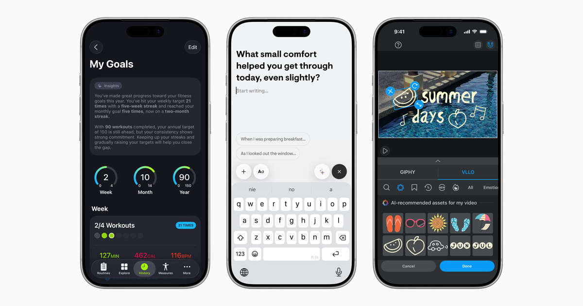
Apple reopens iconic Ginza store to thousands of excited customers
- PHOTOS
Apple celebrated the grand reopening of Apple Ginza on Friday, September 26, in Tokyo’s vibrant Ginza district.
The Digital Markets Act’s impacts on EU users
- APPLE STATEMENT
Apple explains how the Digital Markets Act is forcing the company to make some concerning changes to how it designs and delivers Apple products to its users in Europe.
Make history in every era in NBA 2K26 Arcade Edition, launching October 16
- UPDATE
Apple Arcade adds the highly anticipated NBA 2K26 Arcade Edition game for sports fans to enjoy this October.

Apple launches new project to protect and restore California redwood forest
- UPDATE
Apple announces a new investment in a working redwood forest in California, in collaboration with The Conservation Fund.

The all-new Apple Ginza opens this Friday, September 26, in Tokyo
- PRESS RELEASE
Apple today announced the grand reopening of Apple Ginza on Friday, September 26, located in the vibrant Ginza district.
Apple previews new immersive films for Apple Vision Pro
- UPDATE
Apple today previewed new Apple Immersive films and episodes from top publishers, broadcasters, studios, and brands for Apple Vision Pro.

The latest iPhone, Apple Watch, and AirPods arrive in Apple Store locations
- PHOTOS
On Friday, September 19, Apple debuted its latest lineup of products at Apple Store locations across the world.
Apple Sports adds widgets and expands to seven new countries
- UPDATE
Today, Apple Sports — the free app for iPhone — is making it even easier for fans to stay on top of the action with the launch of widgets for iPhone, iPad, and Mac.
New versions of Apple’s software platforms are available today
- UPDATE
Apple today released exciting new features and capabilities across each of its software platforms — iOS, iPadOS, macOS, watchOS, tvOS, and visionOS.

Your source for the latest Apple news, rumors, analysis, reviews, how-tos and deals.
Top 4 Apple products with most upgraders in Q4 2025
- News
- AAPL
- Apple earnings calls
- Apple Watch
- iPad
- iPhone
iPhone upgraders aren’t alone in driving Apple growth (and boosting AAPL stock). Other products bring repeat customers into stores, too.
(via Cult of Mac - Your source for the latest Apple news, rumors, analysis, reviews, how-tos and deals.)

Use this tool to get the best results from dozens of popular AIs, all for one low price
- Deals
- AI
- AI assistants
- Cult of Mac Deals
Whether creating content or testing how different AIs handle prompts, ChatPlayground AI makes it easy and affordable to get the best results.
(via Cult of Mac - Your source for the latest Apple news, rumors, analysis, reviews, how-tos and deals.)

Today in Apple history: iTunes video takes world by storm
- Apple history
- iTunes
- music
- Steve Jobs
- TIAH: 2000s
- TIAH: Steve Jobs
- Today in Apple history
Soon after launching video downloads with iTunes 6, Apple says it has already sold more than 1 million music videos. iTunes video is a hit!
(via Cult of Mac - Your source for the latest Apple news, rumors, analysis, reviews, how-tos and deals.)

7 exciting features to expect from Siri’s 2026 AI upgrade
- News
- AI
- Apple Intelligence
- artificial intelligence
- Siri
Tim Cook confirms a smarter Siri with an AI upgrade will arrive in 2026. Here's what we can expect from the personal voice assistant.
(via Cult of Mac - Your source for the latest Apple news, rumors, analysis, reviews, how-tos and deals.)

3 reasons to watch Down Cemetery Road on Apple TV
- Reviews
- Apple TV
Love or hate "Slow Horses," our "Down Cemetery Road" review finds reasons to binge Mick Herron's other Apple TV adaptation.
(via Cult of Mac - Your source for the latest Apple news, rumors, analysis, reviews, how-tos and deals.)

EarFun’s top budget earbuds punch way above their weight [Review] ★★★★☆
- Reviews
- AirPods Pro 3
- ANC wireless earbuds
- earbuds
- EarFun
Our hands-on EarFun Air Pro 4 Plus earbuds review finds fantastic sound and great value that challenges AirPods Pro 3 and other top buds.
(via Cult of Mac - Your source for the latest Apple news, rumors, analysis, reviews, how-tos and deals.)

WhatsApp tests long-awaited Apple Watch app
- News
- Apple Watch apps
A dedicated WhatsApp app for Apple Watch is finally in testing that will make chatting from your wrist easier than ever.
(via Cult of Mac - Your source for the latest Apple news, rumors, analysis, reviews, how-tos and deals.)

Discount code: Block ads and data trackers forever with this top-rated service
- Deals
- ad blockers
- Cult of Mac Deals
Snag a lifetime subscription to the AdGuard family plan. The iOS and Mac ad blocker also protects your privacy on Android and PC.
(via Cult of Mac - Your source for the latest Apple news, rumors, analysis, reviews, how-tos and deals.)

Apple posts record revenues — and predicts the best is yet to come
- News
- Top Stories
- Apple earnings
- Tim Cook
Apple set a new record for iPhone revenue in its most recent financial quarter, and CEO Tim Cook sees the “best ever” Apple quarter ahead.
(via Cult of Mac - Your source for the latest Apple news, rumors, analysis, reviews, how-tos and deals.)

Yes, you can repair an M5 iPad Pro — but you probably shouldn’t
- News
Watch an M5 iPad Pro teardown to see how challenging the tablet is to work on, but why it also earned a higher iFixit reparability score.
(via Cult of Mac - Your source for the latest Apple news, rumors, analysis, reviews, how-tos and deals.)

10 best Halloween deals on Apple gear and accessories
- Deals
- Anker
- Apple accessories
- Apple deals
- audio accessories
- Beats
- Belkin
- chargers
- power banks
Halloween deals on Apple gear and accessories — from MacBooks to headphones — are scary good right now.
(via Cult of Mac - Your source for the latest Apple news, rumors, analysis, reviews, how-tos and deals.)

Today in Apple history: iPhone goes on sale in China for first time
- Apple history
- Apple business strategies
- China
- iPhone 3GS
- TIAH: 2000s
- Today in Apple history
On October 30, 2009, the iPhone finally launched in China, giving Apple access to the world's largest market for the first time.
(via Cult of Mac - Your source for the latest Apple news, rumors, analysis, reviews, how-tos and deals.)
Trump cuts China tariff that costs Apple billions
- News
- Donald Trump
- tariffs
Apple's iPhone tariff is slashed by 50%, potentially saving the company billions. And that’s not the only good news from a Trump/Xi meeting.
(via Cult of Mac - Your source for the latest Apple news, rumors, analysis, reviews, how-tos and deals.)

Slim wall charger blows away anything from Apple [Review] ★★★★☆
- Reviews
- Top Stories
- chargers
- Satechi
- wall chargers
Our hands-on review of the Satechi OntheGo 67W Slim Wall Charger shows it makes anything from Apple seem bulky, slow and limited.
(via Cult of Mac - Your source for the latest Apple news, rumors, analysis, reviews, how-tos and deals.)

Apple eases App Store review rules for developers
- News
- App Store
Developers now get more flexibility with the App Store review process, as they can upload new materials while an app is still under review.
(via Cult of Mac - Your source for the latest Apple news, rumors, analysis, reviews, how-tos and deals.)

Crazy price drop: Upgrade to Windows 11 Pro for just $9.97
- Deals
- Cult of Mac Deals
- Microsoft Windows
Why pay list price for Microsoft software? This Windows 11 sale allows you to upgrade your PC to Windows 11 Pro for less than $10.
(via Cult of Mac - Your source for the latest Apple news, rumors, analysis, reviews, how-tos and deals.)

Track your online orders the easy way — in your iPhone’s Wallet app
- How-To
- iPhone
- iPhone How-To
- Wallet app
You can use the built-in iPhone Wallet app for some basic order tracking with classic Apple ease-of-use. No fiddling with tracking numbers.
(via Cult of Mac - Your source for the latest Apple news, rumors, analysis, reviews, how-tos and deals.)

Today in Apple history: Apple fires Scott Forstall after Apple Maps’ awful launch
- Apple history
- Apple leadership
- Apple Maps
- Jony Ive
- Scott Forstall
- Steve Jobs
- TIAH: 2010s
- Tim Cook
- Today in Apple history
On October 29, 2012, Apple fired rising star Scott Forstall in the aftermath of the disastrous Apple Maps launch.
(via Cult of Mac - Your source for the latest Apple news, rumors, analysis, reviews, how-tos and deals.)

Build and deploy unlimited websites for just $34 a year
- Deals
- Cult of Mac Deals
- web hosting
Host unlimited sites with redundant storage, daily backups, Wildcard SSL and more with a three-year plan from web hosting provider Ionos.
(via Cult of Mac - Your source for the latest Apple news, rumors, analysis, reviews, how-tos and deals.)
Mind behind Slow Horses brings thriller Down Cemetery Road [Now streaming!]
- News
- Top Stories
- Apple TV+
- Slow Horses
- thriller series
"Down Cemetery Road" season 1 comes from another book series by Mick Herron, who brought us "Slow Horses." It's now streaming.
(via Cult of Mac - Your source for the latest Apple news, rumors, analysis, reviews, how-tos and deals.)

Wavlink Thunderbolt 5 dock blazes through data transfers and brings big laptop power [Review] ★★★★☆
- Reviews
- Thunderbolt 5
- Thunderbolt docks
- Ugreen
Our hands-on Wavlink Thunderbolt 5 dock review finds impressively powerful and speedy connectivity for Mac workstations.
(via Cult of Mac - Your source for the latest Apple news, rumors, analysis, reviews, how-tos and deals.)

Weird AirPods Pro 3 glitch proves unbearable at 30,000 feet
- News
- AirPods
- AirPods Pro 3
Some users of AirPods Pro 3 are plagued by a whistle noise when using the earbuds on a flight. Here’s how to be ready if it happens to you.
(via Cult of Mac - Your source for the latest Apple news, rumors, analysis, reviews, how-tos and deals.)

Apple could bring iPhone-style water resistance to iPad mini
- News
- Apple rumors
- iPad mini
Apple has reportedly tested a water-resistant iPad mini case, hinting that future iPads could eventually get this feature.
(via Cult of Mac - Your source for the latest Apple news, rumors, analysis, reviews, how-tos and deals.)
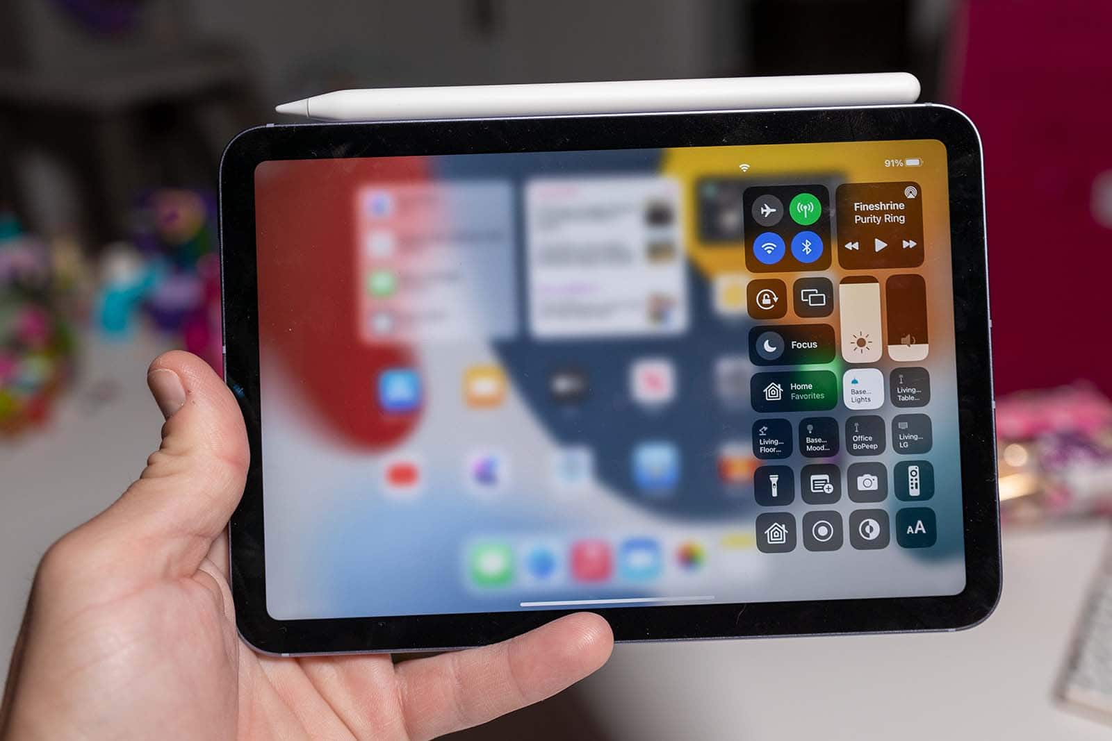
Price drop: Generate images, text, logos and more with lifetime access to this AI platform
- Deals
- AI
- Cult of Mac Deals
All-in-one platform gives businesses AI tools for writing, chatbots, and logo and art generation. Save on a lifetime AI MagicX subscription.
(via Cult of Mac - Your source for the latest Apple news, rumors, analysis, reviews, how-tos and deals.)

Here’s when every iPad gets a beautiful OLED screen
- News
- Apple rumors
- iPad
- iPad Air
- iPad mini
- OLED displays
Apple plans to put gorgeous OLED displays in almost every iPad. Here’s when to expect the tablets to switch away from LCDs.
(via Cult of Mac - Your source for the latest Apple news, rumors, analysis, reviews, how-tos and deals.)

iOS 26.1 and macOS Tahoe 26.1 take their last big step before release
- News
- iOS 26
- iPadOS 26
- Liquid Glass
- watchOS 26
Release candidates for iOS 26.1 and macOS Tahoe 26.1 indicate that the full releases with important changes are likely only a week away.
(via Cult of Mac - Your source for the latest Apple news, rumors, analysis, reviews, how-tos and deals.)

Today in Apple history: Steve Jobs’ yacht launches — without Steve
- Apple history
- Steve Jobs
- TIAH: 2010s
- Today in Apple history
On October 28, 2012, more than a year after Steve Jobs died, his luxury yacht designed by Philippe Starck launched for the first time.
(via Cult of Mac - Your source for the latest Apple news, rumors, analysis, reviews, how-tos and deals.)

Apple market cap passes $4 trillion amid iPhone 17 optimism
- News
- AAPL
- iPhone
Apple hits a major milestone in the stock market, with its market capitalization surpassing the staggering $4 trillion mark
(via Cult of Mac - Your source for the latest Apple news, rumors, analysis, reviews, how-tos and deals.)

New deal slashes price on latest MacBook Air to lifetime low
- Deals
- Apple deals
- M4 chip
- Mac
- MacBook Air
The M4 MacBook Air is Apple’s best notebook for most people. It’s already affordable, and a deal knocks 20% off the price.
(via Cult of Mac - Your source for the latest Apple news, rumors, analysis, reviews, how-tos and deals.)

iPhone 20 could make buttons a thing of the past
- News
- Apple rumors
iPhone 20 might replace buttons with haptics -- at last. The 20th anniversary handset could finally go with motion-sensing, vibrating tech.
(via Cult of Mac - Your source for the latest Apple news, rumors, analysis, reviews, how-tos and deals.)

Take the fast track to TikTok stardom
- Deals
- Cult of Mac Deals
- TikTok
Lock in a TikTokWizard Pro subscription and use AI coaching, scripts and analytics to post smarter. It's the easy way to go viral on TikTok.
(via Cult of Mac - Your source for the latest Apple news, rumors, analysis, reviews, how-tos and deals.)
Hands-on with new ChatGPT Atlas browser: Safari is falling behind fast
- News
- Top Stories
- AI
- Apple Intelligence
- ChatGPT
- OpenAI
- Safari
- web browsers
AI-enhanced browsers are the future. Going hands-on with the ChatGPT Atlas browser makes it crystal clear that Safari's falling behind.
(via Cult of Mac - Your source for the latest Apple news, rumors, analysis, reviews, how-tos and deals.)

Apple’s next budget iPhone may ditch the notch for Dynamic Island
- News
- Apple rumors
- Dynamic Island
The iPhone 17e debut early next year will mark the end of the notch era, with the company switching to Dynamic Island entirely.
(via Cult of Mac - Your source for the latest Apple news, rumors, analysis, reviews, how-tos and deals.)

Train for multiple IT certifications with this $40 bundle
- Deals
- Cult of Mac Deals
- educational bundles
Grab this Complete CompTIA and IT Exam Lifetime Access Training Bundle for just $39.97 and dive into IT certification courses.
(via Cult of Mac - Your source for the latest Apple news, rumors, analysis, reviews, how-tos and deals.)

AI jokers take Vision Pro’s new headband to wild extremes
- News
- M5 chip
- straps
- Vision Pro
The newly expanded M5 Vision Pro headband goes wild in user mockups envisioning armored Samurai warriors, "Star Wars" characters and more.
(via Cult of Mac - Your source for the latest Apple news, rumors, analysis, reviews, how-tos and deals.)

These 4 pro Mac apps could soon launch on iPad
- News
- Apple rumors
- Final Cut Pro
- iPad
- Pixelmator
- Pixelmator Pro
Those clamoring for more professional-grade iPad applications could soon get a quartet of them from Apple added to the App Store.
(via Cult of Mac - Your source for the latest Apple news, rumors, analysis, reviews, how-tos and deals.)
Today in Apple history: Dell PCs overtake Macs in education market
- Apple history
- Apple business strategies
- Dell
- education
- Steve Jobs
- TIAH: 1990s
- TIAH: Macs
- Today in Apple history
On October 27, 1999, data showed that upstart Dell Computer's cheap PCs stole Apple's lead in a key market: education.
(via Cult of Mac - Your source for the latest Apple news, rumors, analysis, reviews, how-tos and deals.)

M5 iPad Pro now cheaper – first-ever sale hits
- Deals
- Apple deals
- iPad Pro
- M5 chip
Right now, a hot M5 iPad Pro deal can already get you $50 off the cost of the premium tablet Apple launched just last week. That’s quick savings!
(via Cult of Mac - Your source for the latest Apple news, rumors, analysis, reviews, how-tos and deals.)

EarFun Air Pro 4+ earbuds bring hi-res sound for under $100
- News
- ANC wireless earbuds
- EarFun
With dual drivers and Hi-Res Audio certification, new EarFun Air Pro 4+ earbuds challenge top buds for less than $100.
(via Cult of Mac - Your source for the latest Apple news, rumors, analysis, reviews, how-tos and deals.)

This credit card-size AirTag alternative fits perfectly in your wallet
- Deals
- Bluetooth trackers
- Cult of Mac Deals
The AirTag isn't designed to track wallets or your office swipe card. KeySmart SmartCard, a credit-card-size wallet tracker, is.
(via Cult of Mac - Your source for the latest Apple news, rumors, analysis, reviews, how-tos and deals.)

Today in Apple history: iPod Photo brings color display to music machine
- Apple history
- Apple product launches
- iPod
- TIAH: 2000s
- Today in Apple history
On October 26, 2004, Apple debuted the iPod Photo, capable of putting not just 15,000 songs in your pocket, but also 25,000 photos.
(via Cult of Mac - Your source for the latest Apple news, rumors, analysis, reviews, how-tos and deals.)
How Apple might give the M6-powered iPad Pro a serious performance boost
- News
- Apple rumors
- iPad Pro
The next-generation iPad Pro will reportedly borrow a feature from the iPhone 17 Pro to supercharge performance.
(via Cult of Mac - Your source for the latest Apple news, rumors, analysis, reviews, how-tos and deals.)

Apple Maps could soon be dotted with ads
- News
- Apple Maps
- Apple rumors
Apple is reportedly gearing up to bring ads to its Maps app, letting businesses pay to have their listings featured more prominently.
(via Cult of Mac - Your source for the latest Apple news, rumors, analysis, reviews, how-tos and deals.)

The M5 Vision Pro is still the ultimate entertainment device [Review] ★★★★☆
- Reviews
- Top Stories
- Vision Pro
- visionOS
The new M5 Vision Pro brings a huge leap in compute power and graphics performance — plus a more comfortable head band in the box.
(via Cult of Mac - Your source for the latest Apple news, rumors, analysis, reviews, how-tos and deals.)

Learn up to 25 languages with this lifetime Rosetta Stone sub
- Deals
- Cult of Mac Deals
- language apps
- Rosetta Stone
Save big-time on the app that helps users master foreign languages quickly. This lifetime deal includes all 25 Rosetta Stone languages.
(via Cult of Mac - Your source for the latest Apple news, rumors, analysis, reviews, how-tos and deals.)

What controversy? Cult of Mac readers love Apple’s Liquid Glass.
- News
- iOS 26
- iPhone
- Liquid Glass
Despite the criticism you might have read online, there’s plenty of love for the iPhone’s new Liquid Glass user interface.
(via Cult of Mac - Your source for the latest Apple news, rumors, analysis, reviews, how-tos and deals.)

M5 Vision Pro’s killer feature is … [The CultCast]
- News
- Apple rumors
- iPad
- iPhone
- M5 chip
- The CultCast
- Vision Pro
This week on Cult of Mac's podcast: Griffin gets his hands on the new M5 Vision Pro and shares his first impressions.
(via Cult of Mac - Your source for the latest Apple news, rumors, analysis, reviews, how-tos and deals.)

Today in Apple history: OS X Panther claws its way onto Macs
- Apple history
- Exposé
- Finder
- macOS
- Safari
- Today in Apple history
Mac OS X Panther arrives on the Mac, bringing brushed-metal Finder, Exposé and Safari as the default browser for the first time.
(via Cult of Mac - Your source for the latest Apple news, rumors, analysis, reviews, how-tos and deals.)
M5 iPad Pro review: What’s actually new — and worth your attention ★★★★★
- Reviews
- Top Stories
- iPad Pro
- iPadOS
- M5 chip
Seven features make Apple's new tablet far better than earlier models. Our M5 iPad Pro review proves it’s no “chip and ship” upgrade.
(via Cult of Mac - Your source for the latest Apple news, rumors, analysis, reviews, how-tos and deals.)

iOS 26.1 will fix one of iPhone’s biggest photo upload pains
- News
- iOS 26
iOS 26.1 will enable third-party apps to reliably upload photos from your iPhone without running in the foreground.
(via Cult of Mac - Your source for the latest Apple news, rumors, analysis, reviews, how-tos and deals.)

Discount code: Get a versatile iPhone scanning app for $24.99 (works with iPad, too)
- Deals
- Cult of Mac Deals
- iOS apps
- iPad apps
- iScanner
- scanning apps
This powerful scanning app offers loads of features at a low price. Turn your iPhone or iPad into a full-service scanner with iScanner.
(via Cult of Mac - Your source for the latest Apple news, rumors, analysis, reviews, how-tos and deals.)

How to hide apps on your iPhone and iPad
- How-To
- Top Stories
- Home Screen
- iPad
- iPhone
- iPhone How-To
Find out how to hide apps on iPhone, plus how to lock them behind Face ID. This hidden feature makes extreme privacy easier than ever.
(via Cult of Mac - Your source for the latest Apple news, rumors, analysis, reviews, how-tos and deals.)

Get Apple’s sleek and stunning M4 iMac with a sweet discount
- Deals
- Apple deals
- iMac
- M4 chip
Apple's sleek, stylish desktop computer is available with a nice discount. This M4 iMac deal drops the all-in-one by over $100.
(via Cult of Mac - Your source for the latest Apple news, rumors, analysis, reviews, how-tos and deals.)

Ben Stiller’s touching new documentary tells his famous parents’ tale
- News
- Apple TV
"Severance" director Ben Stiller's new "Stiller & Meara: Nothing Is Lost" documentary focuses on his comedian parents and showbiz upbringing.
(via Cult of Mac - Your source for the latest Apple news, rumors, analysis, reviews, how-tos and deals.)

Today in Apple history: The world prepares for the NeXT Computer
- Apple history
- NeXT
- Steve Jobs
- TIAH: 1980s
- Today in Apple history
- Top stories
On October 24, 1988, Steve Jobs prepared to launch the NeXT Computer, a machine he hoped would cement his reputation as a tech genius.
(via Cult of Mac - Your source for the latest Apple news, rumors, analysis, reviews, how-tos and deals.)
Making Sense of Technology
∞ The Dalrymple Report: tvOS, Robots, Ads in Apple Maps
- Uncategorized
Apple's services divsion, which includes things like iCloud analytics Apple Music is now bigger than Walt Disney or Tesla. Dave and I look at tvOS and some of the things that have changed in that OS. We also talk about Joanna Stern's experience with a home robot, which seemed a little weird. Unfortunately, it seems Apple is moving ahead with plans to have ads in Apple Maps. Follow this podcast Brought to you by: Surfshark VPN: Go to https://surfshark.com/dalrymple or use code dalrymple at checkout to get 4 extra months of Surfshark VPN! Notion Agent: Go to https://notion.com/tdr to try your new AI teammate, Notion Agent, today. Show Notes:
- Apple’s Services division is now bigger than Walt Disney or Tesla
- tvOS 26’s new Apple TV 4K features
- Joanna Stern takes a home robot for a spin
- Apple Reportedly Moving Ahead With Ads in Maps App
Shows and movies we're watching
- Dexter Resurrection, Paramount+
- The Diplomat vs The West Wing
- John Candy: I Like Me
Apple’s services divsion, which includes things like iCloud analytics Apple Music is now bigger than Walt Disney or Tesla. Dave and I look at tvOS and some of the things that have changed in that OS. We also talk about Joanna Stern’s experience with a home robot, which seemed a little weird. Unfortunately, it seems Apple is moving ahead with plans to have ads in Apple Maps. Follow this podcast Brought to you by: Surfshark VPN: Go to https://surfshark.com/dalrymple or use code dalrymple at checkout to get 4 extra months of Surfshark VPN! Notion Agent: Go to https://notion.com/tdr to try your new AI teammate, Notion Agent, today. Show Notes: Apple’s Services division is now bigger than Walt Disney or Tesla tvOS 26’s new Apple TV 4K features Joanna Stern takes a home robot for a spin Apple Reportedly Moving Ahead With Ads in Maps App Shows and movies we’re watching Dexter Resurrection, Paramount+ The Diplomat vs The West Wing John Candy: I Like Me
∞ The Dalrymple Report: HomePod mini, AWS, Apple Shiny, and F1
- Uncategorized
My wife got me a pair of Meta Ray Ban sunglasses this week. I haven't had a lot of time to work with them , but I talk about my first impressions. Amazon Web Services went down this week and it took some of the biggest tech companies along with it. So much money and expertise all taken out because of one simple mistake. Apple's recently released products are availble for pickup now and there doesn't seem to be shortages of anything. Apple has been moving into live sports over the past couple of years with MLS and MLB, but now Apple has it's biggest one ever--F1. They will get the rights to F1 in the U.S. starting next year. Follow this podcast Show Notes:
- My HomePod mini has gone crazy
- The Louvre was robbed last Sunday
- AWS went down earlier this week, took lots of stuff down with it
- New Apple shiny shipping, available for pickup now
- Your cosmic orange iPhone 17 Pro can turn rose gold
- Apple gets F1 rights
Shows and movies we're watching
- The Diplomat, Netflix
- Dune, HBO
My wife got me a pair of Meta Ray Ban sunglasses this week. I haven’t had a lot of time to work with them , but I talk about my first impressions. Amazon Web Services went down this week and it took some of the biggest tech companies along with it. So much money and expertise all taken out because of one simple mistake. Apple’s recently released products are availble for pickup now and there doesn’t seem to be shortages of anything. Apple has been moving into live sports over the past couple of years with MLS and MLB, but now Apple has it’s biggest one ever–F1. They will get the rights to F1 in the U.S. starting next year. Follow this podcast Show Notes: My HomePod mini has gone crazy The Louvre was robbed last Sunday AWS went down earlier this week, took lots of stuff down with it New Apple shiny shipping, available for pickup now Your cosmic orange iPhone 17 Pro can turn rose gold Apple gets F1 rights Shows and movies we’re watching The Diplomat, Netflix Dune, HBO
∞ The Dalrymple Report: Ear Tips, iPad, MacBook Pro
- Uncategorized
This week, Dave and I talk about the new AirPod Pro ear tips and whether the fit is better than the last generation. We also talk about Apple's newest product releases, including the M5 iPad Pro and the M5 MacBook Pro. Then we talk about Vision Pro and the rebranding of Apple TV+. Follow this podcast Show Notes:
- M5 MacBook Pro
- M5 iPad Pro
- Apple Vision Pro upgraded with the M5 chip and Dual Knit Band
- No Vision Pro trade in for early adopters
- Apple TV Subtracts the + in a Quiet Rebrand
- NBA broadcasting some Laker games in Vision Pro Immersive Video
Shows and movies we're watching
- Nobody 2
- Mr. Scorcese, Apple TV
- Superman, HBO
- Kiki’s Delivery Service, HBO
This week, Dave and I talk about the new AirPod Pro ear tips and whether the fit is better than the last generation. We also talk about Apple’s newest product releases, including the M5 iPad Pro and the M5 MacBook Pro. Then we talk about Vision Pro and the rebranding of Apple TV+. Follow this podcast Show Notes: M5 MacBook Pro M5 iPad Pro Apple Vision Pro upgraded with the M5 chip and Dual Knit Band No Vision Pro trade in for early adopters Apple TV Subtracts the + in a Quiet Rebrand NBA broadcasting some Laker games in Vision Pro Immersive Video Shows and movies we’re watching Nobody 2 Mr. Scorcese, Apple TV Superman, HBO Kiki’s Delivery Service, HBO
∞ The Dalrymple Report: AI, iCloud, Apple’s next CEO
- Uncategorized
Dave and I chat this week about a reader comment we received on the recent episode about AI. With the new iPhone release, we discuss the advantages of iCloud for users. There are some rumors swirling around Apple’s CEO succession plan and who might be stepping up to the plate. Follow this podcast CleanMyMac: Get Tidy Today! Try 7 days free and use my code DALRYMPLE for 20% off at clnmy.com/TheDalrympleReport Show Notes:
- Great Mariners story
- Listener comment
- Five Perks for iPhone Users Who Pay for iCloud Storage
- Two new things in iOS 26.1 Beta 2
- New TAG Heuer Smartwatches Now 'Made for iPhone'
- Apple’s next CEO
Shows and movies we're watching
- The Girlfriend, Amazon Prime
- Alien Earth, Hulu
Dave and I chat this week about a reader comment we received on the recent episode about AI. With the new iPhone release, we discuss the advantages of iCloud for users. There are some rumors swirling around Apple’s CEO succession plan and who might be stepping up to the plate. Follow this podcast CleanMyMac: Get Tidy Today! Try 7 days free and use my code DALRYMPLE for 20% off at clnmy.com/TheDalrympleReport Show Notes: Great Mariners story Listener comment Five Perks for iPhone Users Who Pay for iCloud Storage Two new things in iOS 26.1 Beta 2 New TAG Heuer Smartwatches Now ‘Made for iPhone’ Apple’s next CEO Shows and movies we’re watching The Girlfriend, Amazon Prime Alien Earth, Hulu
∞ The Dalrymple Report: AirPods Pro 3, Super Bowl, New products
- Uncategorized
I've had my new AirPods Pro 3 for a couple of weeks,so Dave and I talk about the sound quality and the quality of the new noise cancellation. Apple announced the artist that will play the Super Bowl halftime show and there is a bit of controversy with its choice. There are rumors of Apple announcing five new products, all due to be released in October—we take a look at each of them. Follow this podcast Show Notes:
- AirPods Pro 3 Music Producer review
- Bad Bunny confirmed as Apple Music Super Bowl LX Halftime Show performer
- AirPods Pro 3 Teardown: Still a Tragedy
- Apple will launch 5+ new products in October, here’s what’s coming
- Apple Shelves Vision Headset Revamp to Prioritize Meta-Like AI Glasses
Shows and movies we're watching
- A Nearly Normal Family, Netflix
- Stiller & Meara: Nothing is Lost, Apple TV+
- Apple TV drops Mr. Scorsese trailer, Apple TV+
I’ve had my new AirPods Pro 3 for a couple of weeks,so Dave and I talk about the sound quality and the quality of the new noise cancellation. Apple announced the artist that will play the Super Bowl halftime show and there is a bit of controversy with its choice. There are rumors of Apple announcing five new products, all due to be released in October—we take a look at each of them. Follow this podcast Show Notes: AirPods Pro 3 Music Producer review Bad Bunny confirmed as Apple Music Super Bowl LX Halftime Show performer AirPods Pro 3 Teardown: Still a Tragedy Apple will launch 5+ new products in October, here’s what’s coming Apple Shelves Vision Headset Revamp to Prioritize Meta-Like AI Glasses Shows and movies we’re watching A Nearly Normal Family, Netflix Stiller & Meara: Nothing is Lost, Apple TV+ Apple TV drops Mr. Scorsese trailer, Apple TV+
∞ The Dalrymple Report: AirPods Pro 3 and Apple Support
- Uncategorized
Apple's recently announced products have begun to arrive. I recieved my new AirPods Pro last week, so Dave and I talk about the new noise cancellation and if there is any difference in the sound. We also look at the new AirPod tip sizes and if those make any difference. Dave tells us about a phone call he had with Apple Support that he didn't like very much. Follow this podcast Brought to you by: OpenCase: A remarkable new iPhone case with an open space in the back so you can use a variety of accessories like a wallet and more. Go to https://theopencase.com/ to get 10 off. Show Notes:
Shows and movies we're watching
- Gracepoint, Peacock
- America’s Team, Netflix
- Pantheon, Netflix
Apple’s recently announced products have begun to arrive. I recieved my new AirPods Pro last week, so Dave and I talk about the new noise cancellation and if there is any difference in the sound. We also look at the new AirPod tip sizes and if those make any difference. Dave tells us about a phone call he had with Apple Support that he didn’t like very much. Follow this podcast Brought to you by: OpenCase: A remarkable new iPhone case with an open space in the back so you can use a variety of accessories like a wallet and more. Go to https://theopencase.com/ to get 10 off. Show Notes: The new Apple shiny have arrived Shows and movies we’re watching Gracepoint, Peacock America’s Team, Netflix Pantheon, Netflix
∞ The Dalrymple Report: Translation, Emmys, AirPods Pro
- Uncategorized
Dave got a chance to try out the translation feature on iOS this week. It's an app I've used many times during my travels to other countries. Apple did well again in this yeqar's Emmy Awards, and we talk about my favorite new product, the AirPods Pro. Follow this podcast Brought to you by: Private Internet Access: Go to https://www.piavpn.com/dalrymple to get 83% off Private Internet Access with 4 months free! Show Notes:
- Apple and the Emmys
- The back of Britt Lower’s acceptance speec
- Some Tahoe new shiny
- Your Mac Can Auto-Join an iPhone Hotspot in macOS Tahoe
- New Recovery Assistant
- AirPods Pro 3 First Look
- AirPods Pro 3 Use Acoustic Seal Test for Optimizing Sound Quality and ANC
- iOS 26 can notify you when your AirPods case is running out of battery
Shows and movies we're watching
- Hostage, Netflix
- ER, 30 YEARS later
Dave got a chance to try out the translation feature on iOS this week. It’s an app I’ve used many times during my travels to other countries. Apple did well again in this yeqar’s Emmy Awards, and we talk about my favorite new product, the AirPods Pro. Follow this podcast Brought to you by: Private Internet Access: Go to https://www.piavpn.com/dalrymple to get 83% off Private Internet Access with 4 months free! Show Notes: Apple and the Emmys The back of Britt Lower’s acceptance speec Some Tahoe new shiny Your Mac Can Auto-Join an iPhone Hotspot in macOS Tahoe New Recovery Assistant AirPods Pro 3 First Look AirPods Pro 3 Use Acoustic Seal Test for Optimizing Sound Quality and ANC iOS 26 can notify you when your AirPods case is running out of battery Shows and movies we’re watching Hostage, Netflix ER, 30 YEARS later
∞ The Dalrymple Report: AirPods, Apple Watch and iPhones
- Uncategorized
It was Apple's annual iPhone event this week where the company unvieled new AirPods Pro, Apple Watches, and a new line of iPhones. Dave and I talk about the product and give our thoughts on each one of them. Follow this podcast Brought to you by: LinkedIn Jobs: Post your job for free at https://linkedin.com/dalrymple to post your job for free. Terms and conditions apply. CleanMyMac: Get Tidy Today! Try 7 days free and use my code DALRYMPLE for 20% off at clnmy.com/TheDalrympleReport Show Notes:
- Design Is How It Works
- AirPods Pro 3
- Apple Watch Series 11
- Apple Watch Ultra 3
- iPhone 17
- iPhone Air
- iPhone 17 Pro
Shows and movies we're watching
- 1923, Paramount+
- Godless, Netflix
It was Apple’s annual iPhone event this week where the company unvieled new AirPods Pro, Apple Watches, and a new line of iPhones. Dave and I talk about the product and give our thoughts on each one of them. Follow this podcast Brought to you by: LinkedIn Jobs: Post your job for free at https://linkedin.com/dalrymple to post your job for free. Terms and conditions apply. CleanMyMac: Get Tidy Today! Try 7 days free and use my code DALRYMPLE for 20% off at clnmy.com/TheDalrympleReport Show Notes: Design Is How It Works AirPods Pro 3 Apple Watch Series 11 Apple Watch Ultra 3 iPhone 17 iPhone Air iPhone 17 Pro Shows and movies we’re watching 1923, Paramount+ Godless, Netflix
∞ The Dalrymple Report: Apple Event, AI dataset, and Android app verification
- Uncategorized
Apple has announced its September iPhone event. Dave and I talk about all of the products we expect to see and which ones we'd buy. Meta is using a lot of books to train its AI dataset, but it doesn't have permission to use them all. It seems the company is using books, including 15 that Dave wrote, without permission. Android is taking a page from Apple's app playbook and will soon require all apps to be registered by verified developers. Follow this podcast Show Notes:
- Meta's AI dataset
- Apple Event Announced for September 9: 'Awe Dropping'
- Five Things to Expect From Apple's 'Awe Dropping' September 9 Event
- Android will require all apps to be registered by verified developers
Shows and movies we're watching
- Yellowstone, Peacock
- Kpop Demon Hunters, Netflix
- Rewatch of The Last of Us, HBO
Apple has announced its September iPhone event. Dave and I talk about all of the products we expect to see and which ones we’d buy. Meta is using a lot of books to train its AI dataset, but it doesn’t have permission to use them all. It seems the company is using books, including 15 that Dave wrote, without permission. Android is taking a page from Apple’s app playbook and will soon require all apps to be registered by verified developers. Follow this podcast Show Notes: Meta’s AI dataset Apple Event Announced for September 9: ‘Awe Dropping’ Five Things to Expect From Apple’s ‘Awe Dropping’ September 9 Event Android will require all apps to be registered by verified developers Shows and movies we’re watching Yellowstone, Peacock Kpop Demon Hunters, Netflix Rewatch of The Last of Us, HBO
∞ The Dalrymple Report: Macs, Woz, and foldable phones
- Uncategorized
This week, Dave and I discuss the value of getting a new, but previous generation of MacBook instead of a brand new one. We also talk about Steve Wosniak and his views on wealth. Samsung is gaining market share from Apple in the U.S.—could this have anything to do with foldable phones? Follow this podcast Brought to you by: CleanMyMac: Get Tidy Today! Try 7 days free and use my code DALRYMPLE for 20% off at clnmy.com/TheDalrympleReport Show Notes:
- The 15" M3 MacBook Air is on sale for $1199
- Woz
- Highest-grossing sports film of all time
- Morgan Stanley says Apple stock could be ‘turning the corner’
- Samsung taking market share from Apple in U.S. as foldable phones gain momentum
- Apple Wallet app just made Amazon returns easy
Shows and movies we're watching
- Patience, PBS
- Superman
- Black Doves, Netflix
This week, Dave and I discuss the value of getting a new, but previous generation of MacBook instead of a brand new one. We also talk about Steve Wosniak and his views on wealth. Samsung is gaining market share from Apple in the U.S.—could this have anything to do with foldable phones? Follow this podcast Brought to you by: CleanMyMac: Get Tidy Today! Try 7 days free and use my code DALRYMPLE for 20% off at clnmy.com/TheDalrympleReport Show Notes: The 15″ M3 MacBook Air is on sale for $1199 Woz Highest-grossing sports film of all time Morgan Stanley says Apple stock could be ‘turning the corner’ Samsung taking market share from Apple in U.S. as foldable phones gain momentum Apple Wallet app just made Amazon returns easy Shows and movies we’re watching Patience, PBS Superman Black Doves, Netflix
∞ The Dalrymple Report: AI Robots, Siri, new Apple products
- Uncategorized
We've heard about Apple looking at releasing an AI robot in the past. The rumors are back and they also include Apple's foray into home security and smart displays. Apple's rumored revamped Siri will supposedly allow users to take action within an app using only Siri voice commands. MacRumors has a list of Apple's upcoming products that Dave and I talk about. Follow this podcast Brought to you by: Private Internet Access: Go to https://www.piavpn.com/dalrymple to get 83% off Private Internet Access with 4 months free! LinkedIn Jobs: Post your job for free at https://linkedin.com/dalrymple to post your job for free. Terms and conditions apply. Show Notes:
- Apple Plots Expansion Into AI Robots, Home Security and Smart Displays
- Apple Testing Revamped Siri With Apps Like Uber and YouTube
- Leaks: Apple’s coming products
- Apple Reportedly Planning to Offer In-Store iPad Repairs
- Amazon announces same day groceries, free for prime members
Shows and movies we're watching
- Dope Thief, Apple TV+
- Titans: The Rise of Hollywood, Netflix
- Sunday Best, Netflix, Ed Sullivan documentary
We’ve heard about Apple looking at releasing an AI robot in the past. The rumors are back and they also include Apple’s foray into home security and smart displays. Apple’s rumored revamped Siri will supposedly allow users to take action within an app using only Siri voice commands. MacRumors has a list of Apple’s upcoming products that Dave and I talk about. Follow this podcast Brought to you by: Private Internet Access: Go to https://www.piavpn.com/dalrymple to get 83% off Private Internet Access with 4 months free! LinkedIn Jobs: Post your job for free at https://linkedin.com/dalrymple to post your job for free. Terms and conditions apply. Show Notes: Apple Plots Expansion Into AI Robots, Home Security and Smart Displays Apple Testing Revamped Siri With Apps Like Uber and YouTube Leaks: Apple’s coming products Apple Reportedly Planning to Offer In-Store iPad Repairs Amazon announces same day groceries, free for prime members Shows and movies we’re watching Dope Thief, Apple TV+ Titans: The Rise of Hollywood, Netflix Sunday Best, Netflix, Ed Sullivan documentary
∞ The Dalrymple Report: Apple Pencil, glass, and ESPN
- Uncategorized
Dave's Apple Pencil died, so he replaced it with a new one. He gives us his thoughts on using it. Apple has committed more money to the U.S. as they partner with Corning to make glass for iPhone and Apple Watch in this country. ESPN is launching a new streaming service, but Dave and I are having trouble understanding how it's going to work for them. Follow this podcast Show Notes:
- Apple increases U.S. commitment to $600 billion, announces American Manufacturing Program
- Apple and Corning partner to manufacture 100 percent of iPhone and Apple Watch cover glass in Kentucky
- Apple’s new $100B US commitment got it a 100% chip tariff exemption
- Apple chipmaker TSMC says it too is exempt from US tariffs
- ESPN flagship streaming service to launch August 21
Shows and movies we're watching
- The One that Got Away, Acorn TV
- HBO gets some BritBox
Dave’s Apple Pencil died, so he replaced it with a new one. He gives us his thoughts on using it. Apple has committed more money to the U.S. as they partner with Corning to make glass for iPhone and Apple Watch in this country. ESPN is launching a new streaming service, but Dave and I are having trouble understanding how it’s going to work for them. Follow this podcast Show Notes: Apple increases U.S. commitment to $600 billion, announces American Manufacturing Program Apple and Corning partner to manufacture 100 percent of iPhone and Apple Watch cover glass in Kentucky Apple’s new $100B US commitment got it a 100% chip tariff exemption Apple chipmaker TSMC says it too is exempt from US tariffs ESPN flagship streaming service to launch August 21 Shows and movies we’re watching The One that Got Away, Acorn TV HBO gets some BritBox
∞ The Dalrymple Report: MacBook Air, Apple Music, and Manufacturing
- Uncategorized
Apple rarely has sales, but Amazon does. They are offering $200 off a new M4 MacBook Air—Dave and I look through the options of other models and see what the best deal is. Apple Music has a new feature in iOS 26 allowing users to pin items to the top of the page. Apple is starting its Manufacturing Academy in Detroit beginning in August. We look at some of the details of that initiative. Follow this podcast Show Notes:
- Amazon Is Selling M4 MacBook Airs for $200 Off
- Apple Manufacturing Academy opens in Detroit on August 19
- iOS 26: How to Use the New Music Pins Feature
- Apple stuff, signed by Steve Jobs, Woz, even Tim Cook
Shows and movies we're watching
- After The Flood, BritBox
- Star Trek Strange New Worlds, Paramount+
- Anora, Hulu
Apple rarely has sales, but Amazon does. They are offering $200 off a new M4 MacBook Air—Dave and I look through the options of other models and see what the best deal is. Apple Music has a new feature in iOS 26 allowing users to pin items to the top of the page. Apple is starting its Manufacturing Academy in Detroit beginning in August. We look at some of the details of that initiative. Follow this podcast Show Notes: Amazon Is Selling M4 MacBook Airs for $200 Off Apple Manufacturing Academy opens in Detroit on August 19 iOS 26: How to Use the New Music Pins Feature Apple stuff, signed by Steve Jobs, Woz, even Tim Cook Shows and movies we’re watching After The Flood, BritBox Star Trek Strange New Worlds, Paramount+ Anora, Hulu
∞ The Dalrymple Report: Ozzy, Captions, and AppleCare One
- Uncategorized
It was a sad week for me and many other music fans around the world, as we learned that Ozzy Osbourne died. Ozzy meant a lot to me and my music. I'll miss him. Dave and I talk about using captions while watching TV, and we take a look at AppleCare One, Apple's new device insurance subscription. Follow this podcast Show Notes:
- RIP, Ozzy
- Peter Cohen and Jim at Ozzfest
- Apple TV Captions
- Apple introduces AppleCare One
- Messages on iOS 26 will make it harder to fall for phishing scams
Shows and movies we're watching
- Tucci in Italy, Disney+
- The Bear, Season 4, Hulu
- Billy Joel: And so it goes, HBO
It was a sad week for me and many other music fans around the world, as we learned that Ozzy Osbourne died. Ozzy meant a lot to me and my music. I’ll miss him. Dave and I talk about using captions while watching TV, and we take a look at AppleCare One, Apple’s new device insurance subscription. Follow this podcast Show Notes: RIP, Ozzy Peter Cohen and Jim at Ozzfest Apple TV Captions Apple introduces AppleCare One Messages on iOS 26 will make it harder to fall for phishing scams Shows and movies we’re watching Tucci in Italy, Disney+ The Bear, Season 4, Hulu Billy Joel: And so it goes, HBO
∞ The Dalrymple Report: watchOS Gestures, Emmys, Apple TV Keyboard
- Uncategorized
Dave installed the latest beta of watchOS and found a new gesture that he really likes. I have one that I use a lot as well, so I'm not sure I'll change. Apple TV+ shows recieved an incredible amount of nominations for this year's Emmy Awards. The new tvOS now allows users to switch the keyboard to a grid, which is a welcome change. Follow this podcast Show Notes:
- Cal Raleigh, man of the people, The Big Dumper, wins Home Run Derby
- watchOS 26. Flick it
- Apple gets an astonishing 81 Emmy nominations
- Apple TV lets you change your search keyboard from linear (one line, across the screen) to a grid
- ChatGPT and other AI services are basically killing @Iconfactory
Shows and movies we're watching
- Mobland, Paramount+
- Ballard, Prime Video, from the Bosch universe
- Ya Never Know, Tom Selleck autobiography
Dave installed the latest beta of watchOS and found a new gesture that he really likes. I have one that I use a lot as well, so I’m not sure I’ll change. Apple TV+ shows recieved an incredible amount of nominations for this year’s Emmy Awards. The new tvOS now allows users to switch the keyboard to a grid, which is a welcome change. Follow this podcast Show Notes: Cal Raleigh, man of the people, The Big Dumper, wins Home Run Derby watchOS 26. Flick it Apple gets an astonishing 81 Emmy nominations Apple TV lets you change your search keyboard from linear (one line, across the screen) to a grid ChatGPT and other AI services are basically killing @Iconfactory Shows and movies we’re watching Mobland, Paramount+ Ballard, Prime Video, from the Bosch universe Ya Never Know, Tom Selleck autobiography
∞ The Dalrymple Report: AI talent, Meta, and COO
- Uncategorized
The turmoil at Apple is not new, but what is new is how some of the companies top AI engineers are leaving the company. The latest was lured away by Meta, who have just invested $3.5 billion in its artificial intelligence projects. Apple's longtime Chief Operating Officer, Jeff Williams, has announced he's retiring. Follow this podcast Brought to you by: LinkedIn Jobs: LinkedIn Jobs helps you find the candidates you want to talk to, faster. Did you know every week, nearly 40 million job seekers visit LinkedIn? Post your job for free at LinkedIn.com/DALRYMPLE. Terms and conditions apply. Show Notes:
- Apple faces AI talent turmoil as senior Siri researcher departs
- Apple announces chief operating officer transition
- Apple Loses Key AI Executive to Meta's Multimillion-Dollar Hiring Spree
- Meta Invests $3.5 Billion in World’s Largest Eye-Wear Maker
Shows and movies we're watching
- Black Snow, AMC+
- Kleo, Netflix
- MurderBot, Apple TV+
The turmoil at Apple is not new, but what is new is how some of the companies top AI engineers are leaving the company. The latest was lured away by Meta, who have just invested $3.5 billion in its artificial intelligence projects. Apple’s longtime Chief Operating Officer, Jeff Williams, has announced he’s retiring. Follow this podcast Brought to you by: LinkedIn Jobs: LinkedIn Jobs helps you find the candidates you want to talk to, faster. Did you know every week, nearly 40 million job seekers visit LinkedIn? Post your job for free at LinkedIn.com/DALRYMPLE. Terms and conditions apply. Show Notes: Apple faces AI talent turmoil as senior Siri researcher departs Apple announces chief operating officer transition Apple Loses Key AI Executive to Meta’s Multimillion-Dollar Hiring Spree Meta Invests $3.5 Billion in World’s Largest Eye-Wear Maker Shows and movies we’re watching Black Snow, AMC+ Kleo, Netflix MurderBot, Apple TV+
∞ The Dalrymple Report: Alexa+, Charging, and iOS 26
- Uncategorized
Dave got a new speaker assistant for his home... and it's powered by Alexa. We talk about how much better Alexa is than Siri and even throw in some comments about Gemini, Google's AI assistant (spoiler, it's better than Siri too). We also talk about charging one device off of anotherfor instance, charging your AirPods using your phone. And we look at some of the new features of Apple's new OSes. Follow this podcast Show Notes:
- Charge AirPods (or Even an iPhone) With Your iPhone
- iOS 26 Brings New Functionality to HomePod
- A few iOS 26 Best and Hidden Features
- iPhone Users Upset About Apple Promoting F1 Movie With Wallet App Notification
Shows and movies we're watching
- Anatomy of a Scandal, Netflix
- Sally, Disney+
Dave got a new speaker assistant for his home… and it’s powered by Alexa. We talk about how much better Alexa is than Siri and even throw in some comments about Gemini, Google’s AI assistant (spoiler, it’s better than Siri too). We also talk about charging one device off of anotherfor instance, charging your AirPods using your phone. And we look at some of the new features of Apple’s new OSes. Follow this podcast Show Notes: Charge AirPods (or Even an iPhone) With Your iPhone iOS 26 Brings New Functionality to HomePod A few iOS 26 Best and Hidden Features iPhone Users Upset About Apple Promoting F1 Movie With Wallet App Notification Shows and movies we’re watching Anatomy of a Scandal, Netflix Sally, Disney+
∞ The Dalrymple Report: ETA, Liquid Glass, and iCloud Storage
- Uncategorized
Have you ever shared your ETA with someone? Most of us have. Dave has a suggestion for how ETA should work in the future. We talk about the Apple's new design, Liquid Glass, and what drove the company to move in that direction for its OSes. We also talk about a new lawsuit that Apple faces over iCloud storage. Follow this podcast Brought to you by: LinkedIn Jobs: LinkedIn Jobs helps you find the candidates you want to talk to, faster. Did you know every week, nearly 40 million job seekers visit LinkedIn? Post your job for free at LinkedIn.com/DALRYMPLE. Terms and conditions apply. Show Notes:
- WWDC: The Bento Boxes
- On AR being the driver for Apple's Liquid Glass
- Apple must face consumer lawsuit over iCloud storage, US judge rules
- YouTube's Latest Move Against Ad Blockers: Video Delays
Shows and movies we're watching
- Anatomy of a Scandal, Netflix
- Trailer to upcoming Springsteen biopic
Have you ever shared your ETA with someone? Most of us have. Dave has a suggestion for how ETA should work in the future. We talk about the Apple’s new design, Liquid Glass, and what drove the company to move in that direction for its OSes. We also talk about a new lawsuit that Apple faces over iCloud storage. Follow this podcast Brought to you by: LinkedIn Jobs: LinkedIn Jobs helps you find the candidates you want to talk to, faster. Did you know every week, nearly 40 million job seekers visit LinkedIn? Post your job for free at LinkedIn.com/DALRYMPLE. Terms and conditions apply. Show Notes: WWDC: The Bento Boxes On AR being the driver for Apple’s Liquid Glass Apple must face consumer lawsuit over iCloud storage, US judge rules YouTube’s Latest Move Against Ad Blockers: Video Delays Shows and movies we’re watching Anatomy of a Scandal, Netflix Trailer to upcoming Springsteen biopic
∞ The Dalrymple Report: WWDC review
- Uncategorized
Apple's annual WWDC was this week and there is a lot to unpack. We look at reactions from the keynote and dive into some of the announcements, like the new Liquid Glass interface, and of course, all of the new OS releases. There are some other featues that were announced as well, like AirPods translation that we'll talk about, as well. Follow this podcast Show Notes:
- MGSeigler on WWDC
- Apple supercharges its tools
- AirPods are more versatile than ever with studio-quality audio recording and camera remote
- visionOS 26
- iPadOS 26
- Apple Intelligence gets even more powerful
- macOS Tahoe 26
- watchOS 26
- iOS 26
- Joanna Stern interviews Craig Federighi and Greg Joswiak
Shows and movies we're watching
- Dept. Q, Netflix
- Secrets We Keep, Netflix
- Derek DelGaudio’s In & Of Itself, Hulu
Apple’s annual WWDC was this week and there is a lot to unpack. We look at reactions from the keynote and dive into some of the announcements, like the new Liquid Glass interface, and of course, all of the new OS releases. There are some other featues that were announced as well, like AirPods translation that we’ll talk about, as well. Follow this podcast Show Notes: MGSeigler on WWDC Apple supercharges its tools AirPods are more versatile than ever with studio-quality audio recording and camera remote visionOS 26 iPadOS 26 Apple Intelligence gets even more powerful macOS Tahoe 26 watchOS 26 iOS 26 Joanna Stern interviews Craig Federighi and Greg Joswiak Shows and movies we’re watching Dept. Q, Netflix Secrets We Keep, Netflix Derek DelGaudio’s In & Of Itself, Hulu
∞ The Dalrymple Report: Popcorn, WWDC, and OS numbering
- Uncategorized
The podcast takes a little twist this week as Dave and I talk about our love of popcorn and Dave's new gadget to help him get the perfect batch every time. We also talk about some of the rumors surrounding WWDC and what we should expect from the keynote on Monday. One of the things that is supposedly changing is the numbering of all the OSes begining with this year's releases. Follow this podcast Show Notes:
Shows and movies we're watching
- Dept. Q, Netflix
- Stick, Apple TV+
- Fountain of youth, Apple TV+
The podcast takes a little twist this week as Dave and I talk about our love of popcorn and Dave’s new gadget to help him get the perfect batch every time. We also talk about some of the rumors surrounding WWDC and what we should expect from the keynote on Monday. One of the things that is supposedly changing is the numbering of all the OSes begining with this year’s releases. Follow this podcast Show Notes: Popcorn Gadget Apple Denied WWDC: What to expect Sky Apple OS numbering rebrand Apple, says nah Shows and movies we’re watching Dept. Q, Netflix Stick, Apple TV+ Fountain of youth, Apple TV+
Apple news, app reviews, and stories by Federico Viticci and friends.
Podcast Rewind: Gaming Highs and Lows, Clicking with Notion, and an Apple TV+ Rebrand
- news
- Comfort Zone
- Magic Rays of Light
- podcast
- unwind
Enjoy the latest episodes from MacStories’ family of podcasts: Comfort Zone Niléane is experiencing the lowest lows with gaming, but Chris is full of joy. Meanwhile, the gang’s attempts to use local LLMs ranges from similar low lows to joy as well. In the Cozy Zone, Niléane challenges the dads to a wild mini game […]
Enjoy the latest episodes from MacStories’ family of podcasts: Comfort Zone Niléane is experiencing the lowest lows with gaming, but Chris is full of joy. Meanwhile, the gang’s attempts to use local LLMs ranges from similar low lows to joy as well. In the Cozy Zone, Niléane challenges the dads to a wild mini game of Internet football (⚽ football, not 🏈 football). MacStories Unwind This week, John explains why Notion is finally working for him, after which he and Federico share new Apple TV series and videogame picks. Plus, two Unwind deal picks. Magic Rays of Light Sigmund and Devon discuss Apple TV+ rebranding as Apple TV, Apple’s exclusive deal with F1 in the U.S., and the possibility of Apple buying Warner Bros. Discovery. Comfort Zone, Episode 73, ‘Boom, Firefox Out of the Question’ Show Notes Main Topics Shadow Savage Raven by Skull & Co. GripCase TomToc Travel Case Other Stuff We Talked About Matt’s Quick Notes app Chris’s Shortcuts automation Cozy Zone For even more from the Comfort Zone crew, you can subscribe to Cozy Zone. Cozy Zone is a weekly bonus episode of Comfort Zone where Matt, Niléane, and Chris invite listeners to join them in the Cozy Zone where they’ll cover extra topics, invent wilder challenges and games, and share all their great (and not so great) takes on tech. You can subscribe to Cozy Zone for $5 per month here or $50 per year here. MacStories Unwind, ‘From the Wilds of Alaska to Lumiose City’ Show Notes Picks Federico’s Pick: Pokémon Legends: Z-A Nintendo Amazon John’s Pick: The Last Frontier on Apple TV Unwind Deal The Big Lebowski is just $4.99. 🎳🥛🕶️ A laid-back slacker gets dragged into a chaotic kidnapping caper after a case of mistaken identity. The Northman is $9.99 in the TV app. ⚔️🩸🌋 A Viking prince pursues a savage blood oath through myth and fire. MacStories Unwind+ We deliver MacStories Unwind+ to Club MacStories subscribers ad-free with high bitrate audio every week. To learn more about the benefits of a Club MacStories subscription, visit our Plans page. Magic Rays of Light, Episode 187, ‘Apple TV Rebrand, F1 on Apple TV, and a Potential Acquisition’ Show Notes Main Topics Apple Original Films’ “F1 The Movie” to make global streaming debut December 12 Apple is the exclusive new broadcast partner for Formula 1® in the U.S. Warner Bros says Apple has shown interest in acquiring its TV and film library | 9to5Mac Trailer Talk Pluribus Palm Royale Come See Me In The Good Light The Family Plan 2 Apple Original News Hijack — Season 2 Date Announcement Disclaimer Signed Vinyl Releases Knife Edge: Chasing Michelin Stars Mr. Scorsese Stiller & Meara: Nothing Is Lost The Last Frontier Loot The Completely Made-Up Adventures of Dick Turpin: The Night of the Werebear NBA 2K26 Arcade Edition Down Cemetery Road Apple Music Live: Gracie Abrams Football Manager 2026 Touch Extras Prehistoric Planet: Ice Age — Season 3 First Look The Lost Bus — An Inside Look The Lost Bus — Jamie Lee Curtis & Cast Read Passages from Paradise The Last Frontier — An Inside Look: Beyond the Crash Jane — Jane Goodall on Giving New Hope | Season 3 Scene Great ideas start on Mac Invasion — Bringing the Apex Alien to Life in Season 3 The Morning Show | Another Take with Karen Pittman | Alex Confronts Mia Pluribus — How’s the Flight, Carol? Pluribus — Preparing For Takeoff Fitness+ Artist Spotlight: Selena Gomez Time to Walk with Phil Dunster Up Next IT: Welcome to Derry Squid Game: The Challenge MacStories launched its first podcast in 2017 with AppStories. Since then, the lineup has expanded to include a family of weekly shows that also includes MacStories Unwind, Magic Rays of Light, Comfort Zone, NPC: Next Portable Console, and First, Last, Everything that collectively, cover a broad range of the modern media world from Apple’s streaming service and videogame hardware to apps for a growing audience that appreciates our thoughtful, in-depth approach to media. If you’re interested in advertising on our shows, you can learn more here or by contacting our Managing Editor, John Voorhees. Access Extra Content and Perks Founded in 2015, Club MacStories has delivered exclusive content every week for nearly a decade. What started with weekly and monthly email newsletters has blossomed into a family of memberships designed every MacStories fan. Club MacStories: Weekly and monthly newsletters via email and the web that are brimming with apps, tips, automation workflows, longform writing, early access to the MacStories Unwind podcast, periodic giveaways, and more; Club MacStories+: Everything that Club MacStories offers, plus an active Discord community, advanced search and custom RSS features for exploring the Club’s entire back catalog, bonus columns, and dozens of app discounts; Club Premier: All of the above and AppStories+, an extended version of our flagship podcast that’s delivered early, ad-free, and in high-bitrate audio. Learn more here and from our Club FAQs. Join Now
Apple Reports Q4 2025 Revenue of $102.5 Billion
- news
- earnings
- earnings call
- iPhone
Today, Apple announced its 2025 Q4 earnings, posting quarterly revenue of $102.5 billion, an 8% increase over the same quarter last year. Apple CEO Tim Cook had this to say of the results: Today, Apple is very proud to report a September quarter revenue record of $102.5 billion, including a September quarter revenue record for […]
Today, Apple announced its 2025 Q4 earnings, posting quarterly revenue of $102.5 billion, an 8% increase over the same quarter last year. Apple CEO Tim Cook had this to say of the results: Today, Apple is very proud to report a September quarter revenue record of $102.5 billion, including a September quarter revenue record for iPhone and an all-time revenue record for Services. In September, we were thrilled to launch our best iPhone lineup ever, including iPhone 17, iPhone 17 Pro and Pro Max, and iPhone Air. In addition, we launched the fantastic AirPods Pro 3 and the all-new Apple Watch lineup. When combined with the recently announced MacBook Pro and iPad Pro with the powerhouse M5 chip, we are excited to be sharing our most extraordinary lineup of products as we head into the holiday season. As CFO Kevan Parekh noted in Apple’s press release, fiscal 2025 was a record year for revenue, coming in at $416 billion, which also represented a double-digit increase in earnings per share. Apple’s board of directors also approved a $0.26/share dividend for shareholders of record as of November 10, 2025, which will be paid on November 13. The results beat analyst expectations, and the outlook for the company looks good with Cook telling CNBC that earnings in the next quarter should grow 10-12% over the same quarter the year prior. Cook attributed the growth outlook to the iPhone 17 line of mobile phones. Here’s the breakdown of earnings by category versus estimates, according to CNBC: iPhone revenue: $49.03 billion vs. $50.19 billion estimated Mac revenue: $8.73 billion vs. $8.59 billion estimated iPad revenue: $6.95 billion vs. $6.98 billion estimated Other Products revenue: $9.01 billion vs. $8.49 billion estimated Services revenue: $28.75 billion vs. $28.17 billion estimated According to CNBC, Apple’s gross margin exceeded expectations at 47.2%, too. Despite multiple challenges from tariffs to antitrust suits to regulation, the continued popularity of the iPhone continues to drive Apple’s success. With the iPhone 17 line only available for a short part of the end of Q4 2025, it will be interesting to see if it continues to drive Q1 2026 earnings and whether Apple releases any new products that add to its earnings momentum. Access Extra Content and Perks Founded in 2015, Club MacStories has delivered exclusive content every week for nearly a decade. What started with weekly and monthly email newsletters has blossomed into a family of memberships designed every MacStories fan. Club MacStories: Weekly and monthly newsletters via email and the web that are brimming with apps, tips, automation workflows, longform writing, early access to the MacStories Unwind podcast, periodic giveaways, and more; Club MacStories+: Everything that Club MacStories offers, plus an active Discord community, advanced search and custom RSS features for exploring the Club’s entire back catalog, bonus columns, and dozens of app discounts; Club Premier: All of the above and AppStories+, an extended version of our flagship podcast that’s delivered early, ad-free, and in high-bitrate audio. Learn more here and from our Club FAQs. Join Now
AI Experiments: Fast Inference with Groq and Third-Party Tools with Kimi K2 in TypingMind
- notes
- AI
- ai experiments
- artificial intelligence
- claude
- kimi k2
- LLMs
Kimi K2, hosted on Grow, running in TypingMind with a custom plugin I made. I’ll talk about this more in depth in Monday’s episode of AppStories (if you’re a Plus subscriber, it’ll be out on Sunday), but I wanted to post a quick note on the site to show off what I’ve been experimenting with […]
Kimi K2, hosted on Grow, running in TypingMind with a custom plugin I made. I’ll talk about this more in depth in Monday’s episode of AppStories (if you’re a Plus subscriber, it’ll be out on Sunday), but I wanted to post a quick note on the site to show off what I’ve been experimenting with this week. I started playing around with TypingMind, a web-based wrapper for all kinds of LLMs (from any provider you want to use), and, in the process, I’ve ended up recreating parts of my Claude setup with third-party apps…at a much, much higher speed. Here, let me show you with a video: Kimi K2 hosted on Groq on the left. It all started because I heard great things about Kimi K2 (the latest open-source model by Chinese lab Moonshot AI) and its performance with agentic tool calls. The folks at Moonshot AI specifically post-trained Kimi K2 to be great at calling external tools, and I found that intriguing since most of my interactions with Claude – my LLM of choice these days – revolve around calling one of its connectors in conversations. At the same time, as I also shared on AppStories a while back, I’ve been fascinated by really fast inference as a feature of modern LLMs. If there’s something I dislike about Claude, it’s how slow it can often be at generating the first token as well as streaming a few tokens per second. A few weeks ago, I played around with Qwen3-Coder running on Cerebras and found its promise of 2,000 tokens per second to mostly hold true (it was more like 1,700 tps in practice) and game-changing. If you’re used to watching Claude’s responses slowly stream on-screen, fast inference can be eye-opening. Even if Qwen3-Coder was not as good as Claude Sonnet 4.5 at one-shotting vibe-coded Drafts actions, the back and forth that Cerebras’ fast inference allowed meant that I could immediately follow up in the conversation without waiting around. But back to Kimi K2. I noticed that Groq (with a q, not the other thing) had been added to the service’s cloud-based infrastructure running at a healthy 200 tokens per second. That’s a far cry from Cerebras, but also more than three times the speed I get even from the faster Claude Haiku 4.5. Since Groq offers an OpenAI-compatible endpoint, which TypingMind supports, and Kimi K2 supports function calls based on the OpenAI spec, I figured I could have some fun with it. I’ve been loving this setup. The video above is a comparison of Kimi K2 hosted on Groq – accessed from TypingMind – versus Haiku 4.5 running in Claude for iOS. In both cases, I’m asking the LLM to give me my list of tasks due today from Todoist. In Claude, that’s done via the Todoist MCP connector. In TypingMind, I vibe-coded (with Sonnet 4.5, in fact) a series of Todoist plugins that are making simple REST calls to the Todoist API as functions. The difference is staggering. Kimi K2 with my TypingMind setup takes two seconds to call Todoist and generate a response; it takes 11 seconds for Haiku 4.5 to do the same. This proves a couple of things: pure tool calls based on functions that run code in a separate environment are naturally faster than the verbose, token-consuming nature of MCP; but regardless of that, fast inference means that Kimi K2 on Groq just flies through data coming from external services at blazing speed. I’ve been so impressed by this, I’ve been building a whole suite of plugins to work with Notion and Todoist and had a wonderful time testing everything with Kimi K2 and TypingMind. (TypingMind has an excellent visual builder for function calls.) I can, in fact, confirm that Kimi K2 is great at calling multiple tools in a row (such as getting today’s date, finding tasks in a project, marking some of them as complete and rescheduling others) and I’ve been pleasantly surprised by how well it responds in English, too (if you want to learn more on how Moonshot AI did this, I recommend reading this). I’m not in love with the fact that TypingMind doesn’t have a native iOS app, but it’s a really well built web app. I don’t think I’m going to abandon Claude any time soon (after all, Kimi K2 is a non-reasoning model, and I want to use one for long-running tasks), but this experiment has shown me that fast inference changed my perspective on what I want from a work-focused LLM. A faster infrastructure for Claude can’t come soon enough. Access Extra Content and Perks Founded in 2015, Club MacStories has delivered exclusive content every week for nearly a decade. What started with weekly and monthly email newsletters has blossomed into a family of memberships designed every MacStories fan. Club MacStories: Weekly and monthly newsletters via email and the web that are brimming with apps, tips, automation workflows, longform writing, early access to the MacStories Unwind podcast, periodic giveaways, and more; Club MacStories+: Everything that Club MacStories offers, plus an active Discord community, advanced search and custom RSS features for exploring the Club’s entire back catalog, bonus columns, and dozens of app discounts; Club Premier: All of the above and AppStories+, an extended version of our flagship podcast that’s delivered early, ad-free, and in high-bitrate audio. Learn more here and from our Club FAQs. Join Now
Coming Soon: What’s Next on Apple TV in November
- news
- apple tv
- streaming
- tv
There is a variety of new content coming to Apple TV+ this month, and this is your handy guide to all of it, including trailers and calendar links you can use to be sure you don’t miss their premieres. Pluribus (November 7) Vince Gilligan, creator of Breaking Bad and Better Call Saul, is back with […]
There is a variety of new content coming to Apple TV+ this month, and this is your handy guide to all of it, including trailers and calendar links you can use to be sure you don’t miss their premieres. Pluribus (November 7) Vince Gilligan, creator of Breaking Bad and Better Call Saul, is back with a highly anticipated series set in the future. The nine-episode premiere season stars Rhea Seehorn as Carol Sturka, an author who seems to be immune to a virus that causes everyone else to be endlessly optimistic. Two episodes will drop on day one, with the remaining seven coming weekly on Thursdays. By all appearances, Apple seems confident that the show will be a success because it has already ordered as second season. Add to your Calendar: iCal Google Calendar Palm Royale, Season 2 (November 12) Emmy award-winning comedy Palm Royale returns for a second season set in 1969 Palm Beach. Kristen Wiig stars as Maxine Dellacorte who strives to climb the social ladder of the local country club after a fall from grace. Along the way, Maxine discovers secrets, lies, and crimes in this star-packed comedy that also includes Laura Dern, Allison Janney, Ricky Martin, Carol Burnett, Josh Lucas, and Leslie Bibb. Add to your Calendar: iCal Google Calendar Come See Me in the Good Light (November 14) Come See Me in the Good Light is a documentary that tells the story of poets Andrea Gibson and Megan Falley following Gibson’s diagnosis of terminal cancer. The film premiered at the Sundance Film Festival this year where it reviewed well and won the event’s Festival Favorite Award. Add to your Calendar: iCal Google Calendar The Family Plan 2 (November 21) Mark Wahlberg is back as Dan, a retired assassin living the dad life. In this holiday season sequel, Dan takes his family to London, where his best-laid plans collide with a mysterious stranger. The action-packed movie spins into a wild chase across Europe, thwarting what was supposed to be a relaxing family vacation. Add to your Calendar: iCal Google Calendar WondLa (November 26) The animated series WondLa kicks off its third and final season with war breaking out between humans and aliens on the planet Orbona. Eva’s mission is to retrieve the Heart of the Forest, which has been stolen, by forming alliances to protect her world. Add to your Calendar: iCal Google Calendar Prehistoric Planet: Ice Age (November 26) The latest installment of Prehistoric Planet, which is executive produced by Jon Favreau and Mike Gunton. Narrated by Tom Hiddleston and scored by Hans Zimmer, Anže Rozman, and Kara Talve for BBC Studios’ Natural History Unit, the third season of the docu-series includes five episodes that explore the ice age. Add to your Calendar: iCal Google Calendar That’s up for now. Also, if you’re not listening to MacStories Unwind, please give it a try. I’m sure you’ll hear more about some of these shows and movies from me and Federico in the coming weeks as they debut. Access Extra Content and Perks Founded in 2015, Club MacStories has delivered exclusive content every week for nearly a decade. What started with weekly and monthly email newsletters has blossomed into a family of memberships designed every MacStories fan. Club MacStories: Weekly and monthly newsletters via email and the web that are brimming with apps, tips, automation workflows, longform writing, early access to the MacStories Unwind podcast, periodic giveaways, and more; Club MacStories+: Everything that Club MacStories offers, plus an active Discord community, advanced search and custom RSS features for exploring the Club’s entire back catalog, bonus columns, and dozens of app discounts; Club Premier: All of the above and AppStories+, an extended version of our flagship podcast that’s delivered early, ad-free, and in high-bitrate audio. Learn more here and from our Club FAQs. Join Now
Podcast Rewind: The M5 iPad Pro, AYN Thor First Impressions, and an Interview with Brendon Bigley
- news
- appstories
- First Last Everything
- NPC
- podcast
Enjoy the latest episodes from MacStories’ family of podcasts: AppStories This week, Federico and John consider whether Apple made the case for running local LLMs and gaming on the M5 iPad Pro and discusss who should consider buying it. On AppStories+, we explain how Claude Skills work and why they are one of Anthropic’s most […]
Enjoy the latest episodes from MacStories’ family of podcasts: AppStories This week, Federico and John consider whether Apple made the case for running local LLMs and gaming on the M5 iPad Pro and discusss who should consider buying it. On AppStories+, we explain how Claude Skills work and why they are one of Anthropic’s most exciting features in a while. NPC: Next Portable Console This week, a Retroid tease, the Miyoo Mini Flip goes on sale, and John is the first of the gang to get the Ayn Thor. This week on NPC XL, the crew shares their experiences using GameHub. First, Last, Everything This episode’s guest, Brendon Bigley, is, in his words, extremely online. He helped build the podcasting platform Anchor, which was acquired by Spotify in 2019, and he worked for Marvel, overseeing its presence on YouTube and other platforms. But what most people know him for is his opinions and passion for gaming and tech in general. He co-hosts the gaming podcasts Into the Aether and NPC, and he blogs and publishes videos under the Wavelengths banner. AppStories, Episode 458, ‘The Potential and Limits of the M5 iPad Pro’ Show Notes Federico’s M5 iPad Pro Review M5 iPad Pro Review An AI and Gaming Upgrade for AI and Games That Aren’t There Yet - MacStories AppStories+ Post-Show Claude Skills Customize AI for your workflows Anthropic What are Skills Claude Help Center Using Skills in Claude Claude Help Center NPC, Episode 54, ‘Hands-On with the Ayn Thor’ Show Notes The Latest Portable Gaming News Retroid Teases New Handheld Reveal for October 27 Miyoo Mini Flip first impressions Anbernic shows off 3DS and other games running on the RG DS Ayn Odin Thor First Impressions A Quick Peek Subscribe to NPC XL NPC XL is a weekly members-only version of NPC with extra content, available exclusively through our new Patreon for $5/month. Each week on NPC XL, Federico, Brendon, and John record a special segment or deep dive about a particular topic that is released alongside the “regular” NPC episodes. You can subscribe here. First, Last Everything, Episode 8, ‘Brendon Bigley - Creator, Podcaster, and Blogger’ Show Notes This Episode’s Links Spotify buys Gimlet and Anchor in podcast push, earmarks $500M for more deals - TechCrunch Diggnation on Wikipedia The Totally Rad Show on Wikipedia iFanboy official site The Terrace House on Netflix Audio Hijack Delta User Guide Brendon Brendon on Mastodon Brendon on Instagram Brendon on Bluesky Wavelengths.online Wavelengths on YouTube Wavelengths Podcast Into The Aether Podcast NPC Podcast on MacStories.net Brendon’s Picks Brendon’s ‘First’: MacBook Air on Wikipedia Brendon’s ‘Last’: AYN Odin on AYN’s official site Brendon’s ‘Everything’: Nintendo DS on Wikipedia, Nintendo.com Mario Kart DS on Wikipedia Something Eliza chatbot on Wikipedia MacStories launched its first podcast in 2017 with AppStories. Since then, the lineup has expanded to include a family of weekly shows that also includes MacStories Unwind, Magic Rays of Light, Comfort Zone, NPC: Next Portable Console, and First, Last, Everything that collectively, cover a broad range of the modern media world from Apple’s streaming service and videogame hardware to apps for a growing audience that appreciates our thoughtful, in-depth approach to media. If you’re interested in advertising on our shows, you can learn more here or by contacting our Managing Editor, John Voorhees. Access Extra Content and Perks Founded in 2015, Club MacStories has delivered exclusive content every week for nearly a decade. What started with weekly and monthly email newsletters has blossomed into a family of memberships designed every MacStories fan. Club MacStories: Weekly and monthly newsletters via email and the web that are brimming with apps, tips, automation workflows, longform writing, early access to the MacStories Unwind podcast, periodic giveaways, and more; Club MacStories+: Everything that Club MacStories offers, plus an active Discord community, advanced search and custom RSS features for exploring the Club’s entire back catalog, bonus columns, and dozens of app discounts; Club Premier: All of the above and AppStories+, an extended version of our flagship podcast that’s delivered early, ad-free, and in high-bitrate audio. Learn more here and from our Club FAQs. Join Now
More Than Just a Camera Grip: Belkin’s Stage PowerGrip for iPhone
- reviews
- accessory
- battery
- iPhone
- MagSafe
- photography
For the past week, I’ve been testing the Belkin Stage PowerGrip. It’s an iPhone accessory that adds a DSLR-like grip to your iPhone while simultaneously charging it. Belkin isn’t the first company to make an accessory like this, but the Stage PowerGrip delivers a bigger battery at a more affordable price than its competitors. That’s […]
For the past week, I’ve been testing the Belkin Stage PowerGrip. It’s an iPhone accessory that adds a DSLR-like grip to your iPhone while simultaneously charging it. Belkin isn’t the first company to make an accessory like this, but the Stage PowerGrip delivers a bigger battery at a more affordable price than its competitors. That’s why it initially caught my eye. However, what I didn’t expect was for the device to make a compelling case to become part of my everyday on-the-go setup, which it absolutely has. Here’s why. The iPhone’s camera is excellent, but a mobile phone is a slab of glass that’s designed more for viewing information than taking photos or videos. Just compare it to any “serious” camera you can buy. It’s no accident that modern DSLRs largely preserve the form factor of their film-based predecessors, especially when it comes to their grips. A camera’s grip is integral to taking good photos. It makes it easy and comfortable to hold onto your camera for extended periods. It also helps stabilize the camera to minimize camera shake and makes it possible to operate your camera one-handed. A view of the top of Stage PowerGrip. The same is true of Belkin’s Stage PowerGrip, which has been designed to make an iPhone look and feel a lot like a DSLR. The device, which retails for $79.99, attaches using strong MagSafe magnets that transform the two devices into a single sturdy unit. It’s such a solid connection that I’ve never felt like my iPhone 17 Pro Max was in danger of falling off of the Stage PowerGrip, which is crucial for using it like you would a standalone camera. It also helps that the bottom of your iPhone extends close enough to the grip that when you aren’t taking a picture, you can use your thumb to hold onto your iPhone while your other fingers wrap around the grip and hold the two parts together. The grip’s magnets may hold everything together, but it’s Bluetooth that connects the Stage PowerGrip’s physical shutter button to your iPhone. The same button is used to pair your phone to the grip with a long press during setup. After that, pairing will happen quickly the next time you press the shutter button to turn on the grip. Charging using the top port on the Stage PowerGrip. By default, the 9,300 mAh battery in the Stage PowerGrip is turned off, but pressing a second button on the top of the grip turns the battery on, along with a small LCD screen on the front that shows how much charge remains in the battery. When the two are connected, your iPhone will charge at 7.5W over MagSafe. That’s lower than some competing grip accessories, but because the Stage PowerGrip’s battery is so much larger than other grips, it can keep your iPhone going for a very long time. The Stage PowerGrip has a couple of other ways to charge, too. There’s a USB-C port on the top of the accessory and a retractable USB-C cable neatly wound around the MagSafe housing that extends 29.5 inches (.75 m). Both the port and the cable deliver 20W of charging power and can be used to charge the Stage PowerGrip’s battery. The result is a versatile device that can charge three things at once and doesn’t require that you carry a separate cable for two of them. The Stage PowerGrip has a hidden retractable USB-C cable. Belkin has clearly put a lot of thought into the design of the Stage PowerGrip. There’s a decorative ring on the front that echoes the look of a camera lens, and the tiny battery meter screen looks like a viewfinder. On a more practical note, the grip can also be used as a magnetic stand for watching video horizontally or vertically, tilting back just a little to provide a good viewing angle. That big battery also makes it an excellent way to enjoy an iPhone in StandBy mode. Rounding things out are a standard tripod mounting point on the bottom of the grip and a lanyard attachment point on the corner. The Stage PowerGrip can serve as a stand for horizontal viewing… …or vertical viewing. What’s more, Belkin accomplished all of this at a price point that other iPhone grip makers haven’t. For example, the ShiftCam Pro is $150, and the Leica Lux Grip is $395. Both of those devices have smaller batteries, too. The Stage Powergrip has a tripod mounting point and a spot to connect a lanyard. However, the Stage PowerGrip’s price point does come with a few compromises. I’ve already mentioned that wireless charging is limited to 7.5W because it uses an older Qi standard that is fine for maintaining your iPhone’s charge but won’t top it off quickly. Also, other iPhone grips offer rotating mount points to make it easier to switch between horizontal and vertical shooting, although you can rotate your iPhone manually with the Belkin grip. For a device that costs substantially less than its competitors, those are tradeoffs I’m willing to make. That’s the genius of the Stage PowerGrip. By filling non-camera needs, it’s always there, ready to be used as a grip, just like the iPhone’s camera is always there to capture an unexpected moment. When the Stage PowerGrip arrived at my door, I expected it to be the kind of accessory that I’d only use occasionally when I left home with the intent to take photos or video. Instead, I’ve found myself carrying it along in my bag whenever I go out. I was already carrying a battery with me to charge devices. With the Stage PowerGrip, I now have a battery that can charge three devices at once, act as a stand for watching video or using StandBy, and also serve as a camera grip if I feel like shooting photos or videos. That’s the genius of the Stage PowerGrip. By filling non-camera needs, it’s always there, ready to be used as a grip, just like the iPhone’s camera is always there to capture an unexpected moment. The Belkin Stage PowerGrip is available from Amazon and directly from Belkin. Access Extra Content and Perks Founded in 2015, Club MacStories has delivered exclusive content every week for nearly a decade. What started with weekly and monthly email newsletters has blossomed into a family of memberships designed every MacStories fan. Club MacStories: Weekly and monthly newsletters via email and the web that are brimming with apps, tips, automation workflows, longform writing, early access to the MacStories Unwind podcast, periodic giveaways, and more; Club MacStories+: Everything that Club MacStories offers, plus an active Discord community, advanced search and custom RSS features for exploring the Club’s entire back catalog, bonus columns, and dozens of app discounts; Club Premier: All of the above and AppStories+, an extended version of our flagship podcast that’s delivered early, ad-free, and in high-bitrate audio. Learn more here and from our Club FAQs. Join Now
Podcast Rewind: Phone Reviews and Daily Notes
- news
- Comfort Zone
- podcast
- unwind
Enjoy the latest episodes from MacStories’ family of podcasts: Comfort Zone Matt reviews basically every phone of 2025, Chris has Apple silicon Christmas in October, and the whole gang gets creative on their phones. In the Cozy Zone, the gang discusses everything in their travel bags. MacStories Unwind This week, John asks Federico to explain […]
Enjoy the latest episodes from MacStories’ family of podcasts: Comfort Zone Matt reviews basically every phone of 2025, Chris has Apple silicon Christmas in October, and the whole gang gets creative on their phones. In the Cozy Zone, the gang discusses everything in their travel bags. MacStories Unwind This week, John asks Federico to explain how he uses Daily Notes in Notion, after which they discuss the AI browsers and why they are so disappointing. Comfort Zone, Episode 72, ‘You Have a Bean on Your Head’ Show Notes Main Topics So many phones M5 iPad Pro M5 Vision Pro Other Stuff We Talked About Niléane’s pics: 1 2 3 4 5 Matt’s pic Cozy Zone For even more from the Comfort Zone crew, you can subscribe to Cozy Zone. Cozy Zone is a weekly bonus episode of Comfort Zone where Matt, Niléane, and Chris invite listeners to join them in the Cozy Zone where they’ll cover extra topics, invent wilder challenges and games, and share all their great (and not so great) takes on tech. You can subscribe to Cozy Zone for $5 per month here or $50 per year here. MacStories Unwind, ‘Notion Daily Notes and AI Browsers’ Show Notes Notion Daily Notes Notion AI Browsers OpenAI Atlas Perplexity Comet Dia Deta Surf Microsoft Edge Strawberry Also mentioned: Helium Vivaldi Picks No picks this week. We’ll have a couple for everyone next week. Unwind Deals Blair Witch Project is $4.99 in the TV app 20 Days Later is $7.99 in the TV app MacStories Unwind+ We deliver MacStories Unwind+ to Club MacStories subscribers ad-free and early with high bitrate audio every week. To learn more about the benefits of a Club MacStories subscription, visit our Plans page. MacStories launched its first podcast in 2017 with AppStories. Since then, the lineup has expanded to include a family of weekly shows that also includes MacStories Unwind, Magic Rays of Light, Comfort Zone, NPC: Next Portable Console, and First, Last, Everything that collectively, cover a broad range of the modern media world from Apple’s streaming service and videogame hardware to apps for a growing audience that appreciates our thoughtful, in-depth approach to media. If you’re interested in advertising on our shows, you can learn more here or by contacting our Managing Editor, John Voorhees. Access Extra Content and Perks Founded in 2015, Club MacStories has delivered exclusive content every week for nearly a decade. What started with weekly and monthly email newsletters has blossomed into a family of memberships designed every MacStories fan. Club MacStories: Weekly and monthly newsletters via email and the web that are brimming with apps, tips, automation workflows, longform writing, early access to the MacStories Unwind podcast, periodic giveaways, and more; Club MacStories+: Everything that Club MacStories offers, plus an active Discord community, advanced search and custom RSS features for exploring the Club’s entire back catalog, bonus columns, and dozens of app discounts; Club Premier: All of the above and AppStories+, an extended version of our flagship podcast that’s delivered early, ad-free, and in high-bitrate audio. Learn more here and from our Club FAQs. Join Now
Finding the Best Sleep Tracker
- Linked
- app
- apple watch
- fitness
- health
- sleep tracking
Earlier this year, Andrej Karpathy wrote an in-depth analysis of four sleep tracking methods that Federico recently recommended I read. I’m glad he did, Karpathy, an AI researcher who has worked at OpenAI and Tesla, took the kind of nerdy, data-driven approach that I love. Over the course of two months, Karpathy plotted sleep tracking […]
Earlier this year, Andrej Karpathy wrote an in-depth analysis of four sleep tracking methods that Federico recently recommended I read. I’m glad he did, Karpathy, an AI researcher who has worked at OpenAI and Tesla, took the kind of nerdy, data-driven approach that I love. Over the course of two months, Karpathy plotted sleep tracking results from: an Oura ring a Whoop fitness band an 8Sleep Pod 4 Ultra smart mattress cover the Apple Watch running the app AutoSleep Karpathy got the best results from the Whoop band and Oura ring, but just as interesting were how the data correlated to how he felt after a good night’s sleep: …my sleep scores correlate strongly with the quality of work I am able to do that day. When my score is low, I lack agency, I lack courage, I lack creativity, I’m simply tired. When my sleep score is high, I can power through anything. On my best days, I can sit down and work through 14 hours and barely notice the passage of time. It’s not subtle. I recommend reading the entire post for all the details of how each tracking method compared on variety of metrics. I’ve long been intrigued by the Whoop band and Oura ring as a companion to the Apple Watch. There’s overlap between the devices, but Karpathy has planted a seed in my brain that may lead to my own multi-device experiments. → Source: karpathy.bearblog.dev
Sky Acquired by OpenAI
- news
- automation
- OpenAI
- shortcuts
- sky
- workflow
Source: OpenAI Sky, the AI automation app that Federico previewed for MacStories readers in May, has been acquired by OpenAI. Nick Turley, OpenAI’s Vice President & Head of ChatGPT said of the deal in an OpenAI press release: We’re building a future where ChatGPT doesn’t just respond to your prompts, it helps you get things […]
Source: OpenAI Sky, the AI automation app that Federico previewed for MacStories readers in May, has been acquired by OpenAI. Nick Turley, OpenAI’s Vice President & Head of ChatGPT said of the deal in an OpenAI press release: We’re building a future where ChatGPT doesn’t just respond to your prompts, it helps you get things done. Sky’s deep integration with the Mac accelerates our vision of bringing AI directly into the tools people use every day. I’m not surprised by this development at all. OpenAI, Anthropic, and Perplexity have all been developing features similar to what Sky could do for a while now. In addition, Sam Altman was an investor in Software Applications Incorporated, the company behind Sky. Ari Weinstein of Software Applications Incorporated, who was one of the co-founders of Workflow, which was later acquired by Apple and became Shortcuts, said of the acquisition: We’ve always wanted computers to be more empowering, customizable, and intuitive. With LLMs, we can finally put the pieces together. That’s why we built Sky, an AI experience that floats over your desktop to help you think and create. We’re thrilled to join OpenAI to bring that vision to hundreds of millions of people. It’s not entirely clear what will become of Sky at this point. OpenAI’s press release simply states that the company will be working on integrating Sky’s capabilities. Access Extra Content and Perks Founded in 2015, Club MacStories has delivered exclusive content every week for nearly a decade. What started with weekly and monthly email newsletters has blossomed into a family of memberships designed every MacStories fan. Club MacStories: Weekly and monthly newsletters via email and the web that are brimming with apps, tips, automation workflows, longform writing, early access to the MacStories Unwind podcast, periodic giveaways, and more; Club MacStories+: Everything that Club MacStories offers, plus an active Discord community, advanced search and custom RSS features for exploring the Club’s entire back catalog, bonus columns, and dozens of app discounts; Club Premier: All of the above and AppStories+, an extended version of our flagship podcast that’s delivered early, ad-free, and in high-bitrate audio. Learn more here and from our Club FAQs. Join Now
Claude Adds Screenshot and Voice Shortcuts to Its Mac App
- news
- AI
- apps
- artificial intelligence
- claude
- mac
Claude’s new in-context screenshot tool. Anthropic introduced a couple of new features in its Claude Mac app today that lower the friction of working with the chatbot. First, after giving screenshot and accessibility permissions to Claude, you can double tap the Option button to activate the app’s chat field as an overlay at the bottom […]
Claude’s new in-context screenshot tool. Anthropic introduced a couple of new features in its Claude Mac app today that lower the friction of working with the chatbot. First, after giving screenshot and accessibility permissions to Claude, you can double tap the Option button to activate the app’s chat field as an overlay at the bottom of your screen. The shortcut simultaneously triggers crosshairs for dragging out a rectangle on your Mac’s screen. Once you do, the app takes a screenshot and the chat field moves to the side of the area you selected with the screenshot attached. Type your query, and it and the screenshot are sent together to Claude, switching you to Claude and kicking off your request automatically. Instead of double-tapping the Option key, you can also set the keyboard shortcut to Option + Space, or a custom key combination. That’s nice because not all automation systems support two modifier keys as a shortcut. For example, Logitech’s Creative Console cannot record a double tap of the Option button as a shortcut. Sending your query and screenshot takes you back to the Claude app for your response. I send a lot of screenshots to Claude, especially when I’m debugging scripts. This new shortcut will greatly accelerate that process simply by switching me back to Claude for my answer. It’s a small thing, but I expect it will add up over time. My only complaint is that the experience has been inconsistent across my Macs. On my M1 Max Mac Studio with 64GB of memory, it takes 3-5 seconds for Claude to attach the screenshot to its chat field whereas on the M4 Max MacBook Pro I’ve been testing, the process is almost instant. The MacBook Pro is a much faster Mac than my Mac Studio, but I was surprised at the difference since it occurs at the screenshot phase of the interaction. My guess is that another app or system process is interfering with Claude. Am I talking to the Claude chatbot or lighting my Dock on fire. The other new feature of Claude is that you can set the Caps Lock button to trigger voice input. Once you trigger voice input, an orange cloud appears at the bottom of your screen indicating that your microphone is active. The visual is a little over-the-top, but the feature is handy. Tap the Caps Lock button again to finish the recording, which is then transcribed into a Claude chat field at the bottom of your screen. Just hit return to upload your query, and you’re switched back to the Claude app for a response. One of the greatest strengths of modern AI chatbots is their multi-modality. What Anthropic has done with these new Claude features is made two of those modes – images and audio – a little bit easier, which gets you from input to a response a little faster, which I appreciate. I highly recommend giving both features a try. Access Extra Content and Perks Founded in 2015, Club MacStories has delivered exclusive content every week for nearly a decade. What started with weekly and monthly email newsletters has blossomed into a family of memberships designed every MacStories fan. Club MacStories: Weekly and monthly newsletters via email and the web that are brimming with apps, tips, automation workflows, longform writing, early access to the MacStories Unwind podcast, periodic giveaways, and more; Club MacStories+: Everything that Club MacStories offers, plus an active Discord community, advanced search and custom RSS features for exploring the Club’s entire back catalog, bonus columns, and dozens of app discounts; Club Premier: All of the above and AppStories+, an extended version of our flagship podcast that’s delivered early, ad-free, and in high-bitrate audio. Learn more here and from our Club FAQs. Join Now
Podcast Rewind: What’s Next for Apple Intelligence, Budget Android Handhelds, and an Interview with Joe Rosensteel
- news
- appstories
- First Last Everything
- NPC
- podcast
Enjoy the latest episodes from MacStories’ family of podcasts: AppStories This week, Federico and John discuss what might be next for Apple Intelligence and how it fits into the broader AI market. On AppStories+, Federico and John cover the fallout from the Sora app and why AI can’t replace human creativity. This episode is sponsored […]
Enjoy the latest episodes from MacStories’ family of podcasts: AppStories This week, Federico and John discuss what might be next for Apple Intelligence and how it fits into the broader AI market. On AppStories+, Federico and John cover the fallout from the Sora app and why AI can’t replace human creativity. This episode is sponsored by: Claude: Get 50% off Claude Pro, including access to Claude Code. NPC: Next Portable Console This week, Steam Deck, Switch 2, and Vision Pro accessory follow-up, Thunderbolt 5 eGPUs, Android handhelds break into the budget category, and the ROG Xbox Ally X is a bust. On NPC XL, Apple’s M5 chip promise gaming advances on the iPad, but can it deliver? First, Last, Everything On this episode, we’re joined by Joe Rosensteel. Joe is a VFX artist who’s worked on big-name Hollywood productions as well as smaller commercial projects. He’s a writer on his own blog and for the Six Colors website, and he also has a podcast with Dan Sturm called Defocused. AppStories, Episode 457, ‘Apple’s Intelligence Quest: Beyond Smart Siri’ Show Notes Apps and Services Mentioned Zapier Tasklet Shortwave Notion AI Exa Small Language Models are the Future of Agentic AI Less is More: Recursive Reasoning with Tiny Networks AppStories+ Post-Show Oatmeal on AI art OpenAI’s Sora app can deepfake anyone — here’s what it did to me NPC, Episode 53, ‘Budget Android Handhelds Rise as the Xbox Ally X Stumbles’ Show Notes Follow-Up Steam Deck Folios are now available for anyone to buy for $40 Apple Vision Pro PSVR 2 controllers are $250 Mechanism Switch 2 Basecase The Latest Portable Gaming News GIGABYTE AORUS RTX 5090 AI BOX Thunderbolt 5 eGPU launches at $2999, 27% slower than desktop RTX 5090 in gaming OneXfly Apex handheld gaming PC with AMD Strix Halo is on the way REDMAGIC 11 Pro could be the first liquid-cooled smartphone you can actually buy MagicX One35 Finally Available For Pre-Order MANGMI Air X Is Finally Here Snapdragon Power, Sub-$100 Price Xbox Ally and Ally X review this is not an Xbox Subscribe to NPC XL NPC XL is a weekly members-only version of NPC with extra content, available exclusively through our new Patreon for $5/month. Each week on NPC XL, Federico, Brendon, and John record a special segment or deep dive about a particular topic that is released alongside the “regular” NPC episodes. You can subscribe here. First, Last Everything, Episode 7, ‘Joe Rosensteel, VFX Artist, Podcaster, and Writer’ Show Notes This Episode’s Links Shake it off: Remembering Apple’s Academy Award–winning failure - Six Colors Stunt Copter game - Nostalgic Mac on YouTube ClarisWorks on Wikipedia ‘Cast Away’ and the story behind Imageworks’ in-house compositing software - before and afters Joe on Mastodon Joe’s blog, ‘Unauthoritative Pronouncements’ Defocused podcast on The Incomparable Joe’s Picks Joe’s ‘First’: Macintosh Plus on Wikipedia Official Apple tech specs page Joe’s ‘Last’: iPhone 16 Pro on Wikipedia Joe’s ‘Everything’: Twitter on Wikipedia Something Apple Pippin on Wikipedia 512 Pixels: The Apple Pippin on YouTube MacStories launched its first podcast in 2017 with AppStories. Since then, the lineup has expanded to include a family of weekly shows that also includes MacStories Unwind, Magic Rays of Light, Comfort Zone, NPC: Next Portable Console, and First, Last, Everything that collectively, cover a broad range of the modern media world from Apple’s streaming service and videogame hardware to apps for a growing audience that appreciates our thoughtful, in-depth approach to media. If you’re interested in advertising on our shows, you can learn more here or by contacting our Managing Editor, John Voorhees. Access Extra Content and Perks Founded in 2015, Club MacStories has delivered exclusive content every week for nearly a decade. What started with weekly and monthly email newsletters has blossomed into a family of memberships designed every MacStories fan. Club MacStories: Weekly and monthly newsletters via email and the web that are brimming with apps, tips, automation workflows, longform writing, early access to the MacStories Unwind podcast, periodic giveaways, and more; Club MacStories+: Everything that Club MacStories offers, plus an active Discord community, advanced search and custom RSS features for exploring the Club’s entire back catalog, bonus columns, and dozens of app discounts; Club Premier: All of the above and AppStories+, an extended version of our flagship podcast that’s delivered early, ad-free, and in high-bitrate audio. Learn more here and from our Club FAQs. Join Now
Max Weinbach on the M5’s Neural Accelerators
- Linked
- AI
- artificial intelligence
- LLMs
- M5
- mlx
In addition to the M5 iPad Pro, which I reviewed earlier today, I also received an M5 MacBook Pro review unit from Apple last week. I really wanted to write a companion piece to my iPad Pro story about MLX and the M5’s Neural Accelerators; sadly, I couldn’t get the latest MLX branch to work […]
In addition to the M5 iPad Pro, which I reviewed earlier today, I also received an M5 MacBook Pro review unit from Apple last week. I really wanted to write a companion piece to my iPad Pro story about MLX and the M5’s Neural Accelerators; sadly, I couldn’t get the latest MLX branch to work on the MacBook Pro either. However, Max Weinbach at Creative Strategies did, and shared some impressive results with the M5 and its GPU’s Neural Accelerators: These dedicated neural accelerators in each core lead to that 4x speedup of compute! In compute heavy parts of LLMs, like the pre-fill stage (the processing that happens during the time to first token) this should lead to massive speed-ups in performance! The decode, generating each token, should be accelerated by the memory bandwidth improvements of the SoC. Now, I would have loved to show this off! Unfortunately, full support for the Neural Accelerators isn’t in MLX yet. There is preliminary support, though! There will be an update later this year with full support, but that doesn’t mean we can’t test now! Unfortunately, I don’t have an M4 Mac on me (traveling at the moment) but what I was able to do was compare M5 performance before and after tensor core optimization! We’re seeing between a 3x and 4x speedup in prefill performance! Looking at Max’s benchmarks with Qwen3 8B and a ~20,000-token prompt, there is indeed a 3.65x speedup in tokens/sec in the prefill stage – jumping from 158.2 tok/s to a remarkable 578.7 tok/s. This is why I’m very excited about the future of MLX for local inference on M5, and why I’m also looking forward to M5 Pro/M5 Max chipsets in future Mac models. → Source: creativestrategies.com
Remess Visualizes Your Life in Texts
- news
- reviews
- app
- mac
- Messages
Text messages are a chronicle of our lives. But by the same token, those conversations remain locked away in Messages. The app’s search has improved with macOS Tahoe, which I appreciate, but finding past snippets of a chat log doesn’t allow you to understand the full arc of conversations across your entire family and friend […]
Text messages are a chronicle of our lives. But by the same token, those conversations remain locked away in Messages. The app’s search has improved with macOS Tahoe, which I appreciate, but finding past snippets of a chat log doesn’t allow you to understand the full arc of conversations across your entire family and friend group. That’s where Remess by Fahmi Omer comes in. It’s a Mac app that accesses your Messages and Contacts databases locally to paint a picture of your life in text messages. To run Remess, which is an open source project that you can inspect on GitHub, you need to run a Terminal command that bypasses Apple’s Gatekeeper protection and give it both full disk access and access to your contacts. The developer says the app only accesses your information locally, but there’s an element of trust there that’s worth considering before you take the plunge. That said, if you go for it like I did, Remess is a lot of fun. Let’s take a look. The app starts out very high level with the total number of messages sent and received: Then, it digs into the details. This is what writing at MacStories for nearly a decade looks like: From all-time numbers, Remess digs into what a typical day of texting looks like for you: The app also calculates the year you sent the most messages and how many people you’ve exchanged texts. After this brief tour of your life in texts, Remess lands on a dashboard with additional data, a graph of your texting totals, a word cloud of most frequently-used words, and a ranking of your contacts and groups ranked by texting totals. You can filter texting totals by year, too, which is an interesting way to spot patterns in your messaging habits. The word cloud should probably filter out common words, but the rest is about what you’d expect from me: Mac, app, shortcuts. I’m not sure I learned anything about my texting habits from Remess that I didn’t already have a sense of based on my day-to-day messaging. Still, it’s interesting and fun to see the magnitude of the number of texts and the way they’ve accumulated over time. Remess is available as a free download directly from its developer. Access Extra Content and Perks Founded in 2015, Club MacStories has delivered exclusive content every week for nearly a decade. What started with weekly and monthly email newsletters has blossomed into a family of memberships designed every MacStories fan. Club MacStories: Weekly and monthly newsletters via email and the web that are brimming with apps, tips, automation workflows, longform writing, early access to the MacStories Unwind podcast, periodic giveaways, and more; Club MacStories+: Everything that Club MacStories offers, plus an active Discord community, advanced search and custom RSS features for exploring the Club’s entire back catalog, bonus columns, and dozens of app discounts; Club Premier: All of the above and AppStories+, an extended version of our flagship podcast that’s delivered early, ad-free, and in high-bitrate audio. Learn more here and from our Club FAQs. Join Now
M5 iPad Pro Review: An AI and Gaming Upgrade for AI and Games That Aren’t There Yet
- stories
- AI
- artificial intelligence
- featured
- iPad Pro
- LLMs
- M5
- mlx
The M5 iPad Pro. How do you review an iPad Pro that’s visually identical to its predecessor and marginally improves upon its performance with a spec bump and some new wireless radios? Let me try: I’ve been testing the new M5 iPad Pro since last Thursday. If you’re a happy owner of an M4 iPad […]
The M5 iPad Pro. How do you review an iPad Pro that’s visually identical to its predecessor and marginally improves upon its performance with a spec bump and some new wireless radios? Let me try: I’ve been testing the new M5 iPad Pro since last Thursday. If you’re a happy owner of an M4 iPad Pro that you purchased last year, stay like that; there is virtually no reason for you to sell your old model and get an M5-upgraded edition. That’s especially true if you purchased a high-end configuration of the M4 iPad Pro last year with 16 GB of RAM, since upgrading to another high-end M5 iPad Pro model will get you…16 GB of RAM again. The story is slightly different for users coming from older iPad Pro models and those on lower-end configurations, but barely. Starting this year, the two base-storage models of the iPad Pro are jumping from 8 GB of RAM to 12 GB, which helps make iPadOS 26 multitasking smoother, but it’s not a dramatic improvement, either. Apple pitches the M5 chip as a “leap” for local AI tasks and gaming, and to an extent, that is true. However, it is mostly true on the Mac, where – for a variety of reasons I’ll cover below – there are more ways to take advantage of what the M5 can offer. In many ways, the M5 iPad Pro is reminiscent of the M2 iPad Pro, which I reviewed in October 2022: it’s a minor revision to an excellent iPad Pro redesign that launched the previous year, which set a new bar for what we should expect from a modern tablet and hybrid computer – the kind that only Apple makes these days. For all these reasons, the M5 iPad Pro is not a very exciting iPad Pro to review, and I would only recommend this upgrade to heavy iPad Pro users who don’t already have the (still remarkable) M4 iPad Pro. But there are a couple of narratives worth exploring about the M5 chip on the iPad Pro, which is what I’m going to focus on for this review. The M5 and Local AI Performance As I mentioned above, the M4 and M5 iPad Pros are nearly identical, both externally and from a specs perspective. They look and weigh the same. The screen technology is the same (outstanding) Tandem OLED tech introduced last year. Battery life is the same. Cameras are unchanged. The key difference is the M5 chip, which is based on a third-generation 3nm process, as opposed to the M4’s second-gen 3nm process. More specifically, there are new Neural Accelerators for AI built into each of the M5’s 10 GPU cores, which is where Apple’s claims of 3.5× faster AI performance compared to the M4 comes from. The M5 also offers 12 GB of RAM rather than 8 GB on the base models, and 2× faster read/write speeds on the internal SSD made possible by the adoption of a PCIe 5 storage controller in place of the M4’s PCIe 4 controller. In addition to the M5, the new iPad Pro also comes with Apple’s new C1X cellular modem and N1 chip for wireless radios. Apple’s bold claim with the M5 chip is that it was designed for intensive AI tasks, which should result in the aforementioned 3.5× performance improvement over the M4, or 5.6× compared to an M1 iPad Pro. The company also claims a big uplift in graphics workloads and rendering tasks thanks to the M5, such as 6.7× faster video rendering with ray-tracing than M1 (4.3× faster than M4) and 4.8× faster video transcoding than M4. Because I’m not a video editor, I couldn’t put those video rendering stats to test. But I’ve been playing around with local LLMs for the past few months, so I was intrigued to corroborate Apple’s numbers and, importantly, understand if there are any practical benefits for power users on iPad. Unfortunately, while Apple’s claims sound enticing, and the Neural Accelerators should improve AI tasks on a variety of fronts, such as token generation per second and prefill time (for time-to-first-token evaluations), these improvements have little to no practical use on an iPad Pro compared to a Mac right now. And it all comes down to the fact that, despite better multitasking and other features in iPadOS 26, there isn’t a strong app ecosystem to take advantage of local LLMs on iPad, beginning with Apple’s own models. Before I share my results, let’s analyze Apple’s claims so we can understand where they’re coming from. There isn’t a strong app ecosystem to take advantage of local LLMs on iPad. Apple conducted AI tests on an iPad Pro with 16 GB of RAM and measured time to first token with “a 16K-token prompt using an 8-billion parameter model with 4-bit weights and FP16 activations and prerelease MLX framework”. You’ll notice a couple of things here. For starters, Apple doesn’t say which app they used to test an MLX-optimized LLM on iPad (I assume it was an internal testing app), and notably, they’re not saying which model they actually used. But when I read that line, it rang a bell. When Apple introduced their Foundation models last year, they mentioned in a footnote that they compared their model against a variety of other LLMs, including (among others) Llama-3-8B-Instruct. Llama 3 was released in April 2024, and at first, I assumed that Apple repeated their tests with the same model for the M5 iPad Pro. However, Llama 3 only offered an 8K context window, and Apple is saying that they tested a 16K context window for the M5. Therefore, my assumption is that Apple benchmarked either Meta-Llama-3.1-8B-Instruct-4bit or Qwen3-8B-MLX-4bit, both of which happen to be available on the MLX Community page on Hugging Face. Naturally, I wanted to test these models myself and see if I would have any practical use cases for them with my iPad Pro workflow. But I immediately ran into a series of problems, for which only Apple is to blame: There is no official, Apple-made Terminal app for iPad that lets you install open source projects like MLX or other local LLM utilities. Apple’s MLX framework is incredible on macOS; however, the company hasn’t released an official MLX client that AI developers and enthusiasts can use on an iPad to test it. I wasn’t able to find an MLX-compatible third-party app that also showed me key metrics such as tokens per second (tps), time to first token (TTFT), or milliseconds per token (ms/t). All of these tools exist on macOS because you can easily install software from the web; none of them can be installed on the iPad, and due to the economics of the platform, third-party developers aren’t making them, either. Does anyone know if Apple’s Foundation model has been optimized for MLX? Does anyone know the actual size of their latest local model? Is it different from 2024? Why isn’t Apple sharing a bigger, 8B model for devices that can run it, like the M5 iPad Pro? I continue to have so many questions about Apple’s Foundation models, and the company isn’t sharing any new details. As I keep saying on AppStories, if Apple wants to be taken seriously in AI, they need to be more transparent about their work. The fact that I had to do a lot of digging to guess which models Apple used for benchmarks of the M5 says a lot. In any case, the offline Foundation model can’t be used for benchmarks, so there’s that. This is the paradox of the M5. Theoretically speaking, the new Neural Accelerator architecture should lead to notable gains in token generation and prefill time that may be appreciated on macOS by developers and AI enthusiasts thanks to MLX (more on this below). However, all these improvements amount to very little on iPadOS today because there is no serious app ecosystem for local AI development and tinkering on iPad. That ecosystem absolutely exists on the Mac. On the iPad, we’re left with a handful of non-MLX apps from the App Store, no Terminal, and the untapped potential of the M5. In case it’s not clear, I’m coming at this from a perspective of disappointment, not anger. I strongly believe that Apple is making the best computers for AI right now – but those computers run macOS. And I’m sad that, all things being equal, an iPad Pro with the M5 doesn’t have access to the breadth of open-source tools and LLM apps that are available on macOS. I strongly believe that Apple is making the best computers for AI right now – but those computers run macOS. Nevertheless, you know me: I wasn’t going to let it go. Testing Local Models with llama.cpp Although Apple reported their benchmarks with an MLX model, I figured I’d be able to see some improvements in inference time and TTFT with models written in the GGUF format, too. After even more research in a very fragmented App Store ecosystem, I decided to test PocketPal AI, an open-source LLM app that can run GGUF models thanks to llama.cpp. It’s not MLX, but I thought, ”Why not?” For starters, model size: I was not able to load models larger than 8B ones quantized in 4-bit. For example, I really wanted to try the “small” Qwen3-Coder-30B on the M5 iPad Pro, but that wouldn’t load. Oddly enough, Qwen3-8B-gemini-2.5-pro-distill did not load on the M5, either. PocketPal AI for iPad. So for my PocketPal tests, I ended up using Qwen2.5-3B-Instruct and Llama-3.1-8B-Instruct-Q4. PocketPal has a “memory lock” feature that forces the system to keep the model in RAM rather than using compression or swapping; I enabled it since I figured it’d also be a good test for the increased 153GB/s memory bandwidth of the M5, a nearly 30% improvement over the M4. Additionally, PocketPal has a “Metal-accelerated API” that can be enabled in Settings, which I tested with Qwen2.5-3B-Instruct first at 50 GPU layers, then at 100. Also, for Qwen2.5-3B-Instruct, I first used a 1,100-token prompt, then a 5,400-token one. For my Llama-3.1-8B-Instruct-Q4 tests, having seen the results from Qwen, I decided to only try a long prompt (where I figured I’d see more gains in prefill time) with PocketPal’s GPU layers set to 100. Here are the results: The results are clear, if modest: across my tests, the M5 delivered 1.1× to 1.5× improvements over the M4 – a far cry from Apple’s “3.5x faster AI” marketing claim. Initially, I assumed that was because I couldn’t find a third-party iPad app that supported MLX models and showing statistics when running them. The biggest win was with Llama-3.1-8B-Instruct-Q4, where I saw a 50% jump in tokens per second (from 8 to 12 tps) and a 27% reduction in per-token latency. Qwen2.5-3B-Instruct showed similar gains, particularly with 100% GPU layers enabled, where I measured 31–44% improvements depending on prompt size. Longer prompts and full GPU acceleration consistently confirmed the M5’s overall baseline gains. Here’s the thing, though: 12 tokens per second is more responsive than 8, but it’s not a transformative leap – and it pales in comparison to what can be achieved with MLX tools on macOS. Apple’s 3.5× claim seems to apply to very specific workloads, especially the ones that have been fine-tuned for MLX. But for practical LLM inference with llama.cpp – the one that you can easily find on the iPad App Store these days – you should expect incremental improvements, not a revolution, with the M5. Still, I wasn’t ready to give up. Making a Custom MLX App for iPad Since I couldn’t verify Apple’s claims of 3.5× faster LLM inference on the M5 with public apps from the App Store, I commissioned a custom app for this review. I teamed up with Finn Voorhees, who built MLXBenchmark, a simple utility that can install the latest MLX models from MLX Community on Hugging Face, allowing you to chat with LLMs and capture real-time stats for each conversation. The custom app we built for MLX benchmarks. I’m going to share my findings below, but it was immediately clear to me when I started comparing the performance of MLX across the M4 and M5 that something wasn’t adding up: I kept getting largely the same numbers between the old and new iPad Pro, with marginal gains on the M5 that were far below Apple’s claims. So I did more digging, and I realized something I’d originally ignored: Apple benchmarked models running on the M4 and M5 iPad Pros with a pre-release version of MLX that is not available to the public yet. This key detail was also confirmed by one of the co-creators of MLX, who said that “much faster prefill” (i.e., how time to first token typically goes down) will be made possible by “a future release” of MLX. Where is this “future release”, you may ask? This is where the story gets interesting. My understanding is that full MLX support for Neural Accelerators in the M5 will be rolled out later this year. A new branch of the MLX open source repository has just added initial support for Neural Accelerators in the M5, and it can be tested on the M5 MacBook Pro since it has a Terminal, can install the latest code from the GitHub repository, and can run mlx-lm. On iPad, it’s a little less clear. In theory, if developers want to use the new Neural Accelerators for low-level calculations, they can already use existing APIs (CoreML, TensorOps, Metal Performance Shaders) to do so. In practice, if they want to build an LLM app that does that with MLX, they have to go through multiple levels of dependencies and commits for the MLX branch that was released last night. I know, because we did with MLXBenchmark. And even then, the results that I got when testing different models were inconclusive and far below a 3.5× improvement, which makes me wonder whether neural-accelerated MLX inference can work at all on an iPad Pro right now with this early branch. As things stand now, I witnessed the same ~1.2× marginal improvements with MLX on the M5 iPad Pro that I saw with a llama.cpp backend. Here are the numbers I benchmarked with our own MLXBenchmark app running Qwen3-8B-4bit on the M4 and M5 iPad Pros with the experimental, Metal-accelerated MLX branch: As you can see, the M5 delivered 1.2× improvements in token generation (12.2 tokens/s vs 10.2 tokens/s) and barely any improvement in time to first token with shorter prompts. This 20% gain is nearly identical to my llama.cpp results, suggesting both frameworks are benefiting from the M5’s faster memory bandwidth and GPU cores. The story is slightly different with longer context windows: longer prompts seem to hint at the M5’s memory bandwidth advantage more clearly. With a 20,000-token prompt, the M5 reduced prefill time by 16 seconds (9.8% faster) compared to just 2 seconds with a 12K prompt, which to me suggests the M5’s ~30% bandwidth increase becomes meaningful at scale. But even at 20K tokens, the 1.22× generation speed was nowhere near Apple’s 3.5× claim. Despite us using the latest MLX branch with MLXBenchmark for iPad, I did not experience a 3.5x speedup in local inference. I’d love to know if any other iPad app developer can figure this out. I look forward to testing Apple’s upcoming version of MLX fully optimized for the M5 iPad Pro, and I’m particularly keen to see how its new architecture can improve the prefill stage and time to first token. I know for a fact that the Neural Accelerator-based performance gains are real: image generation tasks in DrawThings (which worked closely with Apple to offer M5 support at launch) were 50% faster on the new iPad Pro thanks to the M5. My only issue is that I find image generation and so-called “AI art” fundamentally disgusting, and I’m more keen to play around with text-based LLMs that I can use for productivity purposes. You won’t see me cover AI image generation here on MacStories. Today, with the LLM apps from App Store I could find and the custom one we built for the current version of MLX, I could only get a 1.2× improvement over the M4 in real-world LLM inference tasks. Unfortunately, even once Apple launches the new version of MLX, I’m worried that it still won’t change the fact that there isn’t a strong ecosystem of apps on iPad that will take advantage of the M5 for AI tasks. Until Apple builds a Terminal app for iPad, allows for side-loading of software from the web, or fosters a vibrant ecosystem of new native iPad apps (or all of the above), the M5’s AI gains on iPad will remain largely theoretical and not practical. Enough About AI, What About Multitasking? Right. I was hoping to see some interesting gains enabled by the M5 for windowing and multitasking, but that wasn’t the case. On the M5 iPad Pro, I could still only open 12 windows at once in the workspace before one of them would be jettisoned back to the app switcher. Even then, just like on the M4 before, I could see some definite performance degradation when all 12 windows were open at once: things would get choppy on-screen, frame rate started lagging in certain Liquid Glass animations – you know, the usual. The multitasking and windowing experience of the M5 iPad Pro is essentially the same as the M4, despite the improvements to the new chip and faster memory. I’m not ready to say that Apple has hit a performance wall with their new iPadOS windowing engine already, but at the same time, I’m not sure why Macs with 16 GB of RAM and much older chipsets could keep a lot more windows open at once back in the day. The M5 and Gaming I also wanted to test the M5’s improvements for high-end gaming on the iPad Pro. However, similarly to the AI story, I ran into limitations caused by the absence of games on the iPad App Store compared to Steam for Mac as well as a lack of games that had been updated to take advantage of the M5’s architecture. Theoretically, the M5 supports third-generation ray tracing with 1.5× faster rendering than the M4 and 6.7× faster ray-traced rendering than the M1. In practice, I could not find a single iPad game that featured both technologies such as MetalFX upscaling and ray tracing. There are AAA games that have been updated for Apple silicon and which support ray tracing, such as Cyberpunk 2077 and Control; however, those games are Mac-only and cannot be installed on iPad. It’s quite telling, I suppose, that the only demo I saw for a game that supported 120 fps and ray tracing on the M5 iPad Pro was Arknights: Endfield, which is launching in 2026. As a result, I was left testing the few AAA games for iPad that do support Metal-based upscaling, but which don’t offer Metal-based frame interpolation or ray-traced rendering. In my tests, performed with the iPad Pro connected to my Mac Studio and running the MetalHUD overlay to monitor stats, I observed the same performance from the M4 and M5, with nearly identical numbers between the two. I played both Resident Evil 4 and Assassin’s Creed: Mirage, with the latter set to ‘High’ graphical settings and 100% rendering resolution with the MetalHUD overlay. Both games were running at 30 fps – a hard cap imposed by the games’ developers that didn’t allow me to bump the frame rate higher even if I wanted to. Assassin’s Creed: Mirage running on the M4 iPad Pro. On the M5, GPU rendering times were slightly lower, but overall performance was comparable to the M4. Interestingly, Resident Evil 4 showed that the GPU inside the M5 was more powerful than the M4’s with a rendering time of 8 ms for each frame compared to the M4’s 28–30 ms rendering time. Essentially, that meant that the M4’s GPU took 3.5× more time to render each frame than the M5. However, this performance gap between M4 and M5, while impressive, is meaningless: again, due to how the game was developed for iPadOS, both iPads delivered identical frame rates. The M5’s GPU was simply sitting idle most of the time, and although it was rendering each frame more quickly than the M4, the game’s engine didn’t allow me to choose a higher frame rate. Assassin’s Creed ran the same across the M4 and M5, and neither game supported Metal frame interpolation or ray tracing. Resident Evil 4 looked terrible on both the M4 and M5, but at least the M5’s GPU showed faster rendering times. So once again, we go back to the same idea: until developers rebuild their iPad games to tap into the M5’s capabilities, or until Apple fosters a richer ecosystem of console-quality games on iPad, Apple silicon’s improvements for game rendering will remain objectively real, but also theoretical since nobody is taking advantage of M-series chips for gaming to their full extent. This is a larger story that goes beyond the scope of this review when it comes to Apple and gaming. The company has created a remarkable piece of silicon that could allow for console-quality gaming with modern features like ray tracing and frame generation on a fanless computer that has an OLED display with a 120Hz refresh rate and is 5mm thin. But since there are no games that unlock the true power of Apple silicon yet, Apple has very little to show for it on iPadOS. Fast Charging, External Displays, and More Some of my favorite moments when testing the M5 iPad Pro came from smaller quality-of-life improvements that had a real, measurable impact on my daily workflow. First up, fast charging. New in the iPad Pro this year, Apple says that the M5 now supports fast charging up to 50% in 30 minutes when using a 60W power adapter or higher. I can confirm that this is accurate and a fantastic change when you’re working on the iPad Pro all day. I tested fast charging with this 160W UGreen power adapter and a 100W-certified USB4 cable, and I could indeed charge up to 50% in 30 minutes with the iPad’s display turned off on the Lock Screen. Although it would have been nice to see fast charging up to 100W like on other modern laptops and phones, I’ll happily take a 50% charge in 30 minutes. It’s more than enough to get me through several hours of work, and I’m glad to see that the feature is not exclusive to Apple’s new dynamic charger. Second, the M5 iPad Pro can now drive external displays at 4K resolution and a 120Hz refresh rate with Adaptive Sync. While Apple itself doesn’t make a 4K@120Hz display (yet?), I own a 27” 4K OLED monitor that refreshes at 240Hz and is G-Sync compatible, so I was keen to see if this change would be supported (a) on non-Apple displays and (b) with USB-C cables instead of Thunderbolt ones. I’m happy to report that it worked perfectly in my tests and I didn’t have to change anything in my setup to take advantage of faster refresh rates. As soon as I connected the iPad Pro to my ASUS monitor, the resolution stayed at 4K, and the refresh rate was immediately bumped to 120Hz, resulting in faster and smoother animations out of the box with my existing USB4-certified cable. This is an excellent change; when I connect the M5 iPad Pro to my desk setup, I no longer have to sacrifice the quality of the iPad’s internal ProMotion display, and I can enjoy the same, smooth iPadOS animations on the ASUS monitor as well. It feels, effectively, like using a ProMotion display not made by Apple. 4K@120Hz on my external display connected to the M5 iPad Pro over USB-C. For compatible displays, Apple is also introducing a new option called ‘Adaptive Sync’ that is their own take on variable refresh rate. In case you’re not familiar with this feature from the PC gaming world, it is designed to reduce latency; it removes hard refresh rate limits and instead makes a connected display refresh at a variable refresh rate that changes in real time based on what you’re doing. In my case, I observed that with Adaptive Sync enabled, the monitor’s refresh rate would stay idle at 81Hz. As soon as I moved the iPadOS pointer or any window on-screen, the refresh rate would instantly shoot back up to 120Hz. The new Settings screen for Adaptive Sync. With Adaptive Sync enabled, my monitor idles at 81Hz. Since, like I mentioned, I’m not playing high-end games on the iPad Pro – let alone competitive games that would benefit from VRR – I’ve chosen to keep Adaptive Sync off and always have my external display refresh at 120Hz. But if you’re the kind of person who plays competitive games on iPadOS and wants to have the best possible experience, I’m guessing you’ll be happy to enable this setting, assuming your monitor allows for it. As for the other hardware-related features in the iPad Pro, I couldn’t observe any meaningful changes – for better or worse – in Bluetooth 6 or Thread (enabled by the new N1 chip) or cellular connections based on the C1X modem. The latter is, arguably, a good thing: the new modem didn’t perform any better for 5G connections in my area, but it also didn’t perform any worse than its Qualcomm predecessor on the M4 iPad Pro. I consistently got the same 5G speeds across the M4 and M5 iPad Pro in my neighborhood, and I never noticed any particular hiccups with the new modem. It “just worked”, which is also what I’d say about the C1X in my iPhone Air. I also tested the new iPad Pro’s support for Wi-Fi 7 connections with the Wi-Fi 7 mesh system I have at home. While I’m very happy to see adoption of Wi-Fi 7 for future-proofing reasons, I didn’t notice any concrete improvements over Wi-Fi 6E for video and game streaming. That being said, I also know that my small apartment isn’t the most conducive environment for truly putting Wi-Fi 7’s improved range to the test, so I’ll leave these evaluations to someone else. An Aspirational Upgrade In their announcement of the M5 iPad Pro, Apple wrote: The new iPad Pro features the next generation of Apple silicon, with a big leap in AI performance, faster storage, and the game-changing capabilities of iPadOS 26. All of this is true, but as I wrap up this review, I want to be realistic here. Who’s buying an iPad Pro for local AI performance today? Who’s buying an iPad Pro for gaming? Where are the first-party Apple apps that tap into this local AI and ray tracing rendering power to demonstrate what is possible with Apple silicon on an iPad Pro? Ironically, Apple’s marketing strategy for the M5 on the iPad Pro would work a lot better with “one simple trick”: if only they borrowed more aspects of macOS – such as a Terminal app, the ability to install software from the web, or the ability to run more Steam games with a Proton-like compatibility layer – then the M5 iPad Pro’s story would be a lot clearer today. Instead, the AI “leap” that Apple mentions is true on paper, but pointless in practice if you purchase a new iPad Pro this week and start downloading apps and games from the App Store. You’ll be stuck with the same collection of few AAA game ports and a limited selection of third-party apps to use local LLMs with. And even then, all of those apps will have to download their own third-party models (because the Apple Foundation model simply isn’t good enough for most tasks) with a fragmented ecosystem of models running via llama.cpp or an older version of MLX. It is, quite frankly, a mess. The AI “leap” that Apple mentions is true on paper, but pointless in practice if you purchase a new iPad Pro this week. I have no doubt that, over time, the M5’s narrative for local AI and MLX will come into focus, especially on the Mac. But as things stand today, unless you’re a video editor or really like fast charging and a 120Hz refresh rate on external displays, I wouldn’t recommend upgrading to an M5 iPad Pro over your M4 or, arguably, even M2 iPad Pro. Apple fixed a lot of issues with iPadOS 26 and its improvements to windowing, audio recording, file management, and more. But if the M5’s focus is on local AI and game rendering, a tale as old as the iPad itself rears its head again: the iPad’s software needs to catch up. Access Extra Content and Perks Founded in 2015, Club MacStories has delivered exclusive content every week for nearly a decade. What started with weekly and monthly email newsletters has blossomed into a family of memberships designed every MacStories fan. Club MacStories: Weekly and monthly newsletters via email and the web that are brimming with apps, tips, automation workflows, longform writing, early access to the MacStories Unwind podcast, periodic giveaways, and more; Club MacStories+: Everything that Club MacStories offers, plus an active Discord community, advanced search and custom RSS features for exploring the Club’s entire back catalog, bonus columns, and dozens of app discounts; Club Premier: All of the above and AppStories+, an extended version of our flagship podcast that’s delivered early, ad-free, and in high-bitrate audio. Learn more here and from our Club FAQs. Join Now
Notify: Monitor Websites and RSS Feeds. Private. Simple. No Servers Required. [Sponsor]
- Sponsored Posts
- sponsorships
Get Notify for instant alerts when any website changes, RSS feed updates, your scripts or devices need your attention – right from your iPhone or iPad. No accounts, servers, or technical setup needed. Start Monitoring in Seconds Add any website or RSS feed with a tap. Send notifications from any script or web app with […]
Get Notify for instant alerts when any website changes, RSS feed updates, your scripts or devices need your attention – right from your iPhone or iPad. No accounts, servers, or technical setup needed. Start Monitoring in Seconds Add any website or RSS feed with a tap. Send notifications from any script or web app with a simple webhook. Your device does all the work – complete privacy, zero dependencies. Stay Informed, Your Way Visual Change Detection – See exactly what changed with side-by-side comparisons. RSS Feed Monitoring – Never miss updates from your favorite sources. Custom Notifications – Send alerts from any web app or script via simple webhook. Device Groups – Send one notification to all your devices at once. Home Screen Widgets – Monitor status at a glance. Complete History – Track all changes with detailed timelines. Device Notifications – Have notifications sent based on iOS shortcut automations. Simple for Everyone No coding required for website and RSS monitoring. Developers can send custom notifications with a single webhook call. Dark mode, light mode, and intuitive design make monitoring effortless. Powerful for Pros Advanced users can extend with: API for push notifications from your scripts ChangeDetection.io integration Zapier/Make/IFTTT automation (1000+ apps) Apple Shortcuts compatibility Custom webhook triggers Your Privacy, Your Choice Local Mode: Everything runs on-device. Complete privacy, no external connections. Cloud Enhanced: Optionally connect services for cross-device sync and advanced filtering. MDM Enabled: Use Notify to alert your teams for any MDM enabled device. Why Choose Notify? Traditional monitoring requires servers, hosting, and complex setup. Notify works instantly – whether tracking prices, monitoring news, or receiving alerts from your own apps and scripts. Start simple, expand when ready. Key Features Add monitors instantly Webhook notifications Visual diff comparisons Device backup No account required Optional cloud integrations Device group notifications Dark/light mode support Direct links to Zapier/Make/IFTTT Perfect for anyone wanting powerful monitoring without the complexity. Download Notify from the App Store and start monitoring in seconds, or visit Notify’s website to learn more. Access Extra Content and Perks Founded in 2015, Club MacStories has delivered exclusive content every week for nearly a decade. What started with weekly and monthly email newsletters has blossomed into a family of memberships designed every MacStories fan. Club MacStories: Weekly and monthly newsletters via email and the web that are brimming with apps, tips, automation workflows, longform writing, early access to the MacStories Unwind podcast, periodic giveaways, and more; Club MacStories+: Everything that Club MacStories offers, plus an active Discord community, advanced search and custom RSS features for exploring the Club’s entire back catalog, bonus columns, and dozens of app discounts; Club Premier: All of the above and AppStories+, an extended version of our flagship podcast that’s delivered early, ad-free, and in high-bitrate audio. Learn more here and from our Club FAQs. Join Now

An unofficial community about Apple and all of its devices and software.
Daily Advice Thread - October 19, 2025
- apple
Welcome to the Daily Advice Thread for /r/Apple. This thread can be used to ask for technical advice regarding Apple software and hardware, to ask questions regarding the buying or selling of Apple products or to post other short questions. Have a question you need answered? Ask away! Please remember to adhere to our rules, which can be found in the sidebar. Join our Discord and IRC chat rooms for support: Discord IRC Note: Comments are sorted by /new for your convenience. Here is an archive of all previous Daily Advice Threads. This is best viewed on a browser. If on mobile, type in the search bar [author:"AutoModerator" title:"Daily Advice Thread" or title:"Daily Tech Support Thread"] (without the brackets, and including the quotation marks around the titles and author.) The Daily Advice Thread is posted each day at 06:00 AM EST (Click HERE for other timezones) and then the old one is archived. It is advised to wait for the new thread to post your question if this time is nearing for quickest answer time. submitted by /u/AutoModerator [link] [comments]
Canva Relaunches Affinity as Free All-in-One Design App
- apple
submitted by /u/cheesepuff07 [link] [comments]

Apple claims 'tremendous' global uptake of latest iPhones
- apple
submitted by /u/True-Ebb-9719 [link] [comments]

Leaker [Digital Chat Station] Outlines Potential New Colors for iPhone 18 Pro ["Coffee, purple, and burgundy"]
- apple
submitted by /u/iMacmatician [link] [comments]

Apple CEO Tim Cook Says Revamped Siri on Track to Launch Next Year
- apple
So basically, the iPhone 18 and 18 Pro’s will be the phones actually ‘built from the ground up for Apple Intelligence’. That’s if you actually believe for the millionth time that they’ve at all improved Siri. submitted by /u/narcabusesurvivor18 [link] [comments]

iOS 26.1 Brings Back 2007 Feature in New Way
- apple
submitted by /u/TechGuru4Life [link] [comments]

Here’s everything new Apple has coming in November
- apple
submitted by /u/A-Dog22 [link] [comments]

Apple Stockpiling Parts for Foldable iPhone Ahead of 2026 Launch
- apple
submitted by /u/chrisdh79 [link] [comments]

iOS 26 leak co-defendant says Jon Prosser paid him $650
- apple
submitted by /u/juhmikay [link] [comments]

Apple to donate to Hurricane Melissa relief efforts
- apple
submitted by /u/Fer65432_Plays [link] [comments]

Tim Cook says more AIs are coming to Apple Intelligence
- apple
submitted by /u/McFatty7 [link] [comments]

Apple Releases iPhone 17, iPhone 17 Pro, and iPhone Air Parts and Tools for Do-It-Yourself Repairs
- apple
submitted by /u/chrisdh79 [link] [comments]

Apple reports fourth quarter results
- apple
September quarter records for total company revenue, iPhone revenue and EPS Services revenue reaches new all-time high 📈 submitted by /u/Designer-Border-711 [link] [comments]

Apple TV HD was launched 10 years ago today.
- apple
submitted by /u/HelloitsWojan [link] [comments]

How Apple built the new spatial personas in Vision Pro
- apple
submitted by /u/bsoci [link] [comments]

WhatsApp Releases a Compatible Apple Watch Beta App for Easier Messaging on Your Wrist
- apple
Finally? submitted by /u/favicondotico [link] [comments]
US tariffs on Chinese imports affecting Apple are halved; threatened raises suspended
- apple
submitted by /u/chrisdh79 [link] [comments]

Apple Releases Safari Technology Preview 231 With Bug Fixes and Performance Improvements
- apple
submitted by /u/HelloitsWojan [link] [comments]

Updated CPU core frequencies for all current Apple silicon Macs
- apple
submitted by /u/favicondotico [link] [comments]

Here are all the records Apple said it broke in Q4 2025 on the earnings call
- apple
submitted by /u/bsoci [link] [comments]
Apple has delayed the r/AppleMusic AMA. 🙄
- apple
submitted by /u/ioweej [link] [comments]
Apple Wins Partial Dismissal in First-Gen AirPods Pro Crackling Lawsuit
- apple
submitted by /u/favicondotico [link] [comments]

Apple Did NOT break your keyboard - YOU DID (You Can fix it!)
- apple
A couple of weeks ago someone posted about a bug in the iOS keyboard but I don’t believe that to be the case and the solution is actually one of the settings. I thought I would share as many of you seem to have this issue submitted by /u/CatLumpy9152 [link] [comments]

Next year’s AirPods lineup could be Apple’s biggest ever
- apple
submitted by /u/sentient-glow [link] [comments]

Mother describes the dark side of Apple’s Family Sharing when a relationship ends
- apple
submitted by /u/chrisdh79 [link] [comments]

Apple Now Spends Over $8 Million Lobbying the EU Annually
- apple
submitted by /u/iMacmatician [link] [comments]

Reddit’s little corner for iPhone lovers (and some people who just mildly enjoy it…)
Weekly 'What Should I Buy' and Order/Shipping Thread
- iphone
Welcome to the weekly stickied WSIB thread. Have any questions about buying, selling, trading, or giveaways? Ask away! Please remember to adhere to our rules, which can be found in the sidebar. As usual, if you have a serious issue with the subreddit, please contact the moderators directly. This thread is also for questions about preorders and shipments of devices Note: Comments are sorted by /new for your convenience. Here is an archive of all previous "What Should I Buy" threads. This is best viewed on a browser. If on mobile, type on the searchbar [title:"What Should I Buy" author:"AutoModerator"] (without the brackets, and including the quotation marks around the title and author.) submitted by /u/AutoModerator [link] [comments]
Weekly iOS Battery Support Megathread
- iphone
General advice for those concerned about their battery from the Support FAQ Wiki: Battery health Battery health depends on usage and a variety of other factors. It is normal to see a decrease in battery health by 7-10% per year, resulting in a battery health of 80-85% after 2 years. This number can fluctuate, remain the same, or decrease quickly over a small period and should not cause undue concern. Apple recommend battery replacement when your device falls below 80% battery health if you notice reduced battery life. If it falls below 80% within the first year you may be eligable for a free battery replacement. It fails after your warranty, it's a $69-$89 USD replacement cost for a battery. Contact Apple Support here. You can find more information about battery health and performance from Apple here. You can check the cycles count with Coconut Battery for Mac or iCopyBot for Windows. Battery life Issues relating to battery life can be categorised in three ways: Normal battery life that is to be expected due to use Reduced battery life caused by a recent update, iOS indexing, an iOS bug, or a third-party application Reduced battery life, or other abnormalities such as overheating or sudden power-off, caused by device or battery aging If you experience issues with your battery: Check your battery health. If it is below 80% or you are experiencing issues you suspect are related to device or battery age, see Apple Support. If you have a new or recently updated/restored device, wait a number of days for background process to complete. If you continue to have issues, wait for a further iOS update. If you are on iOS Beta, you can expect to have a decreased battery life. Review the advice below on maximising battery life Consider restoring your device. If issues persist, contact Apple Support. Maximising battery life - the amount of time your device runs before it needs to be recharged. Use low power mode (This reduces mail fetch, turns off background app refresh and increases the auto lock timer) Remove apps from background app refresh Ensure auto lock is on Turn off auto brightness and manually reduce brightness Use dark mode if your device has an OLED display Clearing background apps from the app switcher does not improve battery life Maximising battery lifespan - the amount of time your battery lasts until it needs to be replaced. Avoid extreme temperatures If you notice that your iPhone gets hot when charging, remove it from its case Store your iPhone in a cool place, switched off, and half-charged if not using it for long periods - and charge it every 6 months when in storage submitted by /u/AutoModerator [link] [comments]
iPhone 17pro edit lightroom
- iphone
submitted by /u/Jacob__photo [link] [comments]

Green line while using instagram on iphone 17
- iphone
I bought an iphone 17 last month. It works fine, but while using instagram, some specific stories show green line on the right side of the screen. The line moves with the story and it is only visible on some of the stories. It is only visible when I use instagram Should I be concerned??? submitted by /u/Anusheel85 [link] [comments]

Hah no wonder my phone only took magnetic charging
- iphone
5 years worth of pocket lint in the port submitted by /u/Whoareyoublud [link] [comments]

New to eSIM-only (US iPhone 16)
- iphone
I just upgraded to a US iPhone 16, and this is my first phone without a physical SIM slot. I'm planning a trip to Europe and I'm a bit confused. Before, I would just pop in a local SIM. Now, do I have to just buy plans from the big name eSIM providers? Or is there a smarter/cheaper hack that you guys use to find and manage plans? submitted by /u/Acrobatic_Fennel127 [link] [comments]
How do I turn this to dark one ?
- iphone
My control centre has become all weird with light colour on ios 26 . I’ve enabled reduced transparency, enabled dark mode as well set a darker themed wallpaper. Someone pls help me fix this . My brother is facing the same issue . Also this has suddenly tu red into light colour . submitted by /u/The_Elite_Guy_ [link] [comments]

What if?
- iphone
Colors seem kind of bold for Apple but what does everyone think? What color would you get? submitted by /u/Trophiezz [link] [comments]

After 5 years of use and without use a case, today I droped my iPhone 12 Pro Max
- iphone
I never use a case for my iPhones or Apple watches but today was the day I droped my iPhone and broke que display, the most annoying part it's the white lines that burn my eyes even on daylight, after all this years I till have the iPhone at 93% of battery (yes it have too little charge cycles) submitted by /u/ozonostudio [link] [comments]

“Slow Charger”
- iphone
Im literally stressing out. Recently (Oct 27) while Im riding my motorbike on my way home, my phone got a little bit splashed with rain water, it wasn’t that soaked but it sure got rain water. Until I got home, I got a notification “liquid detected” before charging. As usual, I let it dry before charging. It went for like an hour before it returned to normal charging but I got another notification said that “slow charger” since im at ios26.0.1. I tried waiting to come to normal at it did. Tuesday and Wednesday, it was charging normally, only a little fee notification of “slow charger.” When I charge at night till morning, it didn’t say that it is “slow charger.” Not until yesterday while I was going to school, I charged my phone at my powerbank, it detected liquid. After several attempts to charge it, I was only left with “slow charger.” My phone got to experience being soaked in the rain but it never done this (like multiple notifications of liquid detected after how many days). Today, it got that notification again, the “slow charger” notification and randomly get a liquid detected even if its dry. I don’t know what to do, please helppp 🥺 submitted by /u/Svprn0v4 [link] [comments]

Liquid Glass
- iphone
after adding app the home screen it looks like this for a second. anyone know how to make this permanent. it’s cooler than the normal clear submitted by /u/CookieF8k [link] [comments]

Location services and DND permission
- iphone
Is anyone else getting this issue? My Maps / find my will contactly ask for permission even when I click “Allow” and same with the DND popup. I have the iPhone 17, this never happened to me before. I tried resetting my phone, turning off and on location services. I don’t know what else to do. submitted by /u/8bit_moon [link] [comments]

Is iPhone OS Struggling with alarms now?
- iphone
It's really disturbing, why my iPhone sometimes just become silent and the alarms don't ring? Sometimes it works normally, sometimes I wake up just to realize the alarm is going on for hours but without a sound, other times it disappeared, no miss notification, no trace, and the alarm is suddenly off, even if I put multiple ones sometimes they ruin my day, is this happening with y'all? submitted by /u/Searcheroflife [link] [comments]
Old phone
- iphone
I have an old iPhone 5 that’s been sitting around for years. I don’t remember the password for it but I’ve wanted to get the pictures off of it for awhile. It was my phone in high school. Is there any way I can do this without knowing the password or am I just screwed? I figure if there is any hope for me it’d be somewhere on Reddit lol. Thanks in advance submitted by /u/bookish_gamer621 [link] [comments]
Tap and hold the small clock in the upper left to make it big in the middle
- iphone
Does anyone else also miss this feature? I wear readers and can’t really see the clock in the upper left hand corner of the screen without them. But my font is big enough that I can read text messages etc. I used to be able to tap and hold the small clock, then a bigger one would appear in the center of the screen while I kept pressing. I can’t find any way to restore it. Why would Apple do away with this feature. It’s so dumb to remove it. For years iOS got better with each update. Now when you update you never know what’s going to get worse. submitted by /u/superfun5150 [link] [comments]
Emojis I’ve never used in my recent emojis?? (iOS 18.6.2)
- iphone
How do I get rid of these mouse emojis? I’ve never used them before so no clue why they’re there. never used the monkey ones or the dog with the exploding head(???) either but they don’t bug me as much as the mouse one’s ahaha. I’ve tried resetting my keyboard and it didn’t work submitted by /u/HtheExtraterrestrial [link] [comments]

Why has my iPhone 15 Pro been getting exceptionally warmer - even hot - lately?? (Yes, I have tried Googling to no avail) any user tips?
- iphone
In August of 2025 I got a new iPhone 15 Pro (256 GB), the circumstances were such that I wasn't able to wait for the 16, so it is only slightly over a year old. I understand that it is "normal" for an iPhone to run warm at certain times, but mine seems to do so more often than not, and gets pretty hot to the touch even. This will happen when it's charging, even though I'm not actively using it simultaneously, or just basic use: texting, web browsing, etc really warms it up and quickly, regardless of environmental temp. I don't play intensive games with high graphics that would put strain on the phone - heat from that would make sense. I did notice, after updating to iOS 26, that it got warm/hot at a faster pace and more often. Which I know is common for a few days after an update because the phone is doing a lot of background internal work but that was weeks ago, it should've normalized by now, right? I have background app refresh off, dark mode enabled, very low screen brightness, no widgets, soft restart... I'm nervous that the heat is going to harm some of the "internal workings" - I can't imagine this is a problem unique to me. Has anyone figured out a fix or some tips to help this issue? Thanks everyone! submitted by /u/Cooperfan_1114 [link] [comments]
Good settings for star gazing. 17 PM
- iphone
Can someone share good, basic settings for star/moon/ comet, etc. photography. Shutter speed. F stop. Zoom, etc. Should I shoot RAW even if I don’t really know what that is or how to edit it. I have a new tripod. I’d like to really learn more but I want to have something to get started with. I was fairly successful with last years comet (pictured) but I’ve got a lot to learn. Thanks! submitted by /u/Kensterfly [link] [comments]

eSim iPhone 17 Pro Max
- iphone
Hi all, I am in Europe (specifically Ireland) and unfortunately within Europe, they don’t sell the eSIM version. Does anyone know how I can get the eSIM version for that extra juice? I know I can get a flight over, buy it and return but is there an easier way? TIA! submitted by /u/SaucyChief [link] [comments]
Does anyone even make an alarm clock like iHome used to that would sync with your phone
- iphone
The old iHome alarm clocks would sync with your phone and would allow you to wake up to your music. Anyone make these anymore? Particuarly with USB-C? submitted by /u/kingralek [link] [comments]
iPhone 17 base model
- iphone
Hi all, is your iPhone 17 base model is laggy or buggy too? I experienced some of them . I did turn off adaptive power mode too. How’s ur experience with it? submitted by /u/Infamous_Signal2423 [link] [comments]
Flickering/ jittering while scrolling on base 17
- iphone
I’m getting massive flickering/ skipping when scrolling on apps and web pages. Like when I do a rapid scroll, or pull down to scroll through a list, it has a very obvious and annoying jitter. Everything skips and flashes until the page stops scrolling. I screen grabbed a video as an example, but can’t figure out how to post a screengrab submitted by /u/Far_Hovercraft_1621 [link] [comments]
iPhone 17 screen glitch
- iphone
Sudden whitening of screen white watching movies, videos or any form of content. Suddenly the contrast lowers on iPhone. Ruining my experience. Any fixes please. submitted by /u/DumbestAmong8Billion [link] [comments]
Apple Intelligence in IOS 26
- iphone
submitted by /u/Fire_Hunter_8413 [link] [comments]

Iphone 13 Mini charging but screen not showing anything
- iphone
I was on my way home and noticed my phone battery was at 0%, as it was quite low when i went out and hadnt had the possibility to charge it since then. Back at home i tried plugging it in and waited a solid thirty minutes and checked on it again; nothing, no "charging" symbol no nothing. This is the point where i'd like to say that it had been vibrating when i plugged it in therefore i knew it must atleast recognize the power supply About the Power Supply i used: ITs the same one i always use, I even charged my phone with it some hours before that, but to eliminate any chance of it being at fault i tried a different brick and cable and it still didnt do anything after half an hour. Is it possible that my screen died or something and need to get it fixed or is there still some hope left for me to fix it on my own? submitted by /u/Ok-Cause7303 [link] [comments]
iMessage or WhatsApp
- iphone
I’ve used iMessage my entire life since I’ve had an iPhone 4S. These past few years though, I’ve noticed anyone who I speak to out of the U.S. uses WhatsApp for their main source of texting and not iMessage. I’ve always used WhatsApp for communication with my family in Mexico, but lately that’s all I want to use. But with iMessage, it’s syncing with all my devices using iCloud, which is convenient for me because I like to keep all my things under one plan (iCloud). What’s your main texting app and why? submitted by /u/traveltechpro [link] [comments]
Why can't I delete photos?
- iphone
My phone has been tweaking for a while. I can't open life360, it won't let me delete photos, (like when i try to delete it, it just comes back and doesn't delete) i can't send videos to myself, and I can't do other stuff. Is my phone hacked? Does it have a virus? If it does can someone recommend me apps to download or step by step things to do because I have no clue what to do. submitted by /u/Upstairs_Rich_9076 [link] [comments]
Great ideas start on Mac | Apple
Voiced by the late Dr. Jane Goodall, DBE. From groundbreaking discoveries to award-winning films — all of it starts from nothing. Endless possibility is waiting, what will you make with it? Great ideas start on Mac. Start here: https://apple.co/4oszOwN Original music by Emile Mosseri #Mac #MacBookPro #MacBookAir #iMac Welcome to the official Apple YouTube channel. Here you’ll find news about product launches, tutorials, and other great content. Our more than 160,000 employees are dedicated to making the best products on earth, and to leaving the world better than we found it.
Design is how it works | Apple
“Most people make the mistake of thinking design is what it looks like… Design is not just what it looks like and feels like. Design is how it works.” —Steve Jobs, The New York Times, 2003 “Neon: 1. Shinjuku” by Hannah Peel & Manchester Collective https://apple.co/Neon-Shinjuku #AppleEvent #AppleDesign #iPhone17 Welcome to the official Apple YouTube channel. Here you’ll find news about product launches, tutorials, and other great content. Our more than 160,000 employees are dedicated to making the best products on earth, and to leaving the world better than we found it.

The Underdogs: BSOD (Blue Screen of Death) | Apple at Work
The Underdogs are ready for their first-ever trade show until a PC outage strikes and the Blue Screen of Death threatens their beloved Container Con. Thanks to the security of their Apple products, the Underdogs are unaffected and experience extraordinary success. See how the magic of Mac, iPhone, and iPad comes together to help the Underdogs meet potential clients, bag new business, and even lend a hand to a fellow packaging company. This is Apple at Work. Learn more (U.S.): https://apple.co/3Itt6ax Original Music by Hauschka: https://apple.co/Underdogs-Hauschka Welcome to the official Apple YouTube channel. Here you’ll find news about product launches, tutorials, and other great content. Our more than 160,000 employees are dedicated to making the best products on earth, and to leaving the world better than we found it.

Zoom in 8x | iPhone 17 Pro #Shorts
Commissioned by Apple. @jacksonwang on the set of “Let Loose” with 8x optical-quality zoom. #ShotoniPhone17Pro #Shorts

iPhone 17 Pro | The Ultimate Pro | Apple
This is iPhone 17 Pro. With a durable design and 48MP Pro Fusion camera system, it’s the ultimate Pro. It has a heat-forged aluminum unibody, and Ceramic Shield now protects the back, while on the front the new Ceramic Shield 2 has 3x better scratch resistance. iPhone 17 Pro is loaded with the most cinematic camera we’ve ever made, featuring an 8x optical-quality zoom to get even closer to the action. Learn more about iPhone 17 Pro and iPhone 17 Pro Max: https://apple.co/47RqgGB “Come Rain Or Come Shine” by Connie Francis https://apple.co/Come-Rain-Or-Come-Shine #iPhone17Pro #iPhone17ProMax Welcome to the official Apple YouTube channel. Here you’ll find news about product launches, tutorials, and other great content. Apple’s more than 160,000 employees are dedicated to making the best products on earth, and to leaving the world better than we found it.

iPhone 17 Pro or iPhone Air? #Shorts
It’s a win-win whichever you choose: iPhone 17 Pro, our most pro iPhone yet, or iPhone Air, our thinnest iPhone ever. #GuidedTour #iPhone #iPhone17Pro #iPhoneAir #iPhone17

Meet the new iPhone family. #Shorts
Meet the new iPhone family: iPhone 17 Pro, iPhone Air and iPhone 17. Which one will you choose? #GuidedTour #iPhone #iPhone17Pro #iPhoneAir #iPhone17
The Can’t Decide Guide: A Guided Tour of the New iPhone Family | Apple
We’ll guide you through the big news about the powerful iPhone 17 Pro and iPhone 17 Pro Max, the all-new iPhone Air—our thinnest iPhone ever, and the amazing iPhone 17. It’s a win-win whichever you choose: find out which new iPhone is right for you. While you watch, you’ll get a closer look at the new colors and features that make this such an impressive iPhone lineup. 00:09 - Introduction 02:40 - iPhone 17 Pro and iPhone 17 Pro Max 05:11 - iPhone Air 07:05 - iPhone 17 08:29 - Trade In Compare the new iPhone lineup: https://apple.co/46d6dQe Meet the new iPhone family: https://apple.co/3IcNhco #GuidedTour #iPhone #iPhone17Pro #iPhoneAir #iPhone17 Welcome to the official Apple YouTube channel. Here you’ll find news about product launches, tutorials, and other great content. Apple’s more than 160,000 employees are dedicated to making the best products on earth, and to leaving the world better than we found it.

Dear Apple | Apple Watch
Real people share how Apple Watch has changed and even helped save their lives—a fitness story in New York, a teen’s struggle with mental health in the UK and powerful health and safety stories from the U.S., Japan, and Canada. Learn more: https://apple.co/4meEXH7 #AppleWatch #AppleEvent #Apple Welcome to the official Apple YouTube channel. Here you’ll find news about product launches, tutorials, and other great content. Our more than 160,000 employees are dedicated to making the best products on earth, and to leaving the world better than we found it.

Introducing iPhone Air | Apple
This is iPhone Air. Super thin. Strikingly light. Shockingly strong. Powered by the new A19 Pro chip, which is built for Apple Intelligence. Fitted with our new 18MP Center Stage front camera and an advanced 48MP Fusion camera system that enables Dual Capture, Action mode, next-generation portraits, and much more. All with remarkable all-day battery life. Learn more about iPhone Air: https://apple.co/46i77el “Lambent Rag” by Clark https://apple.co/Clark-Lambent-Rag #iPhone #iPhoneAir #AppleEvent #Apple Welcome to the official Apple YouTube channel. Here you’ll find news about product launches, tutorials, and other great content. Our more than 160,000 employees are dedicated to making the best products on earth, and to leaving the world better than we found it.
Introducing iPhone 17 Pro | Apple
Introducing iPhone 17 Pro. Built from solid aluminum, a unique unibody encases our biggest battery with our longest battery life. The most powerful chip made for iPhone is cooled by an entirely new thermal system. Ceramic Shield protects the back as well as the front, and the display is 3x more scratch resistant. The most cinematic camera we’ve ever made captures ProRes RAW video. With a 56 percent larger sensor, the 8x optical-quality zoom gets you even closer to the action. It’s the first phone to offer genlock, for precise video synchronization and creating Hollywood-level effects. The ultimate Pro. iPhone 17 Pro. Learn more about iPhone 17 Pro and iPhone 17 Pro Max: https://apple.co/4ngsB2a “New Age Crisis” by Jean Dawson https://apple.co/New-Age-Crisis #iPhone #iPhone17Pro #AppleEvent #Apple Welcome to the official Apple YouTube channel. Here you’ll find news about product launches, tutorials, and other great content. Apple’s more than 160,000 employees are dedicated to making the best products on earth, and to leaving the world better than we found it.

Introducing AirPods Pro 3 | Apple
The world’s best in-ear Active Noise Cancellation, with up to 2x more noise cancelled than AirPods Pro 2. Exceptional sound quality. All-new heart rate sensing during workouts. A more secure in-ear fit. IP57 dust, sweat, and water resistance. A clinical-grade Hearing Aid feature. Live Translation to communicate across languages. And improved battery life with up to 8 hours of listening time. Learn More: https://apple.co/3If6cDp “BLUH BLUH BLUH” by _BY.ALEXANDER https://apple.co/BLUH-BLUH-BLUH #AirPods #AirPodsPro #AirPodsPro3 #AppleEvent #Apple World’s best Active Noise Cancellation evaluation tested in July 2025 in accordance with IEC 60268-24 as compared with best-selling commercially available wireless in-ear headphones. Built-in heart rate monitor is intended for use during workouts with the Fitness app and compatible third-party apps on iPhone running iOS 26 and later. AirPods Pro 3 are dust, sweat, and water resistant for non-water sports and exercise. The Hearing Aid feature has received FDA authorization. This feature is supported on AirPods Pro 2 and later with the latest firmware when paired with a compatible iPhone, iPad, or Mac with iOS 18, iPadOS 18, or macOS Sequoia and later, and is intended for people 18 years old or older with perceived mild to moderate hearing loss. Live Translation works when paired with an Apple Intelligence–enabled iPhone running iOS 26 and later. Supports English (UK, U.S.), French (France), German, Portuguese (Brazil), and Spanish (Spain). For more information, see https://www.apple.com/ios/feature-availability/. Battery life depends on device settings, environment, usage, and many other factors. Welcome to the official Apple YouTube channel. Here you’ll find news about product launches, tutorials, and other great content. Our more than 160,000 employees are dedicated to making the best products on earth, and to leaving the world better than we found it.

Catch up quick | Apple September event highlights
Here’s a quick recap of the good things coming your way: iPhone 17 Pro, iPhone Air — the thinnest iPhone ever, iPhone 17, AirPods Pro 3, Apple Watch SE 3, Apple Watch Ultra 3, and Apple Watch Series 11. Watch the full keynote here: https://www.youtube.com/watch?v=H3KnMyojEQU #Apple #AppleEvent #iPhone17 #iPhone17Pro #iPhoneAir #AppleWatch #AirPods Welcome to the official Apple YouTube channel. Here you’ll find news about product launches, tutorials, and other great content. Apple’s more than 160,000 employees are dedicated to making the best products on earth, and to leaving the world better than we found it.
Apple colossal news #shorts
Here’s major news from our latest event. Featuring iPhone 17 Pro, iPhone Air, iPhone 17, AirPods Pro 3, and Apple Watch Series 11. #Apple #AppleEvent #iPhone17 #iPhone17Pro #iPhoneAir #AppleWatch #AirPods
Apple Event — September 9
Watch the special Apple Event to learn about iPhone 17, iPhone Air, and iPhone 17 Pro. Plus Apple Watch Series 11, Apple Watch SE 3, Apple Watch Ultra 3, AirPods Pro 3, and more. To watch the event interpreted in American Sign Language (ASL) or hear it narrated via Audio Descriptions, please click here: https://youtu.be/deRUwoigBLg 00:00:00 Introduction 00:02:59 AirPods Pro 3 00:13:07 Apple Watch Introduction 00:17:32 Apple Watch Series 11 00:23:05 Apple Watch SE 3 00:25:35 Apple Watch Ultra 3 00:29:43 iPhone 17 00:40:37 iPhone Air 00:54:15 iPhone 17 Pro “Neon: 1. Shinjuku” by Hannah Peel & Manchester Collective https://apple.co/Neon-Shinjuku “BLUH BLUH BLUH” by _BY.ALEXANDER https://apple.co/BLUH-BLUH-BLUH “Cisco Bay” by Loaded Honey https://apple.co/Loaded-Honey-Cisco-Bay “Dream” by Neggy Gemmy https://apple.co/Neggy-Gemmy-Dream “Obsession” by Oliver Sim https://apple.co/Oliver-Sim-Obsession “U-Bahn Ride (feat. Beaks)” by 1tbsp https://apple.co/1tbsp-U-Bahn-Ride “Mr Man” by Deki Alem https://apple.co/Deki-Alem-Mr-Man “We’ve Got A Good Thing Going” by Tseba https://apple.co/Weve-Got-A-Good-Thing-Going “Kneel” by Nilüfer Yanya https://apple.co/Nilufer-Yanya-Kneel “JV Gets the $$$” by Junior Varsity https://apple.co/Junior-Varsity-JV-Gets-The “Rainbow” by ATRIP https://apple.co/ATRIP-Rainbow “Bikini” by Nick León & Erika De Casier https://apple.co/Nick-Leon-Bikini “Lambent Rag” by Clark https://apple.co/Clark-Lambent-Rag “Touchdown” by NNAMDÏ https://apple.co/NNAMDI-Touchdown “New Age Crisis” by Jean Dawson https://apple.co/New-Age-Crisis “New York” by Addison Rae https://apple.co/Addison-Rae-New-York “All Night” by The Dare https://apple.co/The-Dare-All-Night “[Eyes On You]” by Bas & Galimatias https://apple.co/Bas-Eyes-On-You “Come Rain Or Come Shine” by Connie Francis https://apple.co/Come-Rain-Or-Come-Shine #AppleEvent #iPhone17 #iPhone17Pro #iPhoneAir #AppleWatch #AirPods #Apple Welcome to the official Apple YouTube channel. Here you’ll find news about product launches, tutorials, and other great content. Apple’s more than 160,000 employees are dedicated to making the best products on earth, and to leaving the world better than we found it.
The M5 Vision Pro is What Apple Should’ve Shipped First
Apple’s new M5 Vision Pro is here, and while it might look the same on the outside, the inside is a different story. With the new M5 chip, visionOS 26, and a redesigned Dual Knit Band, this version finally delivers the performance, comfort, and realism Apple promised the first time around. In this hands-on, I go over what’s new — from faster Persona creation and nearly instant spatial photo rendering, to the improved Mac Virtual Display that now feels like two 5K monitors floating in your space. I also talk about how the new band changes comfort, the re-tuned audio, battery life, and how visionOS 26 ties it all together with smarter widgets, better collaboration, and smoother control. If you’ve been waiting for the Vision Pro to truly feel like a complete product, this is it. 📲 Read more: [WEBSITE LINKS HERE] 🌐 Connect with Dan: 𝕏: https://twitter.com/danbarbera Instagram: https://instagram.com/danbarbera1 TikTok: https://tiktok.com/@macrumors Dan's YouTube Channel: https://youtube.com/danbarbera1 🎙️ Follow The MacRumors Show Podcast: https://youtube.com/@themacrumorsshow ⏱️ CHAPTERS 00:00 The most popular Apple News & Rumors site on the Internet. Welcome to MacRumors, your ultimate destination for in-depth and insightful Mac reviews, where we go beyond the surface to bring you a comprehensive look at everything Apple & Mac! 🍎✨ 🖥️💻Thorough Reviews: We meticulously test and evaluate each product, exploring the features, performance, and understanding its capabilities. 🔍 In-Depth Analysis: Dive deep into the intricacies of Apple's latest technologies and innovations. 🌐 Mac News & Rumors: Stay up-to-date with our coverage of the latest tech news, and be the first to know about upcoming new Apple product releases, updates, and developments. 🔧 Apple Accessories: Enhance your Mac experience with our reviews and recommendations for must-have accessories. 💡 Tips & Tricks: Unlock the full potential of your Mac with our tips and tricks that make your user experience easy. Subscribe now and join our community of Mac enthusiasts!
The Next Apple TV Is Coming… Here’s What to Expect
A new Apple TV 4K is expected to launch toward the end of 2025, and it’s shaping up to be the biggest update in years. From a potential A17 Pro and N1 chip with Wi-Fi 7 support to Apple Intelligence features and even a rumored built-in camera for FaceTime, this might finally be the Apple TV upgrade we’ve been waiting for. In this video, I break down everything we know so far — including what’s new in tvOS 26, the new Liquid Glass design, better FaceTime experiences, and whether Apple can actually hit that rumored sub-$100 price point. 📺 Watch the full breakdown and let me know: would you upgrade your Apple TV this year? 🌐 Connect with Dan: 𝕏: https://twitter.com/danbarbera Instagram: https://instagram.com/danbarbera1 TikTok: https://tiktok.com/@macrumors Dan's YouTube Channel: https://youtube.com/danbarbera1 🎙️ Follow The MacRumors Show Podcast: https://youtube.com/@TheMacRumorsShow ⏱️ CHAPTERS 00:00 The most popular Apple News & Rumors site on the Internet. Welcome to MacRumors, your ultimate destination for in-depth and insightful Mac reviews, where we go beyond the surface to bring you a comprehensive look at everything Apple & Mac! 🍎✨ 🖥️💻Thorough Reviews: We meticulously test and evaluate each product, exploring the features, performance, and understanding its capabilities. 🔍 In-Depth Analysis: Dive deep into the intricacies of Apple's latest technologies and innovations. 🌐 Mac News & Rumors: Stay up-to-date with our coverage of the latest tech news, and be the first to know about upcoming new Apple product releases, updates, and developments. 🔧 Apple Accessories: Enhance your Mac experience with our reviews and recommendations for must-have accessories. 💡 Tips & Tricks: Unlock the full potential of your Mac with our tips and tricks that make your user experience easy. Subscribe now and join our community of Mac enthusiasts!
The iPhone Air Is Failing… Here’s Why
Is the iPhone Air a flop? According to analyst Ming-Chi Kuo, Apple’s newest thin and light iPhone has failed to meet expectations — with supply chain reports showing production being scaled back by over 80% heading into early 2026. In this video, I break down what went wrong with the iPhone Air — from pricing and design trade-offs to Apple’s ongoing struggle to fill that “fourth iPhone slot” in its lineup. Despite the sales data, I’ll also explain why I personally love this phone and why I still think it’s one of Apple’s best designs in years. We’ll also talk about what this could mean for Apple’s foldable iPhone plans, and how this mirrors Samsung’s own struggles with ultra-thin flagships like the Galaxy S25 Edge. Drop a comment below with your thoughts — is the iPhone Air underrated, or did Apple simply miss the mark this time? 🌐 Connect with Dan: 𝕏: https://twitter.com/danbarbera Instagram: https://instagram.com/danbarbera1 TikTok: https://tiktok.com/@macrumors Dan's YouTube Channel: https://youtube.com/danbarbera1 🎙️ Follow The MacRumors Show Podcast: https://youtube.com/@TheMacRumorsShow ⏱️ CHAPTERS 00:00 The most popular Apple News & Rumors site on the Internet. Welcome to MacRumors, your ultimate destination for in-depth and insightful Mac reviews, where we go beyond the surface to bring you a comprehensive look at everything Apple & Mac! 🍎✨ 🖥️💻Thorough Reviews: We meticulously test and evaluate each product, exploring the features, performance, and understanding its capabilities. 🔍 In-Depth Analysis: Dive deep into the intricacies of Apple's latest technologies and innovations. 🌐 Mac News & Rumors: Stay up-to-date with our coverage of the latest tech news, and be the first to know about upcoming new Apple product releases, updates, and developments. 🔧 Apple Accessories: Enhance your Mac experience with our reviews and recommendations for must-have accessories. 💡 Tips & Tricks: Unlock the full potential of your Mac with our tips and tricks that make your user experience easy. Subscribe now and join our community of Mac enthusiasts!

M5 14” MacBook Pro – Is It Worth Upgrading?
Apple’s latest entry-level 14-inch MacBook Pro with the M5 chip is here, and while it may look familiar, there are some solid performance gains under the hood. In this video, I go hands-on with the new model to see how it stacks up to last year’s M4 MacBook Pro and whether it’s worth upgrading. The M5 chip brings up to 15% faster CPU, 30% faster graphics, and 45% faster ray tracing compared to the M4 — plus new AI-focused optimizations that deliver serious boosts in real-world workloads. But is that enough to justify the upgrade? I’ll walk through benchmarks, SSD speed tests, display differences, and who this MacBook is really for. 🌐 Connect with Dan: 𝕏: https://twitter.com/danbarbera Instagram: https://instagram.com/danbarbera1 TikTok: https://tiktok.com/@macrumors Dan's YouTube Channel: https://youtube.com/danbarbera1 🎙️ Follow The MacRumors Show Podcast: https://youtube.com/@TheMacRumorsShow ⏱️ CHAPTERS 00:00 – Intro & Overview 01:09 – M5 vs M4 Performance Gains 02:59 – Base Model Specs & Pricing 03:35 – M4 Comparison & Benchmarks 04:10 – SSD Speed Test Results 04:44 – Nano-Texture Display Option 05:12 – Configuration & Storage Upgrades 05:45 – Design Overview & Display Features 06:12 – Ports, Size, and Everyday Use 06:43 – Selfie Camera 07:00 – Who This MacBook Is For The most popular Apple News & Rumors site on the Internet. Welcome to MacRumors, your ultimate destination for in-depth and insightful Mac reviews, where we go beyond the surface to bring you a comprehensive look at everything Apple & Mac! 🍎✨ 🖥️💻Thorough Reviews: We meticulously test and evaluate each product, exploring the features, performance, and understanding its capabilities. 🔍 In-Depth Analysis: Dive deep into the intricacies of Apple's latest technologies and innovations. 🌐 Mac News & Rumors: Stay up-to-date with our coverage of the latest tech news, and be the first to know about upcoming new Apple product releases, updates, and developments. 🔧 Apple Accessories: Enhance your Mac experience with our reviews and recommendations for must-have accessories. 💡 Tips & Tricks: Unlock the full potential of your Mac with our tips and tricks that make your user experience easy. Subscribe now and join our community of Mac enthusiasts!
M5 iPad Pro First Impressions: Here's What's New!
Apple just announced the new iPad Pro with the M5 chip — and I’ve got the 13-inch 512 GB model in Space Black to test. In this hands-on first look I walk through what’s new: the M5 chip (up to 15% faster CPU, 35% faster GPU), the new Wi-Fi 7/N1 chip, the C1X modem, faster SSD, updated RAM options, and more. I’ll dive into the real-world performance comparisons vs the previous gen (M4), including Geekbench results. Plus I’ll cover whether the upgrade is worth it if you already own an iPad Pro. 👉 If you’re curious about how the M5 handles AI tasks, external displays, fast charging, or large-file workflows — drop a comment below and I’ll include those tests in the full review. 🌐 Connect with Dan: 𝕏: https://twitter.com/danbarbera Instagram: https://instagram.com/danbarbera1 TikTok: https://tiktok.com/@macrumors Dan's YouTube Channel: https://youtube.com/danbarbera1 🎙️ Follow The MacRumors Show Podcast: https://youtube.com/@TheMacRumorsShow #iPadPro #Apple #M5Chip #TechReview #iPadReview ⏱️ CHAPTERS 00:00 Intro 00:14 Model Specs & Storage Options 00:39 Unboxing & Included Accessories 00:58 M5 Chip Performance (CPU/GPU Gains) 01:21 AI Improvements 01:49 RAM & Storage Speed Upgrades 02:24 Wi-Fi 7 & N1 Connectivity 02:47 C1X Modem & Cellular Performance 03:32 External Display Support (120 Hz) 04:09 Fast Charging Details 04:29 Should You Upgrade? (M1 vs M5) 06:09 Wrap-Up & Final Thoughts The most popular Apple News & Rumors site on the Internet. Welcome to MacRumors, your ultimate destination for in-depth and insightful Mac reviews, where we go beyond the surface to bring you a comprehensive look at everything Apple & Mac! 🍎✨ 🖥️💻Thorough Reviews: We meticulously test and evaluate each product, exploring the features, performance, and understanding its capabilities. 🔍 In-Depth Analysis: Dive deep into the intricacies of Apple's latest technologies and innovations. 🌐 Mac News & Rumors: Stay up-to-date with our coverage of the latest tech news, and be the first to know about upcoming new Apple product releases, updates, and developments. 🔧 Apple Accessories: Enhance your Mac experience with our reviews and recommendations for must-have accessories. 💡 Tips & Tricks: Unlock the full potential of your Mac with our tips and tricks that make your user experience easy. Subscribe now and join our community of Mac enthusiasts!
Apple Just Tweaked Liquid Glass in iOS 26.1
Apple just added a new Liquid Glass “Tinted” option in iOS 26.1 beta, giving users a way to make the interface more opaque and easier to read. If you’re on the latest iOS 26.1 developer beta, head to Settings → Display & Brightness → Liquid Glass, and you’ll now see the new “Tinted” setting. This update adjusts the look of the UI in both light and dark mode, reducing transparency for Lock Screen notifications, menus, and navigation bars. The change improves readability and contrast while keeping the same overall iOS 26 design. 👉 iOS 26.1 beta 4 is currently for developers only, but a public beta should arrive soon, with a full release expected later this October. #iOS261 #LiquidGlass #Apple #iOS26 #iPhone17 #iOSBeta #MacRumors 📲 Read more: [WEBSITE LINKS HERE] 🌐 Connect with Dan: 𝕏: https://twitter.com/danbarbera Instagram: https://instagram.com/danbarbera1 TikTok: https://tiktok.com/@macrumors Dan's YouTube Channel: https://youtube.com/danbarbera1 🎙️ Follow The MacRumors Show Podcast: https://youtube.com/@TheMacRumorsShow ⏱️ CHAPTERS 00:00 The most popular Apple News & Rumors site on the Internet. Welcome to MacRumors, your ultimate destination for in-depth and insightful Mac reviews, where we go beyond the surface to bring you a comprehensive look at everything Apple & Mac! 🍎✨ 🖥️💻Thorough Reviews: We meticulously test and evaluate each product, exploring the features, performance, and understanding its capabilities. 🔍 In-Depth Analysis: Dive deep into the intricacies of Apple's latest technologies and innovations. 🌐 Mac News & Rumors: Stay up-to-date with our coverage of the latest tech news, and be the first to know about upcoming new Apple product releases, updates, and developments. 🔧 Apple Accessories: Enhance your Mac experience with our reviews and recommendations for must-have accessories. 💡 Tips & Tricks: Unlock the full potential of your Mac with our tips and tricks that make your user experience easy. Subscribe now and join our community of Mac enthusiasts!
Pixel 10 Pro vs iPhone 17 Pro — Which One’s Actually Better?
-Get PITAKA iPhone 17 case: https://bit.ly/3W5SjuC with MACRUMOR10OFF to get 10% off. -Buy PITAKA via Amazon: https://www.amazon.com/dp/B0FJRWL7P6 📲 Read more: Apple’s iPhone 17 Pro and Google’s Pixel 10 Pro are the top flagship phones for 2025 — and in this video, we’re putting them head-to-head. From design and durability to display, camera performance, and AI capabilities, we’re covering it all. We’ll compare the new Ceramic Shield 2 glass on iPhone against Gorilla Glass Victus 2, the new 4x Telephoto 48MP lens on the iPhone vs the 5x and 10x setup on the Pixel, and even talk about Apple’s latest aluminum design vs Google’s glossy aluminum frame. Plus, we’ll dive into real-world differences in photo detail, video quality, selfie performance, and how Gemini AI stacks up against Apple’s Siri + ChatGPT integration. If you’re deciding between the iPhone 17 Pro and Pixel 10 Pro, this is the comparison you’ll want to watch before you buy. 👇 Let me know which one you’d pick in the comments! 🌐 Connect with Dan: 𝕏: https://twitter.com/danbarbera Instagram: https://instagram.com/danbarbera1 TikTok: https://tiktok.com/@macrumors Dan's YouTube Channel: https://youtube.com/danbarbera1 🎙️ Follow The MacRumors Show Podcast: https://youtube.com/@TheMacRumorsShow ⏱️ CHAPTERS 00:00 Intro 00:43 Design 02:21 Durability 03:39 Sponsor 05:09 Display 05:42 Cameras 07:16 Telephoto Zoom 08:04 Video 08:46 Selfie Camera 09:26 Ecosystem 10:34 AI & Software 11:55 Wrap-Up The most popular Apple News & Rumors site on the Internet. Welcome to MacRumors, your ultimate destination for in-depth and insightful Mac reviews, where we go beyond the surface to bring you a comprehensive look at everything Apple & Mac! 🍎✨ 🖥️💻Thorough Reviews: We meticulously test and evaluate each product, exploring the features, performance, and understanding its capabilities. 🔍 In-Depth Analysis: Dive deep into the intricacies of Apple's latest technologies and innovations. 🌐 Mac News & Rumors: Stay up-to-date with our coverage of the latest tech news, and be the first to know about upcoming new Apple product releases, updates, and developments. 🔧 Apple Accessories: Enhance your Mac experience with our reviews and recommendations for must-have accessories. 💡 Tips & Tricks: Unlock the full potential of your Mac with our tips and tricks that make your user experience easy. Subscribe now and join our community of Mac enthusiasts!

Apple Just Dropped 3 New M5 Devices — HUGE Performance Gains!
Protecting your privacy online doesn’t have to be a headache. Take your personal data back with Incogni! Use code RUMORS at the link below and get 60% off an annual plan: http://incogni.com/RUMORS. Apple just officially launched the new M5 chip inside three new products — the 14” MacBook Pro, iPad Pro, and Vision Pro. Here’s everything Apple announced, including major performance upgrades, pricing, and release details. 🧩 What’s New with the M5 Chip • Built on third-generation 3-nanometer technology • Up to 10-core GPU with Neural Accelerator in each core • 45% faster graphics performance over M4 • 15% faster multithreaded performance • 153GB/s unified memory bandwidth (up nearly 30%) • 16-core Neural Engine for better AI and ML performance 💻 M5 MacBook Pro • Same premium design, now with M5 power • Up to 4TB storage (up from 2TB) and 32GB RAM max • Available in Silver and Space Black • Starts at $1,599, ships October 22 📱 M5 iPad Pro • Up to 10-core CPU/GPU with Neural Accelerator • Massive AI performance boost (3.5x) • New C1X modem (50% faster cellular) • N1 chip for Wi-Fi 7, Bluetooth 6, and Thread • Supports Adaptive Sync and 120Hz external displays • Starts shipping October 22 🥽 M5 Vision Pro • Upgraded from M2 to M5 — 50% faster AI tasks • Sharper micro-OLED displays (+10% pixels) • Up to 120Hz refresh rate for smoother visuals • Dual Knit Band now included (or $99 standalone) • Battery life: 2.5 hours general / 3 hours video • Available October 22 📲 Read more: https://www.macrumors.com/2025/10/15/apple-announces-vision-pro-with-m5-chip/ https://www.macrumors.com/2025/10/15/apple-debuts-new-ipad-pro-with-m5/ https://www.macrumors.com/2025/10/15/apple-announces-macbook-pro-with-m5-chip/ 00:00 – Apple announces new M5 lineup 00:45 – M5 performance and specs 01:20 – MacBook Pro M5 details 02:25 – Sponsor: Incogni 03:40 – iPad Pro with M5 05:35 – Apple Vision Pro update 08:38 – Final thoughts 🌐 Connect with Dan: 𝕏: https://twitter.com/danbarbera Instagram: https://instagram.com/danbarbera1 TikTok: https://tiktok.com/@macrumors Dan's YouTube Channel: https://youtube.com/danbarbera1 🎙️ Follow The MacRumors Show Podcast: https://youtube.com/@TheMacRumorsShow The most popular Apple News & Rumors site on the Internet. Welcome to MacRumors, your ultimate destination for in-depth and insightful Mac reviews, where we go beyond the surface to bring you a comprehensive look at everything Apple & Mac! 🍎✨ 🖥️💻Thorough Reviews: We meticulously test and evaluate each product, exploring the features, performance, and understanding its capabilities. 🔍 In-Depth Analysis: Dive deep into the intricacies of Apple's latest technologies and innovations. 🌐 Mac News & Rumors: Stay up-to-date with our coverage of the latest tech news, and be the first to know about upcoming new Apple product releases, updates, and developments. 🔧 Apple Accessories: Enhance your Mac experience with our reviews and recommendations for must-have accessories. 💡 Tips & Tricks: Unlock the full potential of your Mac with our tips and tricks that make your user experience easy. Subscribe now and join our community of Mac enthusiasts!

Apple Just Confirmed the M5 MacBook Pro — Here’s What’s Coming
Apple has officially teased what appears to be the brand-new M5 MacBook Pro with a “Something Powerful is Coming” post. In this video, I break down everything we know so far — from Greg Joswiak’s teaser and the M5 chip specs to Mark Gurman’s latest report covering new updates to the iPad Pro, Vision Pro, and more. Here’s what Apple might launch this week. 📲 Read more: https://www.macrumors.com/2025/10/14/apple-teases-m5-macbook-pro/ 🌐 Connect with Dan: 𝕏: https://twitter.com/danbarbera Instagram: https://instagram.com/danbarbera1 TikTok: https://tiktok.com/@macrumors Dan's YouTube Channel: https://youtube.com/danbarbera1 🎙️ Follow The MacRumors Show Podcast: https://youtube.com/@TheMacRumorsShow The most popular Apple News & Rumors site on the Internet. Welcome to MacRumors, your ultimate destination for in-depth and insightful Mac reviews, where we go beyond the surface to bring you a comprehensive look at everything Apple & Mac! 🍎✨ 🖥️💻Thorough Reviews: We meticulously test and evaluate each product, exploring the features, performance, and understanding its capabilities. 🔍 In-Depth Analysis: Dive deep into the intricacies of Apple's latest technologies and innovations. 🌐 Mac News & Rumors: Stay up-to-date with our coverage of the latest tech news, and be the first to know about upcoming new Apple product releases, updates, and developments. 🔧 Apple Accessories: Enhance your Mac experience with our reviews and recommendations for must-have accessories. 💡 Tips & Tricks: Unlock the full potential of your Mac with our tips and tricks that make your user experience easy. Subscribe now and join our community of Mac enthusiasts!

Don’t Buy the Wrong iPhone 17 – Air vs 17 vs Pro Buyer’s Guide!
Apple’s 2025 iPhone lineup is finally here — and after weeks of testing all three models, I’m breaking down everything you need to know about the iPhone 17, iPhone 17 Pro / Pro Max, and the brand-new iPhone Air. In this video, I’ll compare design, display, battery, performance, and cameras across every model — plus help you decide which one is worth your money. I’ll also give you my personal pick and why I think it’s the best all-around iPhone for 2025. If you’re deciding between the Air’s ultra-thin titanium design, the Pro’s new camera plateau and aluminum build, or the classic 17’s perfect balance of price and performance, this guide will help you figure it out. 📲 Read more: [WEBSITE LINKS HERE] 🌐 Connect with Dan: 𝕏: https://twitter.com/danbarbera Instagram: https://instagram.com/danbarbera1 TikTok: https://tiktok.com/@macrumors Dan's YouTube Channel: https://youtube.com/danbarbera1 🎙️ Follow The MacRumors Show Podcast: https://youtube.com/@TheMacRumorsShow ⏱️ CHAPTERS 00:00 The most popular Apple News & Rumors site on the Internet. Welcome to MacRumors, your ultimate destination for in-depth and insightful Mac reviews, where we go beyond the surface to bring you a comprehensive look at everything Apple & Mac! 🍎✨ 🖥️💻Thorough Reviews: We meticulously test and evaluate each product, exploring the features, performance, and understanding its capabilities. 🔍 In-Depth Analysis: Dive deep into the intricacies of Apple's latest technologies and innovations. 🌐 Mac News & Rumors: Stay up-to-date with our coverage of the latest tech news, and be the first to know about upcoming new Apple product releases, updates, and developments. 🔧 Apple Accessories: Enhance your Mac experience with our reviews and recommendations for must-have accessories. 💡 Tips & Tricks: Unlock the full potential of your Mac with our tips and tricks that make your user experience easy. Subscribe now and join our community of Mac enthusiasts!

Best Apple TV Tips/Features You NEED to Try with tvOS 26
This video is sponsored by Setapp. Try Setapp with an extended 30-day trial here - https://stpp.co/macrumors30 tvOS 26 might not have made as many headlines as iOS 26 or macOS Tahoe, but this update quietly brings some really useful upgrades to your Apple TV. From new personalization options like Liquid Glass posters and profiles on wake, to quality-of-life changes like default audio output and better FaceTime support — there’s a lot to explore here. In this video, I’ll walk you through the best tvOS 26 tips and tricks to help you get more out of your Apple TV, plus a few bonus pro tips for making your setup even smarter and more comfortable. 👇 Watch the whole video to see how to: • Personalize your Apple TV with new Liquid Glass posters • Automatically load your profile on wake • Use Apple Music Sing with your iPhone as a mic • Set your favorite third-party speaker as your default output • Use FaceTime with live captions and translation • Customize screen savers and more • Plus: hidden tips like color calibration, sleep timer, and remote tracking 🌐 Connect with Dan: 𝕏: https://twitter.com/danbarbera Instagram: https://instagram.com/danbarbera1 TikTok: https://tiktok.com/@macrumors Dan's YouTube Channel: https://youtube.com/danbarbera1 🎙️ Follow The MacRumors Show Podcast: https://youtube.com/@TheMacRumorsShow ⏱️ CHAPTERS 00:00 – Intro 00:20 – Liquid Glass + Posters 01:18 – Profiles on Wake 02:52 – Profiles: Dev login API 03:05 – Sponsor: Setapp 04:34 – Apple Music Sing (iPhone Mic) 05:19 – Default Audio Output (3rd-party) 06:03 – FaceTime: Redesign + Captions/Translate 07:04 – Custom Screen Savers 07:36 – Bonus Tips Intro 07:47 – Find Your Remote (iPhone) 08:20 – Night Mode: Reduce White Point 09:01 – Sleep Timer 09:35 – Grid Keyboard 10:07 – Color Calibration (iPhone) 10:46 – Up Next Queue on Home 11:14 – Picture-in-Picture 11:52 – Outro The most popular Apple News & Rumors site on the Internet. Welcome to MacRumors, your ultimate destination for in-depth and insightful Mac reviews, where we go beyond the surface to bring you a comprehensive look at everything Apple & Mac! 🍎✨ 🖥️💻Thorough Reviews: We meticulously test and evaluate each product, exploring the features, performance, and understanding its capabilities. 🔍 In-Depth Analysis: Dive deep into the intricacies of Apple's latest technologies and innovations. 🌐 Mac News & Rumors: Stay up-to-date with our coverage of the latest tech news, and be the first to know about upcoming new Apple product releases, updates, and developments. 🔧 Apple Accessories: Enhance your Mac experience with our reviews and recommendations for must-have accessories. 💡 Tips & Tricks: Unlock the full potential of your Mac with our tips and tricks that make your user experience easy. Subscribe now and join our community of Mac enthusiasts!

Powerbeats Fit Hands-On – The New Workout Earbuds You’ll Actually Want
The all-new Powerbeats Fit are finally here, and they bring some big updates over the Beats Fit Pro. We’re talking a smaller case, more flexible wingtips for a better fit, improved battery life, and all the Apple H1 chip features like ANC, Transparency, Spatial Audio, and Find My support. In this video, I go hands-on with the Powerbeats Fit and walk through all the new features, plus I’ll share my thoughts on the design, fit, comfort, and sound quality. 👉 Powerbeats Fit are available now for $199 in Jet Black, Gravel Gray, Spark Orange, and Power Pink. 🌐 Connect with Dan: 𝕏: https://twitter.com/danbarbera Instagram: https://instagram.com/danbarbera1 TikTok: https://tiktok.com/@macrumors Dan's YouTube Channel: https://youtube.com/danbarbera1 🎙️ Follow The MacRumors Show Podcast: https://youtube.com/@TheMacRumorsShow The most popular Apple News & Rumors site on the Internet. Welcome to MacRumors, your ultimate destination for in-depth and insightful Mac reviews, where we go beyond the surface to bring you a comprehensive look at everything Apple & Mac! 🍎✨ 🖥️💻Thorough Reviews: We meticulously test and evaluate each product, exploring the features, performance, and understanding its capabilities. 🔍 In-Depth Analysis: Dive deep into the intricacies of Apple's latest technologies and innovations. 🌐 Mac News & Rumors: Stay up-to-date with our coverage of the latest tech news, and be the first to know about upcoming new Apple product releases, updates, and developments. 🔧 Apple Accessories: Enhance your Mac experience with our reviews and recommendations for must-have accessories. 💡 Tips & Tricks: Unlock the full potential of your Mac with our tips and tricks that make your user experience easy. Subscribe now and join our community of Mac enthusiasts!

Why the iPhone Air Might Be Apple’s Best New iPhone
Keep your phone protected & charged - use our link https://ridge.com/RUMORS to get a Ridge Power Bank 10% off! Sponsored by Ridge. The iPhone Air is Apple’s thinnest and lightest large iPhone yet, and after using it as my main device for the past couple of weeks, I have a lot of thoughts to share. From its titanium design and feather-light form factor, to the new Ceramic Shield 2 display, battery life, and camera limitations — this review covers it all. In this video, we’ll break down: • The design and build quality of the iPhone Air • Durability and real-world comfort • Display improvements including anti-reflective coating & 120Hz • Battery life and heat performance with the A19 Pro chip • Camera performance and what you miss with only one lens If you’re trying to decide between the iPhone Air, iPhone 17, or the Pro models, this video will help you figure out which one is right for you. Would you be able to live with less battery and just one camera in exchange for a super thin and light iPhone? Let me know your thoughts in the comments! 🌐 Connect with Dan: 𝕏: https://twitter.com/danbarbera Instagram: https://instagram.com/danbarbera1 TikTok: https://tiktok.com/@macrumors Dan's YouTube Channel: https://youtube.com/danbarbera1 🎙️ Follow The MacRumors Show Podcast: https://youtube.com/@TheMacRumorsShow ⏱️ CHAPTERS 00:00 – Intro 00:32 – Design 02:10 – Sponsor: Ridge 03:49 – Color Options 05:23 – Durability 06:06 – Display 06:58 – Performance 08:26 – Battery 10:06 – MagSafe Battery 11:11 – Living with one camera 12:53 – Selfie Camera & One Speaker 14:16 – Final Thoughts The most popular Apple News & Rumors site on the Internet. Welcome to MacRumors, your ultimate destination for in-depth and insightful Mac reviews, where we go beyond the surface to bring you a comprehensive look at everything Apple & Mac! 🍎✨ 🖥️💻Thorough Reviews: We meticulously test and evaluate each product, exploring the features, performance, and understanding its capabilities. 🔍 In-Depth Analysis: Dive deep into the intricacies of Apple's latest technologies and innovations. 🌐 Mac News & Rumors: Stay up-to-date with our coverage of the latest tech news, and be the first to know about upcoming new Apple product releases, updates, and developments. 🔧 Apple Accessories: Enhance your Mac experience with our reviews and recommendations for must-have accessories. 💡 Tips & Tricks: Unlock the full potential of your Mac with our tips and tricks that make your user experience easy. Subscribe now and join our community of Mac enthusiasts!
Living With the iPhone 17 Pro/Max for 1 Week – My Honest Review
I’ve been using the iPhone 17 Pro Max for a full week, and this thing is an absolute tank. In this video, I’m breaking down my experience with the design, durability, cameras, battery life, thermals, and more. The Cosmic Orange and Silver models I’ve been testing have held up perfectly, but there’s already some controversy around scratches on the Deep Blue variant. I’ll also share my thoughts on the new Ceramic Shield 2 display, the 8x telephoto lens, the 18MP front camera, and the insane battery performance powered by Apple’s new A19 Pro chip. If you’re deciding between the iPhone 17 Pro, Pro Max, or even the iPhone Air, this video should help you figure out if the Pro Max is worth it after one week of real-world use. 🌐 Connect with Dan: 𝕏: https://twitter.com/danbarbera Instagram: https://instagram.com/danbarbera1 TikTok: https://tiktok.com/@macrumors Dan's YouTube Channel: https://youtube.com/danbarbera1 🎙️ Follow The MacRumors Show Podcast: https://youtube.com/@TheMacRumorsShow ⏱️ CHAPTERS 00:00 – Intro 00:21 – Design & durability 02:40 – Display durability 04:40 – Brightness & thermals 06:07 – Battery life 06:28 – Size & ergonomics 07:06 – Front camera 07:53 – Rear cameras & telephoto 09:45 – Final thoughts The most popular Apple News & Rumors site on the Internet. Welcome to MacRumors, your ultimate destination for in-depth and insightful Mac reviews, where we go beyond the surface to bring you a comprehensive look at everything Apple & Mac! 🍎✨ 🖥️💻Thorough Reviews: We meticulously test and evaluate each product, exploring the features, performance, and understanding its capabilities. 🔍 In-Depth Analysis: Dive deep into the intricacies of Apple's latest technologies and innovations. 🌐 Mac News & Rumors: Stay up-to-date with our coverage of the latest tech news, and be the first to know about upcoming new Apple product releases, updates, and developments. 🔧 Apple Accessories: Enhance your Mac experience with our reviews and recommendations for must-have accessories. 💡 Tips & Tricks: Unlock the full potential of your Mac with our tips and tricks that make your user experience easy. Subscribe now and join our community of Mac enthusiasts!
10 Hidden iOS 26 Features Apple Didn’t Mention
iOS 26 is officially here, and while most of the big updates have already been covered, there are a ton of hidden features, secret tricks, and small quality-of-life improvements that make the iPhone experience even better. In this video, we’ll break down some of the best unknown features in iOS 26 – from one-handed gestures to custom ringtones, smarter Photos search, Messages drafts, call-back reminders, MagSafe case-matched icons, and so much more. If you’re running iOS 26 on your iPhone, you’ll definitely want to check these out. #iOS26 #iPhoneTips #Apple 🌐 Connect with Dan: 𝕏: https://twitter.com/danbarbera Instagram: https://instagram.com/danbarbera1 TikTok: https://tiktok.com/@macrumors Dan's YouTube Channel: https://youtube.com/danbarbera1 🎙️ Follow The MacRumors Show Podcast: https://youtube.com/@TheMacRumorsShow ⏱️ CHAPTERS 00:00 The most popular Apple News & Rumors site on the Internet. Welcome to MacRumors, your ultimate destination for in-depth and insightful Mac reviews, where we go beyond the surface to bring you a comprehensive look at everything Apple & Mac! 🍎✨ 🖥️💻Thorough Reviews: We meticulously test and evaluate each product, exploring the features, performance, and understanding its capabilities. 🔍 In-Depth Analysis: Dive deep into the intricacies of Apple's latest technologies and innovations. 🌐 Mac News & Rumors: Stay up-to-date with our coverage of the latest tech news, and be the first to know about upcoming new Apple product releases, updates, and developments. 🔧 Apple Accessories: Enhance your Mac experience with our reviews and recommendations for must-have accessories. 💡 Tips & Tricks: Unlock the full potential of your Mac with our tips and tricks that make your user experience easy. Subscribe now and join our community of Mac enthusiasts!
Apple, iPhone, iPad, Mac News and Rumors
The MacRumors Show: Giving Vision Pro Another Chance
- Featured
- Featured (sticky)
- The MacRumors Show
On this week's episode of The MacRumors Show, we dive back into the Vision Pro with Apple's new M5 model.
Subscribe to The MacRumors Show YouTube channel for more videos
Apple's new Vision Pro headset features the M5 chip for better performance and efficiency, 10% more rendered pixels, a refresh rate of up to 120Hz, longer battery life, and an all-new counterweighted Dual Knit headband with a focus on improved comfort. Arriving 20 months after the original model, the Vision Pro now runs visionOS 26 and offers widgets, hands-free scrolling, enhanced Mac Virtual Display mode, significantly improved Personas, a broader selection of immersive content, and more.
We discuss how much better the new version really is and whether it's finally time to give Apple's spatial computing device another chance. The MacRumors Show has its own YouTube channel, so make sure you're subscribed to keep up with new episodes and clips.
Subscribe to The MacRumors Show YouTube channel!
You can also listen to The MacRumors Show on Apple Podcasts, Spotify, Overcast, or your preferred podcasts app. You can also copy our RSS feed directly into your podcast player.
If you haven't already listened to the previous episode of The MacRumors Show, catch up to hear our discussion about the latest rumors about the iPhone Air not selling as well as Apple hoped.
Subscribe to The MacRumors Show for new episodes every week, where we discuss some of the topical news breaking here on MacRumors, often joined by interesting guests such as Kayci Lacob, Kevin Nether, John Gruber, Mark Gurman, Jon Prosser, Luke Miani, Matthew Cassinelli, Brian Tong, Quinn Nelson, Jared Nelson, Eli Hodapp, Mike Bell, Sara Dietschy, iJustine, Jon Rettinger, Andru Edwards, Arnold Kim, Ben Sullins, Marcus Kane, Christopher Lawley, Frank McShan, David Lewis, Tyler Stalman, Sam Kohl, Federico Viticci, Thomas Frank, Jonathan Morrison, Ross Young, Ian Zelbo, and Rene Ritchie.
The MacRumors Show is on X @MacRumorsShow, so be sure to give us a follow to keep up with the podcast. You can also head over to The MacRumors Show forum thread to engage with us directly. Remember to rate and review the podcast, and let us know what subjects and guests you would like to see in the future.Tag: The MacRumors Show
This article, "The MacRumors Show: Giving Vision Pro Another Chance" first appeared on MacRumors.com
Discuss this article in our forums
iOS 26.1 Brings Back 2007 Feature in New Way
- iOS 26
The upcoming iOS 26.1 update includes a small but helpful change for iPhones, and it could prevent you from running late to something important.
Specifically, when an alarm goes off in the Clock app, there is a new "slide to stop" control on the screen for turning off the alarm. On previous iOS 26 versions, there is simply a large "stop" button, which could be accidentally tapped.
The new "slide to stop" control looks very similar to the classic "slide to unlock" bar that existed on the iPhone's Lock Screen from 2007 until 2016.
Given that the iOS 26.1 Release Candidate was seeded earlier this week, Apple will likely release the update next week, on either Monday or Tuesday.Related Roundups: iOS 26, iPadOS 26Related Forum: iOS 26
This article, "iOS 26.1 Brings Back 2007 Feature in New Way" first appeared on MacRumors.com
Discuss this article in our forums
Apple to Donate Towards Hurricane Melissa Relief Efforts
- Tim Cook
In a social media post today, Apple CEO Tim Cook said that Apple will be making a donation of an undisclosed amount towards Hurricane Melissa relief efforts.
"Our hearts go out to all of those impacted by the destruction of Hurricane Melissa," said Cook. "Apple will be making a donation to help with relief efforts on the ground."
Hurricane Melissa has caused catastrophic damage, flooding, and loss of life in several Caribbean countries this week, including Jamaica, Cuba, and Haiti.
Apple has donated to the Red Cross for hurricane relief efforts in the past.Tag: Tim Cook
This article, "Apple to Donate Towards Hurricane Melissa Relief Efforts" first appeared on MacRumors.com
Discuss this article in our forums
Best Apple Deals of the Week: Halloween Deals Arrive Alongside New Record Lows on M5 iPad Pro
- Deals
- Featured
This week we saw deals on Apple's new M5 iPad Pro, M4 MacBook Air, Apple Watch bands, and Samsung monitors. In addition to all of these ongoing sales, we're tracking a few big Halloween sales that are set to end either today or later this weekend, so be sure to check them out soon.
Note: MacRumors is an affiliate partner with some of these vendors. When you click a link and make a purchase, we may receive a small payment, which helps us keep the site running.
Halloween Deals
Today is Halloween, and in celebration of the holiday multiple retailers are hosting notable sales and discount events this weekend. These events include savings on MagSafe-compatible chargers, Mac docks, iPhone 17 cases, noise cancelling headphones, and more.
- Anker - Save sitewide with code halloween2025
- OWC - 14-Port Thunderbolt Dock for $179.99 ($100 off)
- Belkin - Spend $100, save $20
- Casely - Save 15% sitewide with code FALL15
- GRID Studio - Save 20% sitewide with code A20
- Hyper - Save 25% on select products
- OtterBox - Save up to 20% on select products
- Sony - Save on TVs, headphones, and more
- ZAGG - Save 25% on iPhone cases
- Burton Goods - Save 30% on watch bands with code AW30
M5 iPad Pro
- What's the deal? Take up to $100 off M5 iPad Pro
- Where can I get it? Best Buy and Amazon
- Where can I find the original deal? Right here
$50 OFF11-inch M5 iPad Pro for $949.00
$50 OFF13-inch M5 iPad Pro for $1,249.00
Best Buy this week opened up $50 discounts across the board on Apple's new M5 iPad Pro, with prices starting at $949.00 for the 256GB Wi-Fi 11-inch model. Amazon is matching some of these deals, and has steeper markdowns on the higher-end 13-inch M5 iPad Pro.
M4 MacBook Air
- What's the deal? Take $200 off M4 MacBook Air
- Where can I get it? Best Buy and Amazon
- Where can I find the original deal? Right here
$200 OFF13-inch M4 MacBook Air (256GB) for $799.00
$200 OFF15-inch M4 MacBook Air (256GB) for $999.00
Amazon and Best Buy are hosting big discounts across the entire M4 MacBook Air lineup, with deals that represent all-time lows across every model of the computer. In total, you'll find $200 off the M4 MacBook Air notebook right now, with both 13-inch and 15-inch models on sale.
Samsung Monitors
- What's the deal? Save on popular Samsung monitors
- Where can I get it? Woot
- Where can I find the original deal? Right here
UP TO 53% OFFSamsung Monitors at Woot
Woot this week has introduced a big sale on Samsung monitors, offering up to 53 percent off select monitors. Every monitor in this sale is in new condition and comes with a one year Samsung limited warranty.
Apple Watch Bands
- What's the deal? Take up to 70% off Apple Watch bands
- Where can I get it? Woot
- Where can I find the original deal? Right here
UP TO 70% OFFApple Watch Bands at Woot
Woot this week is still hosting a big sale on Solo Loop and Braided Solo Loop bands for Apple Watch, with as much as 70 percent off these accessories. This sale is set to end on November 14, or until stock runs out.
If you're on the hunt for more discounts, be sure to visit our Apple Deals roundup where we recap the best Apple-related bargains of the past week.
Deals Newsletter
Interested in hearing more about the best deals you can find as we head into the holidays? Sign up for our Deals Newsletter and we'll keep you updated so you don't miss the biggest deals of the season!
Related Roundup: Apple Deals
This article, "Best Apple Deals of the Week: Halloween Deals Arrive Alongside New Record Lows on M5 iPad Pro" first appeared on MacRumors.com
Discuss this article in our forums
iPhone Fold: Launch, Pricing, and What to Expect From Apple's Foldable
- Featured
- Foldable iPhone
Apple is expected to launch a new foldable iPhone next year, based on multiple rumors and credible sources. The long-awaited device has been rumored for years now, but signs increasingly suggest that 2026 could indeed be the year that Apple releases its first foldable device.
Below, we've collated an updated set of key details that have been leaked about Apple's foldable iPhone so far.
Overall Design
Book-Style
According to Bloomberg's Mark Gurman, Apple's foldable iPhone is similar in style to Samsung's Galaxy Z Fold, which uses a book-style folding mechanism, rather than the clamshell design of the Samsung Galaxy Z Flip. Industry analyst Ming-Chi Kuo expects the foldable iPhone to measure between 9 and 9.5 mm when folded, and around 4.5 to 4.8 mm when unfolded. More recently, Weibo-based leaker Instant Digital has said that the foldable iPhone will have a thickness of at least 4.8mm.
Display Sizes
Dual Screens
When folded, users will interact with a 5.5-inch outer display that is similar to a typical iPhone screen, while unfolding it will reveal a larger 7.8-inch iPad-style screen. The inner display is said to be virtually crease-free, thanks to Apple's use of a metal plate that can disperse and control the stress generated by bending the display. These dimensions have been corroborated by two reputable sources. According to one rumor, the inner folding display will be approximately the size of a piece of A6 paper and will use a 2,713 x 1,920 resolution, while the outer display will use a 2,088 x 1,422 resolution.
Chassis and Hinge
Durable Materials
The foldable iPhone reportedly has a titanium chassis, with the hinge constructed from a combination of titanium and stainless steel, according to Kuo. Apple is said to be using liquid metal in the hinges to improve durability and help eliminate screen creasing. Liquid metal, manufactured using a die-casting process, has been chosen by Apple to address these two common issues with foldable devices, according to the analyst. The frame itself will use a titanium alloy to prevent bending issues – a solution that has worked well for Apple's new ultra-thin iPhone Air. However, analyst Jeff Pu believes that Apple is using aluminum and titanium, whereas Kuo believes a mix of stainless steel and titanium has been chosen.
Cameras
Front and Rear
The foldable iPhone is expected to include a dual-lens rear camera, with a front-facing camera for both folded and unfolded states, according to Kuo. Bloomberg's Mark Gurman recently corroborated reports that the device will have four cameras consisting of one front camera, one inner camera, and two rear cameras. Prolific Weibo-based leaker Digital Chat Station claims that the rear dual lenses will be 48 megapixels each. Other sources have claimed that the inner display features an under-screen camera (USC), while the outer display – in the device's folded state – will have a punch-hole camera.
Authentication
Touch ID
Kuo believes the phone will forgo Face ID authentication, and instead use a Touch ID side button as a means to save precious internal space, and Bloomberg's Mark Gurman recently corroborated the rumor. Apple has previously integrated Touch ID into the side button of the iPad, iPad Air, and iPad mini.
Cellular Connectivity
C2 Modem
The foldable iPhone will use Apple's second-generation C2 modem for cellular connectivity, according to Bloomberg's Mark Gurman. Apple debuted its custom-designed C1 modem in the iPhone 16e earlier this year, followed by the C1X featured in the iPhone Air, as part of a multi-year plan to transition away from Qualcomm modems. Gurman says the foldable device will not have a physical SIM slot.
Battery Life
High-Density Cells
Apple is putting a heavy focus on improving power efficiency by slimming down key components like the display driver to make room for more battery cells, according to a Korean blog that has leaked accurate details about unreleased products before. The phone will reportedly use high-density battery cells. Expect the C2 modem to be faster overall, and for it to gain mmWave support in the United States. Further power efficiency improvements are likely too.
Color Options
Black and White
Apple is currently only testing variations of black and white for the folding phone with suppliers, according to Bloomberg's Mark Gurman, although he says that Apple's plans could evolve before the device launches.
Pricing
Premium Segment
Multiple reports have suggested the foldable iPhone will be priced between $2,000 and $2,500 in the United States, which could make it the most expensive iPhone ever. Meanwhile, analysts at investment banking firm UBS believe the phone will be between $1,800 and $2,000. However, Kuo recently claimed that the hinge is expected to carry an average selling price (ASP) of approximately $70 to $80 when mass production begins – well below the market expectation of $100 to $120 or higher. Kuo attributed the cost decline to "assembly design optimization" and Foxconn's influence in production scaling. Whether the reduction in hinge price will reduce retail price or simply bolster Apple's margins is an open question. Regardless of the price, the foldable is expected to tap into Apple's loyal fanbase, some of whom will view it as a "must-have device" if its quality meets expectations.
Launch Date
Late 2026
According to industry analyst Jeff Pu, the device entered the New Product Introduction (NPI) phase at Foxconn in March. Foxconn is expected to officially start producing Apple's foldable iPhone early in the fourth quarter (October), and a recent report has suggested Apple is already stockpiling components for pre-production. An exact launch date is currently unknown, but both Kuo and Pu say mass production is planned for the second half of 2026. Bloomberg reporter Mark Gurman has said he expects the device to be launched next year in the fall season. However, Japan's Mizuho Securities banking firm has suggested a postponement to 2027 could still happen because of Apple taking longer to decide on key design elements such as the hinge.Tag: Foldable iPhone
This article, "iPhone Fold: Launch, Pricing, and What to Expect From Apple's Foldable" first appeared on MacRumors.com
Discuss this article in our forums
Leaker Outlines Potential New Colors for iPhone 18 Pro
- Featured
- iPhone 18
- Instant Digital
Apple's iPhone 18 Pro models could be available in new rich and warm color option, according to a known leaker.
The Weibo user known as "Instant Digital" today suggested that next-year's iPhone 18 Pro models will be available in at least one of the following color options: Coffee, purple, and burgundy.
The iPhone XR, iPhone 11, iPhone 12, iPhone 14, and iPhone 14 Pro were all available in lavender or purple, but there have never been coffee or burgundy iPhones before. A coffee-colored iPhone 18 Pro could be a good successor to the gold iPhone XS or the "desert titanium" iPhone 16 Pro.
Coffee sits in the brown family as a deep and earthy shade. Burgundy belongs to the red family, blending rich crimson with traces of brown or purple for a darker, wine-like tone. Purple lies between red and blue, but when muted or darkened, it leans warm.
The leaker added that there will still be no black iPhone 18 Pro next year. The iPhone 17 Pro is available in Silver, Deep Blue, and Cosmic Orange. There was no black or gray option for the first time in the device's history.
The iPhone 18 Pro models are expected to launch in the fall of next year, featuring the A20 chip made with TSMC's 2nm process, a variable aperture main camera, the C2 modem, a simplified Camera Control, and more. Related Roundup: iPhone 18Tag: Instant DigitalRelated Forum: iPhone
This article, "Leaker Outlines Potential New Colors for iPhone 18 Pro" first appeared on MacRumors.com
Discuss this article in our forums
Waiting for New Macs? Apple Just Shared Bad News
- Featured
- iMac
- MacBook Pro 14" & 16"
- Mac mini
Apple has just given a strong indication that it will not be releasing any additional new Macs for the remainder of the year.
Apple's CFO Kevan Parekh dropped the hint during the company's earnings call on Thursday:
On Mac, keep in mind, we expect to face a very difficult compare against the M4 MacBook Pro, Mac mini, and iMac launches in the year-ago quarter.
Parekh essentially gave a heads up that Apple's Mac revenue in the fourth quarter of 2025 might not grow significantly compared to the fourth quarter of 2024, likely because there will be fewer new Macs released this quarter than in the year-ago quarter.
In other words, he implicitly suggested that Apple has no further Mac releases planned for 2025.
Earlier this month, Apple updated the lowest-end 14-inch MacBook Pro with the M5 chip, but it did not release any MacBook Pro models with M5 Pro or M5 Max chips, and the Mac mini and iMac did not receive any hardware updates.
AppleInsider previously reported that MacBook Pro models with M5 Pro and M5 Max chips would launch in 2026, and Parekh's comment seems to support that. Mac mini and iMac models with M5 chips also appear to be slated for 2026, while the MacBook Air, Mac Studio, and Mac Pro were always rumored to be updated next year.
A lower-cost MacBook with an A18 Pro or A19 Pro chip is also rumored to launch in late 2025 or early 2026, but given Parekh's comment, early 2026 sounds more likely. This model is expected to be the spiritual successor to the MacBook Air with an M1 chip, which is still sold exclusively by Walmart for $599 in the United States.Related Roundups: iMac, MacBook Pro, Mac miniBuyer's Guide: iMac (Caution), MacBook Pro (Buy Now), Mac Mini (Neutral)Related Forums: iMac, MacBook Pro, Mac mini
This article, "Waiting for New Macs? Apple Just Shared Bad News" first appeared on MacRumors.com
Discuss this article in our forums
Canva Relaunches Affinity as Free All-in-One Design App
- Apple
- Rumors
- Mac
- iOS
- iPhone
- iPad
After acquiring Serif last year, Canva has overhauled its Affinity design suite, consolidating three creative tools into a single free app for Mac and Windows.
The newly launched Affinity by Canva unifies vector, photo, and layout capabilities that were previously spread across separate Designer, Photo, and Publisher apps. So instead of juggling multiple apps, users can now switch between the three modes through dedicated Vector, Pixel, and Layout tabs within one interface.
The redesigned app includes a customizable workspace where creators can mix tools from different studios, rearrange panels, and save multiple setups for specific project types. Custom configurations can also be shared with teams and communities for standardizing workflows.
Following Canva's 2024 acquisition of Serif, the integration brings some other changes that might give longtime Affinity users pause. Everyone now needs a Canva account to access the software, but signing up is free. Canva premium subscribers also get AI tools directly within Affinity, including Generative Fill, Expand & Edit, and Remove Background features.
In a clear bid to rival Adobe, Canva's decision to ship the app for free is likely to be a welcome surprise for users who feared a subscription model was looming. "There's no catch, no stripped-back version, and no gotchas," said Ash Hewson, CEO of Affinity, commenting on the launch. But while Affinity insists the core app will remain free without restrictions, the account requirement and AI upsells signal a freemium approach. Whether longtime users will appreciate trading a one-time purchase for ongoing Canva integration remains to be seen.
An iPad version is planned for release next year, and existing Affinity V2 license holders can continue using their purchased software if they prefer to stick with the older model without the Canva integrations. Affinity can be downloaded from the Affinity Studio website.
This article, "Canva Relaunches Affinity as Free All-in-One Design App" first appeared on MacRumors.com
Discuss this article in our forums
Apple Stockpiling Parts for Foldable iPhone Ahead of 2026 Launch
- Fixed Focus Digital
- Foldable iPhone
Apple is building up inventory for its first foldable iPhone in preparation for the device's launch next year, claims a Chinese leaker with proven sources within Apple's supply chain.
According to Weibo-based account Fixed Focus Digital, Apple is now stockpiling key components for its long-rumored foldable iPhone, which we are tentatively referring to as "iPhone Fold." The leaker did not elaborate, but Apple is likely securing supplies of advanced parts including foldable OLED displays, titanium frames, and complex hinge assemblies that reportedly combine several materials.
The move suggests Apple is entering the crucial pre-production phase, where suppliers begin ramping output ahead of full mass production. Some of these components may have long lead times and high failure rates, so early stock-building helps reduce risk and smooth the eventual launch pipeline.
Apple's foldable iPhone is reportedly similar in style to Samsung's Galaxy Z Fold, which uses a book-style folding mechanism, rather than the clamshell design of the Samsung Galaxy Z Flip.
When folded, users will interact with a 5.5-inch outer display that is similar to a typical iPhone screen, while unfolding it will reveal a larger 7.8-inch iPad-style screen. The inner display is said to be virtually crease-free, with some sources claiming it features an under-screen camera. The outer screen is said to have a punch-hole camera, while authentication is handled by Touch ID integrated into the side button, rather than Face ID. There's also a dual-lens camera on the rear.
According to analyst Jeff Pu, the frame is made from a mix of titanium and aluminum. Apple analyst Ming-Chi Kuo has also said Apple is using multiple materials, but he believes the main ones are titanium and stainless steel. Kuo also believes some hinge components will be made from Liquidmetal for further durability.
The foldable iPhone is rumored to be as thin as 4.5mm when opened up, which would make it even thinner than the iPhone Air, so titanium is likely being used to prevent bending issues. With display and mechanical engineering challenges unlike any current iPhone, Apple's logistical groundwork hints that its first foldable device may finally be nearing reality. The iPhone Fold is expected to be part of the iPhone 18 lineup, launching in September 2026.Tags: Fixed Focus Digital, Foldable iPhone
This article, "Apple Stockpiling Parts for Foldable iPhone Ahead of 2026 Launch" first appeared on MacRumors.com
Discuss this article in our forums
iOS 26.1 Coming Next Week: All the New Features
- Featured
- iOS 26
Apple is currently beta testing iOS 26.1, which will be the first major update to the iOS 26 operating system. It's not going to bring the new version of Siri that we've been waiting for, but it does include useful new features and interface changes. We're nearing the end of the beta testing process, and iOS 26.1 could be released early next week.
We've rounded up all of the new features that are included in iOS 26.1.
Liquid Glass Transparency Toggle
Apple added a toggle for customizing the look of Liquid Glass. In Settings > Display and Brightness, there's a new option to switch between Clear or Tinted settings.
Clear is more transparent and is the standard version of Liquid Glass that displays the background underneath buttons, menu bars, and other interface elements, while Tinted increases the opacity of Liquid Glass and adds contrast.
Lock Screen Camera Swipe
In the Camera section of the Settings app, there's a Lock Screen Swipe to Open Camera setting, and turning it off disables the feature where you can swipe left to open the camera from the Lock Screen.
The iPhone has long allowed users to open the Camera app directly from the Lock Screen with a swipe, but it can be a setting that's easy to activate, and it provides a way for someone that gets ahold of an iPhone to use it to take unwanted photos.
There was previously no way to turn off Lock Screen camera activation without disabling the camera app entirely.
Phone Haptics
In the Phone app, there's a toggle to turn off haptic feedback when a call is connected or dropped.
Alarms and Timers
Alarms and timers that you set up in the Clock app now have a slide to stop button rather than a tap to stop button on the Lock Screen. You can snooze an alarm with a tap, but to turn it off entirely, you need to use a slide gesture.
The change makes it much harder to accidentally dismiss an alarm when you're trying to tap on the snooze button.
New Apple Intelligence Languages
Apple Intelligence is now available in Danish, Dutch, Norwegian, Portuguese (Portugal), Swedish, Turkish, Chinese (Traditional), and Vietnamese.
AirPods Live Translation Languages
AirPods Live Translation works with additional languages in iOS 26.1, including Japanese, Korean, Italian, and Chinese (both Mandarin Traditional and Simplified).
Apple Music
You can swipe on the music player in Apple Music to switch songs. Just slide a finger over where the song title is listed, and it'll go to the next song or back to the previous song.
Apple TV App
The Apple TV app has a new, more colorful icon that adopts the Liquid Glass aesthetic that Apple added alongside the Apple TV+ name change. Apple is no longer referring to its streaming service as Apple TV+, and is instead just calling it Apple TV, like the app.
Fitness App
You can create custom workouts in the Fitness app on iPhone. There are options for selecting workout type, estimated Active Calories, effort, duration, and start time.
There were workout creation options before, but they were more structured than the open, custom creation options that are in iOS 26.1.
Settings App
Apple changed the alignment of icons and text in the Settings app. All settings with headers that feature text now have that text aligned to the left instead of center aligned. It's a small change that makes a big visual difference.
This includes General, Bluetooth, Wi-Fi, Cellular, Personal Hotspot, Accessibility, and more.
Home Screen Folders
When you tap into a folder on the Home Screen, the name of the folder at the top is left aligned instead of center aligned, matching the changes made in the Settings app.
Phone
The Phone keypad now uses Liquid Glass for the numbers.
Photos
The slider for scrubbing through videos in the Photos app has been updated.
The navigation bar also has a slightly more frosted look that makes it easier to see on light backgrounds.
The interface for managing multiple photos that you've selected has been tweaked slightly. Play as Slideshow, Favorite, and Hide are now at the top of the menu.
Safari
The Tab Bar (Bottom) in Safari is wider with less padding around the edges. In Reduce Transparency mode, there's more padding, so it no longer looks odd.
Background Security Improvements
The Privacy and Security section of the Settings app now has a toggle to automatically download and install security improvements. It's a revamp of the prior Rapid Security Responses feature.
Display Settings
The Display section of the Settings app now has iOS 26-themed wallpaper instead of iOS 18 wallpaper.
Liquid Glass
The light refraction effect around apps is now more subtle with darker icon colors and background colors.
Wallpaper
When setting a wallpaper on the Lock Screen, instructions like Pinch to Crop show up momentarily and then disappear, rather than being shown all the time.
Display Accessibility
Under the Display and Text Size section in the Accessibility settings, there is a new "Display Borders" toggle. It adds a border to all buttons, and replaces the prior "Button Shapes" setting.
Local Capture Settings
There's now an option to set a location in the Files app for audio and video recordings from calls. It's available by going to Settings > General > Local Capture.
Bonus: iPadOS 26.1
Many of the changes above are in iPadOS 26.1 too, and iPadOS 26.1 also makes some changes to multitasking.
Slide Over
With iPadOS 26.1, Apple is reintroducing Slide Over. Slide Over works alongside the window-based iPadOS 26 multitasking functionality, so you can have multiple windows open and still swipe over to quickly access a Slide Over app.
You can only have one Slide Over app at a time in iPadOS 26.1, and you can use the feature by tapping on the green window resizing button and toggling on Enter Slide Over.
External Microphones on iPad
There's now an option to adjust input gain on the iPad when using an external microphone.
Download iOS 26.1
iOS 26.1 is available for both developers and public beta testers, so if you want to get your hands on the new features now, you can. It's easiest to sign up for public beta testing by visiting Apple's beta website. You don't have long to wait for a public release, though.
Compatibility
iOS 26.1 is available on all iPhones that support iOS 26.
Release Date
Apple could release iOS 26.1 on Monday, November 3 or Tuesday, November 4. Related Roundups: iOS 26, iPadOS 26Related Forum: iOS 26
This article, "iOS 26.1 Coming Next Week: All the New Features" first appeared on MacRumors.com
Discuss this article in our forums
Apple's Q4 2025 Earnings Call Takeaways
- Earnings
Apple held its earnings call for the fourth fiscal quarter (third calendar quarter) of 2025 today. With quarterly revenue of $102.5 billion, Apple set a new September quarter revenue record, beating analyst expectations. Apple CEO Tim Cook and Apple CFO Kevan Parekh provided insight into iPhone sales, holiday quarter expectations, and more.
We've rounded up the most interesting takeaways from the call.
iPhone 17 Sales
Cook said that demand for the iPhone 17 models is "off the chart." Traffic in stores is up significantly, and Cook said that consumer reception is "very strong." Apple set a September quarter record for upgraders.
iPhone supply was constrained during the quarter, and several iPhone 17 models are still constrained. Cook said Apple is working hard to fulfill all the orders that it has.
When asked why the iPhone 17 was doing so well, Cook said the following:
I think it's all about the product. The product lineup is incredibly strong or strong as ever. The 17 Pro is the most pro phone we've ever done. It's incredible. And the design sings. The iPhone air feels so thin and so light in your hand, it feels like it's going to fly away. And then the 17 phone is an incredible value, and takes several of the features that were reserved for pro before and brings them down to the consumer lineup. So overall, strongest iPhone lineup ever, and it's resonating around the world.
iPad
Though Apple refreshed the iPad lineup with the iPad Pro, many other iPads haven't had an update as of late. iPad sales were flat, with $6.95 billion in revenue.
Half of customers who purchased an iPad during the quarter were new to the product.
Mac
Mac sales were up, thanks to the launch of new MacBook Air models this year. Mac revenue was $8.7 billion, up from $7.7 billion last year. The Mac install base reached a new all-time high.
Apple said next quarter's Mac sales won't be as impressive because of an "extremely difficult compare." Last year, Apple launched several Macs late in the year, but this year the company only released the M5 MacBook Pro.
Wearables, Home and Accessories
Apple's wearables category includes the Apple Watch and Vision Pro. Sales were slightly down at $9.01 billion compared to $9.04 billion last year.
Services
Apple's Services segment hit a new all-time revenue record, reaching $28.8 billion, up from $25 billion in the year-ago quarter.
Services set revenue records in Americas, Europe, Japan, Rest of Asia Pacific, and a September quarter record in Greater China. Payment services hit an all-time revenue record and there was double-digit growth on Apple Pay active users.
Services revenue has surpassed $100 billion for the year, up 14 percent.
Siri Revamp
Apple is still on track to release an upgraded version of Siri next year, according to Cook. Apple is also planning for more partnerships like the ChatGPT integration in Apple Intelligence.
AI
Parekh said that Apple is "significantly increasing" its investments in AI, with operating expenses between $18.1 and $18.5 billion expected.
Cook said that Apple is continuing to develop its Apple foundation models, and several are in development. But he also said that Apple continually looks at the market and is open to pursuing an acquisition if it will advance the company's roadmap.
China
Despite strong iPhone sales, revenue in China was down significantly. Cook said that China is expected to return to growth in the December quarter because of the reception to the iPhone 17.
Revenue in China was $14.5 billion, down from $15 billion last year, and below analyst expectations of approximately $16.4 billion.
Tariffs
Apple said that it had $1.1 billion in tariff-related costs in Q4 2025. Apple expects $1.4 billion in tariff-related costs next quarter, assuming that nothing changes. It does include the recent tariff change on goods imported from China, which dropped to 10 percent from 20 percent.
December Quarter
Apple CEO Tim Cook said that total company revenue would grow 10 to 12 percent year over year in the December quarter. iPhone revenue is expected to grow double digits, and Apple is projecting that it will have its best December quarter ever.Tag: Earnings
This article, "Apple's Q4 2025 Earnings Call Takeaways" first appeared on MacRumors.com
Discuss this article in our forums
WhatsApp Testing Apple Watch App
WhatsApp today provided its TestFlight users with a new Apple Watch app for testing purposes, which means a version of WhatsApp for the wrist could be coming soon.
The app supports reading WhatsApp messages, sending replies, sending message reactions, sharing voice messages, and more, without the need to open the app on another device.
A connected iPhone with the WhatsApp app installed is required to use the Apple Watch app, and it is only available to beta testers at this time.
WhatsApp has not previously offered an Apple Watch app. There's no word on when a public launch might happen. Tag: WhatsApp
This article, "WhatsApp Testing Apple Watch App" first appeared on MacRumors.com
Discuss this article in our forums
Apple Projects Best-Ever December Quarter Revenue Thanks to iPhone 17 Demand
- Earnings
During today's call for the fourth fiscal quarter of 2025, Apple CEO Tim Cook gave rare insight into Apple's expected performance in the holiday quarter. Cook said that Apple believes it will set a new all-time revenue record in the December quarter.
"We are incredibly excited about the strength we're seeing across our products and services," said Cook. "We expect the December quarter revenue to be the best ever for the company and the best ever for iPhone." Overall revenue is expected to grow 10 to 12 percent year over year, while iPhone revenue is expected to grow double digits.
Cook went on to say that Apple is heading into the holiday season with a "truly remarkable lineup that includes the biggest leap ever for iPhone." Apple has received a "tremendous response" to the iPhone 17 lineup despite supply constraints for some iPhone 17 models and also iPhone 16 models before the iPhone 17 launched.
Apple set a new iPhone September revenue record at $49 billion, up six percent year-over-year.
Tag: Earnings
This article, "Apple Projects Best-Ever December Quarter Revenue Thanks to iPhone 17 Demand" first appeared on MacRumors.com
Discuss this article in our forums
Apple CEO Tim Cook Says Revamped Siri on Track to Launch Next Year
- Siri
- Tim Cook
Apple CEO Tim Cook today said that a more personalized version of Siri remains on track to launch at some point next year, with the new set of features expected to debut on the iPhone as part of iOS 26.4 in March or April.
"We're also excited for a more personalized Siri," said Cook, on Apple's earnings call for the third quarter of the 2025 calendar year. "We're making good progress on it, and as we've shared, we expect to release it next year."
Apple first announced the personalized Siri features during its WWDC 2024 keynote, but in March it announced that they were delayed. The new capabilities will include better understanding of a user's personal context, on-screen awareness, and deeper per-app controls. For example, Apple showed an iPhone user asking Siri about their mother's flight and lunch reservation plans based on info from the Mail and Messages apps.
Apple is facing multiple class action lawsuits over the delayed features.Tags: Siri, Tim Cook
This article, "Apple CEO Tim Cook Says Revamped Siri on Track to Launch Next Year" first appeared on MacRumors.com
Discuss this article in our forums
Apple Reports 4Q 2025 Results: $27.5B Profit on $102.5B Revenue
- Featured
- Earnings
Apple today announced financial results for the fourth fiscal quarter of 2025, which corresponds to the third calendar quarter of the year.
For the quarter, Apple posted revenue of $102.5 billion and net quarterly profit of $27.5 billion, or $1.85 per diluted share, compared to revenue of $94.9 billion and net quarterly profit of $14.7 billion, or $0.97 per diluted share, in the year-ago quarter.
Apple's profits in the year-ago quarter were hit hard by a one-time charge of $10.2 billion over tax issues in the European Union. Without that one-time charge, Apple's profits in the year-ago quarter would have been $1.64 per share.
Gross margin for the most recent quarter was 47.2 percent, compared to 46.2 percent in the year-ago quarter. Apple also declared a quarterly dividend payment of $0.26 per share, payable on November 13 to shareholders of record as of November 10.
Apple set September quarter records for total revenue, iPhone revenue, and earnings per share, and an all-time record for Services revenue.
For the full fiscal year, Apple recorded $416.2 billion in sales and $112.0 billion in net income, compared to $391.0 billion in sales and $93.7 billion in net income for fiscal 2024. Both numbers set all-time fiscal year records for Apple, topping previous highs set in fiscal 2022.
"Today, Apple is very proud to report a September quarter revenue record of $102.5 billion, including a September quarter revenue record for iPhone and an all-time revenue record for Services," said Tim Cook, Apple's CEO. "In September, we were thrilled to launch our best iPhone lineup ever, including iPhone 17, iPhone 17 Pro and Pro Max, and iPhone Air. In addition, we launched the fantastic AirPods Pro 3 and the all-new Apple Watch lineup. When combined with the recently announced MacBook Pro and iPad Pro with the powerhouse M5 chip, we are excited to be sharing our most extraordinary lineup of products as we head into the holiday season."
As has been the case for over five years now, Apple is once again not issuing detailed guidance for the current quarter ending in December, though it should provide some color on things in its conference call.
Apple will provide live streaming of its fiscal Q4 2025 financial results conference call at 2:00 pm Pacific, and MacRumors will update this story with coverage of the conference call highlights.
Conference call recap ahead...
1:40 pm: Apple's share price is roughly flat in after-hours trading following the earnings release, after rising 0.6% in regular trading earlier today.
1:40 pm: "Our September quarter results capped off a record fiscal year, with revenue reaching $416 billion, as well as double-digit EPS growth," said Kevan Parekh, Apple's CFO. "And thanks to our very high levels of customer satisfaction and loyalty, our installed base of active devices also reached a new all-time high across all product categories and geographic segments."
1:44 pm: Quarterly iPhone revenue was up 6.1% year-over-year, while Mac revenue was up 12.7% and Services revenue was up 15.1%. iPad revenue was essentially flat, while Wearables revenue was down 0.3%.
1:46 pm: Looking at revenue by geographic segment, the Americas were up 6.1%, Europe was up 15.2%, Japan was up 12.0%, and Rest of Asia Pacific was up 14.4%. The only weak segment was Greater China, which was down 3.6%.
1:47 pm: The quarterly earnings call between Apple CEO Tim Cook, CFO Kevan Parekh, and analysts will begin at the top of the hour.
1:48 pm: Apple's share price has risen in the last few minutes and is now up 3.5% compared to the 4:00pm Eastern close.
1:52 pm: Regarding the current December quarter: "We expect total company revenue to grow by 10 to 12% year over year, we expect iPhone revenue to grow double digits, year over year, and we expect that that would make the December quarter the best ever in the history of the company," Cook told CNBC.
2:01 pm: The call is beginning with the standard warnings on forward-looking statements, legal and regulatory proceedings, tariffs, and other developments.
2:03 pm: Tim is starting his introductory remarks, sounding upbeat about the results, including the September quarter revenue record, up 8% from last year, and an all-time Services revenue record of $28.8 billion, up 15% from last year. Earnings per share was $1.85, a September quarter record. September quarter records were set in dozens of markets in the US, Canada, Latin America, Western Europe, the Middle East, Japan, Korea and South Asia. September quarter records were set in emerging markets and an all-time revenue record for India.
2:04 pm: Apple set an all-time revenue record for the complete fiscal year of $416 billion.
2:04 pm: For the full year, Apple set records in iPhone and in Services, as well as across every geographic segment.
2:05 pm: He's now going through the various new products launched recently, hyping up the company's upcoming December holiday quarter.
2:07 pm: Apple is selling new iPhones, M5 iPad Pro, M5 MacBook Pro, M5 Apple Vision Pro, as well as the new Liquid Glass user interface on nearly all Apple's platforms.
2:07 pm: There are new AI features including Live Translation and Workout Buddy, too.
2:07 pm: He says Apple is making "good progress" on the more personalized Siri, and it's expected next year.
2:08 pm: iPhone faced supply constraint on iPhone 16 and iPhone 17 models during the quarter, and set a revenue record for the September quarter at $49 billion, up 6% from last year, with growth in the majority of tracked markets.
2:09 pm: Mac revenue was $8.7 billion, up 13% year over year, driven by the strength of the MacBook Air.
2:09 pm: iPad revenue was $7 billion, with iPadOS 26 launching as well as the new M5 iPad Pro.
2:10 pm: "The new iPad Pro makes every interaction delightful with its thin, light and portable design."
2:10 pm: Wearables, Home and Accessories revenue was $9 billion, with the new Apple Watch lineup.
2:11 pm: "AI and advanced machine learning are at the core of powerful health features like heart rate monitoring, fall detection, crash detection and more."
2:12 pm: There are new features including hypertension detection and sleep score, as well. AirPods Pro 3 "have been a huge hit" with users and reviewers alike praising the sound quality and improved fit.
2:12 pm: For Services, revenue was $28.8 billion for the quarter, an all-time record. Double-digit growth in both developed and emerging markets, and all-time records in Advertising, App Store, Cloud Services, Music, Payment Services and Video. Apple TV won 22 Emmy Awards.
2:13 pm: Apple TV will pick up Formula One in the US next year. "F1 is one of the most exciting and fastest growing sports in the world. Starting next year, Apple TV will be the place for subscribers to follow every twist and turn of the new season."
2:14 pm: The quarter marked the 10-year anniversary of Apple News.
2:14 pm: Retail has seen the first stores in India and the UAE, plus new stores in the US and China. Apple Ginza, the company's first overseas store, was just redesigned and reimagined.
2:16 pm: Apple is committed to invest over $600 billion in the United States, supporting more than 450,000 jobs across thousands of suppliers in all 50 states. A new factory in Houston started shipping products for advanced AI services.
2:17 pm: Now Kevan is on to discuss things in more detail.
2:17 pm: Growth was driven by sales of iPhone and Mac, with installed, active devices reaching an all time high across all product categories and geographies. Services revenue was up double digits in the majority of markets.
2:18 pm: Gross margin was 47.2%, above the high end of the guidance range, up 70 basis points sequentially, driven by favorable mix. It includes $1.1 billion of tariff-related costs. Hardware gross margin was 36.2%, up 170 basis points, driven by favorable mix. Services margin was 75.3%, down 30 basis points sequentially. OpEx was $15.9 billion, up 11% year over year, driven by increased investment in R&D.
2:19 pm: Earnings per share was $1.85%, up 13% year over year on an adjusted basis.
2:19 pm: Cash flow was a September quarter record at $29.7 billion. iPhone set a September quarter record for upgraders, and iPhone was the top-selling model in the US, urban China, the UK, France, Australia and Japan. Customer satisfaction in the US was 98%.
2:20 pm: Mac revenue was $8.7 billion, with double-digit growth in emerging markets and strong growth in every geographic segment. 96% customer satisfaction, and the install base reached another all-time high.
2:20 pm: iPad was $7 billion, flat year-over-year, against a difficult compare against last year's iPad Air and iPad Pro launch. New all-time high for the install base, and half of cutsomers who purchased an iPad were new to the product. 98% customer satisfaction in the US.
2:21 pm: Wearables, Home and Accessories revenue was $9 billion, flat, but driven by growth in Watch and AirPods, offset by accessories which were affected by the iPad launches last year.
2:22 pm: Services set revenue records in the Americas, Europe, Japan, Rest of Asia Pacific, and a September quarter record in Greater China. All-time revenue records in payment services and saw double-digit growth year over year on Apple Pay active users. Revenue in Services passed $100 billion for the year, up 14%. Both transacting and paid accounts reached new all-time highs.
2:23 pm: Apple is also continuing its penetration in the enterprise. BMW is deploying thousands of iPhones, including to factory employees, and Capital One is expanding its Mac Choice program to add thousands of MacBook Airs across its workforce.
2:24 pm: Apple has $132 billion in cash and marketable securities. $1.3 billion of debt maturities, decreased commercial paper by $1.9 billion, with $99 billion in total debt. Net cash of $34 billion. Returned $24 billion to shareholders, with $3.9 billion in dividends and equivalents and $20 billion through repurchases of 89 million Apple shares.
2:24 pm: $416 billion in yearly revenue, with growth on iPhone, Mac, iPad and Services. Full year operating results with all-time records of net income and diluted EPS, which grew double-digits year over year on an adjusted basis.
2:25 pm: We expect December quarter company revenue to grow by 10-12 percent year over year. iPhone revenue to grow double-digits year over year. On Mac, we expect a difficult compare against last year. Services to grow in a year over year rate similar to fiscal 2025. Gross margin between 47 and 48%, and estimated $1.4 billion in tariff related costs. We are significantly increasing our investments in AI, with operating expenses between $18.1 and $18.5 billion.
2:26 pm: Cash dividend of $0.26/share, payable on November 13, 2025.
2:26 pm: Now we're moving to the Q&A portion of the call.
2:27 pm: Q: Why do you think the iPhone 17 is having the degree of success it is as this point? Is this the age of the install base replacement cycle, specific features or functionality this cycle?
A: I think it's all about the product. The lineup is incredibly strong, our strongest ever. The Pro is the most pro phone we've ever done, the design sings, the iPhone Air feels so thin and light in your hand it feels like it's going to fly away. And then the 17 phone is an incredible value and brings several features that were reserved for Pro and brings them down to the consumer lineup. Strongest iPhone lineup ever and it's resonating around the world.
2:29 pm: Q: Can you discuss your approach to managing component cost inflation? Memory prices are going through some pretty significant inflation.
A: We have a world class procurement team and they're finding ways to drive cost opportunities. We're seeing changes in memory and storage prices, but as seen in our gross margin performance, I think we're managing costs pretty well. We just launched a bunch of new products and they do have a higher cost structure, but we focus on getting those costs down over time.
2:30 pm: Q: Can you talk about iPhone in China? How is that trend going into December and have you turned the corner there?
A: I was just there, store traffic is up significantly, it's incredibly vibrant and dynamic. The iPhone 17 family has been very well received there. We believe that we'll return to growth in Q1, largely based on the reception of the iPhone there. I couldn't be more pleased with how things are going there in the early going.
2:31 pm: Q: Wondering if the antitrust ruling, if there was anything in the Google trial that affected your performance in Services.
A: There was no tax related impact, our strong performance in the quarter was really organically driven. Nothing abnormal at all, pretty much all organic growth.
2:33 pm: Q: Services revenue growth was the fastest across many categories and fastest in the last two years, if you could unpack the drivers of the acceleration — was there cross selling with the new iPhone launch, install base growth, you've been doing a lot of bundling with Apple One and AppleCare One, any thoughts on that would be very helpful.
A: The way we looked at it, it's not one thing to point to. It's higher than we've seen the last few quarters but the Services profile is very broad with lots of different businesses. Our strength was very broad across categories and geographically, so wouldn't point to one factor that drove any kind of performance.
2:34 pm: Q: On iPhone sell-through, are you seeing any notable shifts in trends between sell-through coming from upgraders versus switchers, US carrier dynamics, promotional activity and channel inventory?
A: We set a September quarter record for upgraders so it was a great quarter from that point of view, it's too early in the cycle on 17 to make any comments about upgraders or switchers. In terms of channel inventory we ended the quarter toward the lower end of the targeted range. We are constrained today on several models of iPhone 17 today, there's not a ramp issue we just have very strong demand. We are working hard to fill all the orders that we have.
2:35 pm: Q: Can you walk through the expectations on gross margin in December quarter, I think it implies up 30 basis points, can you talk through the puts and takes on there?
A: Targeting 47-48 percent, a lot of puts and takes. This is a quarter we launched a lot of new products that are more expensive than those we replace, those were more favorable mix and higher leverage, those are the two big drivers but really favorable mix from the product side.
2:37 pm: Q: For China, what resulted in the weakness over there and the pause, what drove the weakness in September? What is the uptick for December?
A: Greater China revenue was down 4% year over year, driven by iPhone and if you look at the iPhone, the majority of the sequential year over year change was due to supply constraints mentioned earlier. That drove the results. We're thrilled with what we're seeing now with traffic up and the reception of the 17 family. We expect a return to growth this quarter.
2:38 pm: Q: Regarding constraints and demand for iPhones, do you see yourself exiting December without constraints or do you think they'll still be there at the end of the quarter? Do you know what revenue might have been without constraints?
A: If you look at the supply constraints, we are constrained on several 17 models. We're not predicting when the supply/demand will balance. We're obviously working very hard to achieve that, we want to get as many of these products out to people as possible. Today I'm not going to predict.
2:39 pm: Q: Talked about new records across a lot of categories and services. I didn't hear search explicitly called out. There are some concerns about search volumes decelerating at the expense of AI, how do you see these growth rates continuing for services?
A: Advertising, which is a combination of third-party and first-party, did set a record during the quarter.
Q: Both Apple's internal advertising and external set record?
A: I'm not saying that, we don't split that out. I'm dodging the question intentionally.
2:41 pm: Q: Strong momentum in China, what are your thoughts on subsidies in that region and how they play a role?
A: The subsidies play a favorable role, they're across multiple categories from PCs to tablets, smartwatches and smartphones, but it only applies to certain price ranges, there's a maximum price. Several of our products are above that price are not eligible for a subsidy. It does have a favorable effect and is driving some consumer demand.
2:42 pm: Q: On OpEx increase into December, that's a sizable step up. What are the components and that increase in OpEx exceeds your revenue growth, should we expect this to continue?
A: As we've been outlining, we are increasing our investments in AI, while also continuing to invest in our product roadmap. Vast majority of the increase is R&D, we're managing the company in a thoughtful and disciplined way an we're managing the business for the long term. We have seen OpEx growing faster than revenue, but we've seen gross margin expansion and operating income growth has been outpacing revenue growth for the past several years.
2:43 pm: Q: Can you help us understand the tariff impact sequentially from September to December, especially around iPhone supply constraints, tariffs going from $1.1 billion to $1.4 billion, but the uplift on iPhone revenue and production will be dramatically bigger so how do these tariff headwinds work as we move forward?
A: Yes, $1.1 to projection of $1.4, that's based on what we know right now and where the tariff rates and policies are. It assumes a stable environment for the quarter. It does comprehend the changes that were just made that we were very encouraged to see with the tariffs moving from 20% to 10% in China. That is factored in and is one of the reasons why it's not linear to volume.
2:45 pm: Q: When you think about it, you're going into a holiday season, the attach possibilties for other products to the iPhone in this season, is there an opportunity to see upside to iPhone attach?
A: We always like to remind people who buy an iPhone of all the other things that we offer. We're definitely doing that. From a Mac point of view, the challenge was the last year was the mother of all Mac launches. All of these, from Mac mini to iMac to all the MacBook Pros all launched literally at the same time. That compares to launching the 14-inch MacBook Pro, so it's a very difficult compare. In the long run, I'm very bullish on the Mac. You can see that the Mac again last quarter outgrew the market. We feel really well about how Mac is positioned but this certain quarter is an extremely difficult compare. We also had the DRAM upgrade last year for the Mac lineup, another factor.
2:47 pm: Q: On the iPhone constraints, is there a way to quantify how much business was left on the table because of the constraints, and does different iPhone manufacturing from different regions contribute to the constraints?
A: It was not related to manufacturing capacity per se. We called the number of iPhone 16 that we were going to make and we were a bit short of the demand, we're a bit short of where demand really was. We're not publicly estimating the extent of that. On iPhone 17, the demand is very strong and we came out of Q4 with lots of backorders.
2:48 pm: Q: Given the prevalence of chatbots and AI-infused web services, do you think that could change consumer behavior on the mobile app ecosystem or are you seeing any of that? Would there be any impact on the App Store?
A: I think there are opportunities on the App Store with artificial intelligence. We have made our on-device models available for developers and we've seen developers begin to adopt them. As that proliferates, there's an opportunity for developers and Apple to benefit from that.
2:49 pm: Q: When we look at the iPhone 17 demand, has there been any discernable changes in mix relative to prior cycles?
A: It's too early to call to the mix to be honest, and we don't publicly disclose that for competitive reasons, but we don't know what the mix will be because we have constraints at both the top and at the entry, we'll see what happens as we get more supply.
2:50 pm: Q: As we work through the AI narrative, can you provide thoughts on the build out of AI's private compute cloud?
A: Our PCC is being used today for a number of queries for Siri, and we will continue to build it out. The manufacturing plant that makes the servers used for Apple Intelligence just started manufacturing in Houston a few weeks ago and we've got a ramp planned there for use in our data centers. It's robust. In 2025 we did have CapEx costs associated with PCC environment in our first party data centers, so some of that would be in our CapEx invest this year.
2:51 pm: Q: Does the consumer reception on iPhone Air give you a feel on the foldable phone market or are the two form factors too different?
A: I'm not sure that one is a proxy for the other. The thing that I would say, we don't get into the model demand, at the aggregate level we're thrilled with how iPhone has been received and that's why we're expecting double-digit growth in the coming quarter.
2:52 pm: Q: On personalized Siri, would you continue to use the three-prong approach with your own foundation models, partner with LLM providers or potential M&A?
A: We're continuing Apple foundation models, we ship them on device and use them in the Private Cloud Compute as well. We have several in development. We also continually surveil the market on M&A and are open to pursuing M&A if we think it will advance our roadmap.
2:53 pm: Q: We've often seen Apple be a fast follower, whether with large displays or 4G/5G, are you seeing AI capabilities being a material purchase consideration for consumers or are your record sales levels reflecting other factors?
A: There are many factors that influence people's purchasing considerations. We don't have a great, in-depth survey yet on the current iPhone 17 yet. It's very new in the cycle and we give it some time to formulate. I would say that Apple Intelligence is a factor. We're very bullish on it becoming a greater factor. That's the way that we look at it.
2:54 pm: Q: In the wake of every other tech company raising their CapEx in advance of AI demand, and mentioning scarce capacity, do you anticipate changing your hybrid approach to your own and third-party data centers and the role for Apple silicon?
A: We are expecting increases to CapEx spending related to AI spending... we had investments this year to build out our Private Cloud Compute environment. I don't see us moving away from this hybrid model with first-party and third-party capacity.
2:55 pm: And with that, the call — and Apple's 2025 fiscal year — are complete!Tag: Earnings
This article, "Apple Reports 4Q 2025 Results: $27.5B Profit on $102.5B Revenue" first appeared on MacRumors.com
Discuss this article in our forums
Video: Testing the New M5 Apple Vision Pro
- Vision Pro
- Featured
Apple recently refreshed the Apple Vision Pro, adding a new M5 chip for improved performance. There aren't design changes, but Apple did introduce a new Dual Knit Band that's supposed to be more comfortable. MacRumors videographer Dan Barbera picked up one of the new Vision Pro headsets to see how it compares to the prior-generation M2 versions.
Subscribe to the MacRumors YouTube channel for more videos.
Software and hardware are the same if you've been using visionOS 26, but with the M5 chip, performance is noticeably improved. Creating a Persona, generating spatial photos, and using multiple apps at once are all tasks that are quicker.
Apple didn't update the micro-OLED displays in the Vision Pro, but the M5 is able to render 10 percent more pixels and it supports a 120Hz refresh rate, so things look smoother than before. Mac Virtual Display, where the Vision Pro works as a screen for your Mac, looks like two sharp 5K displays side-by-side. Personalized Spatial Audio support adds more accurate directionality for more immersive audio.
To improve the wearing experience, the Vision Pro ships with a Dual Knit Band that replaces the prior Solo Knit Band and Dual Loop that came with the M2 model. The Dual Knit Band has a strap that goes over the top of the head and one at the back of the head, which allows for better weight distribution. The back band has weights inside for counterbalance, and it does make a difference in how it feels.
The top and bottom straps can be adjusted using an updated Fit Dial, so each Vision Pro wearer can get an ideal fit. The Dual Knit Band isn't a miracle fix, so while it does make the Vision Pro a little more comfortable to wear, it's still a heavy headset. The M5 Vision Pro continues to be priced at $3,499, and it can be purchased from Apple. M2 Vision Pro owners can buy the Dual Knit Band standalone for $99.Related Roundup: Apple Vision ProBuyer's Guide: Vision Pro (Buy Now)Related Forum: Apple Vision Pro
This article, "Video: Testing the New M5 Apple Vision Pro" first appeared on MacRumors.com
Discuss this article in our forums
Apple This November: iOS 26.2 Beta, Rumored New Products, and More
- Featured
- iOS 26
Tomorrow is Halloween, and then November is upon us. Below, we outline what to expect from Apple next month, as the slower holiday season approaches.
Apple is expected to kick off November by releasing iOS 26.1, iPadOS 26.1, macOS 26.1, watchOS 26.1, tvOS 26.1, and visionOS 26.1. With beta testing now wrapped up, the updates will likely be released this Monday, November 3 or Tuesday, November 4.
iOS 26.1, iPadOS 26.1, and macOS 26.1 let you choose your preferred look for Liquid Glass. iPadOS 26.1 also reintroduces a version of the Slide Over feature for multitasking, and it expands the Apple Vision Pro app to iPads. With visionOS 26.1, videos in the Spatial Gallery app will show playback controls and video length while in immersive view.
watchOS 26.1 and tvOS 26.1 are minor updates, with bug fixes and performance improvements.
The beta train never stops, with Apple likely to seed the first betas of iOS 26.2, iPadOS 26.2, macOS 26.2, watchOS 26.2, tvOS 26.2, and visionOS 26.2 in the first or second week of November. Apple typically releases the "point-two" updates in mid-December, before Apple's software engineers take time off for the holiday season.
We are still waiting on Apple's promised U.S. passport feature in the iPhone's Wallet app. Apple said the feature is "coming later this year," but it is unclear if it will require iOS 26.2, or if will be enabled with a server-side update.
Earlier this month, Apple updated the 14-inch MacBook Pro, iPad Pro, and Vision Pro with its next-generation M5 chip, and previous rumors have indicated the company still planned to announce at least a few additional products before the end of the year. However, as we head into November, it is unclear if that will still happen.
The following Apple products have at one point been rumored to be updated in 2025:
- HomePod mini: S9 chip or newer with support for next year's revamped version of Siri powered by Apple Intelligence, likely Apple's N1 chip with Wi-Fi 7 support, improved sound quality, a second-generation Ultra Wideband chip for proximity features, and potentially new color options like Red.
- Apple TV: A faster A17 Pro chip that will support next year's revamped version of Siri powered by Apple Intelligence, and likely Apple's N1 chip with Wi-Fi 7 support. A built-in FaceTime camera has been rumored for a future Apple TV, but it is unclear if that will arrive with the next model specifically.
- AirTag: Up to 3× longer item tracking range vs. current AirTag, a more tamper-proof speaker, and "very low" battery life alerts.
The following products are rumored to launch in late 2025 or early 2026:
- MacBook with A18 Pro chip: A lower-cost MacBook model equipped with an A18 Pro chip — or perhaps an A19 Pro chip, although this might be wishful thinking — is rumored to launch in late 2025 or early 2026.
- Studio Display: A new version of the Studio Display with an A19 Pro chip and mini-LED backlighting is expected to launch in late 2025 or early 2026.
- Pro Display XDR: A new version of the Pro Display XDR with a built-in Center Stage camera is expected to launch in late 2025 or early 2026.
Apple rarely announces new products in November, but it is not unheard of. Apple introduced the first 16-inch MacBook Pro in November 2019, and the original HomePod mini debuted in November 2020. Apple has even announced a few products in December over the years, such as multiple Mac Pro models, the Pro Display XDR, and the AirPods Max.
HomePod mini and Apple TV inventory is starting to dwindle at select Apple Store locations around the world, as often happens ahead of new models.
There is one big caveat, though. Apple delayed its more personalized version of Siri until next year — it is expected to launch with iOS 26.4 in March — so perhaps it is holding off on releasing a new HomePod mini until then. Apple's long-rumored smart home hub was reportedly delayed until the all-new Siri is ready. However, this is just a theory.
Apple's professional video editing tool Final Cut Pro often receives a major update in November, and we recently reported that the company is possibly planning to release iPad versions of its Final Cut Pro companion apps Compressor and Motion, Logic Pro companion app MainStage, and Pixelmator Pro. Maybe those will come out next month, too.
Finally, Apple has been heavily promoting its upcoming sci-fi drama series Pluribus, which hails from Breaking Bad creator Vince Gilligan. The first two episodes of Pluribus will be released on Apple TV (formerly known as Apple TV+) on Friday, November 7, and a new episode will follow every Friday through December 26.
Of course, these are only the things that we know to expect, and Apple could have some other announcements in store this November. Apple will likely implement its extended return policy for the holiday season next month, announce year-end awards for services like Apple Music and the App Store, and more. Stay tuned!Related Roundups: iOS 26, iPadOS 26Related Forum: iOS 26
This article, "Apple This November: iOS 26.2 Beta, Rumored New Products, and More" first appeared on MacRumors.com
Discuss this article in our forums
Apple Releases Safari Technology Preview 231 With Bug Fixes and Performance Improvements
- Blurb
- Safari Technology Preview
Apple today released a new update for Safari Technology Preview, the experimental browser that was first introduced in March 2016. Apple designed Safari Technology Preview to allow users to test features that are planned for future release versions of the Safari browser.
Safari Technology Preview 231 includes fixes and updates for CSS, JavaScript, Media, Rendering, Web API, Web Inspector, and WebDriver.
The current Safari Technology Preview release is compatible with machines running macOS Sequoia and macOS Tahoe, the newest version of macOS.
The Safari Technology Preview update is available through the Software Update mechanism in System Preferences or System Settings to anyone who has downloaded the browser from Apple’s website. Complete release notes for the update are available on the Safari Technology Preview website.
Apple’s aim with Safari Technology Preview is to gather feedback from developers and users on its browser development process. Safari Technology Preview can run side-by-side with the existing Safari browser and while it is designed for developers, it does not require a developer account to download and use.Tag: Safari Technology Preview
This article, "Apple Releases Safari Technology Preview 231 With Bug Fixes and Performance Improvements" first appeared on MacRumors.com
Discuss this article in our forums
Best Buy Takes $50 Off Every M5 iPad Pro, While Amazon Has Up to $100 Off High-End Models
- Deals
- Featured
Best Buy today opened up $50 discounts across the board on Apple's new M5 iPad Pro, with prices starting at $949.00 for the 256GB Wi-Fi 11-inch model. Amazon is matching some of these deals, and has steeper markdowns on the higher-end 13-inch M5 iPad Pro.
Note: MacRumors is an affiliate partner with some of these vendors. When you click a link and make a purchase, we may receive a small payment, which helps us keep the site running.
Specifically, you can save up to $100 on the 13-inch M5 iPad Pro on Amazon this week. If you're shopping for the 2TB Nano-Texture Glass Wi-Fi model, Amazon has this tablet for $2,299.00, down from $2,399.00, as well as a few other 13-inch models between $75 and $90 off.
$50 OFF11-inch M5 iPad Pro for $949.00
$50 OFF13-inch M5 iPad Pro for $1,249.00
In regards to the Best Buy discounts, you don't need to have a My Best Buy Plus or Total membership in order to see these deals. On Amazon, all sales have been applied automatically and don't need any coupon codes to see the final sale prices.
11-Inch M5 iPad Pro
- 256GB Wi-Fi - $949.00 ($50 off) [matched at Amazon]
- 512GB Wi-Fi - $1,149.00 ($50 off)
- 1TB Wi-Fi - $1,549.00 ($50 off)
- 1TB Nano-Texture Glass Wi-Fi - $1,649.00 ($50 off)
- 2TB Wi-Fi - $1,949.00 ($50 off)
- 2TB Nano-Texture Glass Wi-Fi - $2,049.00 ($50 off)
13-Inch M5 iPad Pro
- 256GB Wi-Fi - $1,249.00 ($50 off) [matched at Amazon]
- 512GB Wi-Fi - $1,440.00 ($60 off) [only at Amazon]
- 1TB Wi-Fi - $1,824.00 ($75 off) [only at Amazon]
- 1TB Nano-Texture Glass Wi-Fi - $1,920.00 ($79 off) [only at Amazon]
- 2TB Wi-Fi - $2,209.00 ($90 off) [only at Amazon]
- 2TB Nano-Texture Glass Wi-Fi - $2,299.00 ($100 off)
If you're on the hunt for more discounts, be sure to visit our Apple Deals roundup where we recap the best Apple-related bargains of the past week.
Deals Newsletter
Interested in hearing more about the best deals you can find as we head into the holidays? Sign up for our Deals Newsletter and we'll keep you updated so you don't miss the biggest deals of the season!
Related Roundup: Apple Deals
This article, "Best Buy Takes $50 Off Every M5 iPad Pro, While Amazon Has Up to $100 Off High-End Models" first appeared on MacRumors.com
Discuss this article in our forums
Apple Launched Its Big New Vision for TV 10 Years Ago Today
- Apple TV
Apple launched the Apple TV HD, the Siri Remote, tvOS, and their accompanying App Store a decade ago today, marking a major overhaul of the device.
The new vision for the Apple TV was unveiled on September 9, 2015 during Apple's "Hey Siri" event in San Francisco, where CEO Tim Cook introduced the device with the statement, "The future of TV is apps." The announcement represented a major strategic shift from previous Apple TV models, which had primarily focused on streaming iTunes and partner content. Pre-orders opened on Monday, October 26, 2015, and devices began arriving with customers and in stores on Friday, October 30, 2015.
With the new Apple TV, Apple introduced tvOS, a dedicated operating system derived from iOS 9, and opened the platform to third-party developers for the first time. Apple services chief Eddy Cue presented the new system, demonstrating a redesigned interface and an entirely new App Store built for the living room. Developers could create apps and games using Xcode 7 and the same frameworks used for iPhone and iPad, including UIKit and Metal. Cue emphasized that the unified architecture would allow iOS developers to transition easily to tvOS. The new interface introduced universal search, enabling users to query content across multiple platforms such as iTunes, Netflix, and Hulu simultaneously.
A major hardware change accompanied the software overhaul. The fourth-generation Apple TV featured the A8 processor, originally used in the iPhone 6, paired with either 32GB or 64GB of storage. The new model supported HDMI 1.4 video output at 1080p and included Bluetooth 4.0, 802.11ac Wi-Fi, and a Lightning port for service and development. The device's design was thicker than its predecessor, allowing for active cooling and more processing power.
Apple also introduced the Siri Remote, a touch- and motion-sensitive controller with dual microphones for voice input. The top surface of the remote was made of glass, allowing users to swipe to navigate or scrub through video playback. The controller included a built-in accelerometer and gyroscope, making it compatible with motion-based games. It charged via a Lightning connector and connected to the Apple TV via Bluetooth instead of infrared, enabling input without line-of-sight requirements.
During the demonstration, Apple showcased voice control capabilities integrated directly into the tvOS interface. Siri could execute commands such as "Show me new comedies," "What did she say?," or "Rewind two minutes." When asked to "show me James Bond movies,” Siri displayed results aggregated from multiple services.
Apple also positioned the device as a casual gaming platform. Independent developers such as Hipster Whale demonstrated the hit title "Crossy Road" with support for multiplayer gameplay using the Siri Remote and iPhones as secondary controllers. Other demonstrations included fitness and shopping apps.
A decade later, Apple's hopes to turn the Apple TV into a device driven by Siri, an ecosystem of third-party apps, and gaming seem to have not panned out as much as it hoped. Nevertheless, the Apple TV HD and tvOS defined how the platform looks and works to this day. A new Apple TV is rumored to launch this year, featuring a newer processor and Apple's custom N1 chip for Bluetooth and Wi-Fi connectivity.Related Roundup: Apple TVBuyer's Guide: Apple TV (Don't Buy)Related Forum: Apple TV and Home Theater
This article, "Apple Launched Its Big New Vision for TV 10 Years Ago Today" first appeared on MacRumors.com
Discuss this article in our forums
News, tips, software, reviews, and more for Mac OS X, iPhone, iPad
How to Disable Safari Color Tinting on MacOS Tahoe
- Mac OS
- Tips & Tricks
- Mac
- macOS
- MacOS Tahoe
- MacOS Tahoe 26
- safari
- Safari 26
- tips
- tricks
The latest versions of Safari use an aggressive tinting feature by default that changes the color the Safari window and titlebars to whatever color is detected on the top of a particular webpage. This can cause some visually jarring experiences when browsing the web with Safari on the Mac, and if the colorful windows and ... Read More
Release Candidate for iOS 26.1, macOS Tahoe 26.1, iPadOS 26.1 Available for Testing
- News
- beta
- iOS 26 beta
- iOS 26.1
- iPadOS 26 beta
- iPadOS 26.1
- macOS
- macos tahoe 26 beta
- macOS Tahoe 26.1
- MacOS Tahoe Beta
- release candidate
Release Candidate builds of iOS 26.1, macOS Tahoe 26.1, and iPadOS 26.1, are now available for users participating in the beta testing programs for Apple system software. Release Candidate (RC) builds are typically the final version in a beta period, absent any major bugs, and the release of an RC build indicates the final versions ... Read More
How to Disable Automatic Window Resizing in MacOS
- Mac OS
- Tips & Tricks
- Mac
- macOS
- tips
- tricks
- window manager
- window snapping
- window tiling
MacOS has evolved with some powerful window resizing features, including automatic window resizing capabilities that were introduced in newer versions of MacOS system software. These automatic window resizing functions will activate when dragging windows around on the Mac screen, and will either attempt to tile windows, resize windows, or make windows fill the screen, depending ... Read More
Deals: AirTags 4-pack for $65, M4 MacBook Air from $799
- Deals
- deals
Amazon is slashing $200 off the price of all M4 MacBook Air models, with prices starting at $799 for the 13″ Air, and $999 for the 15″ Air model. These are absolutely fantastic Mac laptops and are also staff favorites around here. 13″ M4 MacBook Air ($200 off) 13″ M4 MacBook Air 16GB / 256GB ... Read More
Check Your Mac Security Update Status with SilentKnight
- Mac OS
- Security
- Tips & Tricks
- filevault
- Mac
- macOS
- malware
- mrt
- SilentKnight
- tips
- tricks
- xprotect
Basically every Mac user is familiar with the process of updating MacOS system software to install updates for their operating system, which typically arrive as point releases (like 15.6) or major version releases (like 26). But did you know that MacOS will also periodically install security updates and anti-malware updates to Gatekeeper, MRT, and Xprotect? ... Read More
How to Show Battery Percent in Menu Bar of macOS Tahoe
- Mac OS
- Tips & Tricks
- battery
- battery life
- battery percent
- Mac
- macOS
- MacOS Tahoe
- MacOS Tahoe 26
- show battery percent in menu bar
- tips
- tricks
Knowing the percentage remaining of your MacBook battery life is valuable information for many Mac laptop users who work on the go or away from a power source, and a simple way to always know where your battery stands is to adjust the Mac battery menu icon to show the battery percentage remaining. This article ... Read More
That Looks Sh*tty: Kohler Launches $600 Toilet Camera to Monitor Your Gut Health
- Fun
- News
- Health
- interesting
- iPhone
- Smart home
- toilet
Kohler, the faucet and toilet brand, is expanding into the tech market in a rather innovative and unusual way; by launching Dekoda, a $600 iPhone-connected toilet camera that monitors your waste for various health metrics. Dekoda apparently can monitor your hydration levels and provide other information about your gut health, as well as detect signs ... Read More
Beta 4 of iOS 26.1, macOS Tahoe 26.1, iPadOS 26.1 Available for Testing
- News
- beta
- iOS 26 beta
- iOS 26.1
- iPadOS 26 beta
- iPadOS 26.1
- macos tahoe 26 beta
- macOS Tahoe 26.1
- MacOS Tahoe Beta
Apple has issued the fourth beta of iOS 26.1, iPadOS 26.1, and macOS Tahoe 26.1, for users enrolled in the beta testing programs for Apple system software. The betas continue to offer refinements, adjustments, improvements, and bug fixes to the various OS 26 operating systems. The latest 4th beta build includes a new Liquid Glass ... Read More
Grab the 17 Different iPhone 17 Default Wallpapers
- Customize
- default wallpaper
- iPhone 17
- iPhone 17 Air
- iPhone 17 Pro
- wallpaper
The iPhone 17 series is now in the wild, and along with the new iPhone 17, iPhone 17 Pro, and iPhone 17 Air, we have new default wallpapers for those devices too. Depending on the device model, you’ll find some star-like designs for the standard model, or futuristic glassy designs that spell out “AIR” or ... Read More
Steve Jobs to Be Honored on 2026 American Innovation $1 Coin
- Fun
- News
- apple
- Apple history
- coin
- interesting
- Steve Jobs
The United States Mint will feature Steve Jobs on a commemorative $1 coin next year, as apart of the 2026 American Innovation Coin Program, according to a press release from the US Mint. The program originally launched in 2018 to honor significant innovators from each US state. Steve Jobs will represent California, highlighting his roll ... Read More
You Can’t Downgrade from iOS 26 to iOS 18 – But a Goofy Workaround Has Been Found
- iPhone
- News
- Tips & Tricks
- downgrade
- downgrade iOS
- downgrade iOS 26
- iOS 18
- iOS 26
- tips
- tricks
When there’s a will, there’s a way. And in this case, some iPhone users are so committed to finding a way back to iOS 18, that they’ve come up with a fairly unconventional yet creative workaround to get away from iOS 26. As you likely know, there’s no longer any way to downgrade an iPhone ... Read More
New M5 Chip Comes to iPad Pro, MacBook Pro 14″, & Apple Vision Pro
- News
- Apple Vision Pro
- iPad Pro
- M5
- M5 iPad Pro
- M5 MacBook Pro
- macbook pro
Apple has updated the iPad Pro lineup, MacBook Pro 14″, and Apple Vision Pro, to feature the all new M5 chip. These are basically spec-bump updates focused on the new M5 chip architecture, with no new hardware redesign or major new features or changes otherwise. The new M5 chip architecture is apparently notably faster with ... Read More
macOS Tahoe Battery Life Worse? Tips for Battery Issues with MacOS 26
- Mac OS
- Tips & Tricks
- Troubleshooting
- battery
- battery drain
- battery issues
- battery life
- Mac
- macOS
- MacOS Tahoe
- MacOS Tahoe 26
- tips
- tricks
A fair number of Mac users have found that macOS Tahoe has notably reduced the battery life and battery performance of their MacBook hardware. Looking around online, you’ll find a variety of complaints from MacBook Pro and MacBook Air users about quickly draining battery and significant reductions in battery life in general, since installing the ... Read More
3rd Beta of iOS 26.1, macOS Tahoe 26.1, iPadOS 26.1 Available for Testing
- News
- beta
- iOS 26 beta
- iOS 26.1
- iPadOS 26 beta
- iPadOS 26.1
- macos tahoe 26 beta
- MacOS Tahoe Beta
Beta testing for iOS 26.1, iPadOS 26.1, and macOS Tahoe 26.1 is accelerating pace, with the third beta release now being available for those participating in the beta testing programs for Apple system software. Beta 3 comes just a week after beta 2, and Apple usually goes through several beta versions before issuing a final ... Read More
Where Did Voicemail Go in iOS 26? Finding iPhone Voicemail in the New iOS
- iPhone
- Tips & Tricks
- Troubleshooting
- iOS
- iOS 26
- phone
- phone app
- tips
- tricks
- visual voicemail
- voicemail
Wondering if voicemail no longer works in iOS 26? Convinced that iOS 26 removed the Voicemail feature from iPhone? Can’t determine how to check voicemail on iOS 26? If you can’t find voicemail on iPhone since updating to iOS 26, you’re not alone. The new unified Phone app design in iOS 26 features a complete ... Read More
More news and rumors, more help and how-tos, more app and accessory reviews, more iPhone and iPad and iPod touch. More of everything you love. iMore.
One more thing… Goodbye from iMore
- Apple
Time to power down for good.


iFi GO bar Kensei review: Stunning sound, fabulous features, premium price
- Music, Movies and TV
One of the best mobile DACs I've reviewed, the iFi GO bar Kensei is a masterclass in build quality, and quality features, with audiophile-grade pricing


Fiio KA11 review: One of the best ways to enjoy Apple Lossless, right now!
- Music, Movies and TV
Have audiophile aspirations and a "beer wallet?" Fiio's KA11 delivers without breaking the bank if you have a solid pair of headphones or IEMs.


Tapo TC73 pan/tilt AI camera is a vision of perfection
- Homekit
- Smart Home
A wealth of features, a speedy pan and tilt motor, and smart security features make the Tapo TC73 the best on the market right now.


Aqara Smart Video Doorbell G4 review: fast notifications, needs more height
- Homekit
- Smart Home
Aqara gets a lot right with their Smart Video Doorbell G4, including pricing and features. However, if your porch is tight, its aspect ratio may leave you a bit in the blind.


Aqara Camera E1 review: A smart camera with excellent privacy features
- Homekit
- Smart Home
Smart privacy features, Wi-Fi 6, f/2.0 lens, and wallet-friendly pricing make the Aqara Camera E1 tough to beat.


iFi GO blu review: The best Bluetooth mobile DAC right now
- Music, Movies and TV
This mobile Bluetooth DAC has it all! Beautiful design, highly functional features, and excellent sound quality make this my top pick right now.


The Aqara Camera Hub G3 puts the "fun" in highly "functional"
- Homekit
- Smart Home
Who says your indoor security camera needs to be all business to be effective? The Aqara Camera Hub G3 is long on features and fun!


Attain desktop audio Nirvana with the iFi Zen DAC 3
- Music, Movies and TV
This smooth DAC from iFi is a solid performer for those wanting to level up their desktop audio experience.


Enjoy great Hi-Res Audio for just $60 with the Fosi Audio DS2 DAC
- Music, Movies and TV
Paying just $60 for this high-quality DAC means you can spend your money where it counts most, high-quality headphones.


The Qudelix-5K DAC is an inexpensive EQ tinkerer's dream
- Music, Movies and TV
What you get for $100 with the Qudelix-5K is quite impressive, but that's just the beginning. Wait until you crack open the app! It's PEQ heaven.


Aqara Camera Hub G2H Pro gives you a lot for your money!
- Homekit
- Smart Home
Combining a great indoor PT camera, Zigbee hub, and a huge list of accessories to connect to makes the Aqara Camera Hub G2H Pro a HomeKit standout!


Jony Ive’s OpenAI hardware device could be his next world-changing design
- iPhone
The former design lead at Apple has teamed up with Sam Altman’s artificial intelligence company.


This new 4K projector is tempting me to replace my LG C2 TV, just so I can watch Slow Horses on a 200-inch display
- Accessories
Nebula's newest projector has already replaced my 4K television — but it comes with a price.


Anker launches its new MagGo range — and its 3-in-1 charger could be my new favorite
- Accessories
Anker has announced its updated MagGo range for 2024, which includes new power banks, stands, and more.


Razer Huntsman V3 Pro Tenkeyless: Pro-level Mac gaming
- Macs
The Razer Huntsman V3 Pro Tenkeyless is a mechanical keyboard that you can make (almost) entirely your own, even without macOS support for its Synapse customisation app.


These are the 7 accessories I'm buying for my iPhone 16 Pro upgrade
- Accessories
With my iPhone 16 Pro arriving on September 20, I'm already planning to buy these accessories for it.
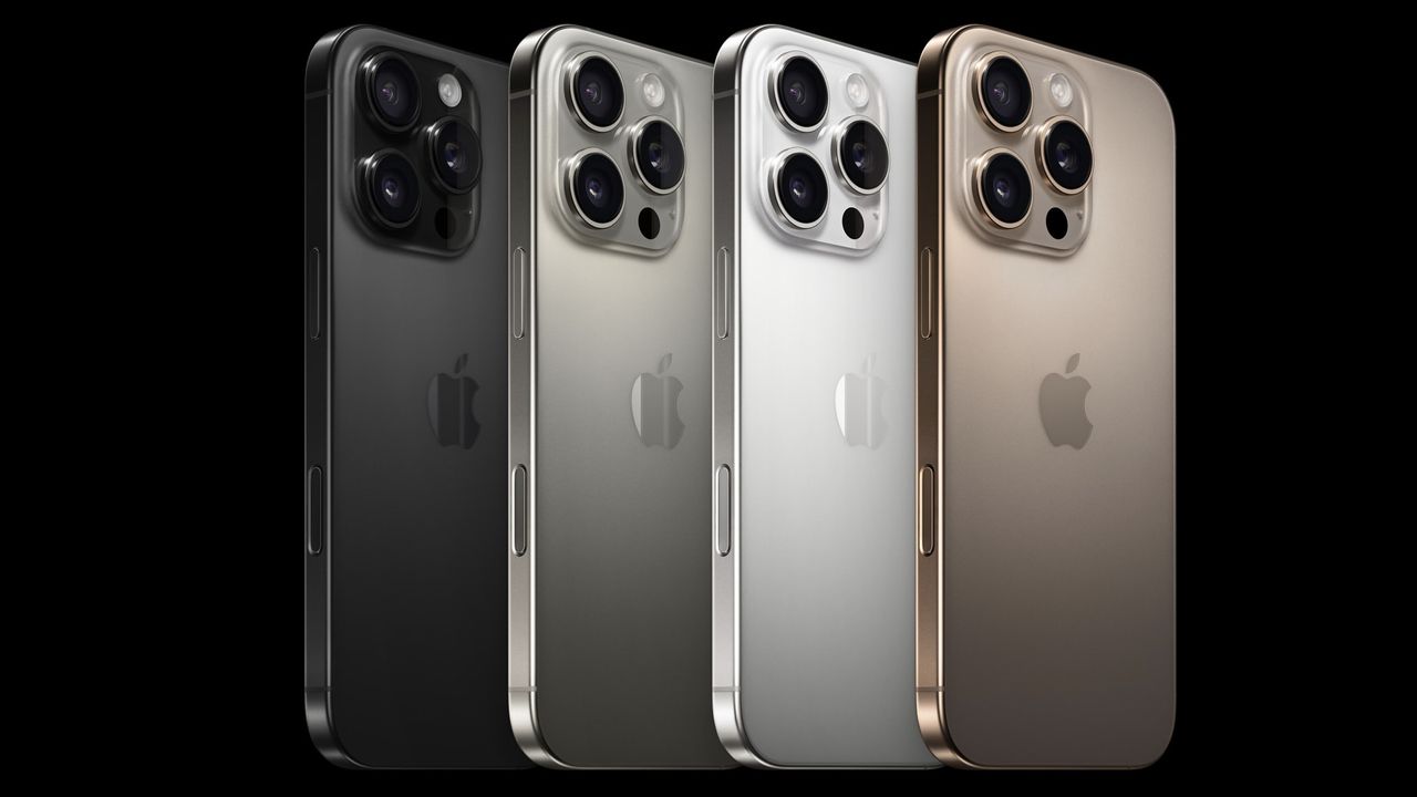


These 4 accessories have supercharged my Mac now that macOS Sequoia is here
- Accessories
With macOS Sequoia now available, I've bought these three accessories to help me multitask to the next level.
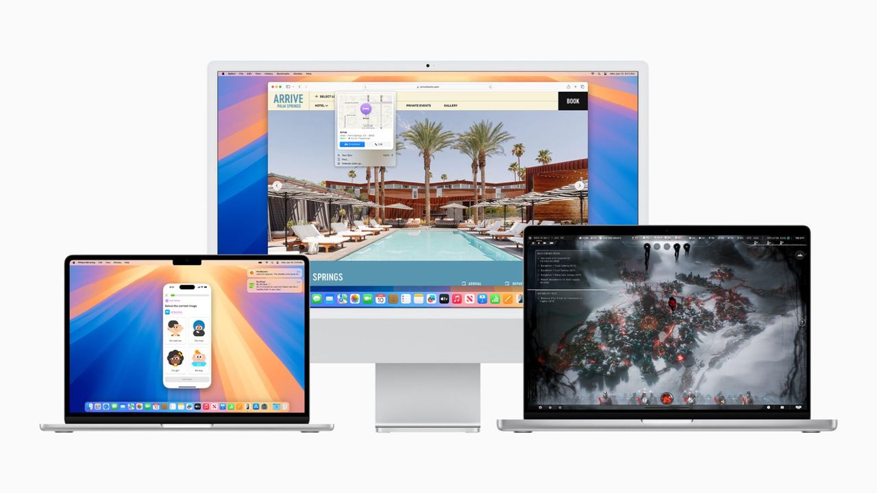


These are the best iPhone apps getting a major iOS 18 update so far
- iOS 18
- iOS
Now that iOS 18 is out, we’ve rounded up the best apps for your iPhone's newest update!


visionOS 2 is the first major software update for Apple Vision Pro, and now it's available
- Vision Pro
visionOS 2 is the first major software update for Apple Vision Pro, and now it's available for everyone to install after months of beta updates.


macOS Sequoia (version 15) is now available for your Mac with some big upgrades
- Macs
The latest software update for Macs is now available. You can install macOS Sequoia (version 15) on your device for some big upgrades.
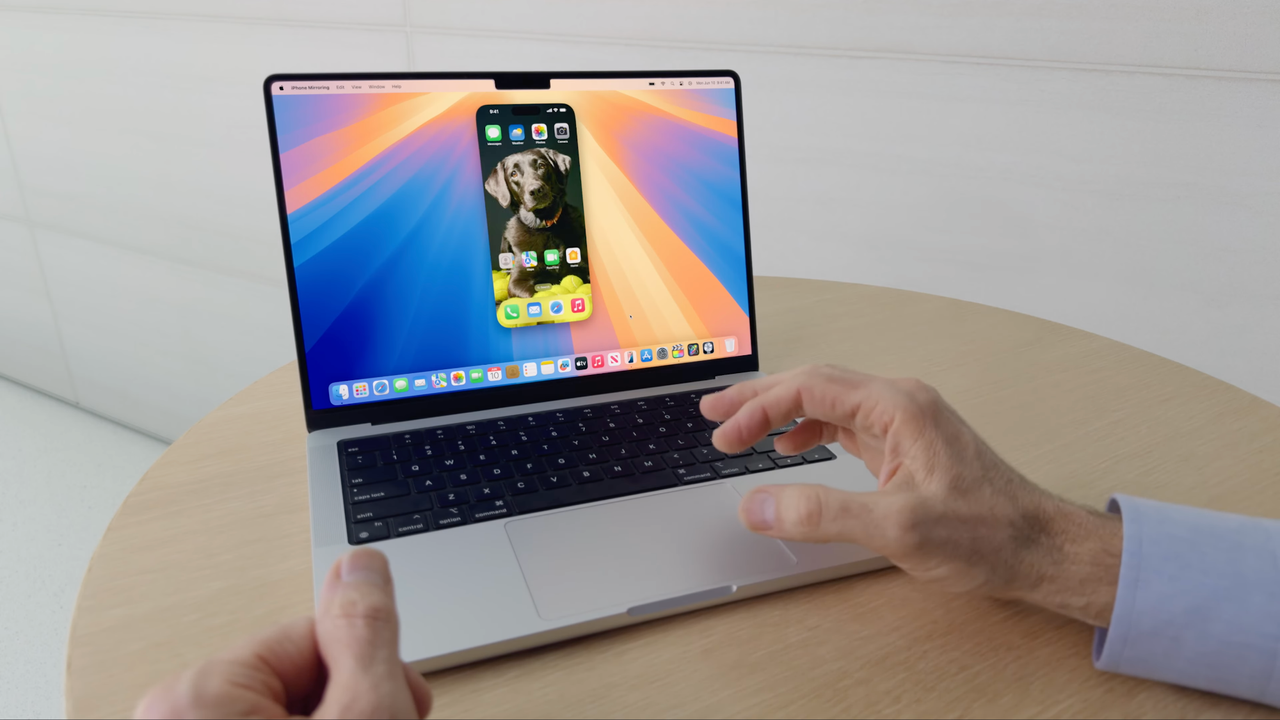

watchOS 11 is now rolling out to all Apple Watch users with the Series 6 or newer
- Apple Watch
- Health and Fitness
After months of beta releases, Apple is finally rolling out the watchOS 11 update to all Apple Watch users with the Series 6 or newer.
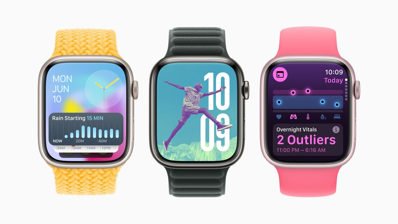


iOS 18 and iPadOS 18 are finally available for everyone – without any Apple Intelligence features
- iPhone
Apple is officially rolling out iOS 18 and iPadOS 18 to all users, after months of beta releases. But, it launches without any Apple Intelligence features.
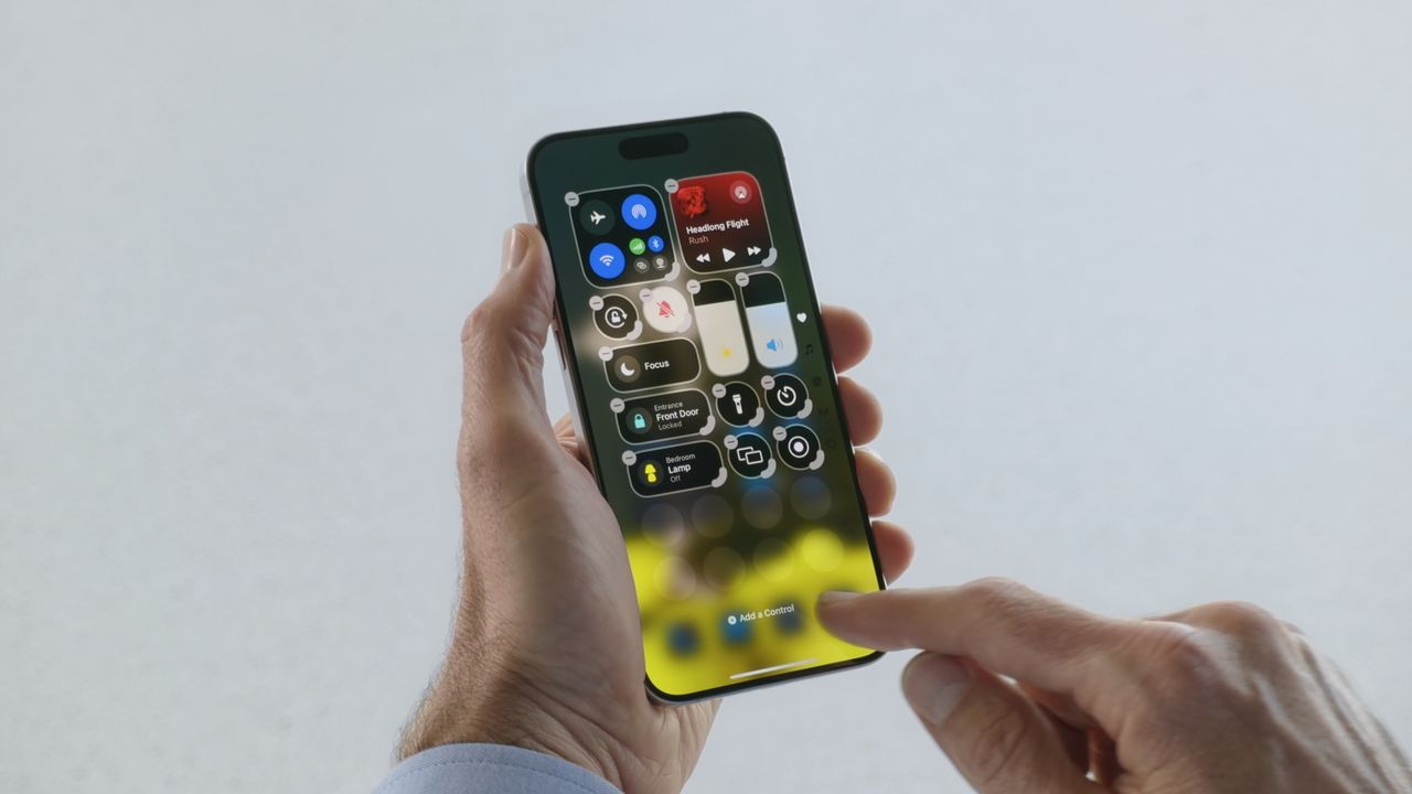


iOS 18 features a new tool to help repair your iPhone
- iOS 18
- iOS
iOS 18 will feature a 'Repair Assistant', to help indicate what parts will work with your broken iPhone.
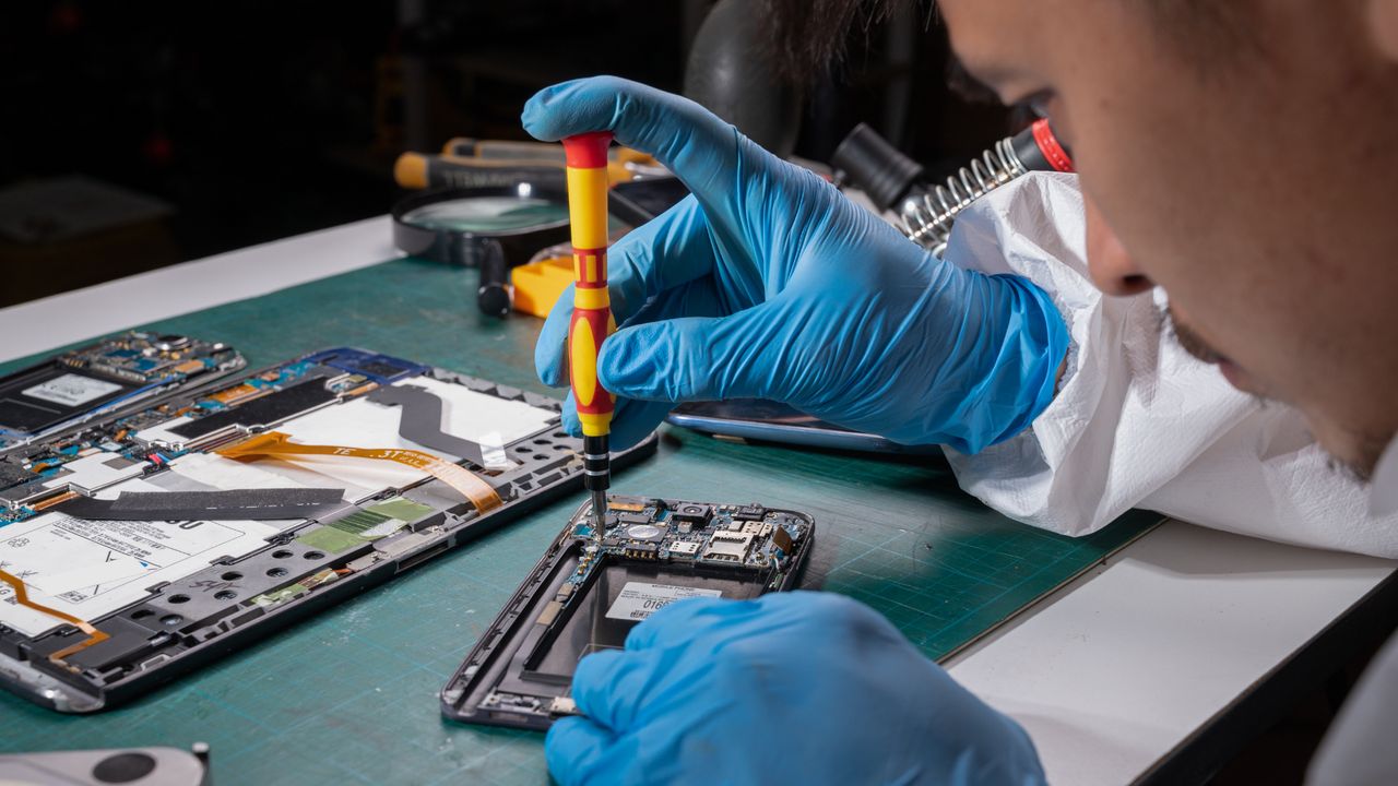


Apple Watch SE 3 is still in development — and is set to come in plastic
- Apple Watch SE
- Health and Fitness
- Apple Watch
A plastic version of the Apple Watch SE 3 is still in development, according to Bloomberg's Mark Gurman.
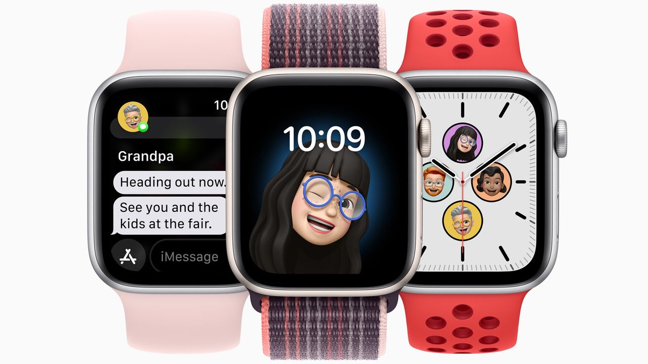


Netflix is ending support for millions of iPhones with latest update - are you affected?
- Music, Movies and TV
Netflix's app update is ending support for iOS 16, affecting older iPhones that can't run iOS 17 onward.
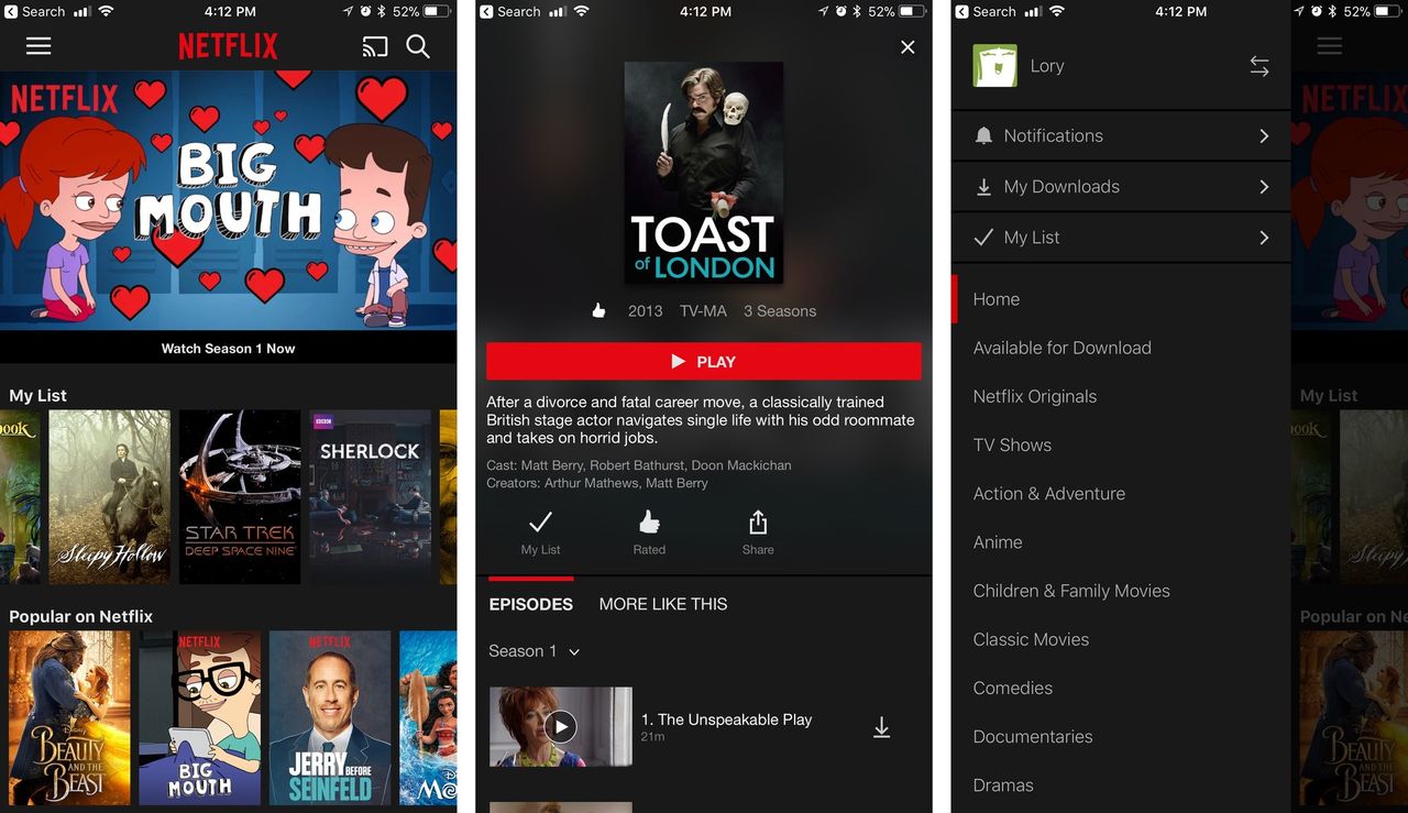


Apple has discontinued the iPhone 15 Pro, so you'll need an iPhone 16 for Apple Intelligence
- iPhone
Apple Intelligence is now only available on iPhone 16 and 16 Pro models, unless you buy a used iPhone 15 Pro.


Early iPhone 16 Pro benchmarks show it could be more powerful than your MacBook
- iPhone
Geekbench results for iPhone 16 Pro suggest it'll be a powerhouse that could outperform your MacBook.


Apple finally ditches classic stickers in the iPhone 16 box
- iPhone
Your new iPhone won't include Apple Stickers, reports suggest, but you can ask for them if you feel nostalgic.


Apple chip boss finally confirms how much RAM is in iPhone 16 and 16 Pro
- iPhone
Apple's Senior Vice President of Hardware Technologies, Johny Srouji, has confirmed all new iPhone 16 models have 8GB of RAM.


iPad users in the EU can sideload apps starting tomorrow
- iPad
Apple has confirmed third-party app stores will be available on the iPad from tomorrow, September 16.


iPhone 16 and iPhone 16 Pro preorders are now live — as well as Apple Watch Series 10, AirPods 4, and more
- iPhone 16
- iPhone
You can now preorder iPhone 16 and iPhone 16 Pro directly from Apple's site as well as select carriers!

Apple Store down ahead of iPhone 16 pre-orders
- iPhone
The Apple Store is down in advance of iPhone 16 pre-orders.


AirPods Pro 2 got their FDA clearance to be used as a hearing aid
- Airpods
Apple has received FDA clearance for its new hearing aids feature for the AirPods Pro 2.


iPhone 16 has a secret charging upgrade Apple didn't even mention
- iPhone 16
- iPhone
Apple's iPhone 16 features up to 45W wired charging across the board.


Apple hints that the iPhone SE 4 is closer than ever
- iPhone SE
- iPhone
With Apple allowing apps updated for iOS 18 to be submitted to the App Store, developers have noticed one less requirement.


AT&T reveals its iPhone 16 deals — get up to $1,000 off with an eligible trade-in
- iPhone 16
- iPhone
AT&T has revealed its iPhone 16 and iPhone 16 Pro deals ahead of next week's launch.

Don't worry, the Apple Watch Ultra 3 and Apple Watch SE 3 are both coming next year
- Apple Watch
- Health and Fitness
According to leaker Ming-Chi Kuo, Apple is waiting until 2025 to release the next generation of Apple Watch Ultra and SE.
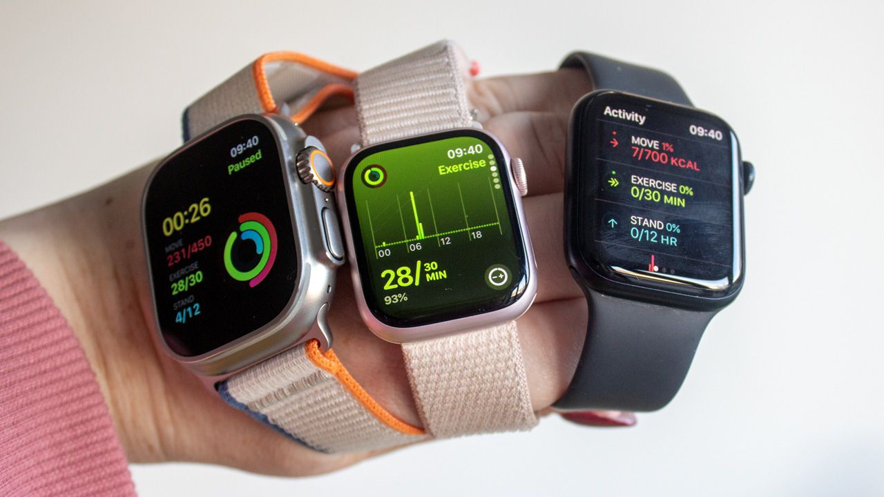


Apple releases new firmware for AirPods Pro 2 with features for iOS 18
- Airpods
Apple has released a new firmware update for AirPods Pro 2, bringing iOS 18 features to the wireless earbuds.


I might downgrade from my AirPods Pro 2 to the AirPods 4
- Airpods
After seeing Apple roll out the AirPods 4 with noise cancellation, I might leave my AirPods Pro 2 behind.

A surprising new Beats product launched at Apple's latest event: iPhone 16 cases
- iPhone 16
- iPhone
After the iPhone 16 event, Apple quietly revealed that Beats is now making hardshell polycarbonate iPhone 16 cases in a surprising move.


iPhone 16 battery life stats reveal that you'll get hours extra from the latest iPhones
- iPhone
In the iPhone 16 keynote, Apple said the new devices have bigger batteries, but didn't go into the specifics. Now, we can see the battery life stats offer hours of extra battery.


The new Apple Watch Series 10 bands will work with older Apple Watch models
- Apple Watch
- Health and Fitness
Apple just released the Apple Watch Series 10 and a new option for the Ultra 2, which comes with new bands. But, they'll work with older models.


Apple loses $14bn Irish tax case against the EU
- Apple
Apple must pay back 13 billion euros to Ireland following a ruling in its unpaid taxes case.


iPhone 16 models still come with a SIM card tray everywhere outside the US
- iPhone
While the new iPhone 16 models are eSIM only in the US, they still come with a SIM card tray everywhere else, while lacking 5G mmWave support.


I'm downgrading from my iPhone 15 Pro to the iPhone 16 - here's why
- iPhone
After seeing Apple announce the iPhone 16, I think it's time to admit that I'm not a "Pro" user anymore.


How to re-watch Apple's iPhone 16, Apple Watch Series 10, and AirPods 4 event
- Apple
If you missed the special event or just want to watch everything again, here's how you can re-watch Apple's "It's Glowtime" event.


iPhone 16, Apple Watch Series 10, and AirPods 4 impressions: my early thoughts on Apple's newest devices
- iPhone
Apple just released the iPhone 16, iPhone 16 Pro, Apple Watch Series 10, AirPods 4, and more. Here are my early thoughts on Apple's impressive new devices.
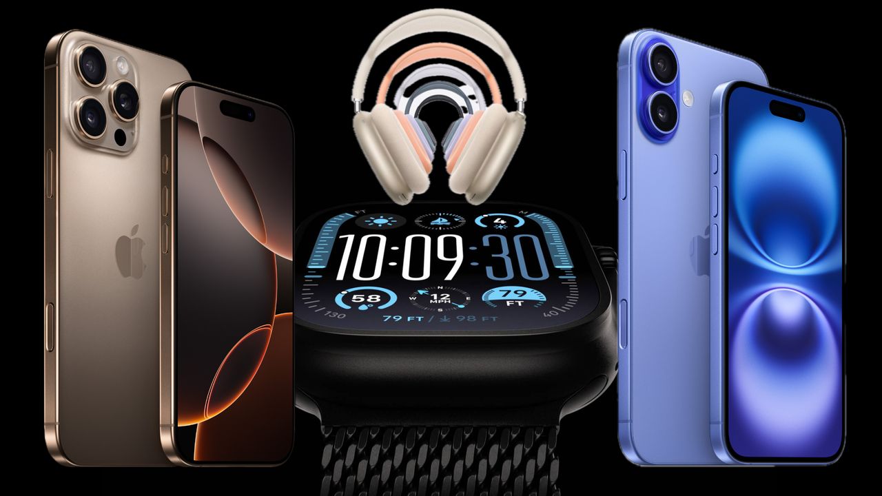


Apple launches preapproval process for iPhone 16 and iPhone 16 Pro preorders
- iPhone
Apple has launched its pre-approval process for customers who wish to purchase an iPhone 16 or iPhone 16 Pro.


Every Apple product discontinued after the iPhone 16 event
- Apple
While the iPhone 16 event was all about new iPhones, Apple Watches, and AirPods, it also marked the end for all of these Apple products.
