Photography
Soulful Seasonal Portraits with Natural Backdrops
- 500px Blog
- Featured
- Headline
- Home Feed
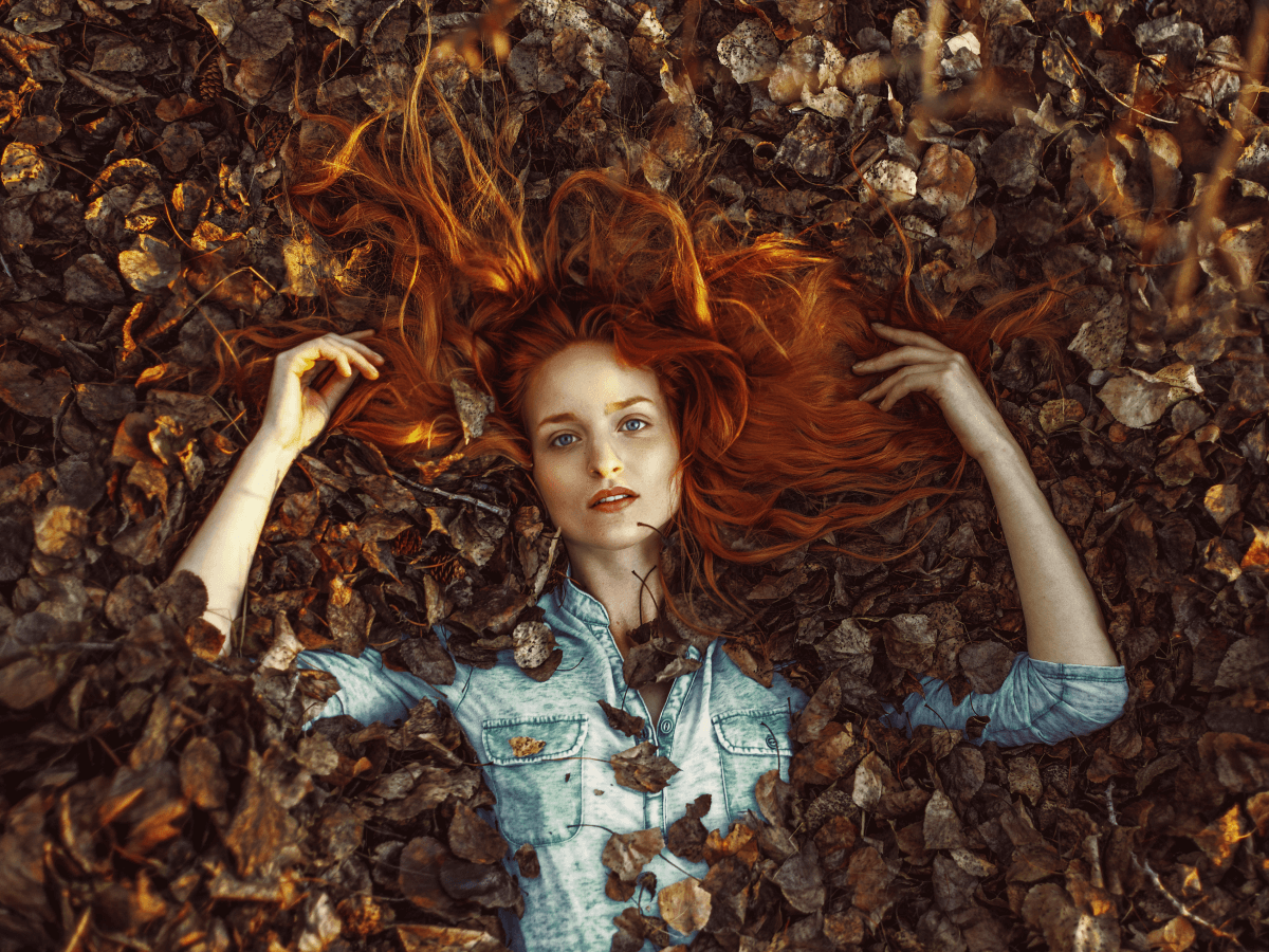
Fall offers a rich tapestry of natural elements, changing leaves, soft light, and textured landscapes that make it an ideal setting for emotive, story-driven portraiture. Capturing soulful seasonal portraits with natural backdrops means using your surroundings to amplify emotion, create visual harmony, and enhance storytelling. Here’s how to elevate your portraits this fall. Creating Soulful Seasonal Portraits with Natural Backdrops Autumn evokes introspection and nostalgia, which can be mirrored in […]
The post Soulful Seasonal Portraits with Natural Backdrops appeared first on 500px.
Fall offers a rich tapestry of natural elements, changing leaves, soft light, and textured landscapes that make it an ideal setting for emotive, story-driven portraiture. Capturing soulful seasonal portraits with natural backdrops means using your surroundings to amplify emotion, create visual harmony, and enhance storytelling. Here’s how to elevate your portraits this fall. Creating Soulful Seasonal Portraits with Natural Backdrops Autumn evokes introspection and nostalgia, which can be mirrored in your portraits through expression, light, and location. When photographing soulful seasonal portraits with natural backdrops, think about how the environment contributes to the overall feeling. A lone figure among golden trees or soft light filtering through falling leaves can set the tone for something timeless and intimate. Pro Tip: Use the Landscape to Evoke Emotion Frame your subject within the landscape in a way that highlights scale, space, and emotion. Wide shots with negative space can evoke solitude, while tighter frames surrounded by warm tones suggest comfort or closeness. Choosing and Using Your Backdrop Thoughtfully Natural backdrops should feel intentional, not incidental. Scout for locations that offer texture, depth, and color harmony: Forest trails with fallen leaves Open fields with golden grasses Lakesides with soft reflections Tree-lined paths at golden hour Position your subject with the light, side light adds depth, while backlight enhances mood and softness. Guiding Your Subject for Genuine Emotion A soulful portrait is more than a good backdrop. Engage with your subject, ask them to move slowly, or think about a personal memory. Capture in-between moments: a glance over the shoulder, an exhale, a gentle smile. Let natural gestures guide your frame. Extended reading: Crafting Compelling Stories Through Your Lens The post Soulful Seasonal Portraits with Natural Backdrops appeared first on 500px.
Photographing Fog, Frost, and Transition Light
- 500px Blog
- Headline
- Home Feed
Autumn isn’t just about fiery foliage, some of the most poetic moments happen on misty mornings and frost-kissed fields. Photographing fog, frost, and transition light allows photographers to capture the quiet, in-between moments that define the season’s mood. These conditions offer subtle light, soft textures, and ephemeral beauty that lend themselves perfectly to atmospheric imagery. Embracing Atmosphere: Photographing Fog, Frost, and Transition Light The combination of fog, frost, and transition […]
The post Photographing Fog, Frost, and Transition Light appeared first on 500px.
Autumn isn’t just about fiery foliage, some of the most poetic moments happen on misty mornings and frost-kissed fields. Photographing fog, frost, and transition light allows photographers to capture the quiet, in-between moments that define the season’s mood. These conditions offer subtle light, soft textures, and ephemeral beauty that lend themselves perfectly to atmospheric imagery. Embracing Atmosphere: Photographing Fog, Frost, and Transition Light The combination of fog, frost, and transition light creates a dreamy softness that transforms ordinary scenes into magical compositions. These conditions often occur during early mornings or late evenings, so timing is everything. Fog acts as a natural diffuser, softening highlights and shadows. Frost adds delicate texture and shimmer to leaves, grass, and surfaces. Transition light, especially during dawn or dusk, adds dimension and mood. Seek out wide-open spaces like meadows, lakesides, or forest paths where mist can hang low and catch the light just right. Best Settings for Capturing Delicate Detail To do justice to these fleeting scenes, adjust your settings to capture both atmosphere and texture: Use a wide aperture (f/2.8–f/5.6) to emphasize shallow depth of field, especially for frost. Slightly underexpose foggy scenes to preserve the subtle tonality. Shoot in RAW for more control in editing; fog and frost can easily be washed out in JPEGs. Stabilize your camera with a tripod if you’re shooting in low light, especially during early mornings. Creative Ideas for Fog, Frost, and Transition Light Photography Silhouettes in fog: Backlit subjects in fog can create haunting, ethereal silhouettes. Macro frost: Get close to frosted leaves, grass blades, or windows to reveal intricate crystal patterns. Golden haze: When fog meets sunrise, it glows—frame with trees or architecture for added contrast. Transition light is brief, so plan your shot before the light changes. Arrive early, scout your location, and anticipate where the light will fall. Extended reading: How to create ethereal photos on misty mornings The post Photographing Fog, Frost, and Transition Light appeared first on 500px.
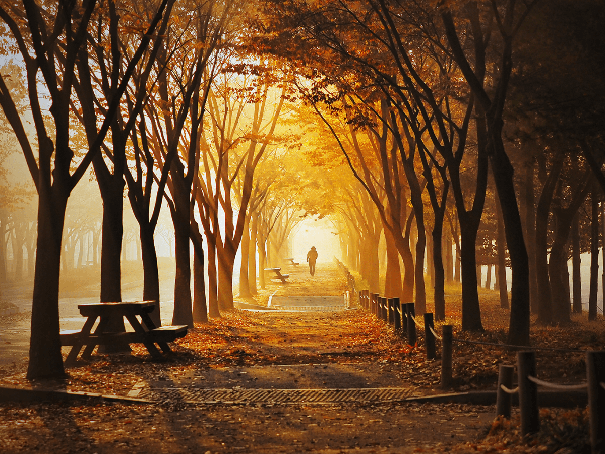
Shooting with Fall’s Golden Palette
- 500px Blog
- Featured
- Headline
- Home Feed
Autumn is a dream season for photographers, with trees cloaked in rich hues of amber, gold, and russet. Shooting with fall’s golden palette offers an opportunity to create warm, emotive, and textured images that resonate with viewers. But working with such intense colors also comes with challenges; compositional choices, lighting conditions, and editing all play a role in capturing the mood. Finding the Right Scene When Shooting with Fall’s Golden […]
The post Shooting with Fall’s Golden Palette appeared first on 500px.
Autumn is a dream season for photographers, with trees cloaked in rich hues of amber, gold, and russet. Shooting with fall’s golden palette offers an opportunity to create warm, emotive, and textured images that resonate with viewers. But working with such intense colors also comes with challenges; compositional choices, lighting conditions, and editing all play a role in capturing the mood. Finding the Right Scene When Shooting with Fall’s Golden Palette Golden tones can be found everywhere from forests and parks to quiet country roads and even city sidewalks. The key to shooting with fall’s golden palette is to look for scenes where the color is concentrated and naturally composed. Focus on trees with dense canopies of yellow or gold. Include ground-level leaves for added texture and harmony. Frame your subject with backlighting to make colors glow. Try using polarizing filters to reduce glare and enhance the vibrancy of your shots. Golden Hour Meets Golden Leaves Autumn light is already warm, but when paired with golden hour, it becomes magical. The low sun adds softness and directionality that brings warmth and dimensionality to your scene. Use sidelighting to accentuate texture in foliage and bark. Backlighting creates glowing edges around leaves or people. Position your subject to interact with the warm light like walking through a sun-drenched path or pausing in a beam of late-day sun. Tips for Balancing Color and Composition It’s easy to get swept away by colour, but smart composition keeps your images grounded. Here are a few tips to help: Simplify the frame: Isolate a few strong shapes or colors rather than trying to capture everything at once. Include contrast: Gold pops more when placed next to cooler tones like blue skies, deep shadows, or neutral clothing. Mind the exposure: Meter for highlights to avoid blowing out the brightest leaves. Bring the Golden Mood into Post-Processing Enhance the golden tones without oversaturating. Use HSL (hue, saturation, luminance) sliders to fine-tune yellows and oranges. Adding a subtle vignette or warm color grade can further highlight the mood of fall without making the image feel artificial. Extended reading: Capturing Emotional Portraits with Golden Hour Light The post Shooting with Fall’s Golden Palette appeared first on 500px.
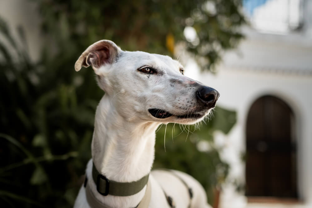
Maggie Gongolevich: 500px Photographer Spotlight
- Featured
- Spotlights
- 500px spotlight
The 500px Photographer Spotlight invites you to dive into the minds and methods of the incredible photographers who shape our community. Discover the unique journeys, creative insights, and inspiring stories behind the stunning photos we love. Meet Maggie Gongolevich A Spain-based photographer whose work beautifully blends her love of dogs and the outdoors. What began with motorsport photography in Poland, where her rally images appeared in print, has since evolved into […]
The post Maggie Gongolevich: 500px Photographer Spotlight appeared first on 500px.
The 500px Photographer Spotlight invites you to dive into the minds and methods of the incredible photographers who shape our community. Discover the unique journeys, creative insights, and inspiring stories behind the stunning photos we love. Meet Maggie Gongolevich A Spain-based photographer whose work beautifully blends her love of dogs and the outdoors. What began with motorsport photography in Poland, where her rally images appeared in print, has since evolved into capturing the bond between animals and nature. With fresh inspiration drawn from travel, landscapes, and her own dogs, Maggie’s photography tells a story of passion and discovery. Maggie, at what point did you realize photography was your passion? Was it a gradual realization, or an instant epiphany? My father was an artist at heart. When I was little, he loved drawing and taking photos of nature and of me, but I always hated being photographed. I realized that if I showed interest in his camera, he’d focus on teaching me instead of pointing it at me. It was an old Zenith, and it was beautiful; my plan worked, I was able to learn from him instead of always being a subject in his photos. Let’s go back to the very beginning. Can you tell us about the story behind your very first camera? Which one? It’s hard to say which was my very first. I grew up in Poland, where we mostly had access to Russian cameras. My dad had an old one he didn’t use anymore, so I started playing with it, though it wasn’t great. Later, for one of my birthdays, I got a simple compact camera that allowed me to take photos on school trips and around my town. I always made sure to buy the film with the most frames and always two rolls, just in case. What’s harder—getting the perfect shot, or getting the pet to sit still for it? It depends on the pet. For me, the perfect shot in pet photography is a mix of the photographer’s vision and the dog’s expression at the exact millisecond you press the shutter. Some photos were saved by the dog’s expression at the right time, and others turned out great because everything went according to plan. For example, one of my dog, Suki, is a natural-born model.+ She’ll stand still, jump over obstacles, and always look her best whenever I have a camera. The other three? They’re stunning too, but getting a good photo of them is more about luck than planning. The bond between a photographer and their subject is paramount, especially when that subject happens to have four legs. How do you cultivate that trust before the lens is even uncapped? Sometimes the camera itself sparks their curiosity, and a curious dog is already halfway to a successful photo shoot. But there’s no one-size-fits-all. It depends on the animal’s personality. Some need space, some need encouragement, and the super-excited ones often need to be ignored a little. It’s all about adapting to the situation and the model in front of you. Do you secretly think some pets are natural models, and others just aren’t? Of course, and not secretly at all!+ My dog Suki is a complete supermodel, while the others are not as comfortable, and one is even completely camera-shy. When I first started photographing at the shelter, I noticed the same thing. Some dogs, who probably had never seen a camera in their lives, somehow just knew to stand tall and look their best. Others, not so much. What’s one thing people don’t realize about photographing animals until they try it? We often see perfectly posed animal photos online, with tutorials on how to place their legs or direct their gaze. But in reality, most dogs aren’t that well-trained, and even well-trained ones may behave differently in front of the camera. I think many people don’t realize how random and chaotic it can be, but that’s also the beauty of it. Some of my best shots came out of complete chaos. Is there a landscape you’ll never tire of photographing? For me it would be mountains and the ocean. Nothing in between, really. Mountains look different every single time, and with the ocean, I adore the colors and how they change depending on the weather. What’s a hidden gem destination you think more photographers should know about? Tabernas Desert in Spain. It’s just one of many spectacular landscapes in this amazing country, but it brings completely different vibes from what most people imagine when they think of Spain. How do you feel that photography has changed the way you see the world around you? I don’t think photography changed that, I was drawn to it because of the way I see the world. I’ve always noticed details, gestures and found beauty in the scenes in front of me. Photography simply became my way of expressing that. Do you have a recent or upcoming shoot or project you would like to share or promote? I’ve recently started exploring equine photography. I now have my very own equine model, so I’ll definitely be sharing more horse photos on my feed soon. Stay tuned! Read more 500px Photographer Spotlight interviews: Andrea Gambirasio The post Maggie Gongolevich: 500px Photographer Spotlight appeared first on 500px.
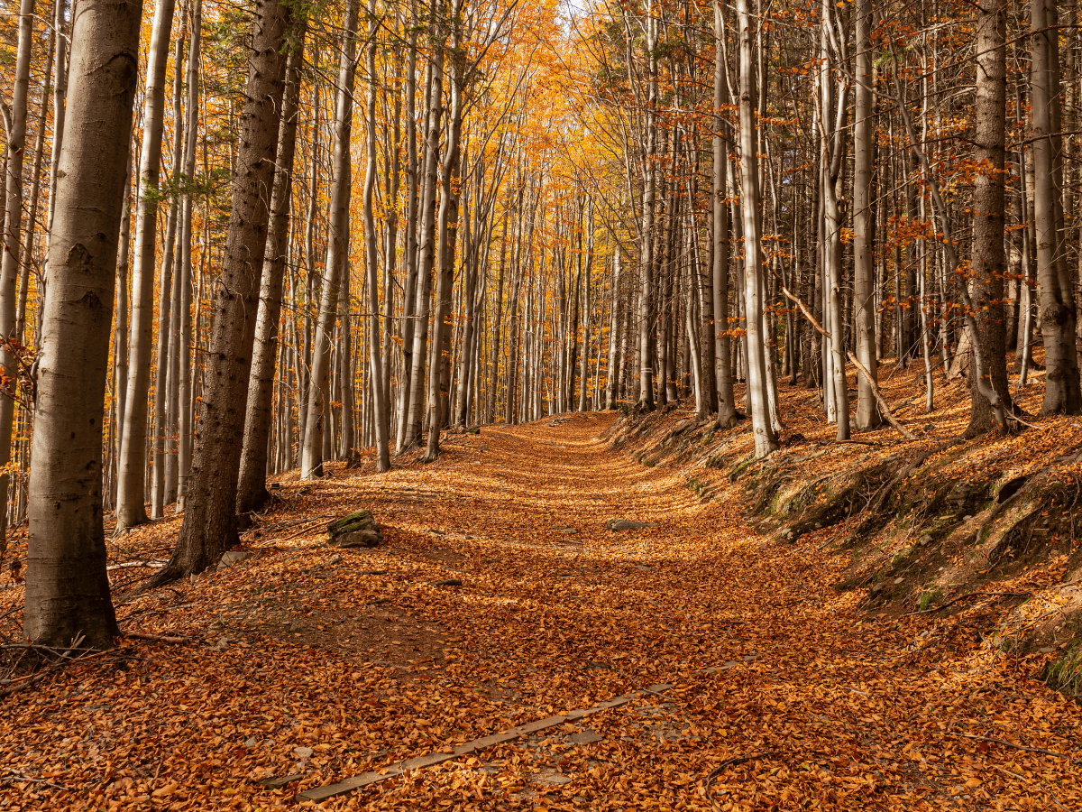
Capturing Autumn in the Woods: Composition Tips
- 500px Blog
- Featured
- Headline
- Home Feed
Fall transforms forests into dreamlike scenes filled with colour, texture, and atmosphere. For photographers, it’s the perfect season to refine your compositional skills while soaking in nature’s vibrant display. Capturing autumn in the woods requires more than just pointing your camera at pretty leaves, it’s about framing nature in ways that tell a story, evoke emotion, and guide the viewer’s eye. Framing for Impact When Capturing Autumn in the Woods […]
The post Capturing Autumn in the Woods: Composition Tips appeared first on 500px.
Fall transforms forests into dreamlike scenes filled with colour, texture, and atmosphere. For photographers, it’s the perfect season to refine your compositional skills while soaking in nature’s vibrant display. Capturing autumn in the woods requires more than just pointing your camera at pretty leaves, it’s about framing nature in ways that tell a story, evoke emotion, and guide the viewer’s eye. Framing for Impact When Capturing Autumn in the Woods Strong composition begins with awareness of the elements in your frame. Think of the woods not just as a background, but as an active participant in your image. Use tree trunks to create natural frames for your subject. Look for paths or leading lines like fallen logs or trails to draw the eye inward. Incorporate negative space like fog, sky, or open glades, for balance. The key to capturing autumn in the woods is slowing down. Take time to explore different perspectives and experiment with foreground elements like branches or mushrooms to add depth. Light and Colour: Essentials for Capturing Autumn in the Woods Golden hour in a forest creates magical lighting conditions, soft beams, filtered shadows, and warm tones. Use this to your advantage by: Backlighting leaves to make their colours glow. Capturing contrast between sunlit and shaded areas to add dimension. Shooting during early morning mist for atmosphere and mood. Keep an eye on how light plays through branches, and remember: you don’t always need sunshine. Overcast days help saturate colour and reduce harsh shadows, making them perfect for leaf detail shots. Composition Tips to Elevate Your Autumn Forest Photos To move beyond snapshots, consider these proven composition techniques: Rule of Thirds: Place key subjects—like a lone tree or person—off-center for a more dynamic feel. Layering: Include foreground, middle, and background elements to create visual depth. Symmetry and Balance: Look for reflections in puddles or evenly spaced trees to create pleasing symmetry. Bonus tip: look up! Shooting from a low angle toward the canopy can yield dramatic images full of shape and repetition. Don’t Overlook the Details While wide-angle forest shots are striking, zooming in on details like bark textures, leaf veins, or fallen acorns tells a quieter story. These images help round out a series and capture the sensory experience of walking through the woods in fall. Exteded reading: Enhancing Your Storytelling with Strong Compositional Techniques The post Capturing Autumn in the Woods: Composition Tips appeared first on 500px.
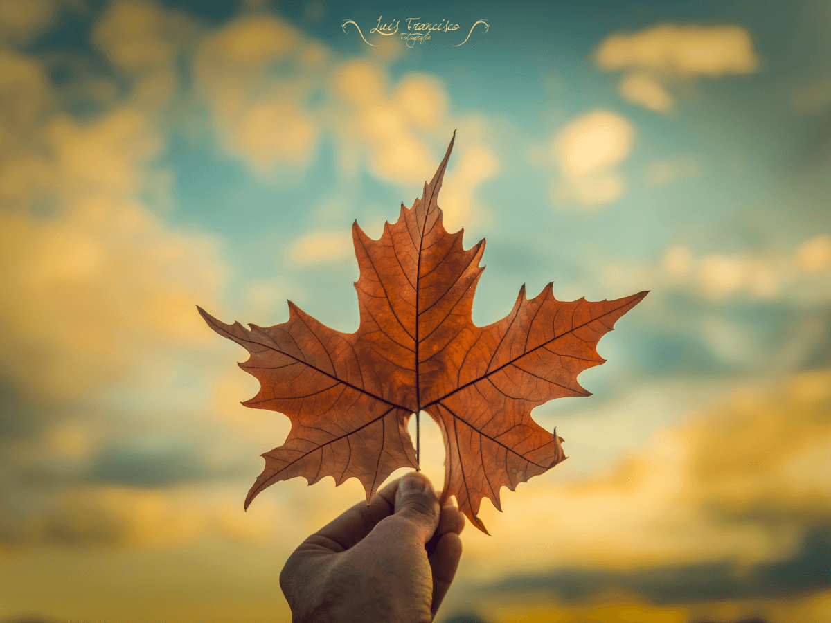
Mastering Leaf Photography: Colors, Textures, and Patterns
- 500px Blog
- Featured
- Headline
- Home Feed
As the leaves turn brilliant shades of red, gold, and orange, autumn becomes a stunning canvas for photographers. Leaf photography is more than capturing foliage, it’s about exploring shape, detail, and emotion in the smallest subjects of the season. Whether you’re out for a walk or planning a dedicated shoot, learning to photograph leaves with intention can help you craft images that are both timeless and striking. Why Leaves Make […]
The post Mastering Leaf Photography: Colors, Textures, and Patterns appeared first on 500px.
As the leaves turn brilliant shades of red, gold, and orange, autumn becomes a stunning canvas for photographers. Leaf photography is more than capturing foliage, it’s about exploring shape, detail, and emotion in the smallest subjects of the season. Whether you’re out for a walk or planning a dedicated shoot, learning to photograph leaves with intention can help you craft images that are both timeless and striking. Why Leaves Make Great Subjects Leaves offer endless variety: no two are ever the same. From fiery maples to earthy oaks, each species carries its own story through shape, vein structure, and hue. In autumn, nature offers a palette rich in saturated tones and crisp detail, the perfect ingredients for compelling compositions. Playing with Light and Texture with Leaf Photography Lighting can dramatically change the mood of your leaf shots. Backlighting: Shoot with the sun behind the leaf to reveal intricate vein patterns and translucency. Side lighting: Highlights texture and creates dramatic shadows. Overcast light: Softens contrast and enriches color saturation, perfect for flat-lay arrangements or forest floors. Try experimenting at different times of day to find your preferred light style. Leaves shot in early morning fog will feel vastly different from ones captured at golden hour. Composing with Intention When photographing leaves, consider: Isolated details: Use a macro lens or your camera’s close-focus setting to zero in on leaf edges, frost crystals, or rain droplets. Pattern repetition: Capture piles or rows of similar leaves for a rhythmic, graphic feel. Color contrast: Look for leaves that pop against their environment, a red leaf on green moss, or a yellow one on dark pavement. Use a wide aperture (f/2.8–f/5.6) to create shallow depth of field and direct the viewer’s attention where you want it. Bonus Idea: Try Flat Lays Flat lays can turn everyday leaves into creative art. Arrange different shapes or colors into a pattern on neutral backgrounds like wood or paper. Add autumn props (acorns, pinecones, or a steaming mug of tea) to tell a seasonal story. Bring It Together in Post Enhance contrast and clarity in your post-processing to bring out the textures of each leaf. Boost vibrance slightly, autumn tones love a little extra pop, but avoid oversaturation. Play with split toning or subtle vignettes to add mood. Leaf photography is a reminder that beauty doesn’t need to be grand. With a little creativity and attention to detail, even a single fallen leaf can hold an entire story. Extended reading: Capturing fall foliage The post Mastering Leaf Photography: Colors, Textures, and Patterns appeared first on 500px.
Andrea Gambirasio: 500px Photographer Spotlight
- Featured
- Spotlights
- 500px spotlight
Meet Andrea Gambirasio A 26-year-old photographer drawn to landscapes, travel, and wildlife. With just a few years of experience, Andrea’s style is simple yet imaginative—blending what the eye sees with what the moment inspires. Though photography is still a hobby, their approach reveals a thoughtful creative process. Today, we’re exploring Andrea’s views on photography and where inspiration takes them. The 500px Photographer Spotlight invites you to dive into the minds […]
The post Andrea Gambirasio: 500px Photographer Spotlight appeared first on 500px.
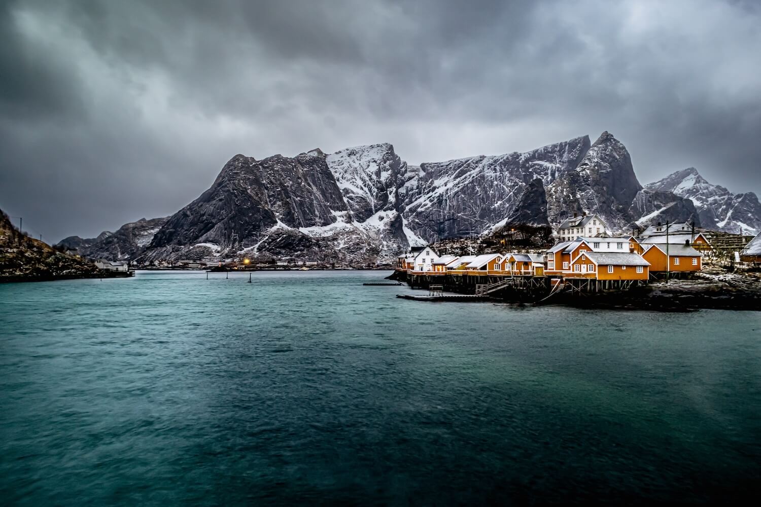
Meet Andrea Gambirasio A 26-year-old photographer drawn to landscapes, travel, and wildlife. With just a few years of experience, Andrea’s style is simple yet imaginative—blending what the eye sees with what the moment inspires. Though photography is still a hobby, their approach reveals a thoughtful creative process. Today, we’re exploring Andrea’s views on photography and where inspiration takes them. The 500px Photographer Spotlight invites you to dive into the minds and methods of the incredible photographers who shape our community. Discover the unique journeys, creative insights, and inspiring stories behind the stunning photos we love. Andrea, do you remember the first time you thought, “I want to take photography seriously”? What sparked it? Yes, of course. For a few years now, especially during trips, hikes, and vacations, I’ve been taking photos with my iPhone. Even though it has a good camera, I wanted something more—especially with some trips I was planning to take with my girlfriend. That’s when I started looking for a camera to bring along. From there, a whole world opened up—made of lenses, sensors, shutter speeds, apertures, and technicalities—that completely drew me in. My first camera was a Canon R100, Canon’s entry-level model, which I truly loved. It was small, compact, and intuitive. With it, I managed to capture some of my favorite photos. I’ve recently decided to replace it with a Sony, mainly because of the availability of lenses I really liked but weren’t compatible. It was truly a great travel mate. What was the photographer’s learning curve like for you—self-taught trial and error, or more structured training? Let’s say my learning curve was a bit like a roller coaster. I’m self-taught, and I like to experiment. At the beginning, I would just play around with dials here and there without really knowing what I was doing. I watched different influencers on YouTube, TikTok and Instagram and followed their advice. I got influenced and ended up buying tons of lenses that I no longer knew where to store. I would travel with a bag full of gear and only two pairs of underwear. In the end, though, my photos were always pretty basic and lacked a clear sense of direction. After that, I decided to start watching serious tutorials and rely on solid books. Then, on that theoretical foundation, I began to experiment. From there, I finally started to feel satisfied with my photos. Even though I know much more now than when I first started, there are still photos I don’t like or that don’t fully convince me, and I’m always looking for new information and advice to keep improving my technique. How do you know when you’ve captured “the shot”? That’s a great question. It depends. Sometimes I realize it right away on the camera display—the light and shadows are balanced, the subject is in focus, the shutter speed is correct, there’s no motion blur, and the composition works. Other times, I only notice it once I download the images and start a post-production process where I try to give the photo the right direction. In any case, until I’ve downloaded the photos and can carefully check every detail, there’s always a bit of anxiety that I might have gotten it wrong. What’s your ritual before heading out on a shoot? I don’t really have a set ritual. Usually, I just grab my camera and look for a framing that I like, then I adjust the settings and start shooting. Do you shoot with the final image in mind, or discover it later in editing? Usually, before a trip or a shoot, I quickly go through images of the landscape, animal, monument, or city I want to photograph. Based on these, I form an idea and then mentally develop my project. So, let’s say I often already have the image in my mind before taking the shot. I love landscape photography, so before going out, I study the type of landscape and visualize the final image in my head. However, there are often many variables in landscape photography—from weather conditions to the time of day when the shot can be taken, to other people who might appear in the scene. As a result, the shot doesn’t always come out as imagined. Inevitably, in these cases, post-processing becomes necessary. One of these cases was the coastal landscape of Hamnøy in Norway. I planned the trip in January and had already envisioned the scene I wanted to capture before departure. I had bought a wide-angle lens and a variable ND filter because I wanted to create a silky effect on the waves crashing against the rocks. For seven days, it rained nonstop, and the wind was terrible making the shot impossible. On the last day, the wind finally calmed, and it had just started to snow. I was finally able to get my shot. I really liked the photo itself, even though the colors of the houses were muted by the gloomy weather. With some careful post-processing, I was able to bring my vision to life. To this day, I think it’s the shot I’m most in love with among everything I’ve taken. Do you plan trips around the shot, or the shot around the trip? Usually, I plan the shot around the trip. Although I have to admit, there are some trips I would take just to capture a “that shot”… How do you find beauty in “ordinary” places others might overlook? I have to say that nowadays, with social media, we’re encouraged to travel and go out looking for beauty and new experiences. The truth is, beautiful things are often hidden close to home as well. Since I also enjoy exploring and traveling, when I can’t do that, I try to appreciate what’s near me, sometimes focusing on details that many people might overlook. Sometimes, all it takes is a drop of dew on a hedge, a beam of light hitting an object in a special way, a reflection in a puddle, a shadow, or a particular texture to create a new photograph that conveys the beauty of small things. What’s the strangest thing you’ve learned about yourself through photography? The strangest thing about me is that I’m willing to do anything for a photograph: standing in the cold for hours waiting for the Northern Lights, hiking for hours uphill to capture a mountain sunset, staying silently among grass and insects waiting for a roe deer or a stag to emerge from the vegetation, driving for hours up and down to photograph a landscape, or waking up at 2 a.m. to shoot the Milky Way or at 5 a.m. for sunrise. But all that effort is rewarded when I open my computer, download the photos, and see that they turned out just as I had imagined. Is there a subject or setting you’ll never tire of photographing? Oh yes. Fortunately, I live in an area where the mountains are quite close. My favorite shot will always be the sunset reflected on the lakes between the mountain peaks. The colors of the mountain sky, the fresh, clean air filling your lungs, the scents and aromas of flowers, meadows, and damp rocks—this will always be a shot I’ll never stop taking. If you could give advice to your younger self starting out with photography, what would it be? The advice I would give to myself when I started photographing is this: don’t focus on the gear or on comparing yourself to photographers and photos you see on social media. You can achieve great results even with basic equipment, without traveling to amazing places, simply by trying to capture the best in small things—focusing on the composition that suits the scene in front of you and making the most of the elements present to create a WOW effect. Do you have a recent shoot or project you would like to share or promote? I’m currently curating some of my favorite photos I’ve taken over the years and will be sharing them soon. I’ll also be traveling to South Africa for vacation… I’m hoping that I’ll be able to capture the shots I’ve planned and upload them to 500px as soon as possible. Read more 500px Photographer Spotlight interviews: Olena Leliuk The post Andrea Gambirasio: 500px Photographer Spotlight appeared first on 500px.
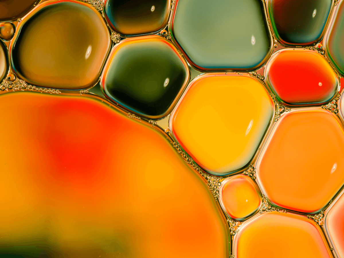
Transforming the Ordinary: Abstract Macro Shots
- 500px Blog
- Featured
- Headline
- Home Feed
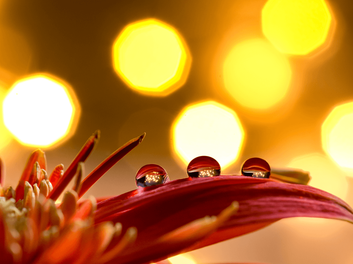
Macro photography doesn’t always have to be about capturing tiny details with crystal clarity. Sometimes, it’s about stepping back creatively to reimagine everyday subjects in new and abstract ways. Through clever framing, lighting, and focus, even the most mundane objects can become visually captivating. Seeing Beyond the Subject Abstract macro photography challenges you to see texture, color, and form rather than objects. Instead of capturing a flower in full bloom, […]
The post Transforming the Ordinary: Abstract Macro Shots appeared first on 500px.
Macro photography doesn’t always have to be about capturing tiny details with crystal clarity. Sometimes, it’s about stepping back creatively to reimagine everyday subjects in new and abstract ways. Through clever framing, lighting, and focus, even the most mundane objects can become visually captivating. Seeing Beyond the Subject Abstract macro photography challenges you to see texture, color, and form rather than objects. Instead of capturing a flower in full bloom, zoom in on the curling edge of a petal or the chaotic pattern of pollen. Instead of photographing a spoon, focus on the reflections along its curve. This style invites curiosity. The goal is not always to identify the subject but to feel something when viewing it. Techniques for Abstract Macro Magic Use a shallow depth of field: Embrace blur. With a wide aperture (f/2.8 or wider), you can isolate fragments of your subject and let the rest melt into color and shape. Play with light and shadow: Harsh light can create strong contrast and drama. Backlighting or side lighting adds texture and dimensionality. Experiment with reflections and refractions: Water droplets, glass, or plastic can distort reality in fascinating ways. Shoot through them to introduce randomness. Focus on texture: Rust, fabric, bark, feathers—zoom in until the texture becomes the story. Abstract macro shots thrive on surface detail. Ordinary Objects, Unusual Outcomes What you need is already around you. Try these ideas: The grainy surface of a sponge under angled light A close-up of a cracked eggshell Oil on water producing rainbow swirls Worn pages of an old book create repeating patterns Let your home, backyard, or junk drawer be your gallery. Post-Processing for Abstract Enhancement Editing can push your abstracts further. Consider: High contrast black-and-white to emphasize form over color. Selective color grading to create surreal tones. Clarity and texture boosts to draw out minute detail. Don’t hesitate to crop aggressively or rotate your image—orientation is flexible in abstraction. Embrace the Unexpected The beauty of abstract macro photography lies in discovery. There’s no pressure to identify a subject or tell a literal story. Instead, you’re transforming the ordinary into something emotionally or visually compelling. Trust your eye, experiment freely, and allow yourself to be surprised. Extended reading: A guide to creating abstract photography that sells The post Transforming the Ordinary: Abstract Macro Shots appeared first on 500px.
Mastering Light in Macro Photography
- 500px Blog
- Featured
- Headline
- Home Feed
- macro
- macro photography guide
- macro tutorial
When it comes to macro photography, light can either elevate your shot to a work of art or bury intricate details in shadows. Whether you’re photographing insects, flowers, or small objects, understanding how to use light effectively is key to achieving sharp, expressive, and visually compelling images. Natural vs Artificial Light in Macro Photography Natural light is often the first choice for outdoor macro photographers. Early morning and late afternoon […]
The post Mastering Light in Macro Photography appeared first on 500px.
When it comes to macro photography, light can either elevate your shot to a work of art or bury intricate details in shadows. Whether you’re photographing insects, flowers, or small objects, understanding how to use light effectively is key to achieving sharp, expressive, and visually compelling images. Natural vs Artificial Light in Macro Photography Natural light is often the first choice for outdoor macro photographers. Early morning and late afternoon offer soft, golden light that brings out textures and reduces harsh shadows. However, natural light is unpredictable, and you may encounter overcast skies or midday harshness. On the other hand, artificial lighting such as ring flashes, LED panels, or speedlights gives you full control. These tools allow you to shape, direct, and modify light for consistent results regardless of the environment. Tip: Try combining both natural and artificial light. Use natural light as the base and a reflector or soft flash to fill in unwanted shadows. Key Lighting Techniques for Macro Success Diffuse Your Light: Whether natural or artificial, harsh light can blow out details. Use a diffuser like a translucent umbrella, softbox, or even a piece of white cloth to soften the illumination. Side Lighting: Positioning your light source to the side can reveal textures and give your subject a more three-dimensional feel. Backlighting: Great for translucent subjects like petals or wings. Backlighting creates a glow and adds mood, but may require exposure compensation. Use Reflectors: Bouncing light back onto the subject can help fill shadows and add a touch of warmth, especially in cool light conditions. Controlling Shadows and Highlights In macro photography, shadows can become distracting if not controlled properly. Try these techniques: Adjust Angle and Distance: Move your light source or change your position to modify the shadow cast. Use Fill Light: A secondary light source or small LED panel can help fill in shadows without overpowering the main light. Manual Exposure Settings: Shoot in manual mode to control your highlights and preserve details in both dark and light areas. Practical Setup Tips for Macro Lighting Stabilize your gear – Use a tripod to keep your composition steady when experimenting with light angles. Start with one light source – Master it before adding more complexity. Use a diffuser or bounce card – Even a folded piece of white paper can make a difference. Experiment and review – Check your shots frequently, and don’t be afraid to adjust. Light in Macro Photography as a Creative Tool Light tells a story. Harsh shadows can convey drama. Soft light can evoke intimacy. A splash of warm sunlight can introduce nostalgia, while cool tones may suggest tranquillity or mystery. Train your eye to see how light interacts with your subject, and you’ll unlock new dimensions in your macro photography. Extended reading: Getting Started with Macro Photography The post Mastering Light in Macro Photography appeared first on 500px.
Olena Leliuk: 500px Photographer Spotlight
- 500px Blog
- Featured
- Home Feed
- Spotlights
- 500px spotlight
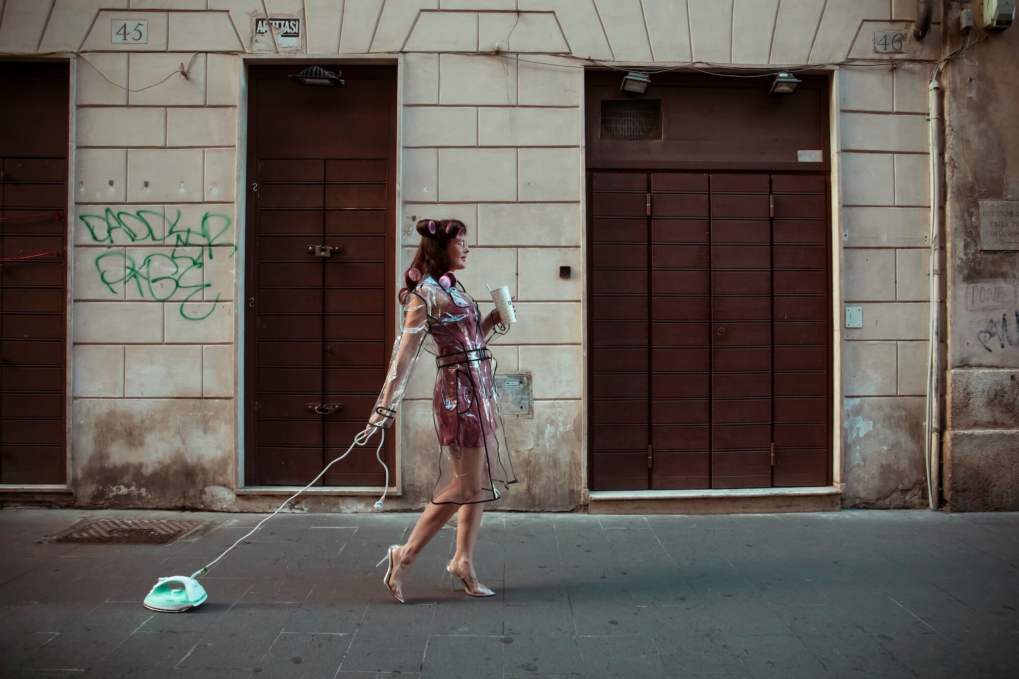
The 500px Photographer Spotlight invites you to dive into the minds and methods of the incredible photographers who shape our community. Discover the unique journeys, creative insights, and inspiring stories behind the stunning photos we love. Olena Leliuk is a Rome-based, award-winning wedding and fashion photographer. Her distinctive style merges the surreal with the everyday, infused with fashion and flair, resulting in vibrant, imaginative photographs. Discover more about Olena’s unique […]
The post Olena Leliuk: 500px Photographer Spotlight appeared first on 500px.
The 500px Photographer Spotlight invites you to dive into the minds and methods of the incredible photographers who shape our community. Discover the unique journeys, creative insights, and inspiring stories behind the stunning photos we love. Olena Leliuk is a Rome-based, award-winning wedding and fashion photographer. Her distinctive style merges the surreal with the everyday, infused with fashion and flair, resulting in vibrant, imaginative photographs. Discover more about Olena’s unique approach and perspective on photography, planning vs spontaneity, and crafting stunning photos that make an impression. Olena, tell us about your journey into photography. How did your initial interest evolve over time? I started taking pictures in the 80s with my father’s analog camera, and I instantly enjoyed the process of creating images. Today, I continue to find inspiration in the work of other talented photographers, which constantly pushes me to explore new creative avenues. Looking back at your earliest photos, what early lessons continue to influence your work today? One of the greatest lessons I’ve learned through photography is that while masterpieces can sometimes arise spontaneously, a significant factor in their creation is being in the right place at the right moment. Have you ever revisited an old idea with a new perspective? What changed? I sometimes create a series and then revisit the same concept with a different model. This approach allows for a connected series with shared themes, highlighting the distinctions between the subjects in a unique way, with more experience and skill. What role does planning play in your shoots, and how much do you leave open to spontaneity? My approach to travel photography is largely spontaneous, allowing me to capture authentic moments as they unfold. However, when I undertake shoots in Rome, every detail is meticulously planned to ensure I achieve the precise vision I have in mind. Are there any camera techniques or settings you wish you had mastered sooner? No. I think when it comes to mastering the camera, everything unfolds exactly as it’s meant to, with each photograph, technique learned, and challenge serving a purpose in the grand design of a photographer’s evolving skill. What’s something you wish more people knew about being a photographer? Photography is a demanding art form that requires significant control and oversight from the photographer at every stage of the process. From conceptualization to post-production, the photographer’s vision and technical expertise are paramount. Many people underestimate the amount of work a photographer puts into each photo. What’s in your camera bag that no one would expect? Hairpins, clothespins, and oil control film are essentials in my camera bag. Hairpins are great for taming flyaways during a shoot or securing small props. Clothespins can be used to hold backdrops, secure gels to lights, or even create impromptu clamps. Oil control film is perfect for quickly blotting away shine on a subject’s face, ensuring a clean look in the photo. Where do you see the future of photography heading? I see a growing interest in analog photography, and I feel it is likely due to its inherent challenges with analog, the meticulous process, the limited shots per roll, the anticipation of development, all of which can lead to a more rewarding final image. In a time dominated by instant digital gratification and AI-generated art, analog offers a tangible, handcrafted alternative that emphasizes skill, patience, and artistic vision. Do you have a recent shoot or project you would like to share? Yes, these are part of a fashion shoot I did in Rome earlier this year. Read more 500px Photographer Spotlight interviews: Tugba Din The post Olena Leliuk: 500px Photographer Spotlight appeared first on 500px.